

- Published on

FIGURE SPECS
(“KING KONG ESCAPES”, 1968)
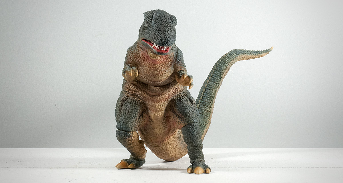
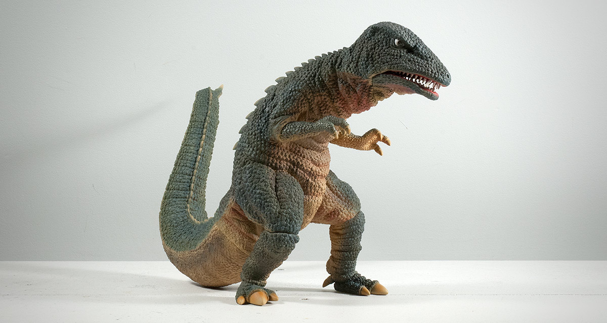
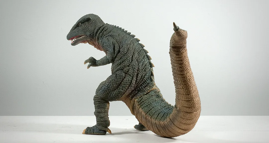
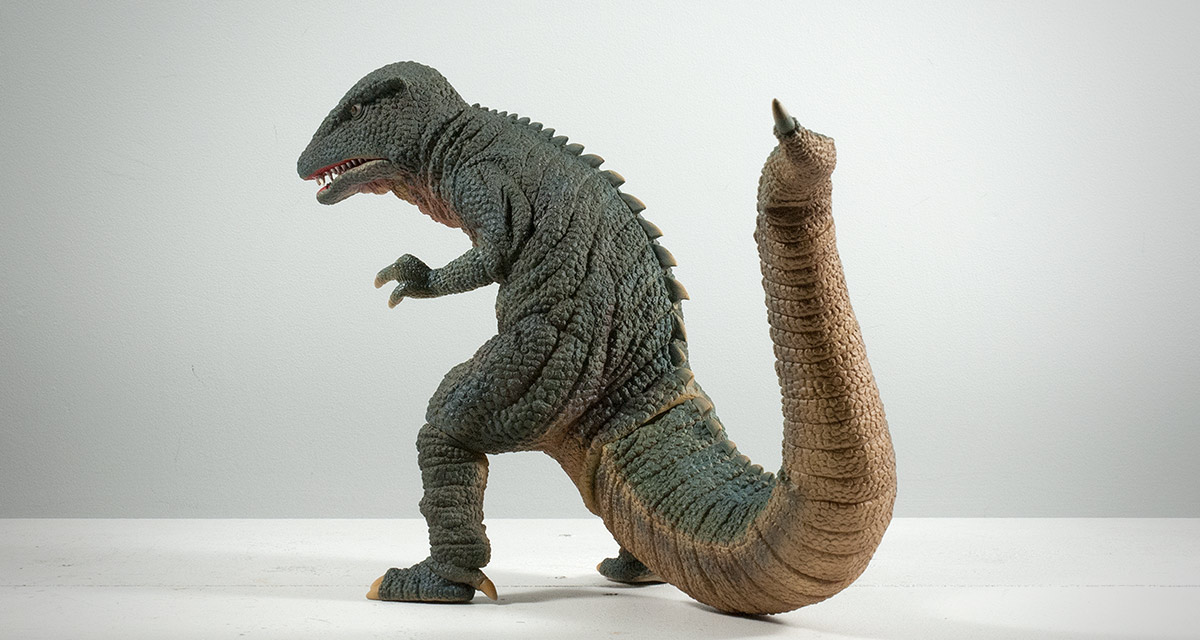
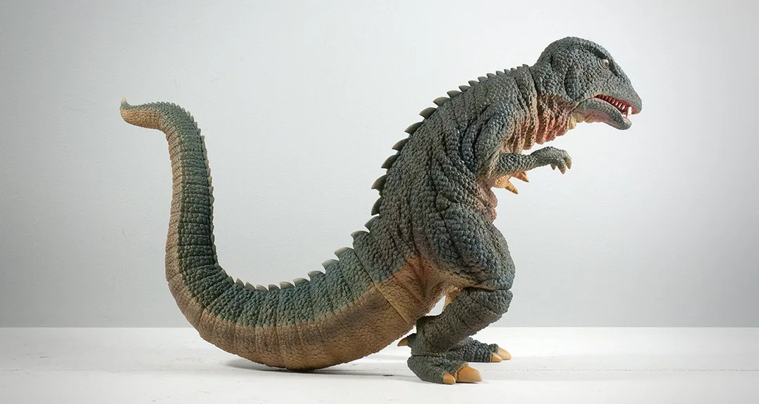
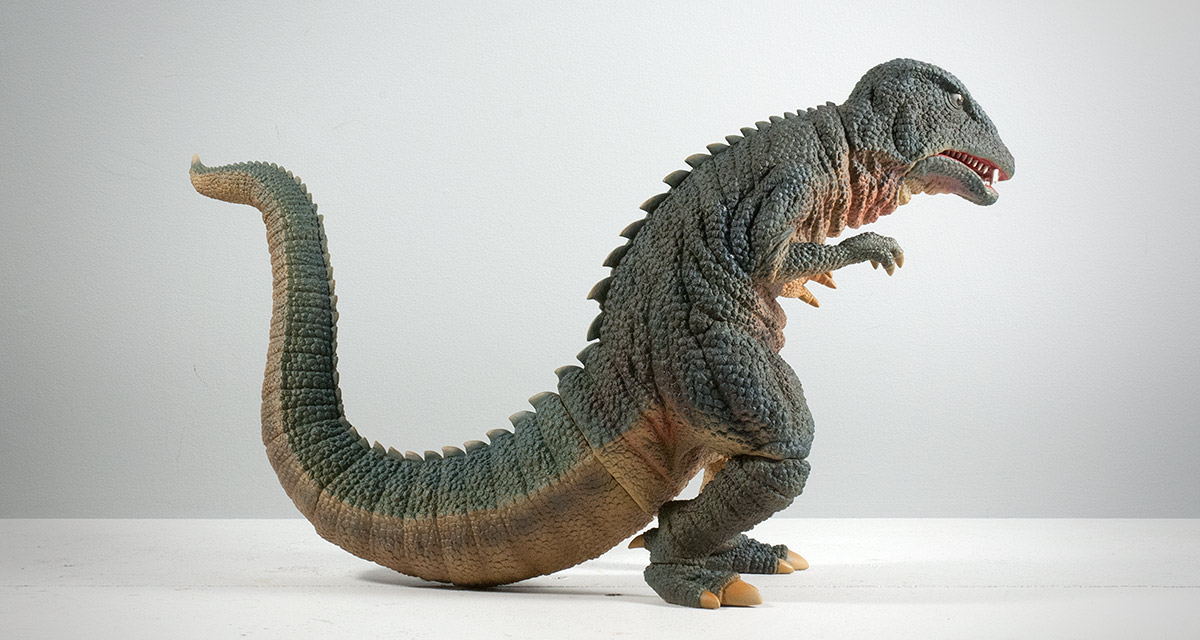
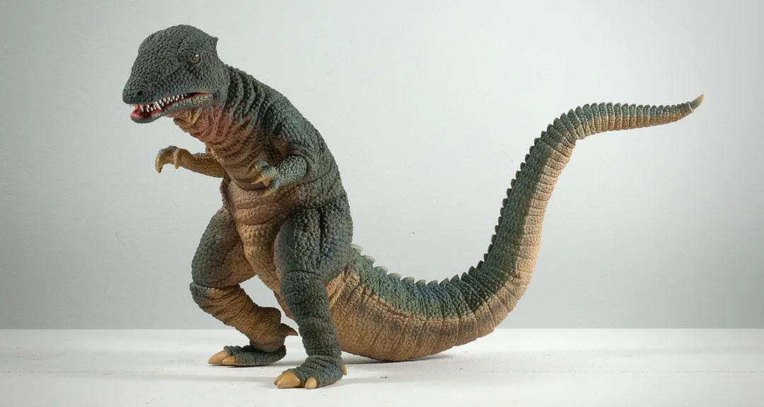
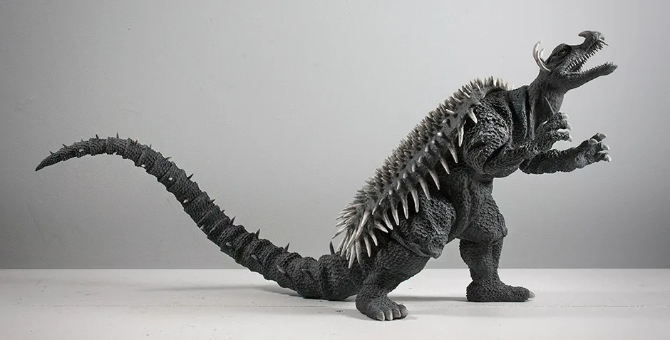
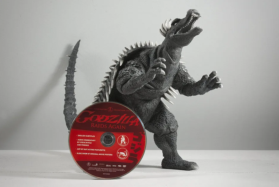
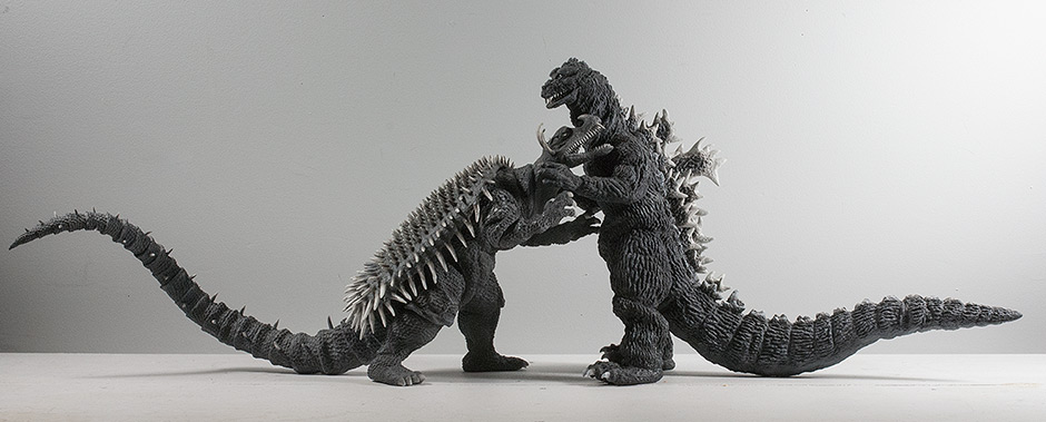
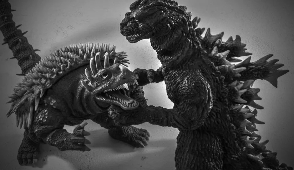
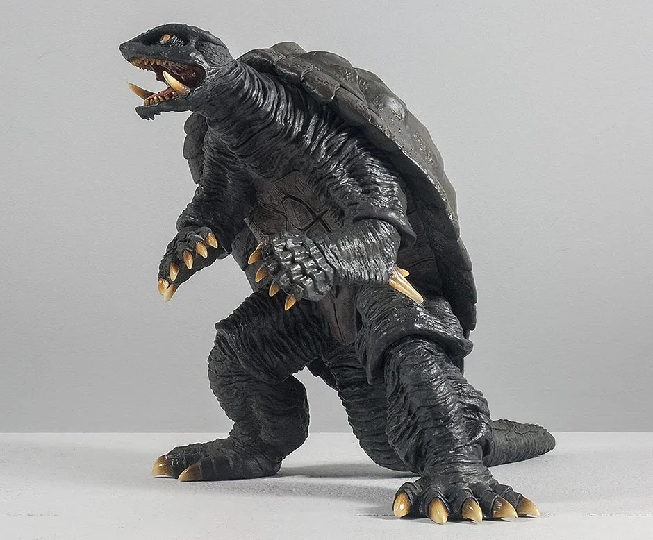
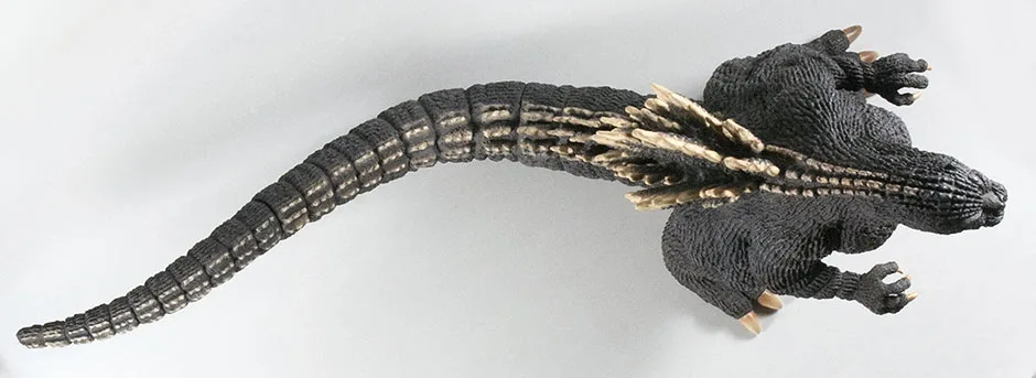
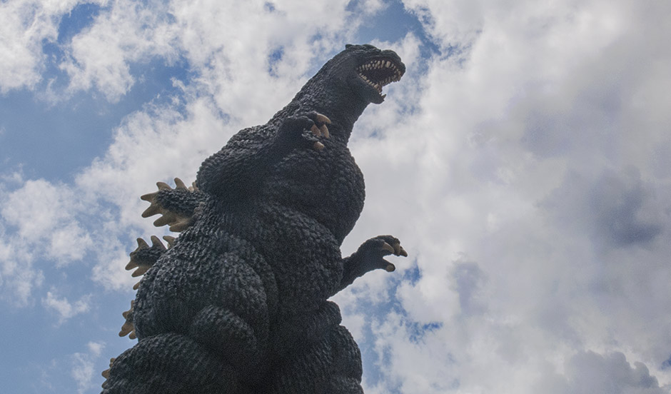
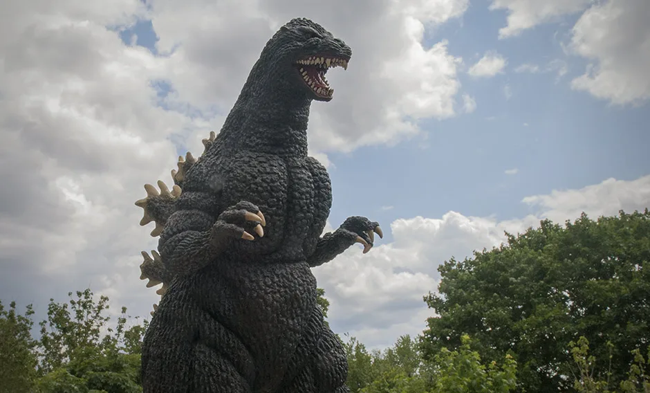
The Toho 30cm Series Gorosaurus 1967 vinyl figure was first released in 2008, at the very beginning of X-Plus‘ current ‘way of doing things’. It appeared again as a kit in 2010, and yet again as a special 1968 repaint version in 2011 and, finally, as a re-issue licensed for North America via Diamond Distributors. This review is for the Diamond Reissue.
Before I go on, I just want to say that I was never much of a Gorosaurus fan. I got this figure only because the completist in me just couldn’t say ‘no’ to another X-Plus. And, just as with Varan (also not previously a huge fan of), I was wowed by the figure as soon as I took it out of box. It looks so much better in person than it did in the same old photos I saw on the web for the last two years. What is this power X-Plus has to win me over?
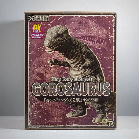
THE BOX
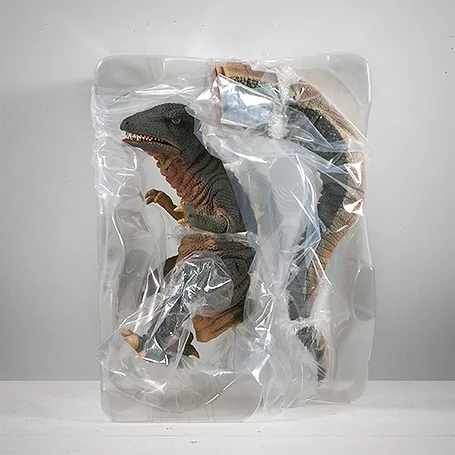
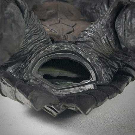
Inside, the figure is wired into a plastic shell. The tail needs to be attached.


Getting the tail on the first time, though, was troublesome for me. The “butt” hole on my figure was squooshed into a horizontal ellipse. The tail hole was squooshed vertically in the opposite direction. Because of this, I blasted the butt with the hair dryer since it was obvious it needed some re-shaping. With the tail end still cool and stiff, I pushed and twisted and it just did not want to go in at first. The hole on the body just completely capitulated to the tail and didn’t have the strength to push its way over the tail’s rim. Blah, blah, blah. Let me just suggest that when you attach the tail yours that you heat and soften the body hole just a little and not as much as you’re used to.
OTHER OUTTA THE BOX STUFF


ALIGN THE TAIL
Goro’s tail has two joints on it and chances are yours won’t be aligned right out of the box. Give ’em both a tweak and set ’em straight. You probably want to do this after you attach the tail to the body since they’re a bit loose.
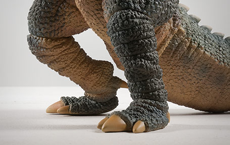
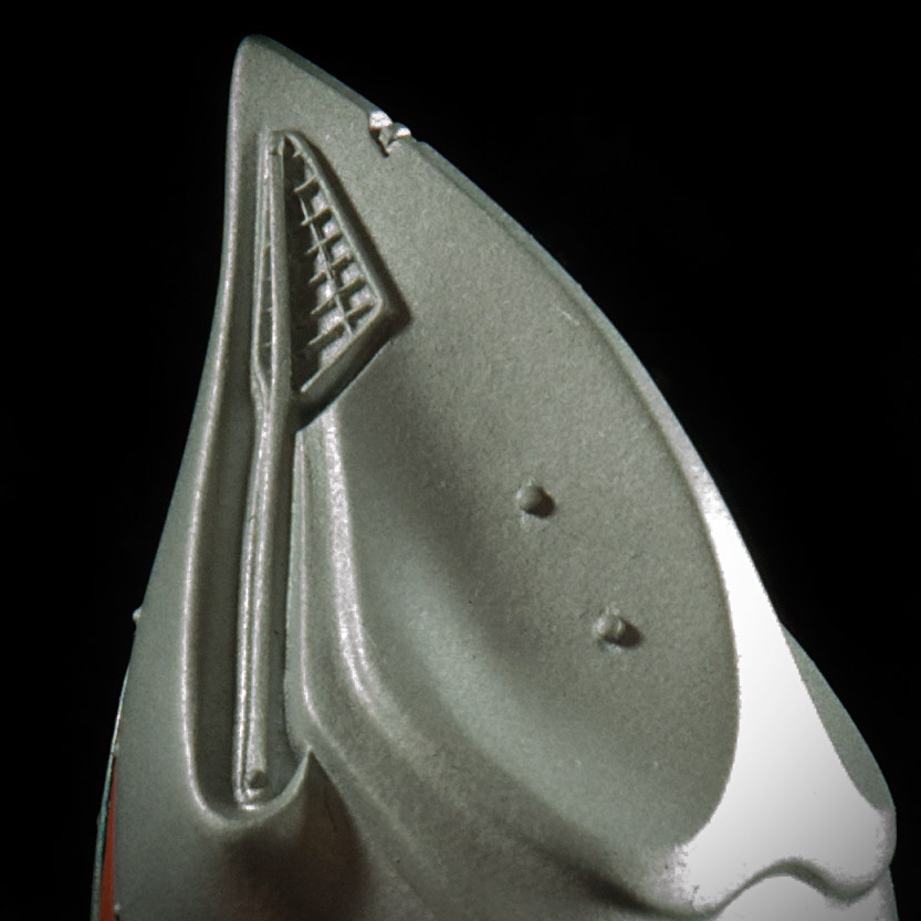
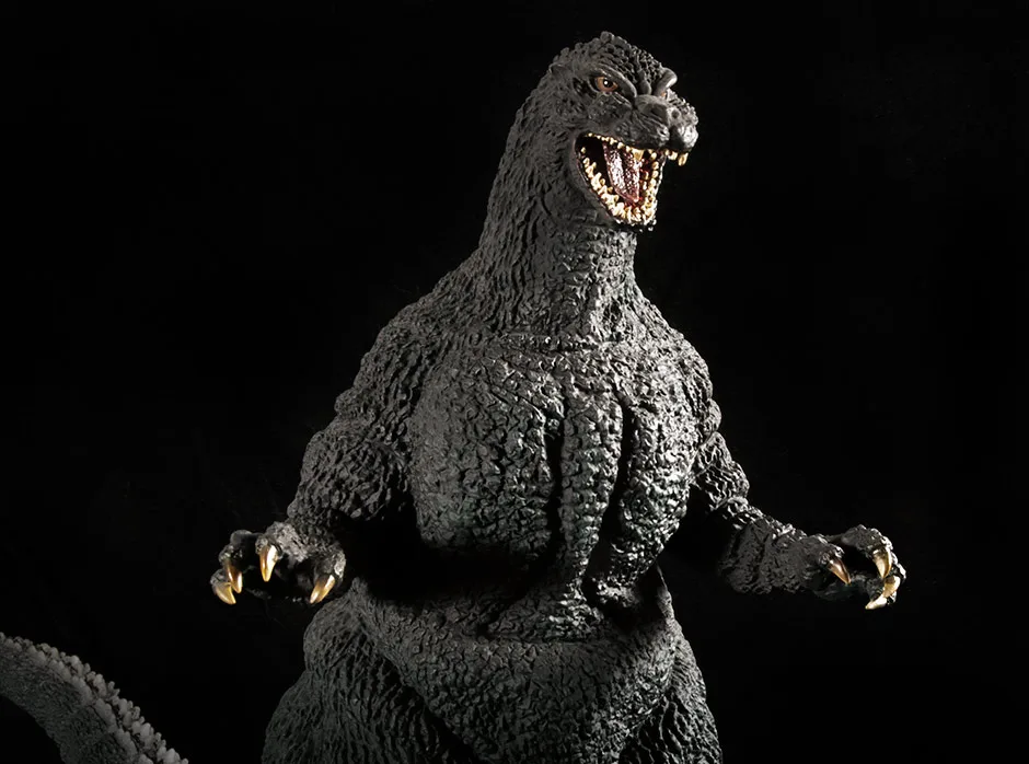
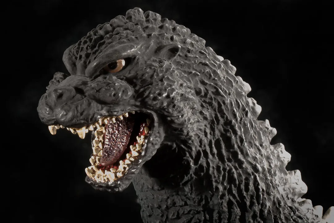
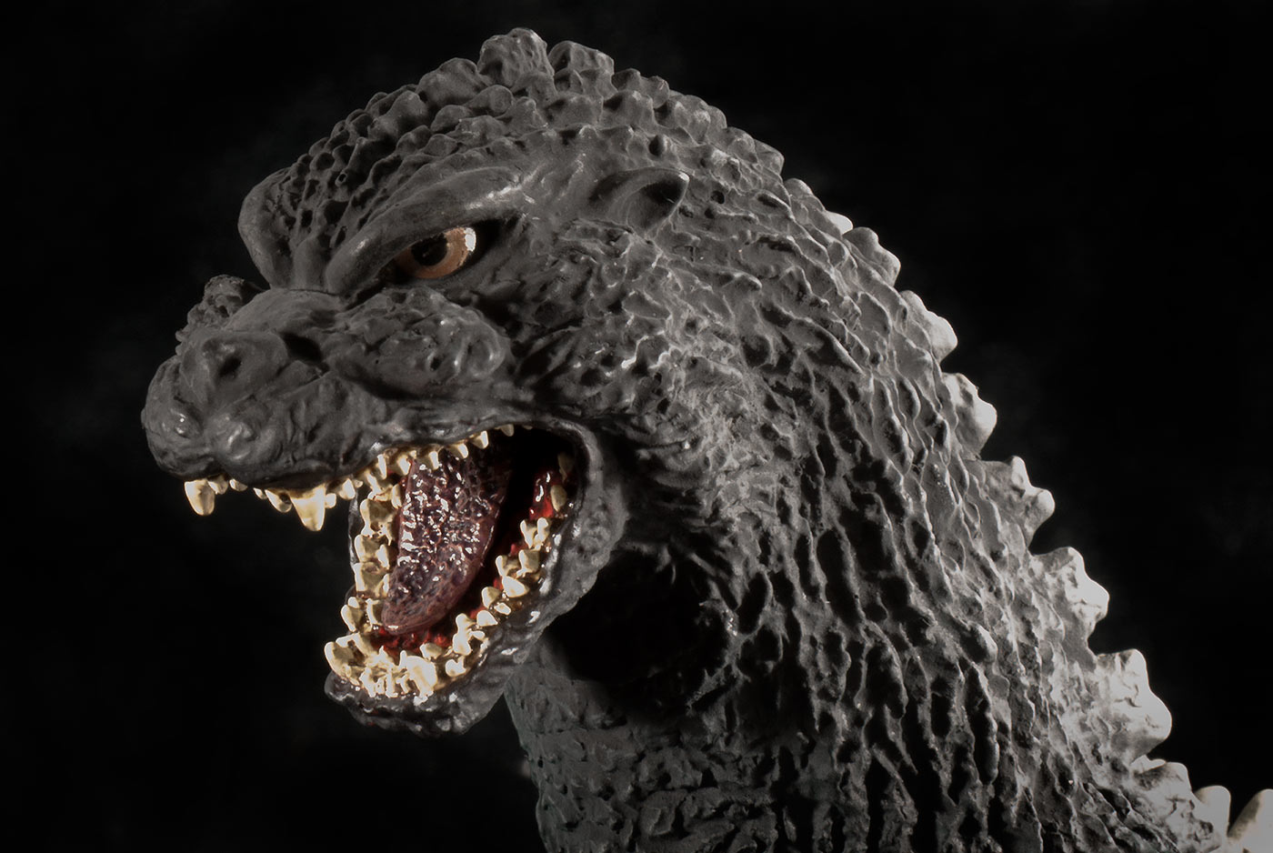
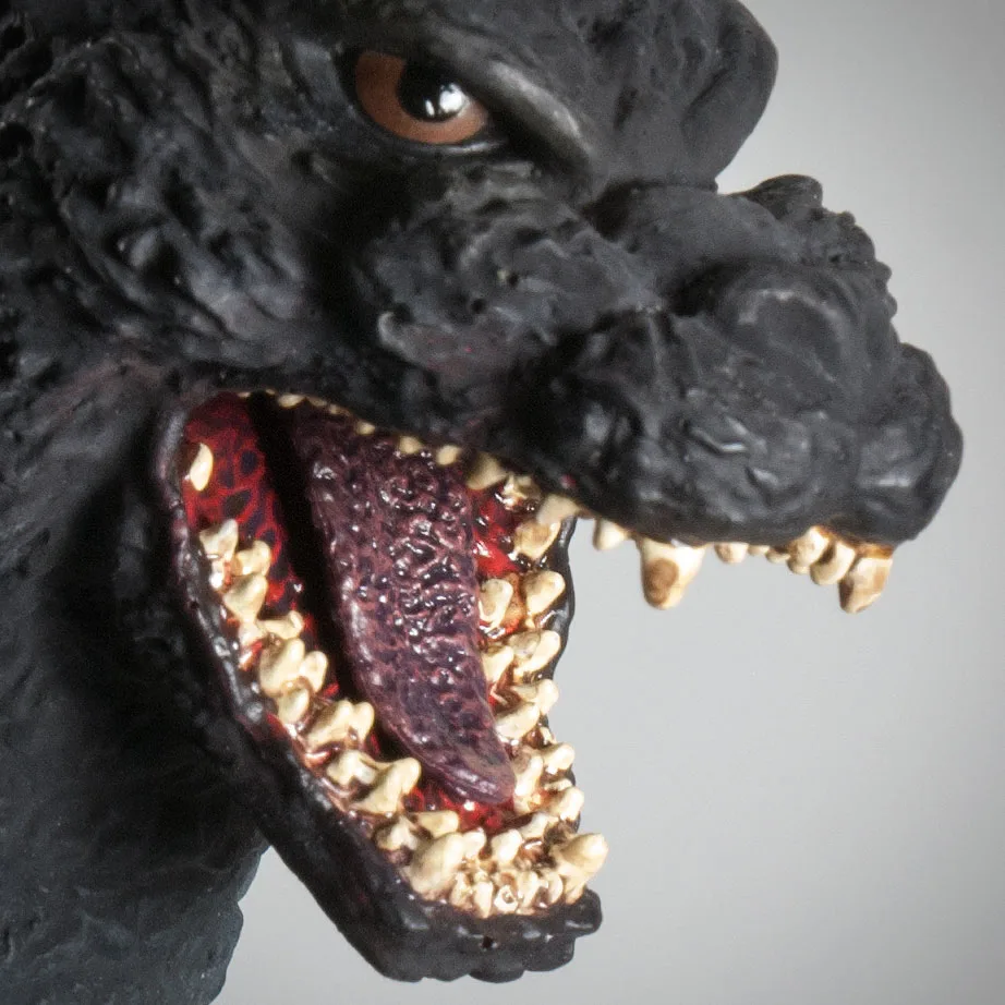
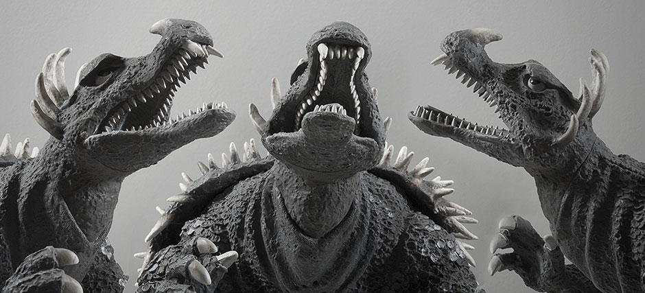
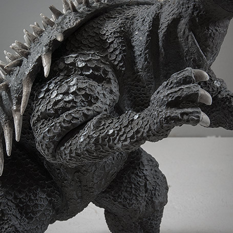
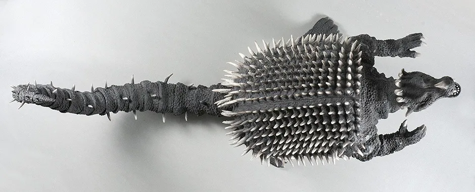
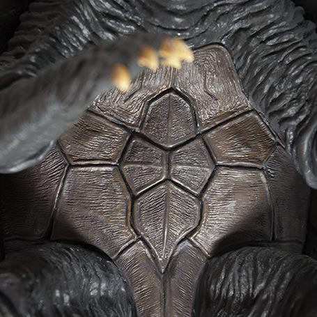
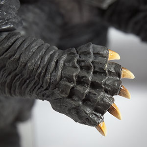
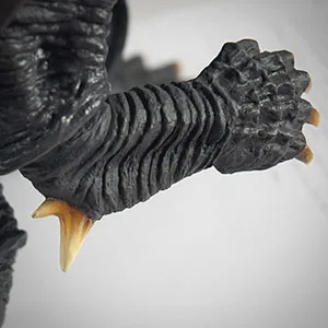
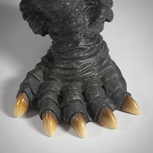
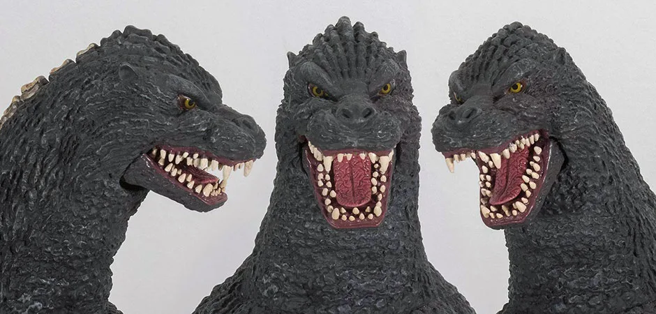
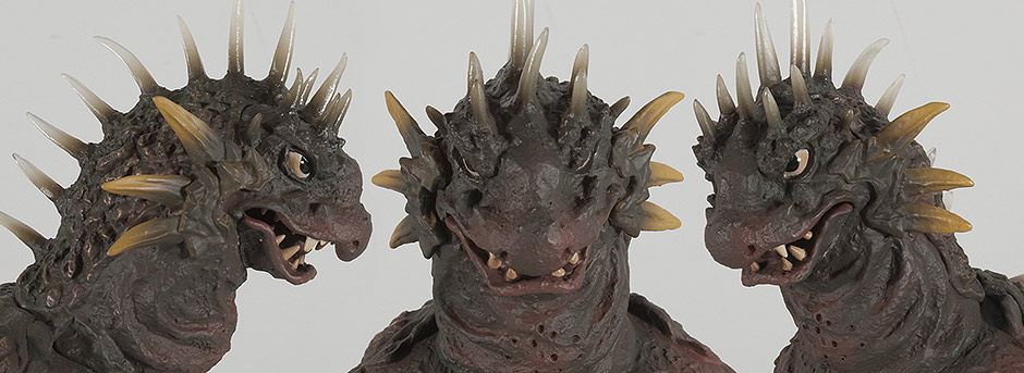
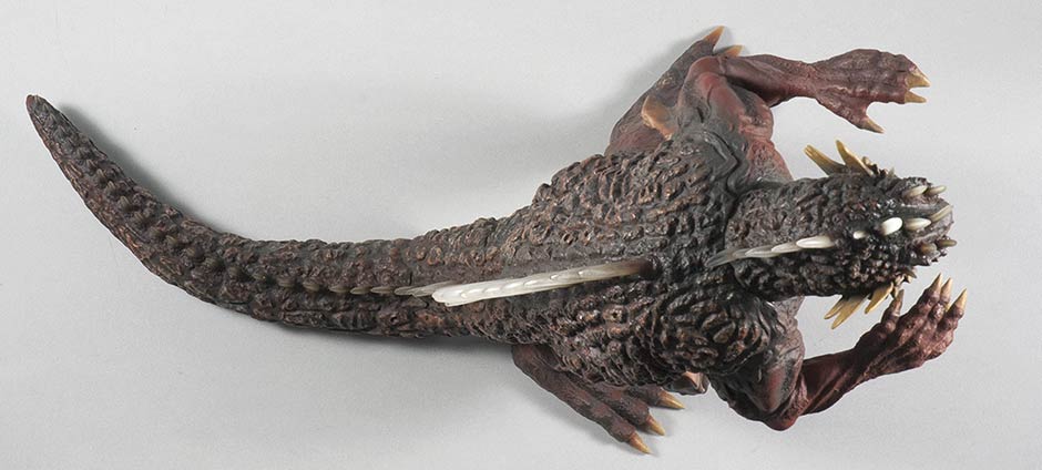
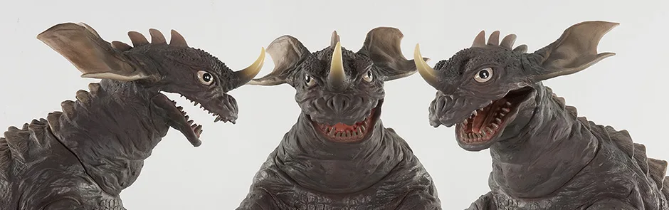
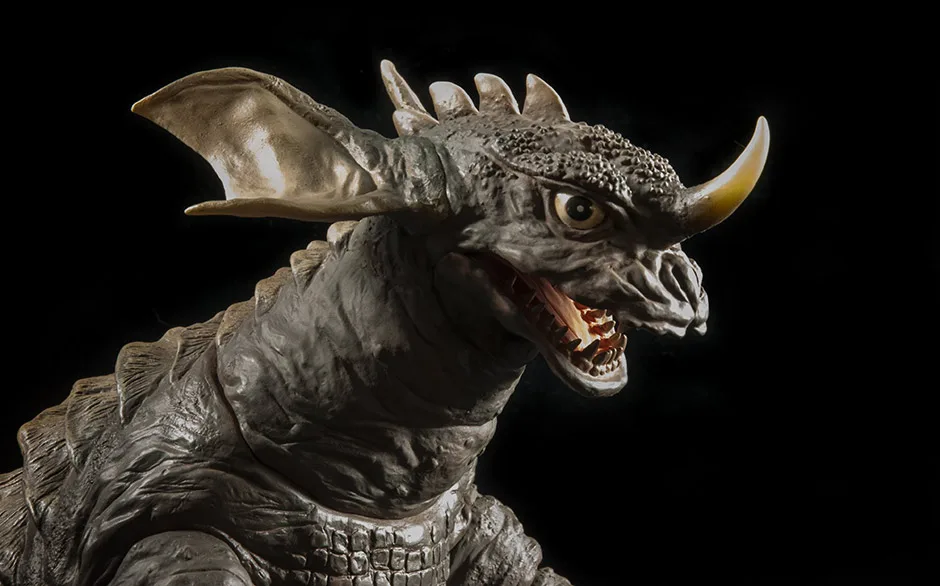
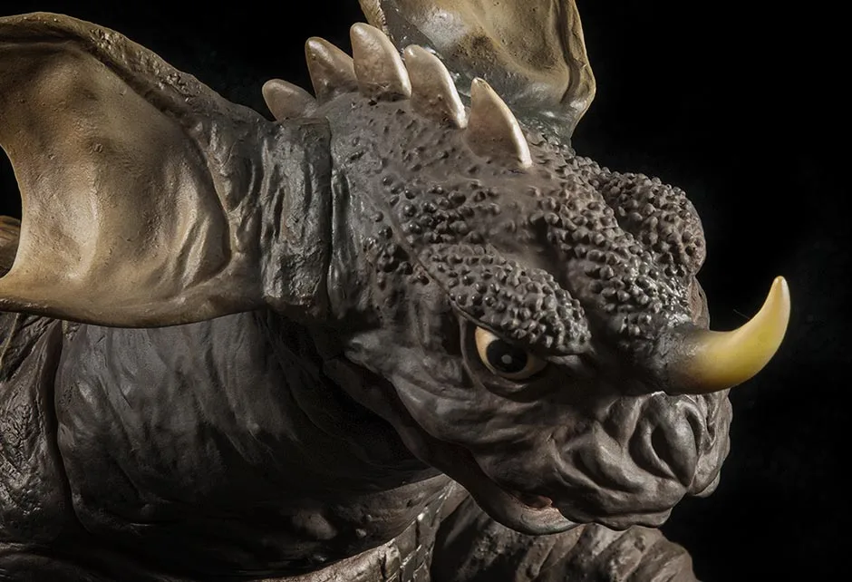
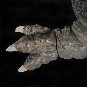
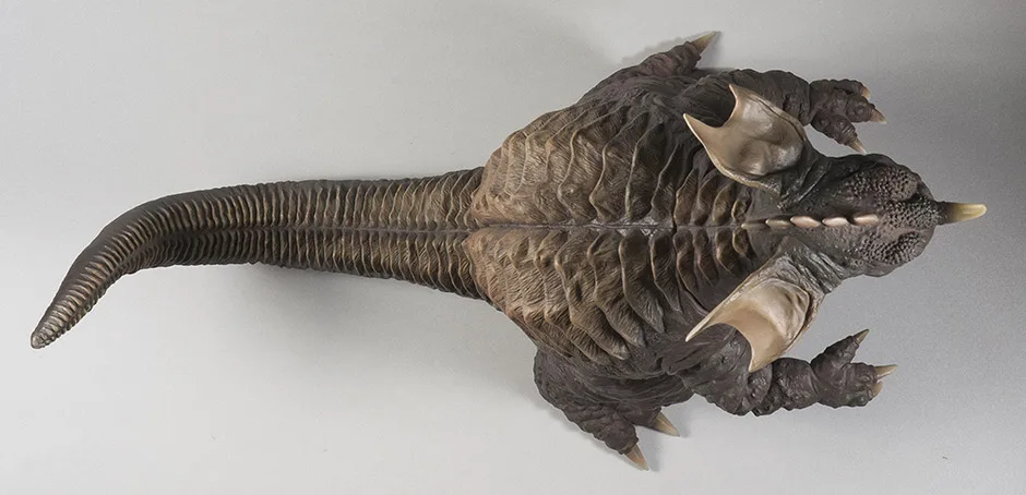
SCULPT


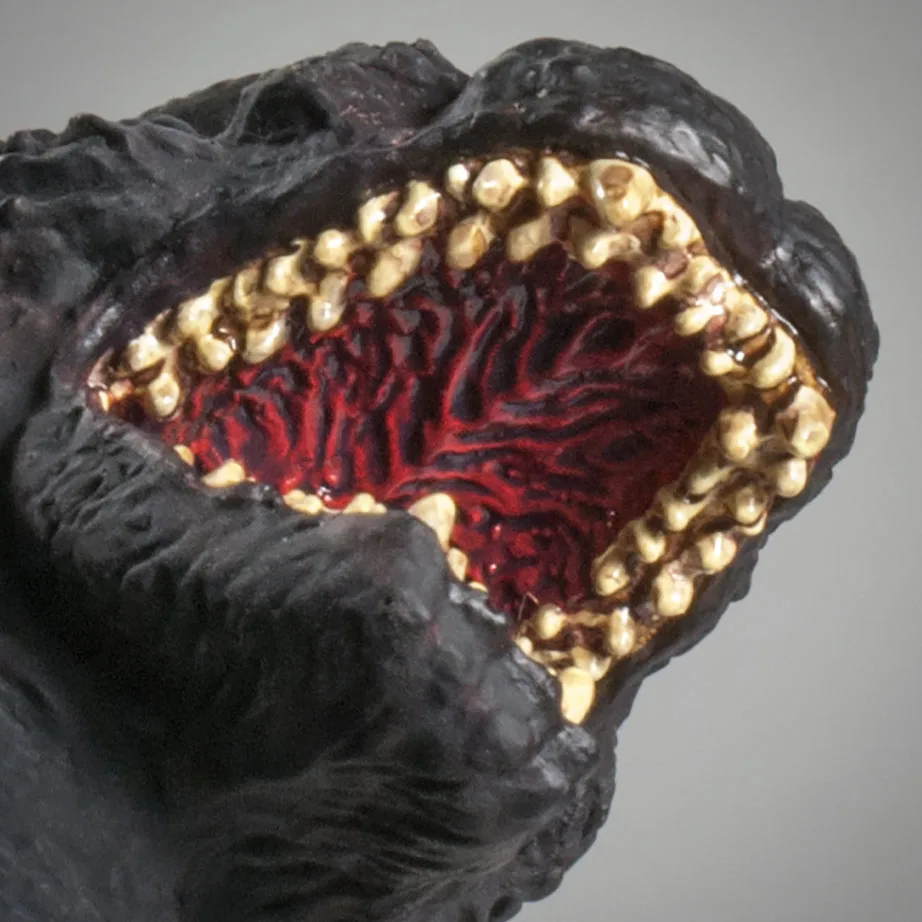
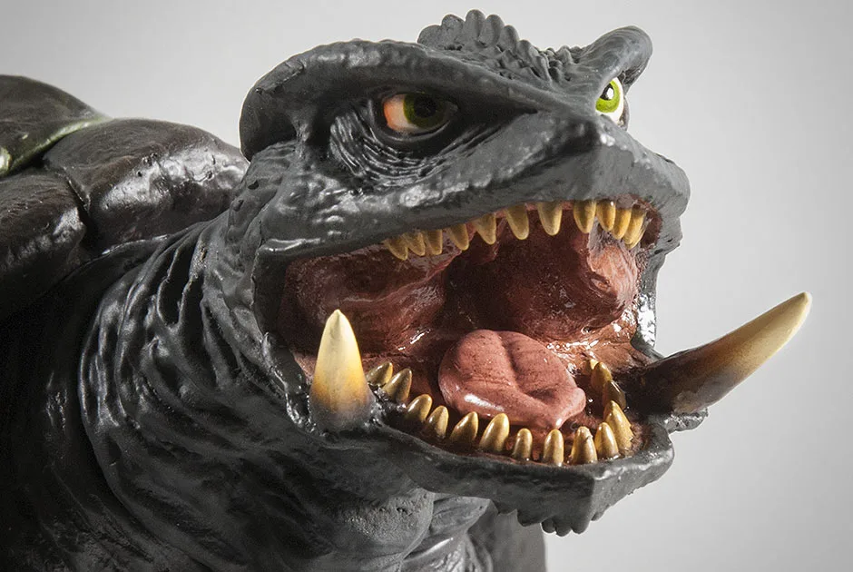
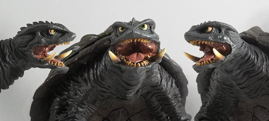
Hate to keep repeating myself, but for the new collectors: check out those individually sculpted teeth! Also, you’d expect no one to bother with the tongue since the mouth is almost closed… but it’s in there! You can’t see it unless you tilt it back and squint yer eyes in there.
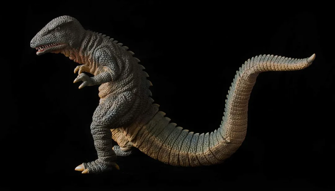
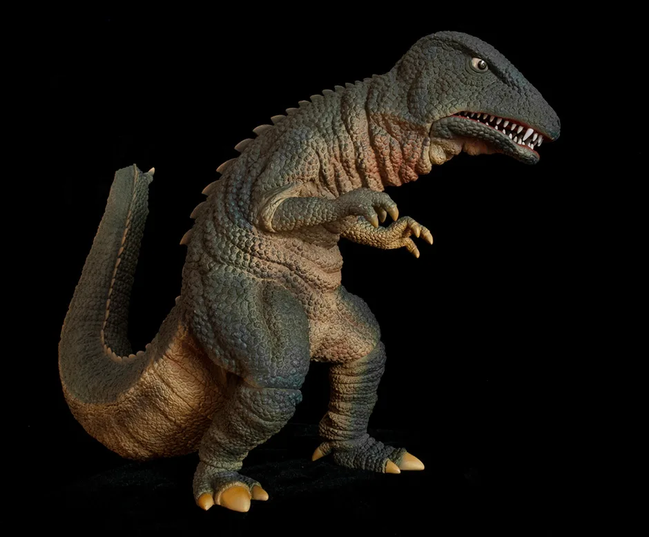
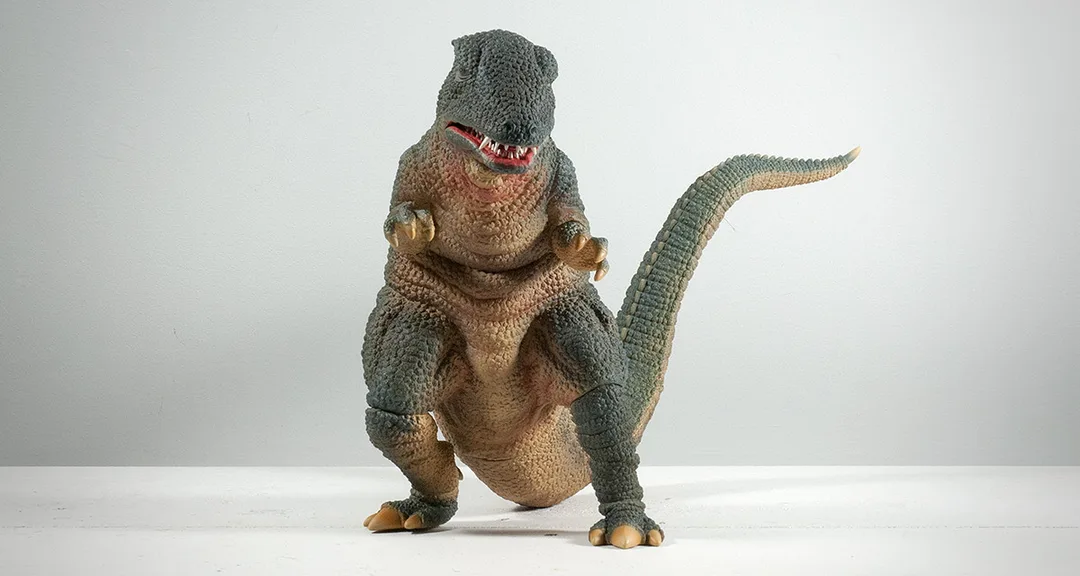
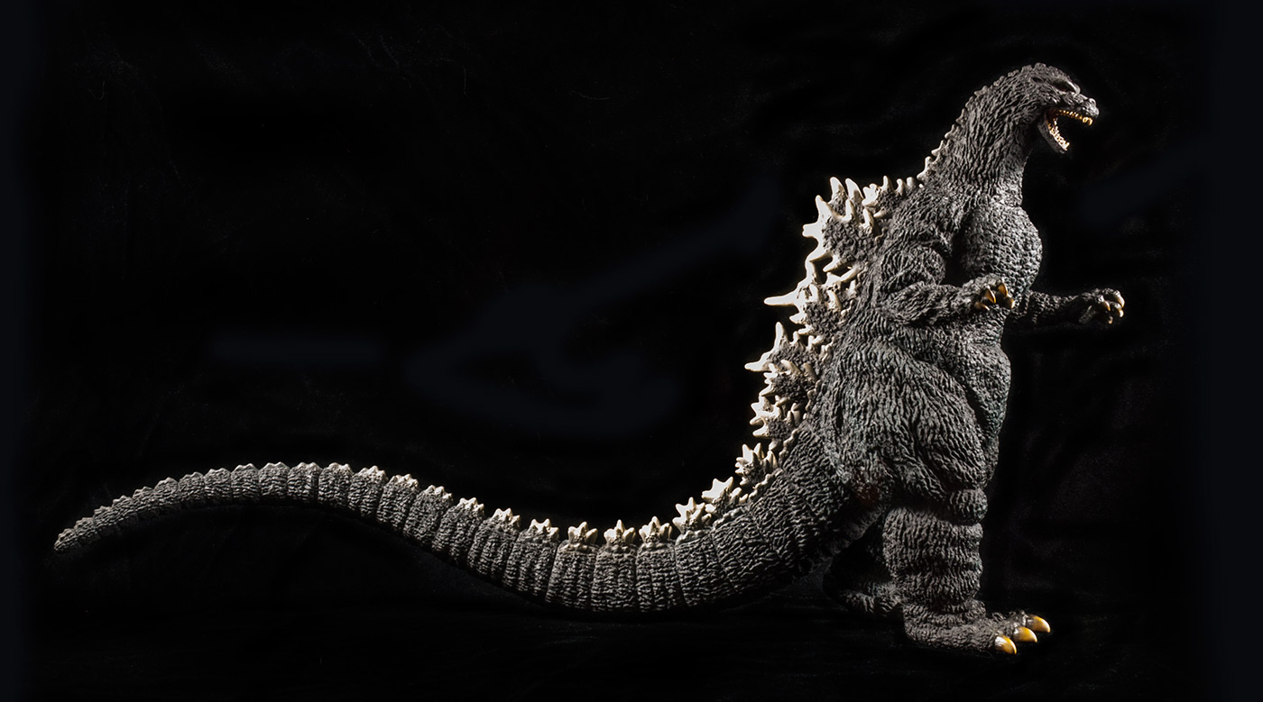
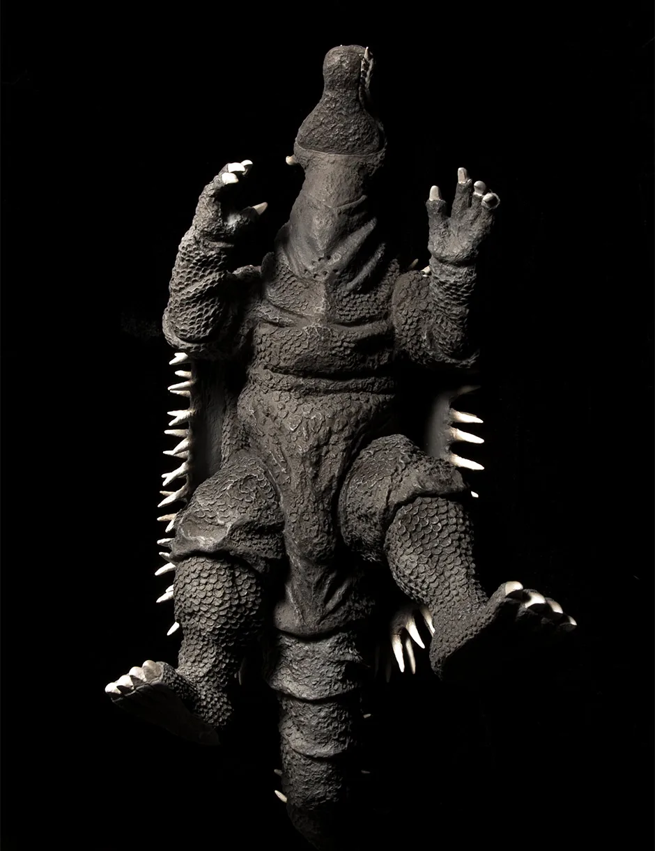
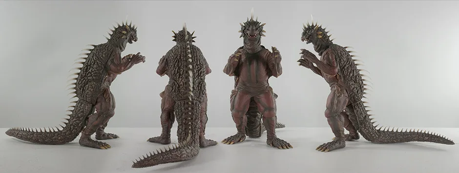
The pose is unmistakably Goro all the way and it looks good from so many angles.
JOINTS & SEAMS
The ankles have joints which just don’t want to bothered. Leave them be unless they came out of place. They are reasonably unnoticeable.
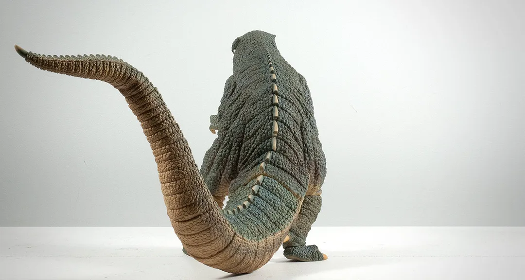
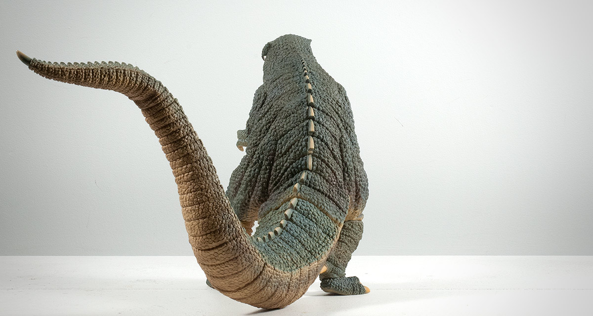
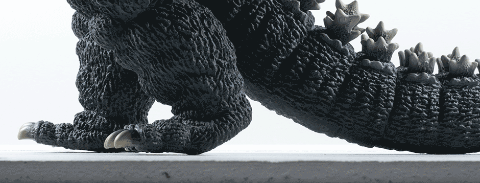
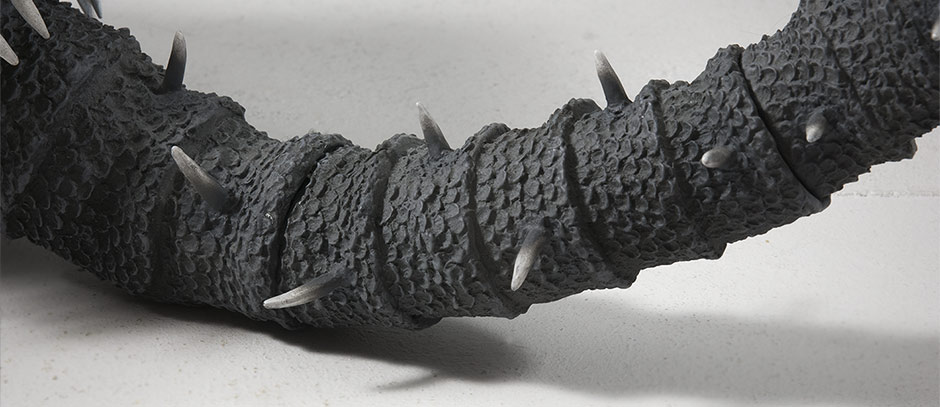
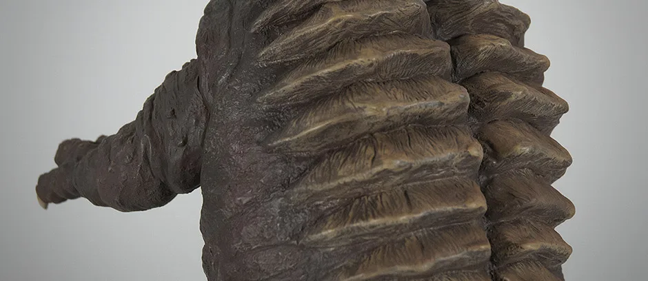
The two joints on the tail are, for the most part, well hidden between the segments in the sculpt. However, they are a bit loose and may easily move out of alignment with handling. The tail matches the body fairly well on the top, yet has a slight gap on the underside.
As for glued seams: there are two. The bottom jaw is a separate piece and has a seam which is only somewhat noticeable, but only if you look. Mine has a bit of a gap on one side and I expect the degree of this varies on each figure. The main body is in two piece as so there is a seam running along the front right above the waist and up the back. Again, it’s mostly unseen unless you look for it. Photos have already turned up online where some figures have large gaps and outright holes along this connection.
POSE

PAINT JOB
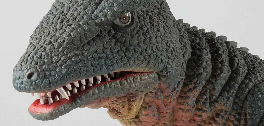

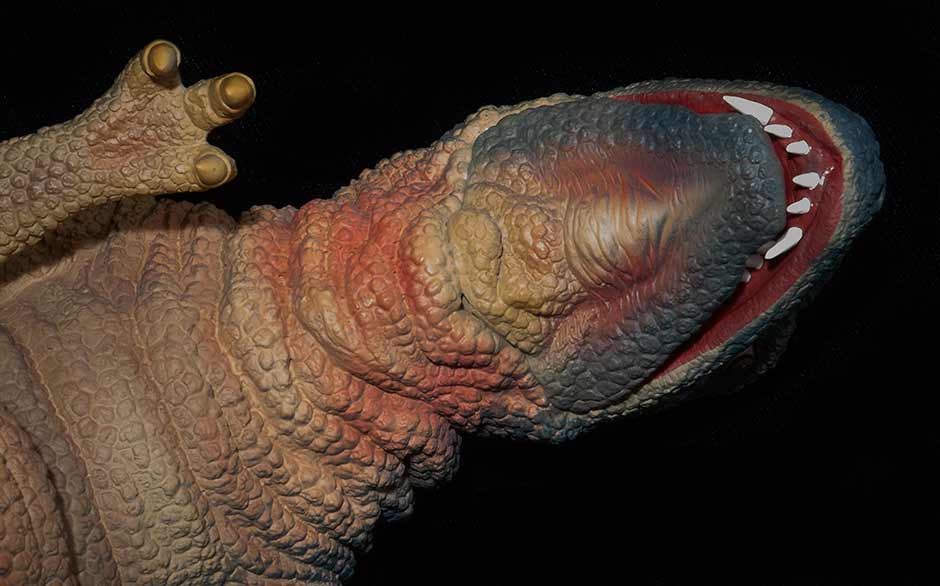
Despite the liberties this paint job takes from the suit, it’s look fan-f’n-tastic! The throat is particularly impressive.
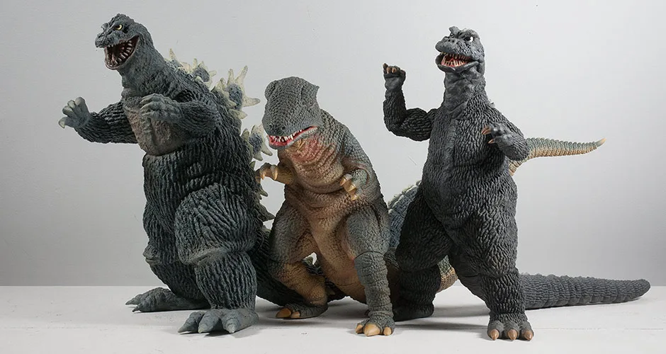
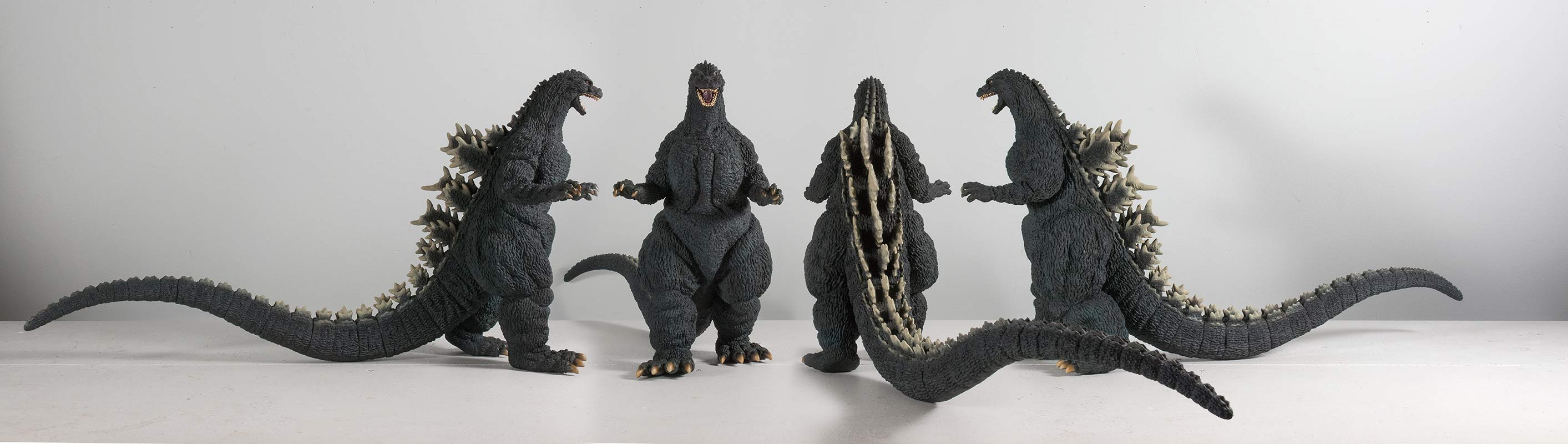
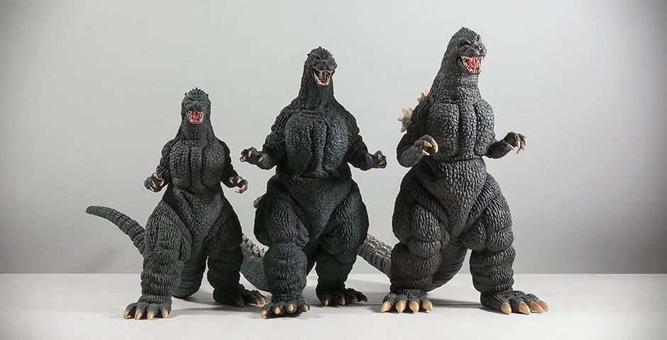
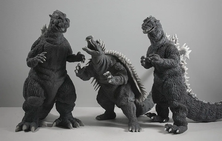
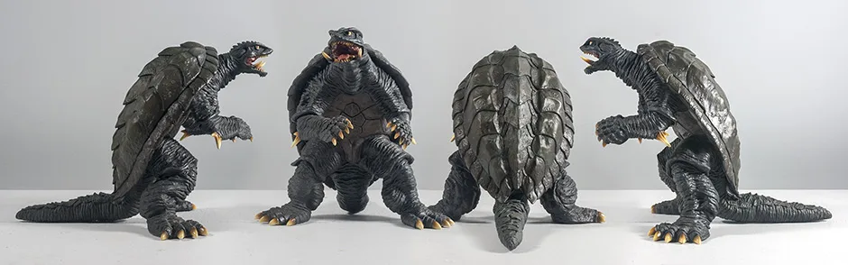
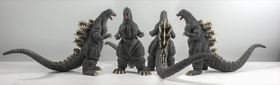
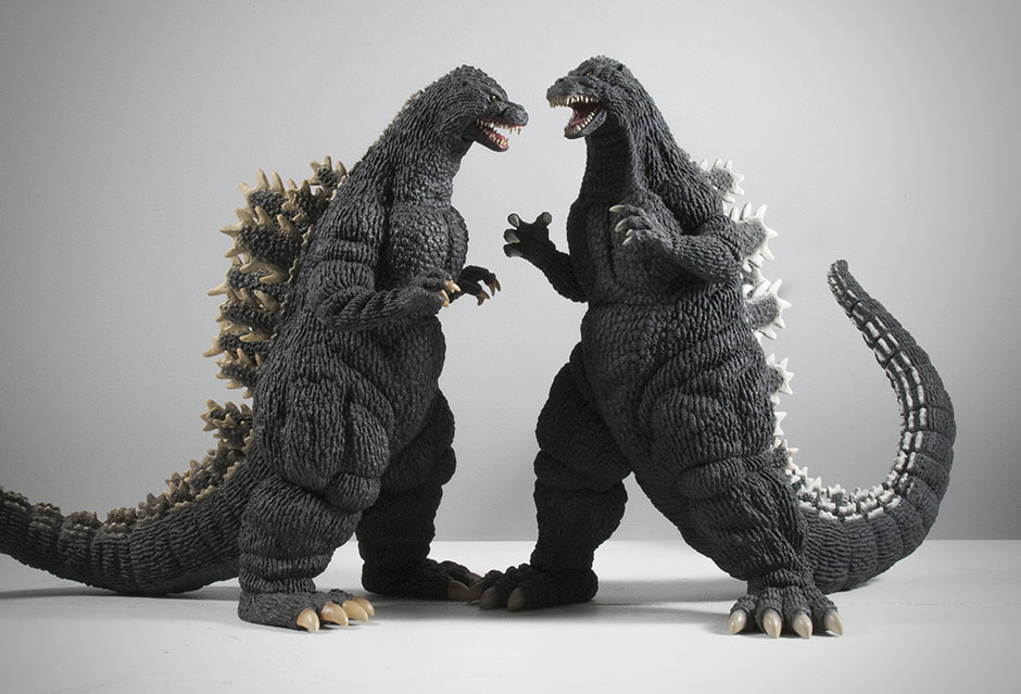
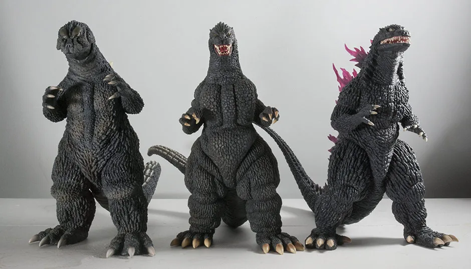
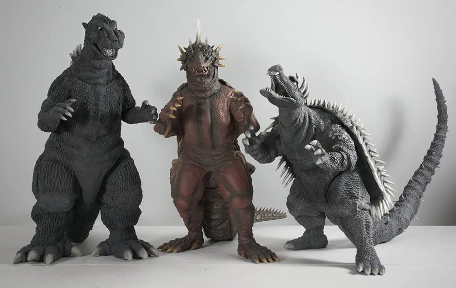
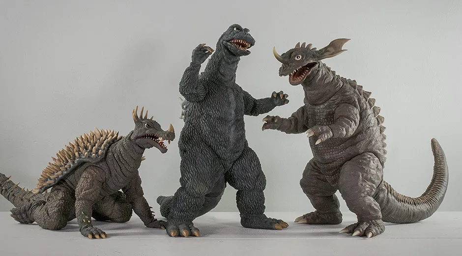
SIZE COMPARISONS


FOOTPRINT
The tail makes a bend toward the figure’s left side which is perfect for scooping up behind it’s nearest neighbor on the shelf, assuming that the tails don’t collide. This figure seems to fit in well on a crowded shelf. It’s tail could limit the angles you display it at in tighter spaces.
SUMMARY
MORE INFORMATION
EXTRAS

- Published on

FIGURE SPECS
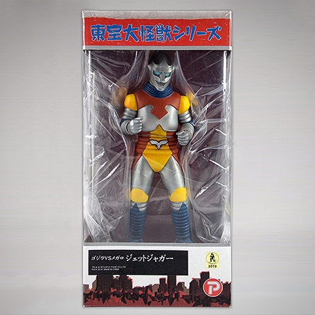
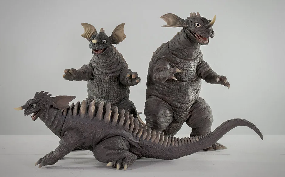
ゴジラ対メガロ
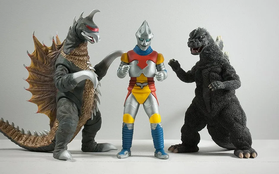
This figure is a part of the Large Monster Series (or 25cm Series as it’s often called) and is totally in scale with other figures from that line.
(Special thanks goes out to Lester Wayne Daniels for allowing me to use a few of his photos for this review.)
THE BOX
PHOTOS: LESTER WAYNE DANIELS
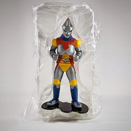
PHOTOS: LESTER WAYNE DANIELS

SCULPT

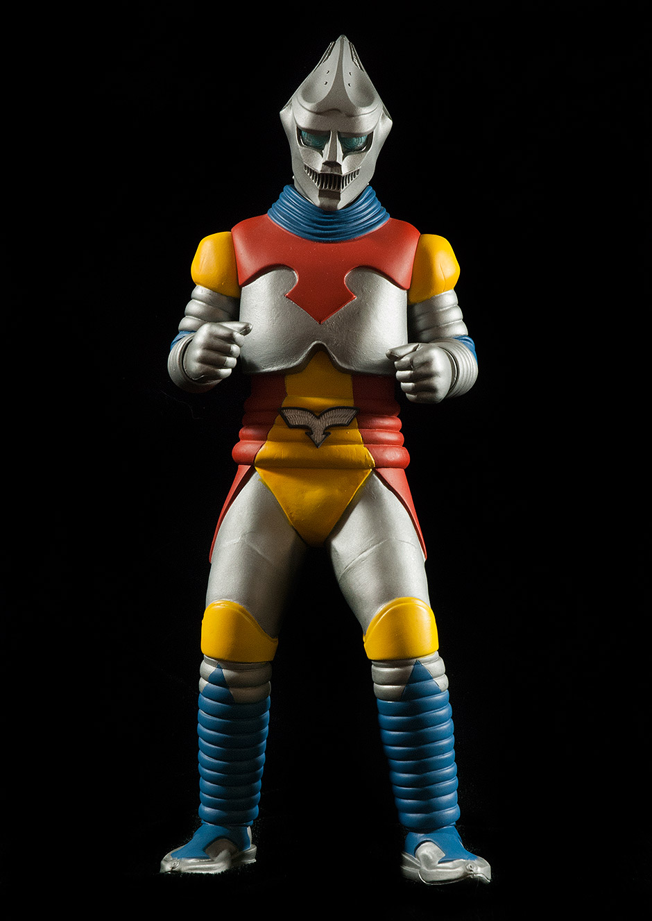
Now, THIS is the reason I collect X-Plus!
Even with movie accuracy aside for a moment, the details on this sculpt are pretty impressive.

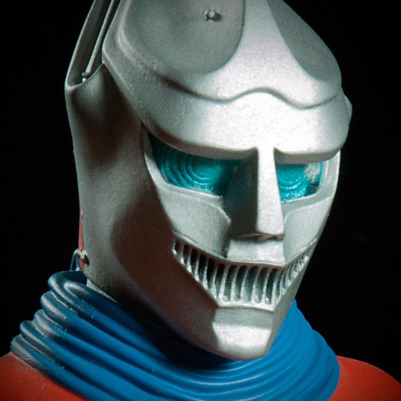

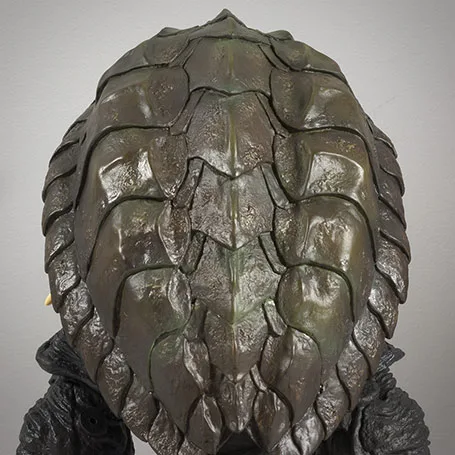
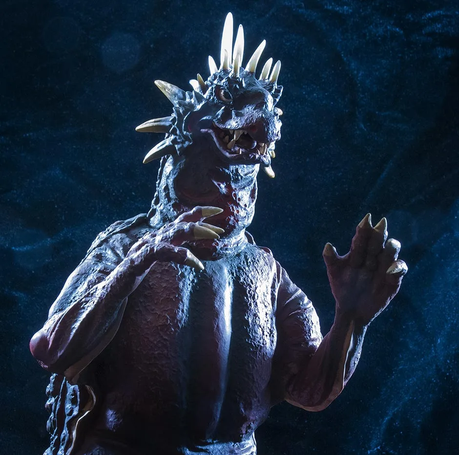
The eyes are molded in clear, smooth plastic tinted blue. A series of concentric circles molded on the inside create the ridges for Jet’s eyes. Sidenote: I only now realized how Jet Jaguar’s face was modeled after old Japanese Noh masks and demon paintings. See for yourself: can you find Jet?
Jet Jaguar’s antennae are skillfully etched into the head with fine detail. No, sorry, they don’t fold out.
PHOTOS: LESTER WAYNE DANIELS

PHOTOS: LESTER WAYNE DANIELS

PHOTOS: LESTER WAYNE DANIELS
This thing isn’t just a nice Jet Jaguar figure, it’s crazy-accurate! I have to say it again… This figure looks like it just walked right out of the movie.
JOINTS & SEAMS
As for seams… they’re aren’t any! At least none that you can casually see. I hereby declare this figure seamless!
POSE
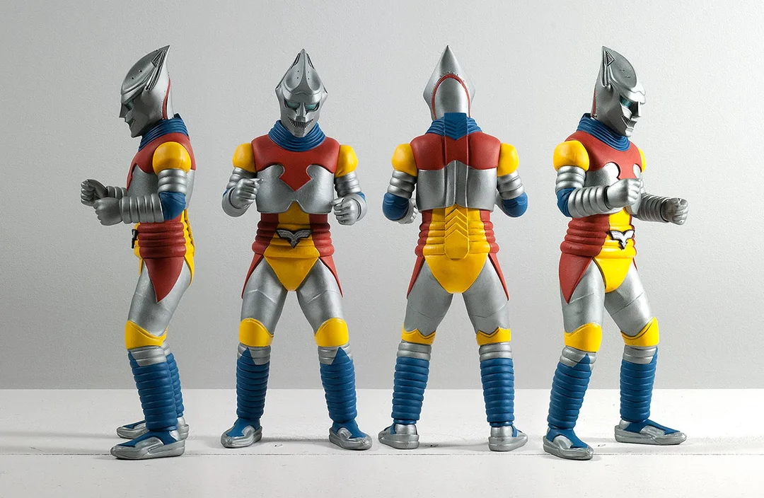

PAINT JOB
These colors were also expertly applied and conform very well against the subtle elevations in the sculpt. The painters did a great job of “staying in the lines”. Well done, X-Plus!
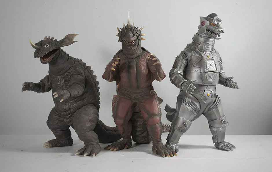
SIZE COMPARISONS
FOOTPRINT

RIC BOY EXCLUSIVE

SUMMARY
MORE INFORMATION
- Diego Doom’s Unboxing and Review of the Jet Jaguar 2016 reissue.
- GodzillaFanFreaks Reviews the Large Monster Series Jet Jaguar by X-Plus.
- Rich Eso Reviews the Large Monster Series Jet Jaguar vinyl figure by X-Plus.
- Published on
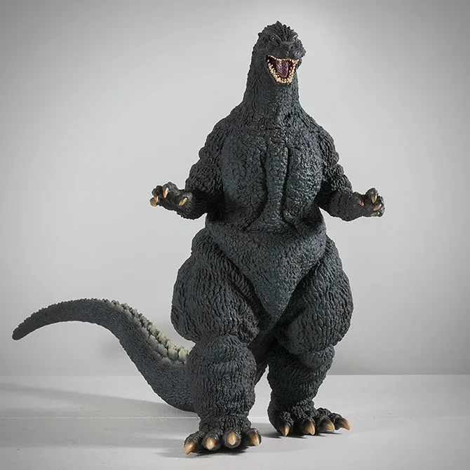

FIGURE SPECS
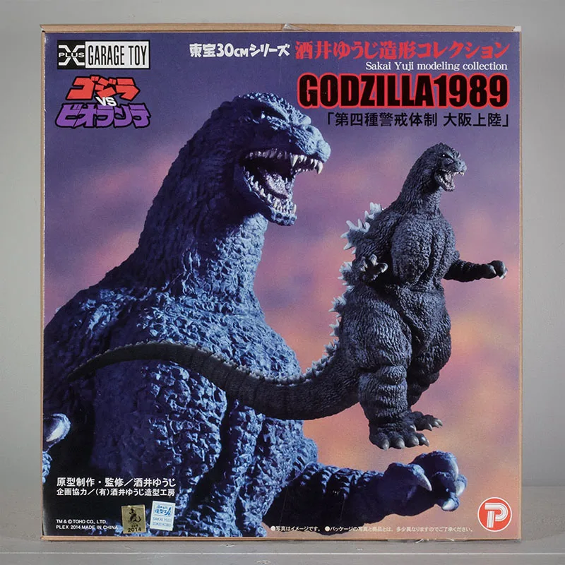
ゴジラ(1989)「第四種警戒体制 大阪上陸」
ゴジラVSビオランテ


It’s molded from a sculpt from renowned Godzilla sculptor Yuji Sakai’s ‘Landing Series’. It depicts Godzilla shortly after he climbed out of Osaka Bay and began his rampage through the city.
“Fourth Kind Warning Systems”, or “Alert Level 4” as it’s known in English subtitles, is the warning given when it’s certain Godzilla will make landfall in a specific place, in this case Osaka (home of X-Plus headquarters, by the way. Coincidence?).
Take a look at the photo below.


I used to say “it looks like it walked right out of the TV screen” a lot in my earlier reviews. It’s time to dust that line off for this figure because, as you can see, it literally looks it was taken right out of this scene!
Okay, let’s dig in.
THE BOX

I’ve heard it described as everything between being the work of an intern to looking like a 70s record album cover. Okay, so it stinks. But, I’m resolved to look at it this way: it looks like a garage kit box. And that’s ‘sort of’ what this is. Right?
The box comes with the usual X-Plus Garage Toy logo in one corner and the Plex logo in another. A new detail here is the inclusion of a Godzilla vs. Biollante logo.
And for those who need to know, the text reads (in kanji and katakana) Toho 30cm Series Sakai Yuji Modelling Collection. It then repeats “Yuji Sakai Modelling Collection” in English, along with “Godzilla 1989”. Then, in kanji: “fourth kind warning system, Osaka Landing”.
Also new: next to the usual Toho Godzilla licensing sticker is another licensing sticker from Sakai’s company, Zokei Kobo. It says “SAKAI YUJI, ZOKEI KOBO”.
Now, on to what’s inside!
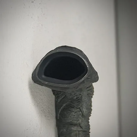
ATTACHING THE TAIL
The tail assembly process should be well known by now: use a hair dryer to heat the “female” end of the joint. This is typically the “butt” of the figure. Warming it will make it soft and agreeable to being invaded by the “male” end (the end with the suction cup-looking flange). Keep the male end cool so that it will be firm. If you are doing this in the summer, you may want to put the tail in the refrigerator (NOT THE FREEZER: you may wind up cracking the flange right off the tail!) for a SHORT while to get it firm and sturdy. Then, just insert, push and twist.
The joints on the tail pieces are not completely round, but this does not get in the way of inserting them. They went in really easy for me.
Since this figure has two pieces, attach the larger tail piece to the body first. Then add on the second, smaller piece.
(Attaching the smaller tail piece to the larger tail piece first would require you to heat the larger piece and, in the process, could soften its male end making it harder to attach to the body.)
SCULPT

I had some doubts about this figure when it was first revealed. Especially with how it looks from the front. But, I ordered one anyway. (Of course, I did!) And now that it’s in front of me I am just blown away by it. Sculpt-wise… THERE’S NOTHING WRONG WITH IT! There are little things that bug me about the other two X-Plus Heisei Godzilla entries, but this… nothing!
As usual, when reviewing a new figure, I sat down to watch the movie with the figure in front of me, my eyes darting back and forth between it and the screen, comparing every detail I could get a good view of and pause on. Every single time, the figure failed to disappoint.

[ UPDATE: It was just mentioned in the comments that the ‘pointy head’ was only on the ‘sea suit’, so Sakai’s sculpt is right; I’m wrong! ]
Okay, so there is just one thing. From the front, the head seems a little skewed to one side. His eyes, nose and mouth don’t line up perfectly. His left cheek seems lower than his right. Something isn’t quite right here. Thankfully, it’s not overly obvious and from angles other than the front, a non-issue.
The inside of the mouth has a deep ridge pattern under the tongue and even on the roof of the mouth! The tongue has a similarly detailed texture, even though it wasn’t nearly that coarse on the suit. This is just unbelievable detail squeezed into a space smaller than a quarter!
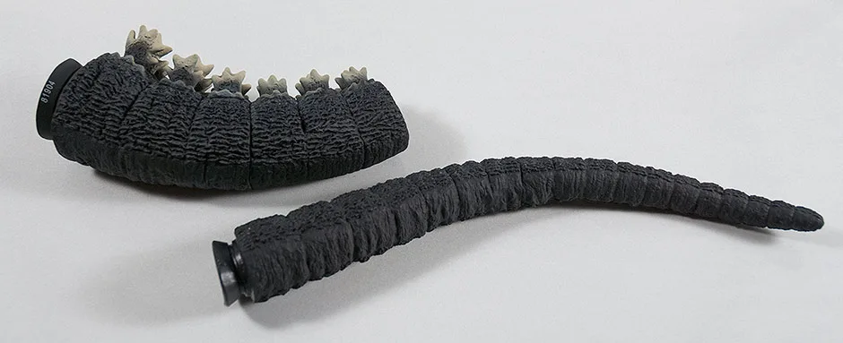
The teeth are not individually sculpted like those on the original X-Plus 30cm Series Godzilla 1989 vinyl, but they are much, much closer to being accurate. The downside is that since they are so small and have a weak paint job and they can look like a fat row of gunky molars rather than the double row of sharp wedges that they were on the suit.
More on the mouth, including photos, are down in the Paint Job section.

The X-Plus Yuji Sakai Godzilla 1989 not only looks accurate, but is more accurate than you can see!
But, wait, there’s more! The upcoming Ric Boy version of this figure will have light-up fins. In cases like this, X-Plus typically makes the Standard versions the same exact way as the Ric’s, sans the lights and wires. And, also typically, light-up fins don’t look anywhere near as good as those made without the soft, translucent vinyl. But, these fins LOOK GOOD! So, either X-Plus decided to make totally opaque fins for the standard, or they’ve stepped up their game and found a way to make the fins look good and light up at the same time. We’ll have to wait for the Rics to come out at the end of October to find out.
JOINTS & SEAMS
There are sealed joints above both biceps, below both knees and at both ankles. The back strip with the dorsal fins are also a separate piece. And at each and every one of these spots, the joints are virtually invisible.
The tail is in four pieces, all of which are not glued and sealed and two of which you need to attach yourself. And all four joints are PERFECTLY matched and practically invisible thanks to the ribbed segments in the sculpt.
I can’t help thinking that there must be a seam around the jaw because I can’t see how the intricate paint job inside the mouth could have been applied otherwise. But I just can find a line.
A+, X-Plus!
POSE
Now, I think I very much like its ‘realistic’, un-posed look. Most X-Plus figures look like they’re posing for the camera — trying to look perfect from every angle. (Not that there’s anything wrong with that.) The Sakai ’89, though, seems realistic and “alive” to me.
It’s also interesting that this figure’s walking pose has one heel off of the ground. Which brings me to …
UH-OH

It may not seem like it’s off by much by looking at the animated GIF above, but in person, and at a low angle, it is kind of obvious.
Thankfully, it doesn’t look like that big of a deal when looking at it from higher angles. Still, I’m not sure we should have this problem for a figure that costs well over $200.
UPDATE: Apparently Yuji Sakai likes to sculpt these with the tails slightly in the air. I somewhat confirmed this by taking a peek at the Dream Evolution book and found other sculpts that do the same thing. So, maybe the figure is just following the original sculpt. Well. Um. At the end of the day the figure leans back so I don’t get it.
The X-Plus Yuji Sakai Godzilla 1989 not only looks accurate, but is more accurate than you can see!
PAINT JOB
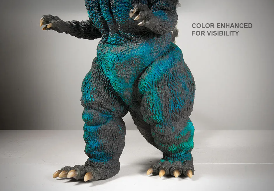
I noticed later, under bright light, the reason for the richer-looking black is that the figure is smothered with subtle blueish highlights. They’re almost invisible to be seen as actual highlights, yet they’re there enough to affect the overall look.
The photo above shows an exaggerated view of the highlights which I made obnoxiously visible with Photoshop by cranking up the saturation values of just the blues and aquas. Now you can clearly see how extensive the highlights are. If you’re looking at this review on a computer (and not a phone) you can just faintly see these highlights in the first photo at the top of this page.
While I appreciate the work that went into applying the stealthy blue highlights which I can only faintly detect with my eyes, I still feel this figure could do with a few visible splashes, like a bit of dirt here and there (as on the ’64) to break up its overly clean feel.

The inside of the mouth has a meticulously detailed reddish/purple color filling the lower regions of a very detailed texture in the sculpt. A meaner red coats the higher elevations of this veiny ridge pattern. And if that’s not cool enough for you… look up! They did the same thing to the roof of the mouth which looks even better!
The tongue gets the same two-color treatment but with a muddy purple. (Which confuses me because the tongue was clearly red in the movie.)
It’s not really visible in my photos, but my figure has some slight red overspray around the mouth which, fortunately, can’t be seen with out a camera close-up.
TEETH
Unfortunately, the teeth don’t look as great as the rest of the mouth. And don’t even begin to compare to the simpler, superior paint job on the original X-Plus 30cm Series Godzilla 1989. The care taken to paint each single tooth on the original (which you can see below) just didn’t happen on the Sakai version.
But, it probably couldn’t happen. The teeth on the Sakai ’89 are so small that they must have been very difficult to paint. They just covered them all in an off white and then added a tartar brown dabbed into the tiny crevices in between each tooth for shadowing. But the result is somewhat of a gunky mess if you look too closely. Even from normal viewing distances, the results look a little sloppy.
Despite the failed paint job, the teeth on the Sakai ’89 absolutely crush the original figure when it comes to being sculpted accurately.


The eyes on the Sakai ’89 are painted far more simply than the eyes on the original 30cm Series Godzilla 1989 which had a palate of brown, black and yellow. The Sakai has only black balls floating on a light brown. Fortunately, the glossiness of the paint used on the eyes picks up the light in the room adding a little specular twinkle for a “third color”.
But which eyes are more accurate? The original figure wins here. The Sakai ’89 eye colors are technically painted too simply. There are plenty of close-ups in the movie which show Godzilla’s eyes looking more complex than depticted on the Sakai ’89. However, there are scenes where the eyes “appear” to be just black and brown. You decide.
BONEY BITS
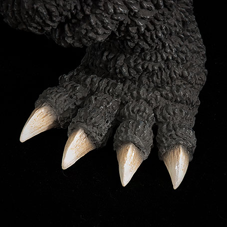
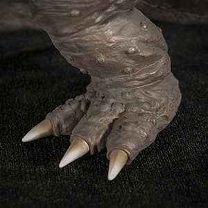
As is typical with X-Plus, the dorsal fins feather into a boney white along the edges and look great as usual. The smaller dorsal ridges that creep up to the head and all the way down to the tip of the tail fade out nicely. The claws seem to have gotten extra attention on this figure. They’re darker than usual, fading from a black to dark brown to dark tan at the tips.
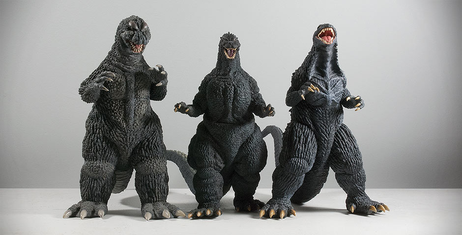
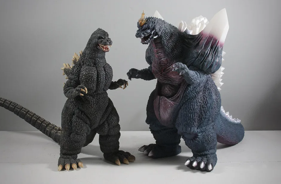
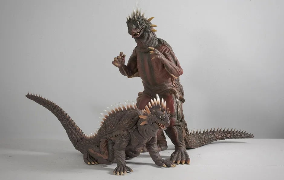
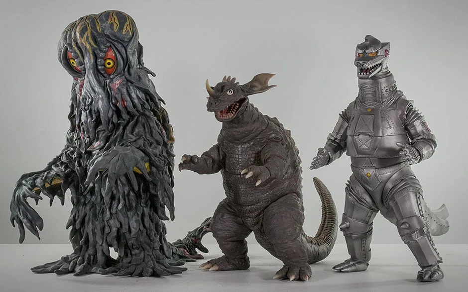
SIZE COMPARISONS
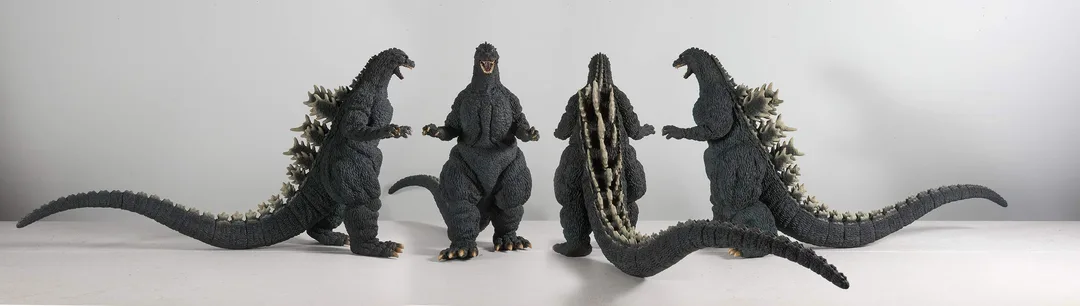
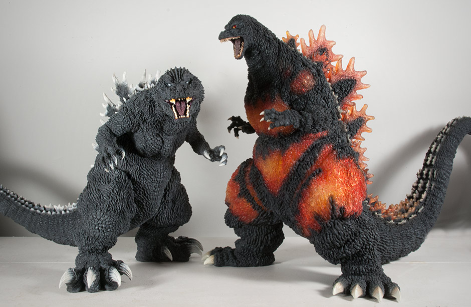
Left to right: X-Plus Large Monster Series Godzilla 1989, 30cm Yuji Sakai Godzilla 1989 and the original 30cm Series Godzilla 1989.
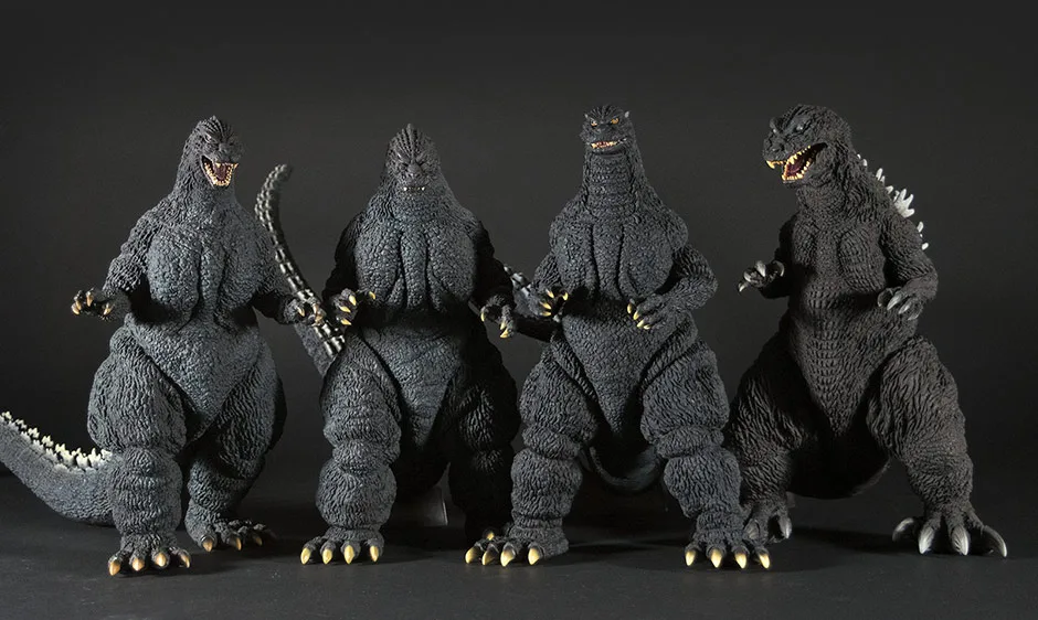
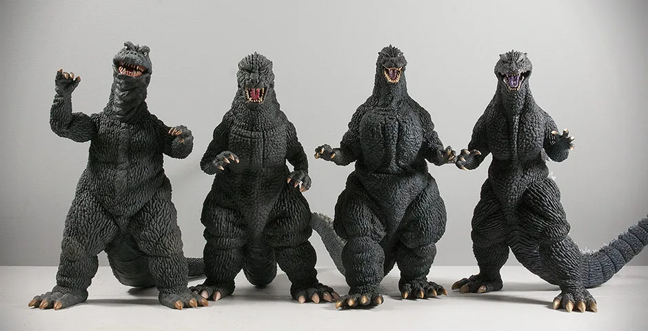
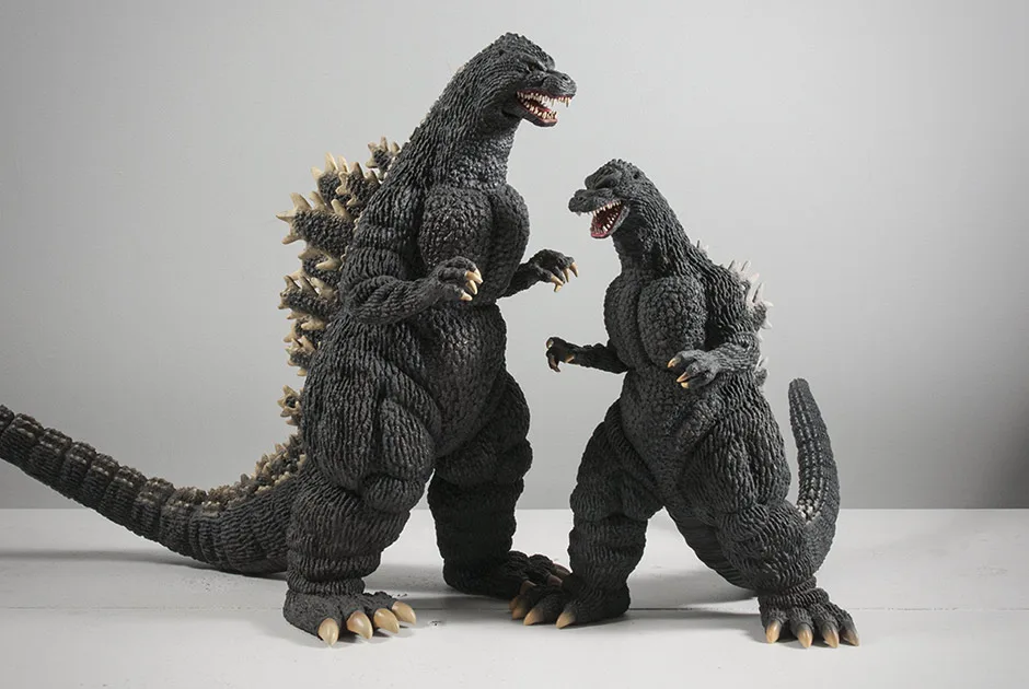
Left to right: The Sakai Godzilla 1989, 1991, 1992 and 2001. This collection lines up perfectly with itself.
Left to right: Toho 30cm Series Godzilla 1964, Yuji Sakai Godzilla 1989 and Godzilla 2003. The Sakai ’89 will produce a dip in your 30cm Shelf skyline.
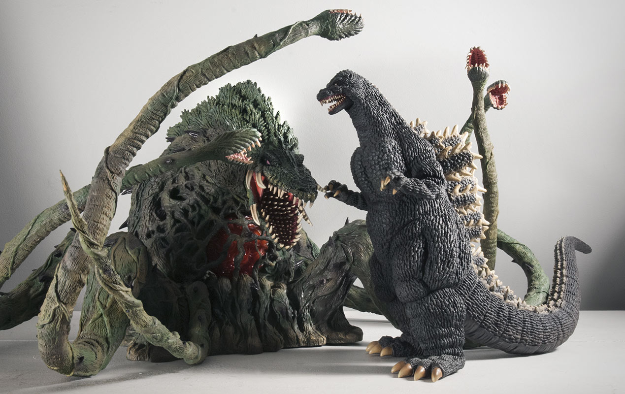
Left to right: Toho 30cm Series Godzilla 1968, 1984, Sakai 1989 and 2004.
The ’68 was the first “shortie” and was, for quite a while, the only one. But then came the ’84 and shortly after, the ’04 and now the Sakai ’89. This foursome is frustratingly short compared to the typical height of other Godzillas in the 30cm Series. But now they number high enough to make up exactly one third of the 30cm Series Godzilla catalog. If this keeps up, we won’t be able to call them short anymore and just accept the fact that the 30cm Series figures are simply no longer in perfect scale with each other.
FOOTPRINT
SUMMARY
I’m drooling over the very idea of a second entry into the Yuji Sakai Modelling Series. I pulled out my copy of the Yuji Sakai Dream Evolution book to take a peek at what could possibly come next but found very little as far as entries in the 30cm size range. I’m hoping this book either isn’t complete or that perhaps brand new sculpts might be on the way from Sakai.
Hurry, X-Plus! More of this, please!
EXTRAS


MORE INFORMATION
- Tokyo Toy Fiend Sakai ’89 Video Review.
- GodzillaFanFreaks Sakai ’89 Video Review.
- The Kaiju Planet’s X-Plus Yuji Sakai Godzilla 1989 written review.
- Diego Doom’s Video Review of the Yuji Sakai Godzilla 1989 by X-Plus.
- Gojira851 Reviews the 30cm Series Yuji Sakai Godzilla 1989 vinyl figure by X-Plus.
- RELATED: Kaiju Addicts original X-Plus Toho 30cm Series Godzilla 1989 Review.
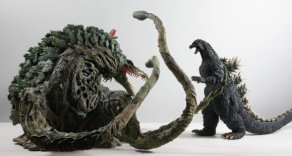
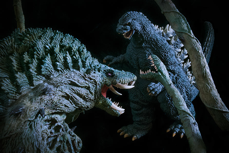
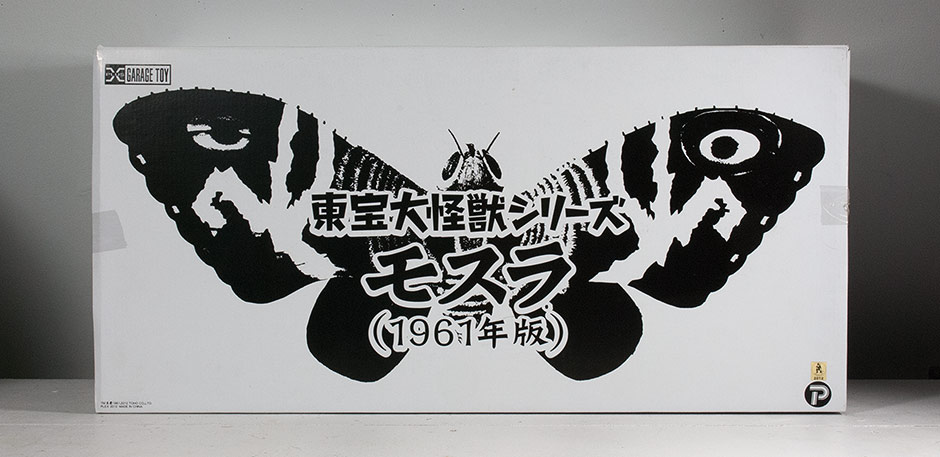
- Published on
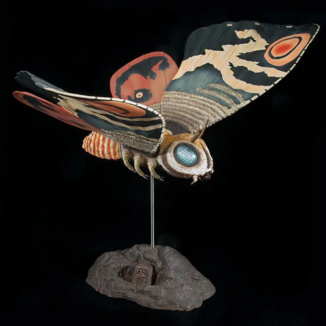
FIGURE SPECS
モスラ
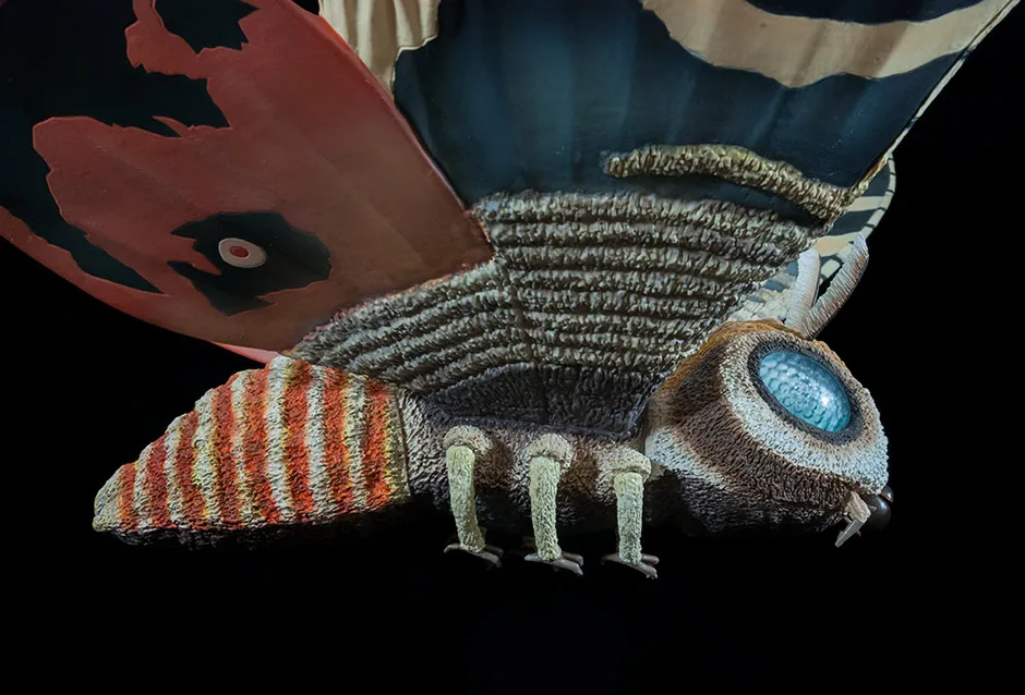
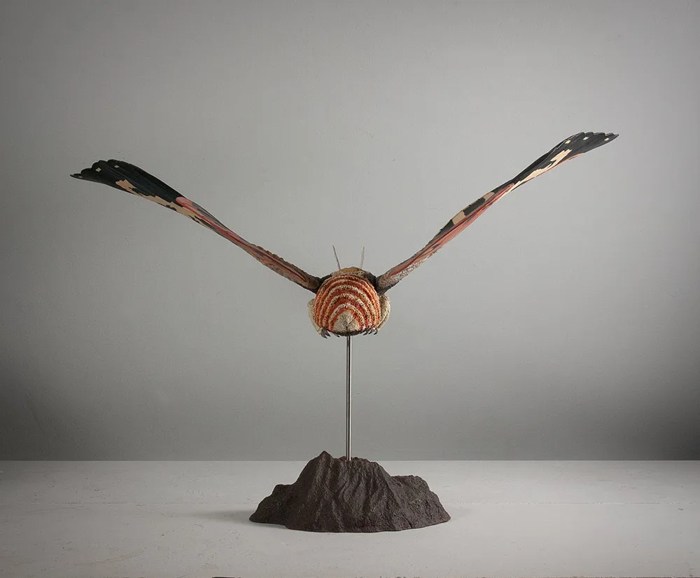
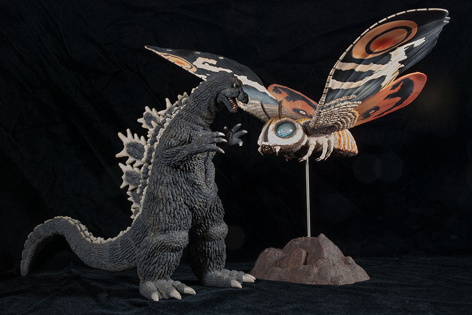
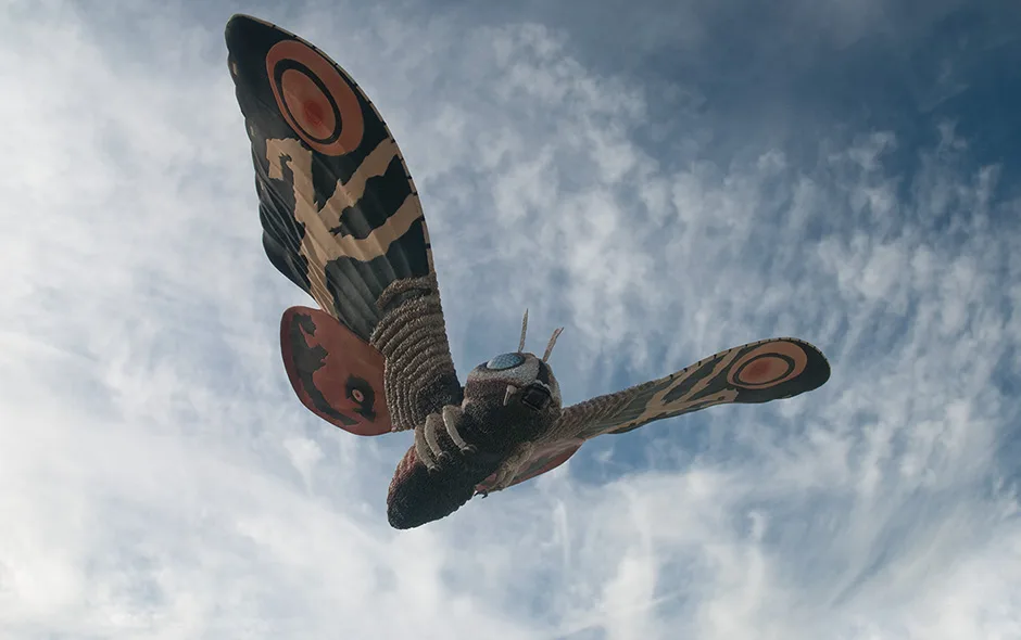
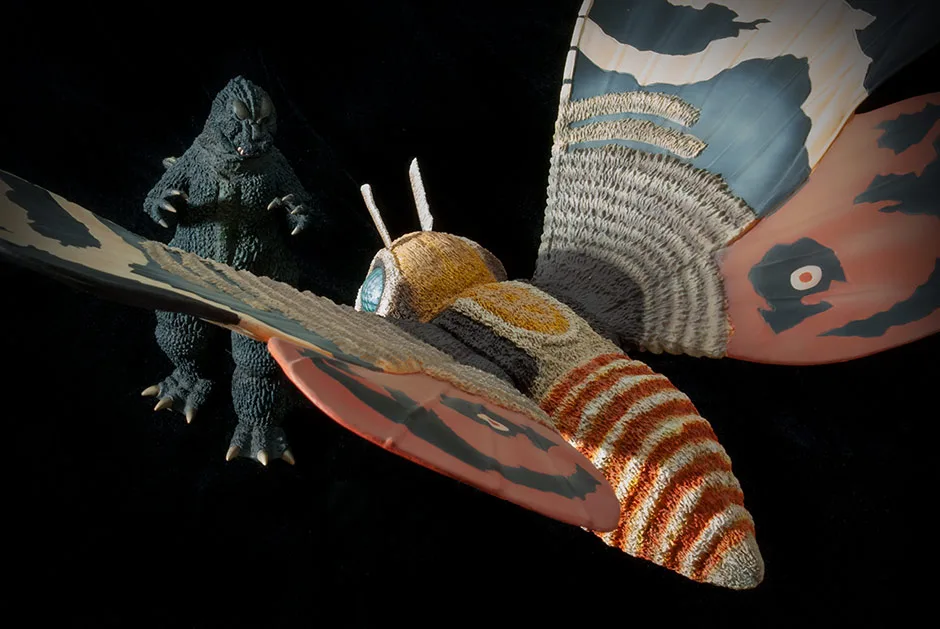
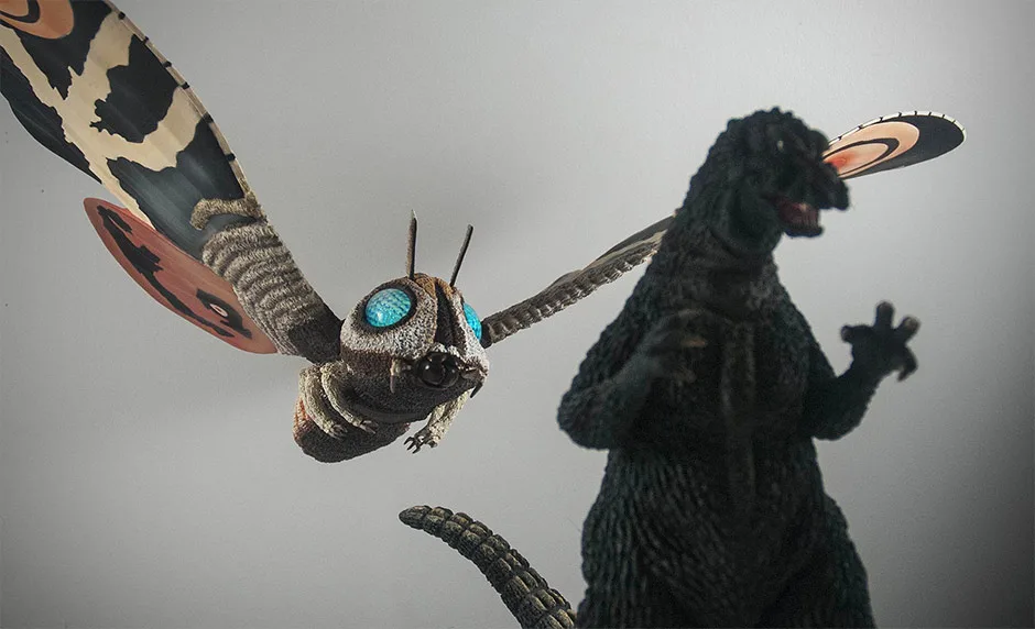
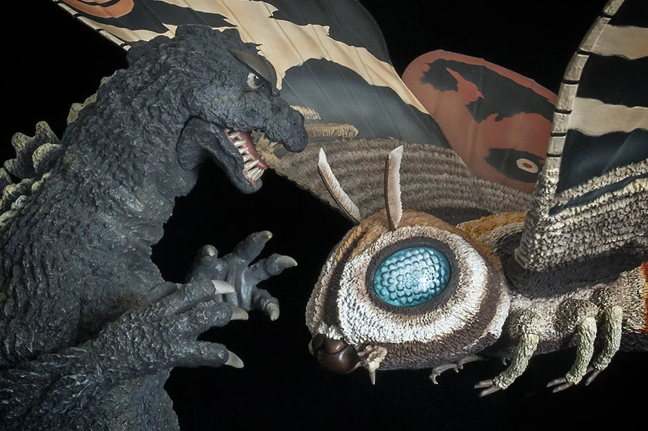
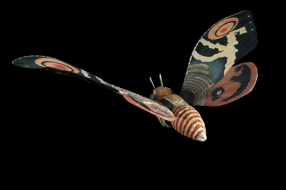
What’s particularly unique about this vinyl when compared to the rest of X-Plus’ catalog, is that it’s in flight. Propped into the air with a metal post fixed into a sculpted, rocky base, it strongly contrasts the other bipeds and quadrapeds in your collection by hovering over them with its large, outstretched wings.
WINGS
While we’re on the subject of wings: you no doubt have heard stories about (or experienced yourself) drooping, deformed wings from all three of X-Plus’ Rodan figures. Warm temperatures and the figures’ own weight tends to make the wing tips bend and curve, making the figures lean and, eventually, topple off the shelf. This is not a concern with the Mothra Imago figure. The wings on this buggy beast are made out ABS, a firmer plastic which is immune to high temperatures and gravity. I’ve had this figure for over a year now and both wings are still flying high.
IT’S BIG
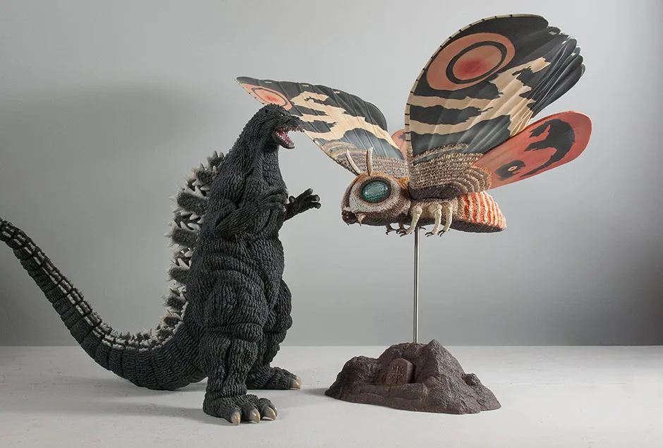
The Mothra Imago 1961 vinyl is part of the Toho Large Monster Series. A Godzilla figure in this series is typically around 25cm tall (about 10 inches). Mothra, though, is another story. She’s HUGE and, at first glance, looks like she should belong to the Toho 30cm Series. But this vinyl is actually in scale with the other Large Monster Series figures. Mothra was just plain big in 1961 (and 1964 as well).
From wing tip to wing tip, this figure is 22.5 inches wide. Now keep in mind that both wings are angled upward. If the wings were completely horizontal, this figure would have a wingspan of over TWO FEET!
THE BOX
THE BASE
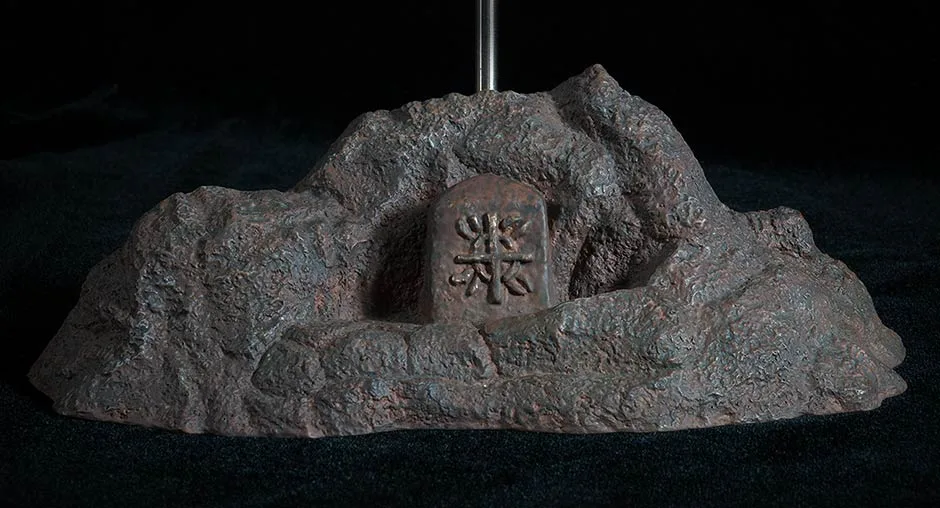
This set-up may look precarious, and could be if you’re not careful. But overall, it’s pretty sturdy. I picked this figure up, base and all, dozens of times while taking photos for this review and there was never a problem. When moving it, just don’t grab the figure by itself, nor the base. Grab the pole instead. And always check to make sure the pole is still sticking out of the hole on the bottom after putting it down. More on that below…
ATTACHING TO THE BASE
There’s potential for disaster if you don’t place Mothra on her base the correct way. There is a hole in the BOTTOM of the base. The pole needs to go into the base through the top and then ALL THE WAY THROUGH to peep out the bottom hole (see photo to the left). This second hole is needed to keep the pole straight. If you don’t insert the pole into the base all the way through, then your figure may lean, wobble and fall. (This happened to me at first. Luckily there was no damage.)
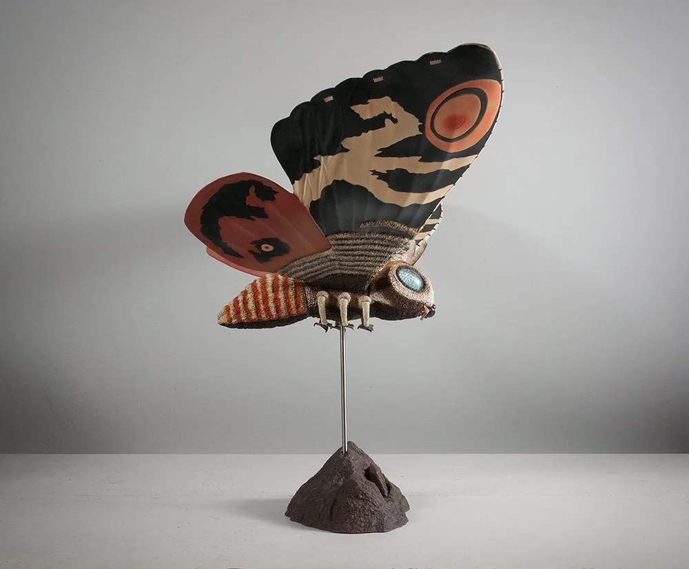
SCULPT

LIKENESS
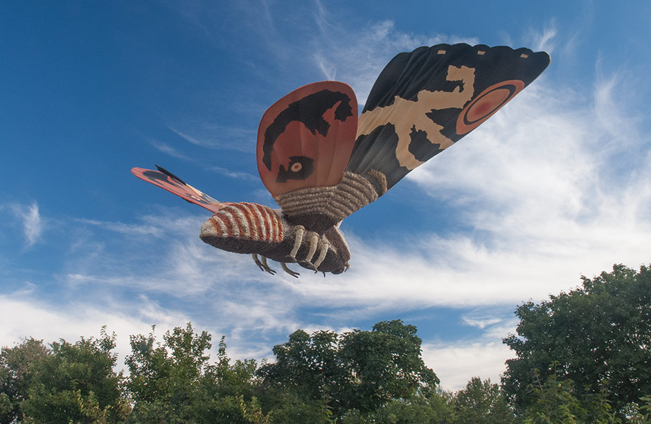
This figure seems to be a dead ringer, at any angle, for the ‘puppet’ from the film. But is it picture perfect? No, actually. Allow me to nitpick: the legs are slightly thicker than they should be. The stubby, three-pronged “pincer” at the end of the abdomen which was so prominent in the movie, is less pronounced on this figure. Despite this, I’d say they still did a fine, fine job of it.
Even the patterns on the wings show that a real effort was made to represent almost every jaggy edge in the design. The result also isn’t picture perfect, but the spirit of the pattern is there, intact despite being slightly simplified, no doubt to make it easier on the painters in the factory. The end result is amazing.
FUR
The puppet used in the film had fuzzy, fur all over it which had to be sculpted into a static surface for this figure. And I am just amazed by the fine and intricate detail that was created to cover the main body and parts of the wings. This faux fur texture is yet another clue that this is not some lowend toy… it’s an X-Plus figure.
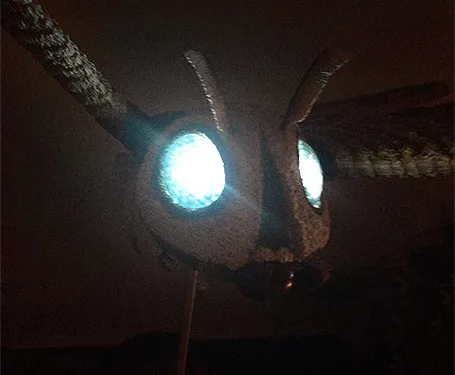
Mothra’s eyes are brilliantly represented here in hard, translucent plastic tinted blue. The outside surface is smooth while the inside is molded with bumps to mimic the giant moth’s compound eyes. This is a great technique which X-Plus also used on Kumonga, all three Gigans and others.
ANTENNAE
The antennae are thin and precise. They are also soft and bendy. And, in the case of the figure I got, can be on backwards. Out of the box, my figure came with the antennae arcing toward the rear. You can see this in practically every photo on this review. But in the movie, the antennae arc forward. I thought I may as well try and see if they could be rotated… and they could! It seems to me these should have been glued, and maybe they were meant to, I don’t know. So, PLEASE BE CAREFUL if you try this on yours.
MANDIBLES
The mandibles are hard plastic and are articulated for an optional open mouth look. These pieces are sort of stiff and hard to open. The hinges are tiny so use caution here.
JOINTS & SEAMS

All six legs (below the ‘knees’) are separate pieces and are glued to the main body. And they kind of look like they were, too. But, again, she’s a bug and it seems like this should be forgiven. Moving on…
The wings are inserted into the middle section and lines can really only be seen from directly above.
POSE
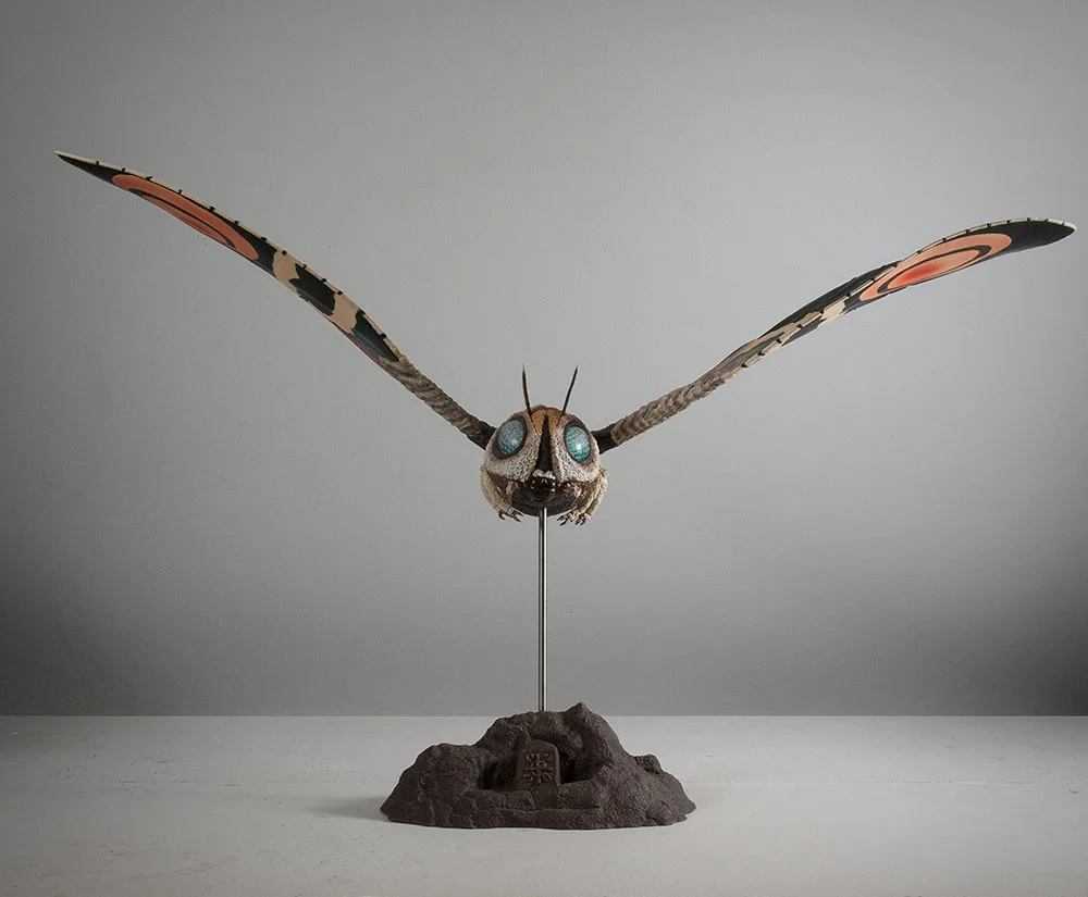

The front, back and side views seen above may look boring. (Although, I think the side views look pretty freaking awesome.) The pose may seem mechanical and the wings pretty simple and flat. But they actually have subtle curves and waves in them which really shine when you explore this figure from different angles. (Take another look at the first photo at the top of this page to see what I mean.) X-Plus could have taken the easy way out and sculpted the wings perfectly flat like a lower grade toy or collectible… but they didn’t. And that’s why we love them!
From wing tip to wing tip, this figure is 22.5 inches wide. Now keep in mind that both wings are angled upward. If the wings were completely horizontal, this figure would have a wingspan of over TWO FEET!
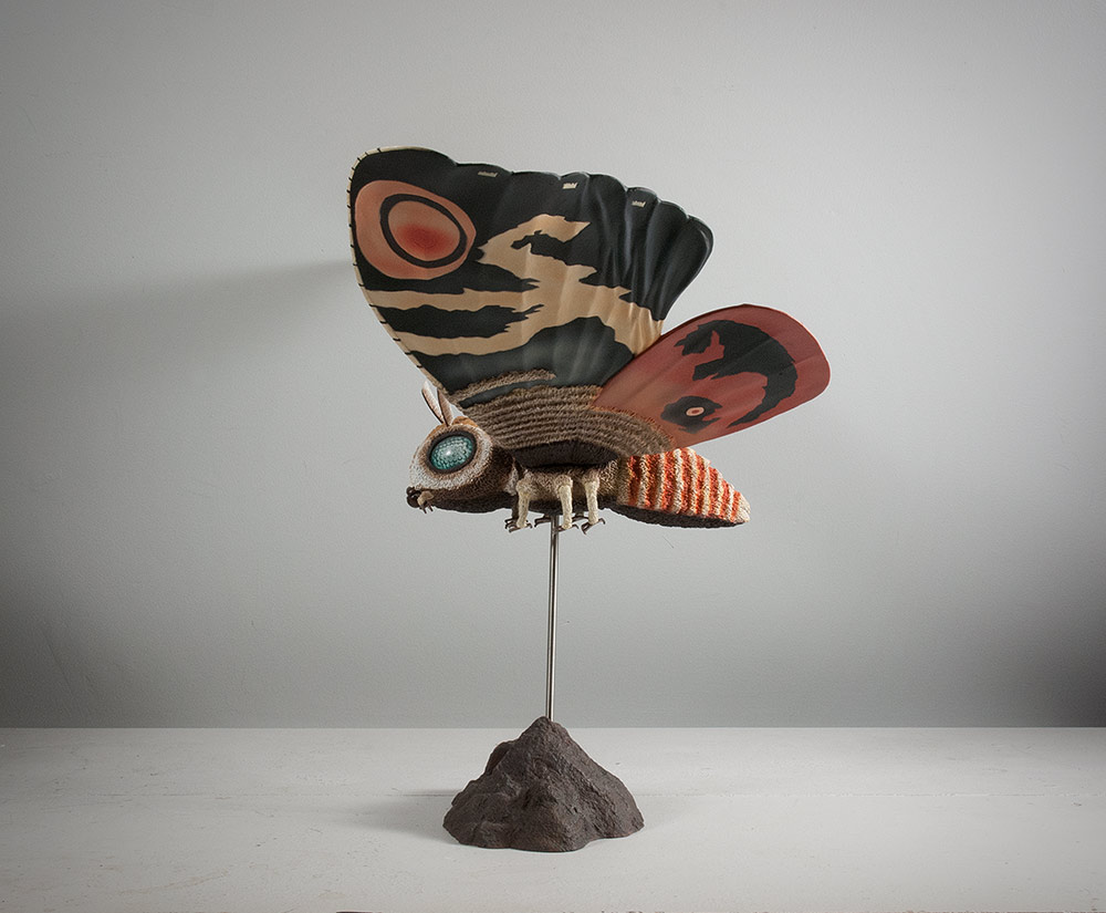
PAINT JOB

The wings have subtle indents following Mothra’s zig-zagged pattern molded into them allowing the factory folk to paint “in the lines”. There are also some dusty off-whites airbrushed on the wings to give it some gradation. Mothra’s famous big red spots are also airbrushed.
There are some inaccuracies, though. The abdomen should have white stripes which are thicker than its orange stripes. The figure has that reversed. Also the smaller rear wings should be a mustard color gradating into a lightened brick red toward the ends. This figure sports only the red. I’m not going to gripe about this, though. It’s obvious that a LOT of time and effort went into all the little details on this figure and I’m sure they did the best they could in order to remain on budget. The end result may not be 100% accurate in all areas, but it still looks amazing.
SIZE COMPARISONS
But, alas, this is the closest thing you’re going to get if you want to recreate that film on your shelves. And size-wise, it’s damn near perfect.

FOOTPRINT
If, for some reason, you place her with 30cm figures, you’ll find that even they can fit it under her wings. So, although this figure is 22.5 inches wide from wing tip to wing tip, it doesn’t need to take up all of that space just for itself.
RIC BOY VERSION
SPECIAL THANKS TO VINCE ELLIOT FOR THIS PHOTO.

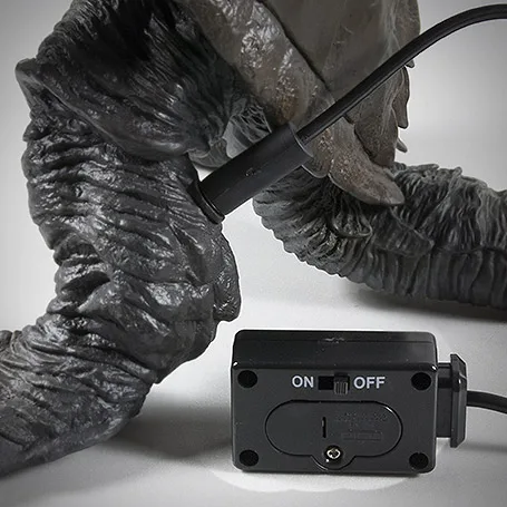
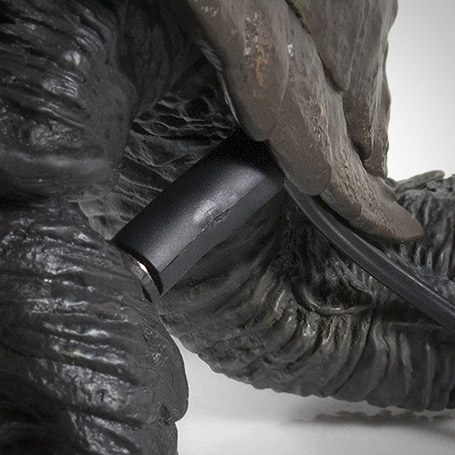
However, being one of the earlier X-Plus figures to get the light-up treatment, it has poor implementation. The abdomen (butt) needs to be pulled off in order to reach the switch. Sounds like that’s a big pain. Especially since there’s no good place to grab the figure while doing this.
X-Plus has since devised ways to turn the lights on with a lot less effort, but at the cost of having a small black box and wire on the shelf. But, alas, the point is moot. If you want to make the Ric Boy Mothra’s bright blue eyes get even brighter, you’ll have to roll up your sleeves.
SUMMARY
EXTRAS


MORE INFORMATION
- Published on
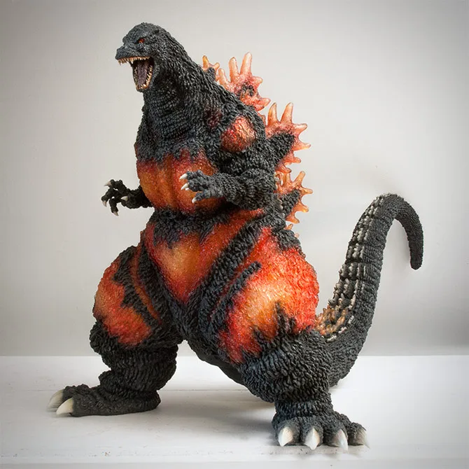
FIGURE SPECS
ゴジラVSデストロイア
The ’95 was first announced in March or April of 2014 and a troubled production pushed its release date down to July (for the Ric Boy versions) and August (for the standard versions).
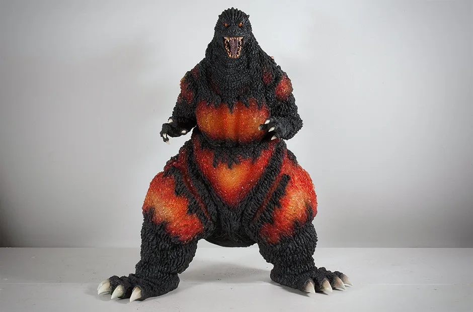
The two main things to note about this figure, the one before it, and any to come are their (gigantic) size, and the abandonment of hyper suit accuracy in the sculpt in lieu of hyper stylization. So, if you’re accustomed to having your new X-Plus figures look like they walked right out of the movie, you’ll need to adjust your perception in order to appreciate the artistic exaggerations that capture, instead, the power and spirit of these monsters.
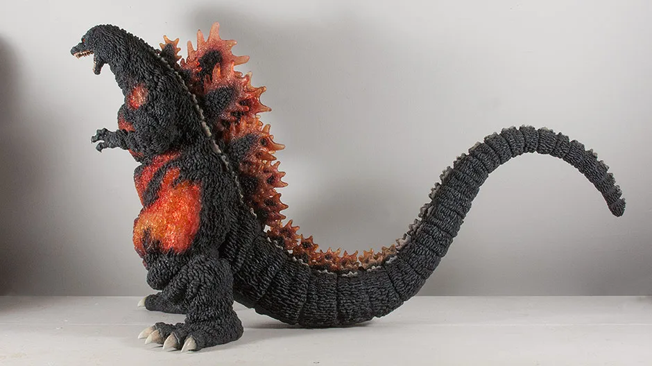
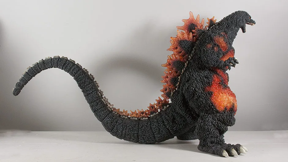
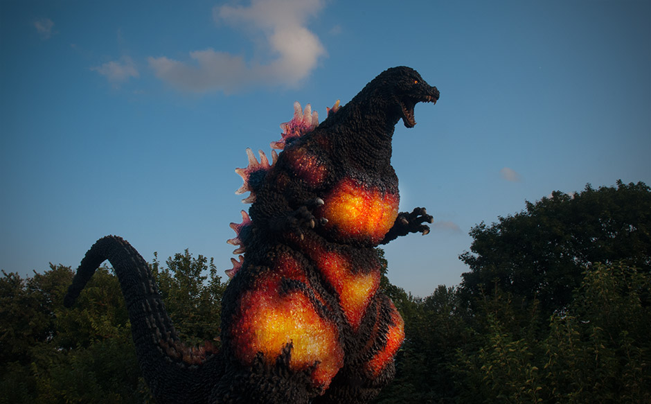
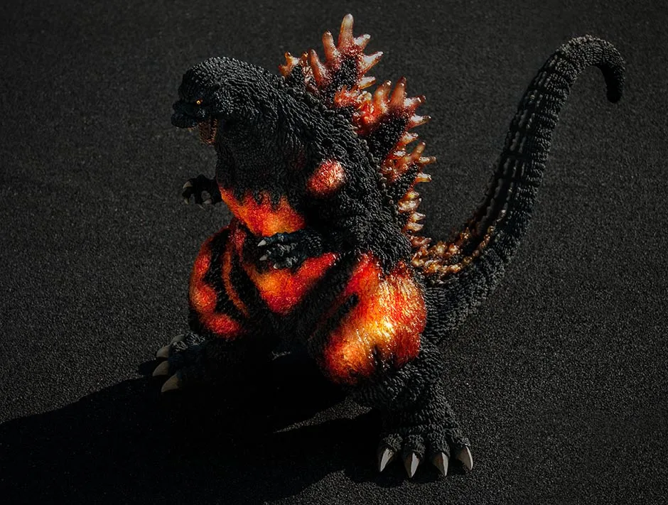
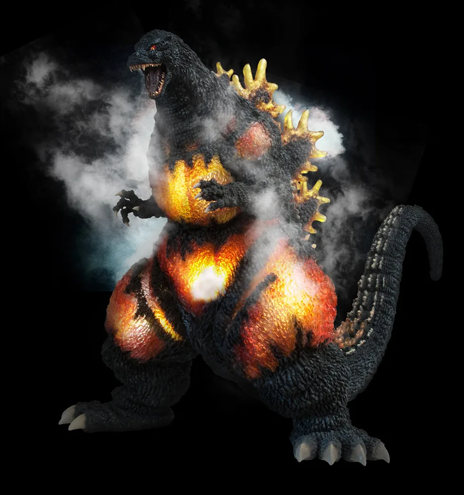
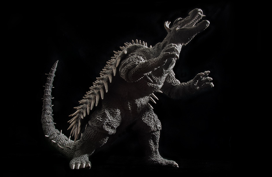
The Gigantic Series Godzilla 1995 is based on the daikaiju’s appearance from the movie Godzilla vs. Destroyah. In that installment of the Heisei series, Godzilla’s radioactive energy rages out of control which turns his body into a walking overheating reactor. Energy forced its way through to the surface of Godzilla’s tough skin and gave him a firey, glowing appearance. Fans and collectors often refer to this suit as “Burning Godzilla”.
For this figure, the rights were acquired to use the sculpt from a previous kit from another company. That kit came with LED lights to illuminate its ‘burning’ skin. X-Plus had originally wanted to do the same for their release, but production concerns caused them to abandon that plan. But even without lights, this figure looks firey enough just the way it is!
THE BOX

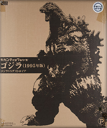
The foam shell slips into it’s own plain box with a simple, black lineart design. And since this figure comes only one to a case, you’ll most likely get the case, too.
Note: I’m not going to take photos of every piece of the box like I did for the Gigantic GMK review. But the box setup is the same as the GMK so you can reference that photo HERE.
ASSEMBLY

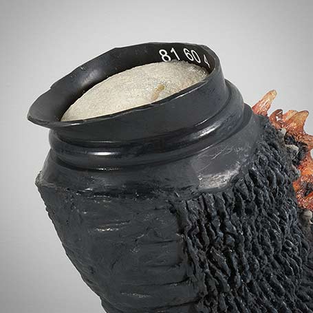
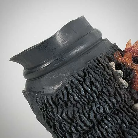
INSERTING THE TAIL
The traditional procedure requires you to heat the body hole with a hair dryer to soften the vinyl. You would then press in the (unheated and firm) tail into the body. But, this process does not seem to work with this figure. I attempted assembly this way the first time. The tail slid in easily, however it then slid out again just as easily. I suspect that the inner flange inside the body, when heated and softened, becomes too weak to grab onto the tail.
Instead, give it a try with NO hairdryer. I left my figure alone in a warm room while placing the tail in front of an air conditioner for a while to firm it up. After that, the tail popped right in, and stayed in. …mostly.
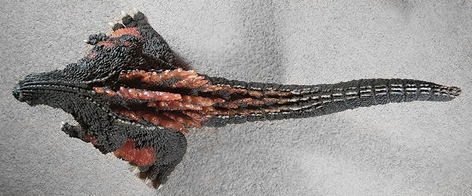
While the tail may seem snug inside the body, it can still come off fairly easily if you tug on it while pulling downward. I have to admit I’m stumped as to why this happens. It may have been designed to do that for some reason. If you look at the photo you’ll see that the flange at the top of the tail does not flare out as it does on the sides and bottom. I don’t know what to say about this. All I can say is that the tail stays put while the figure is on display, and even while carrying it around the house as long as you don’t tug on it.
Note: one collector I spoke to about this claims his tail is “locked” in and doesn’t pop out with a light tug. Here’s hoping you get one of those.
SCULPT

As already stated, the sculpt never tries to be super suit accurate, but instead exudes a dynamic, artistic interpretation the likes of which you’d find in comic books. Which is okay by me because this thing blew me away when I got it!
It doesn’t totally ignore “reality” because from certain angles it, at a glance, does look somewhat passable as an accurate sculpt. But from most angles, it’s clear this thing is embellished.
It’s like this: the sculpt doesn’t show the Godzilla you see when you look at the TV screen. It shows the Godzilla you see in your mind!


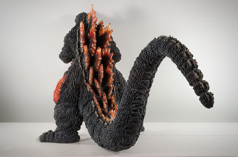
The teeth and tongue look like something you’d find on a high quality resin model and not on a vinyl. The teeth are really pointy and sharp. And the tongue has a ridiculously fine and deep texture. No, these bits are definitely not vinyl. I suspect they are made of hard polyurethane (PUR) plastic like the tongue on the Gigantic GMK was.
Seeing this detail in person, combined with the glaring eyes above it will blow – you – away.


I could be wrong, but as far as I can tell, most of the body is molded in colorless, translucent vinyl. The asphalt black paint covers the “cooler” skin. I suspect that red highlights are painted (on the outside) onto the higher elevations of the skin texture in the hot spots. And I’ll bet that the dominant yellowish hues are coming from another layer of vinyl inside the body acting like a “double wall” just below the clear outer layer. (I’ve seen this extra wall inside the body before adding the tail.)
However this effect was achieved, the end result is jaw-dropping! Words just can’t describe how awesome these burning patches look in person nor how their appearance slightly changes as you look at them from different angles. And photos DO NOT do it justice! You have to see this in person to really appreciate it.
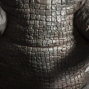
TEXTURE
The sculptor went above and beyond expectations when creating the treebark texturing on this figure. Deep and rough don’t even begin to describe it. You know how I always mention individually sculped teeth? Well, I almost feel I have to say that this figure has individually sculpted skin bumps! No, really. It looks like fanatical care went into every bump and groove. Just touching this thing will set your tactile sensors on overload.

JOINTS & SEAMS
SEAMS
What seams?? You will not notice a single sloppy seam this figure. None!
But what if you look for them? Okay, if you look hard enough, you’ll eventually find them even though they are expertly glued and filled. They’re really not worth mentioning though, but I suppose in the interest of know where to grab this figure when moving it, I’ll tell you what I saw.
The feet below the knees are separate pieces. Curiously, the tops of the these pieces are not open like the rest of the figure and have solid tops inside. I suspect they may contain extra material to keep the feet weighted down like the Gigantic GMK has. There appears to be a seam running around the waist. there is a peculiar seam running down the back on both sides. Normally, the body is all one piece except for the back strip of dorsal fins. But this dorsal piece extends well out to both sides. There is a tiny seam running over the forehead making me think the whole top of the face is a separate piece. You can’t really see this seam, however, you can and will notice a sudden change in texture complexity on the top of the head. It suddenly stops when it reaches this seam. This is the one and only possible complaint I could have about this otherwise awesome vinyl statue.
POSE
NOTE: FIGURE IS SHOWN WITHOUT THE TAIL ATTACHED.


PAINT JOB
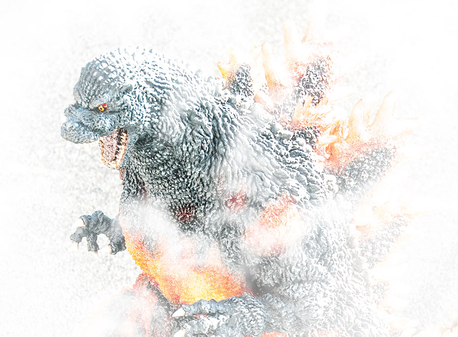
EYES
The eyes have vivid yellow corneas with thick black outlines floating on a dark red. These eye colors must be decals because if you zoom into the eyes from a high res photo, you’ll find tiny, notchy lines like those found on a clock. You can see a photo of one eye fairly close up in the Sculpt section of this review.
HOT SPOTS
The lack of noticeable highlights on the black skin is quickly forgotten when you feast your eyes on the fiery reds, oranges and yellows on the burning areas of Godzilla’s skin. Words and photos can not even begin to fully impart how AWESOME this looks. As already mentioned in the Sculpt section of the review, it seems that most of the body is molded in colorless, translucent vinyl and that the base yellow color is actually painted on the inside of the figure! This allows the color to show through but also lets refraction give these areas a crystal like effect. Red highlights are adding on the outside surface where it borders the regular black skin.
The comination of paint, translucent vinyl and deep textures in the sculpt make this figure a feast for the eyes.
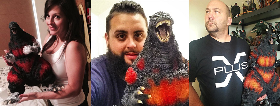
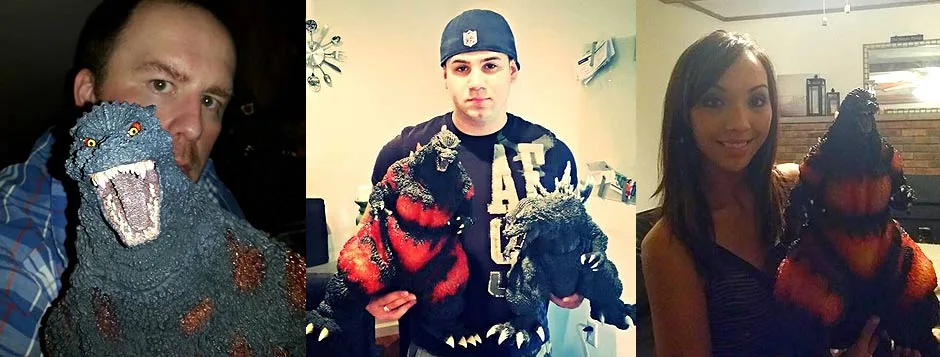
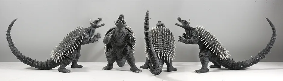
SIZE COMPARISONS


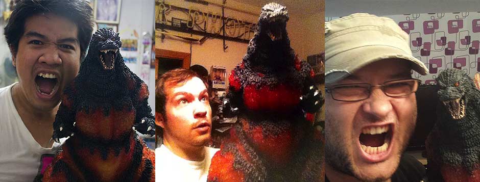
For a ‘real world’ size comparison I brought the old soda can back for a shot. Instead, I’m trying something new. To help you completely and utterly appreciate the size of this figure, here are some shots of collectors with their new Gigantic 95’s.
LEFT TO RIGHT: COLLECTORS JOHN STANOWSKI, RICH ESO, AND JONATHAN LEE.


LEFT TO RIGHT: COLLECTORS MIKE OJEDA, AARON TIU, AND DAVID ERIC DOPKO.

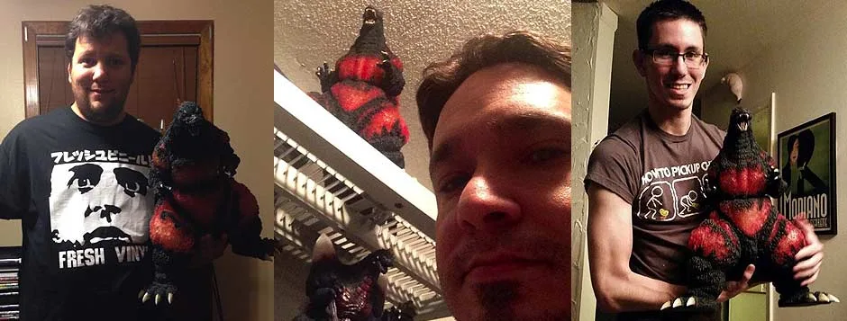
LEFT TO RIGHT: COLLECTORS CHRIS WANLASS (WIFE), EDWIN TALAVERA, AND JIM JENKINS.
LEFT TO RIGHT: COLLECTORS GARY GUINN, DAVID DASTAS, AND MICHAEL CAVALLARO (WIFE).

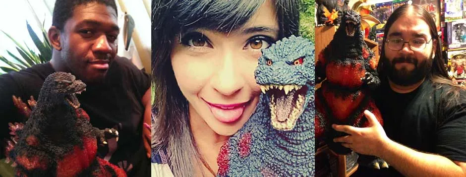
LEFT TO RIGHT: COLLECTORS DANIEL GILCHRIST, CHRISTINE CHAPIN AND KEITH RUIZ.

LEFT TO RIGHT: COLLECTORS EAKARACH MONWAT, ADAM THOMAS AND JOHN DEUßING.
LEFT TO RIGHT: COLLECTORS JOSHUA DIMAGGIO, JAVIER LABAULT AND NICHOLAS FALCON-PUNCH NAVARO.

FOOTPRINT

Finding a place to fit this figure into your collection is going to require some thought and planning on your part and might wind up being a big problem for many. But, like I always say: It’s a good problem to have!
RIC BOY EXCLUSIVE FEATURE

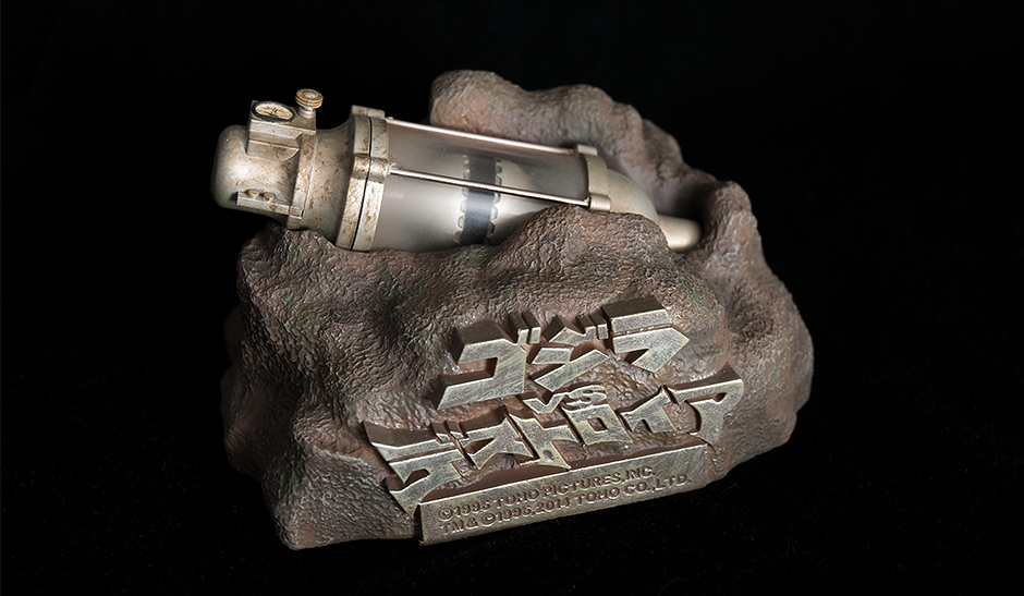
A nice touch: the oxygen destroyer can be removed from the base!

The only difference with this version is that it’s lost all of its shiny, new looks and instead is painted with a darker silver and expertly dabbed or sponged with dark, grungey paint texture to represent 42 years of salt water corrosion. Oh, and the ball is open! It really is a pretty incredible model.
Is it worth the extra cash? That’s for you to decide. Myself, I have to say it’s pretty nice having a miniature of such an iconic device from Godzilla history on my shelves.
GIGANTIC SERIES GODZILLA 1995, 1999 DEGREE VERSION, SDCC EXCLUSIVE (BLUEFIN)
PHOTO: BANDAI / BLUEFIN DISTRIBUTION

It came with the tail already permanently attached. The vinyl also featured larger red patches. The smaller, non-translucent dorsal fins are more of a stark white.
GIGANTIC SERIES GODZILLA 1995 FROZEN VERSION
PHOTO: X-PLUS

It came with a mini Super X III.
SUMMARY
It has super-detailed, deep textures and looks fantastic with it’s translucent burning patches. And it’s BIG! It totally captures the raw power and spirit of Burning Godzilla and its pretty damn BIG, too!
Wow. Just, wow. Sign me up for the next in the series right now!
EXTRAS
The photos depicting glowing light below are merely Photoshop embellishments meant to celebrate the figure’s awesomeness.


MORE INFORMATION
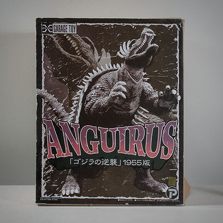
- Published on
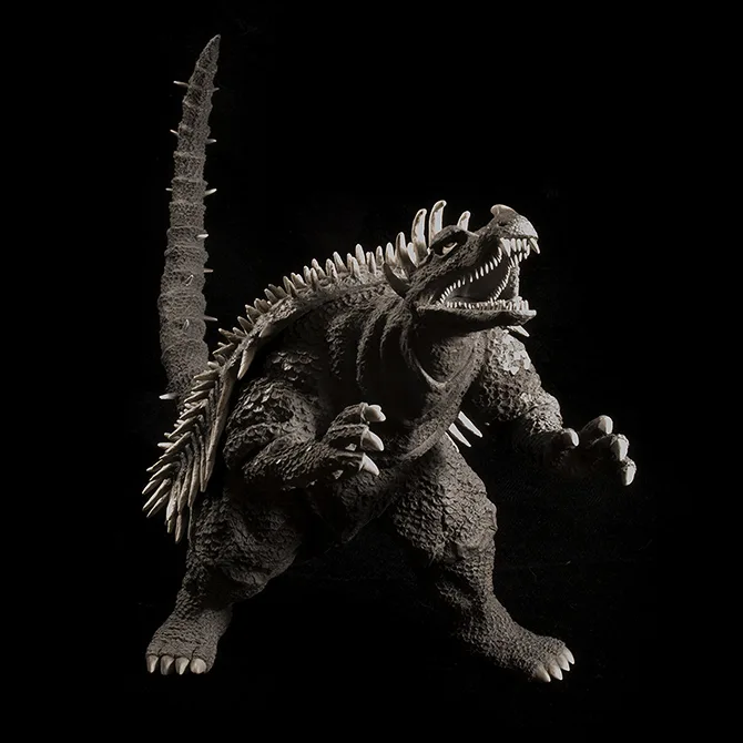
FIGURE SPECS
ゴジラの逆襲
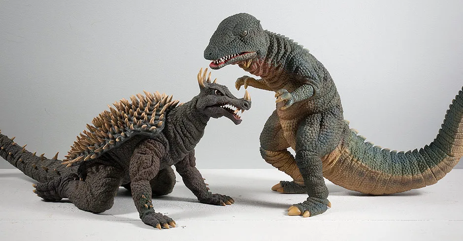
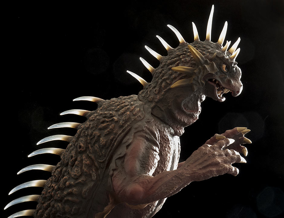
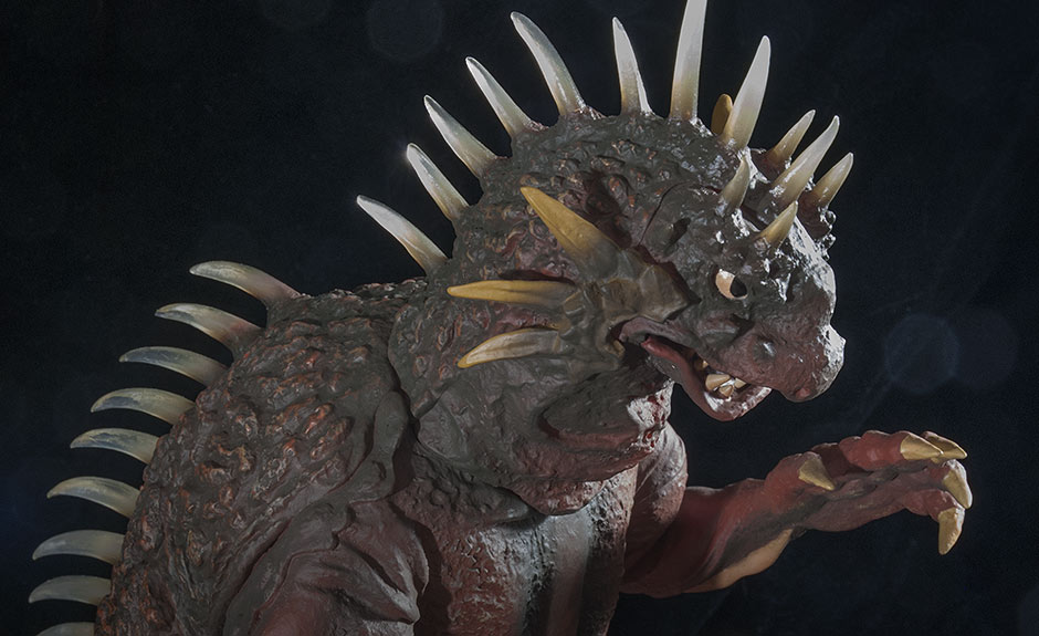
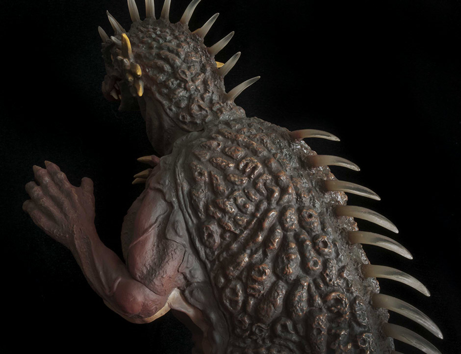
Despite his badassery, Anguirus 1955, or Angilas if you prefer, isn’t as popular as the suit design which came after it. And collectors most likely have set their sights on going after an X-Plus Anguirus 1968. Fair enough. But there’s no reason to turn your head and pfft at this historical kaiju suit and X-Plus’ beyond awesome vinyl rendition of it. There’s lots to love here, whether you grew up with the movie or you just dig the 1950’s retro thing. The Toho 30cm Series Anguirus 1955 is a prize.

THE BOX
ATTACHING THE TAIL
As for how easy or hard it was for me to assemble: I just don’t remember. I’ve had this for over a year now.
SCULPT
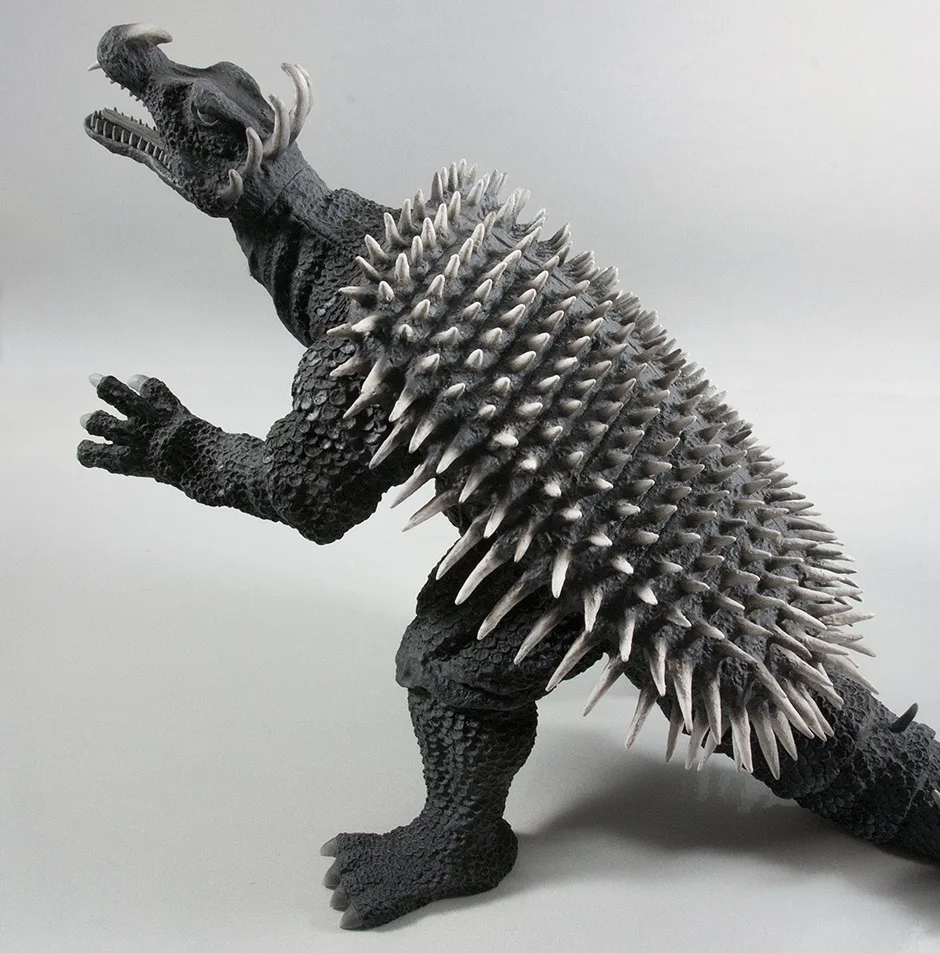
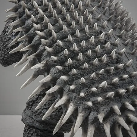
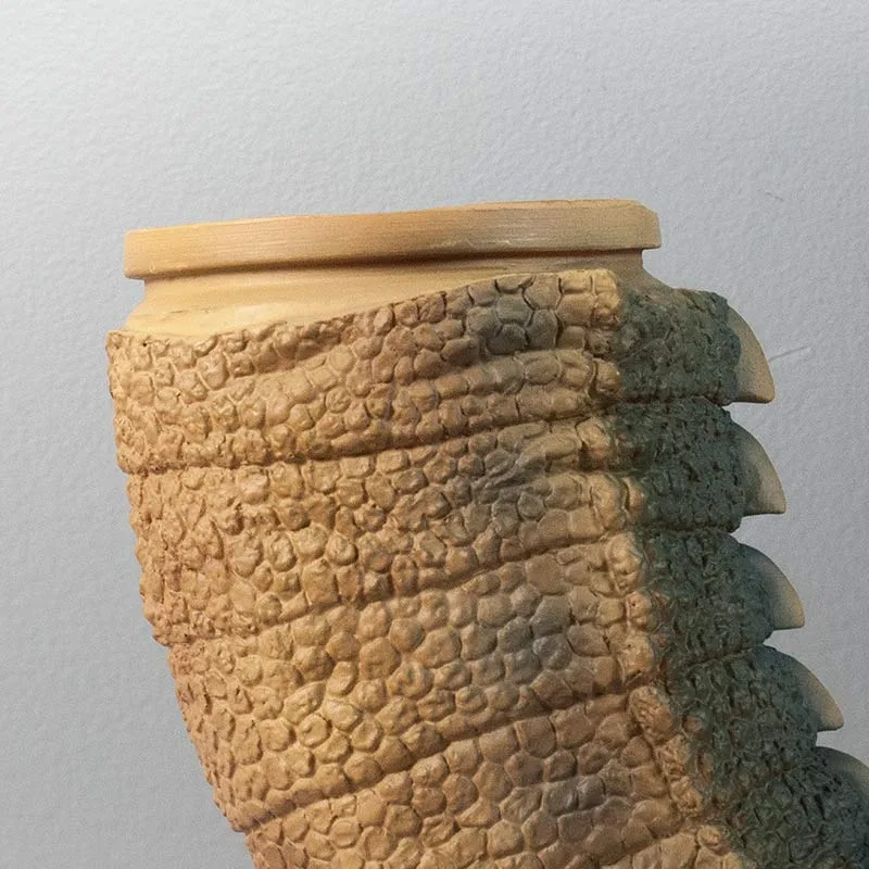
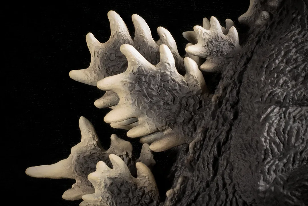
The back is covered with individually sculpted spikes. There was no cheap, easy-way-out sculpting done here. This must have been a tedious labor of love to create.
JOINTS & SEAMS
The tail is in 4 pieces. One joint is glued and two aren’t but are tight. The final joint is where it connects to the body and that seam is masterfully hidden by the sculpt. Overall: it seams to be pretty seamless. (Yes, that was a pun).
POSE

POSE UPDATE
Michael told us to line up the spikes. I never noticed but Anguirus has only 3 rows of spikes: one down the top and one on each side. Use those as your guide. There are two joints you’ll need to rotate to get the right look. And right it is! Now it more resembles the tail on the suit as it was tugged on by a wire on the set.
It would seem the X-Plus factory folk rotated the tail out of shape and into a single curve in order to make it fit into the box. Oh well. Now we know. Take note, though, that twisting the tail into the correct position will add a few inches to Anguirus’ overall length. Yeees, he’s even longer now. If he doesn’t fit on the shelf anymore, you could always just put it back the way it was.
…it does wonders to summon up visions from Godzilla Raids Again when gazed upon. It may not be your favorite Anguirus suit, but it is one hell of a figure.
PAINT JOB
The eyes, teeth and claws are a super light gray, almost white. And the spikes on its back are a brighter, dirty white. The feathering of this white into the base of each spike is beyond impressive. Also, many of the spikes, especially the crown of them on the head have a nice grungey texture to them.
Subtle highlights are brushed on to the higher ridges on the belly. And perhaps most impressive is the freckling of silver scales on each shoulder. The painters in the factory actually targeted individual scales to brighten. And it looks exactly like it did in the movie.
Now, all of this was done back in 2011 when X-Plus was still trying to prove itself with this line. Let’s just hope that the upcoming Diamond Reissues will have paint jobs which match the quality of the original.
SIZE COMPARISONS
Uh, hello? Are you still reading?
You’re staring at the ’68, aren’t you? Come on, this review is all about the ’55.
Fine, stare away. I’m moving on.

FOOTPRINT
Even with its tail curved up into the air to cut it’s length, this figure is still 19 inches (48.25 cm) long! If your shelves aren’t that deep, you’ll need to pose this guy on an angle (which you’re likely to do anyway). But, if needed, you can subtract 4 to 5 inches off the length if you’re only concerned with keeping his feet inside the edge of the shelf.
This kind of set-up is probably only for diehard Godzilla Raids Again fans since it takes up three feet of shelf space.
SUMMARY
EXTRAS


MORE INFORMATION
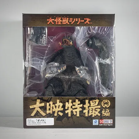
- Published on
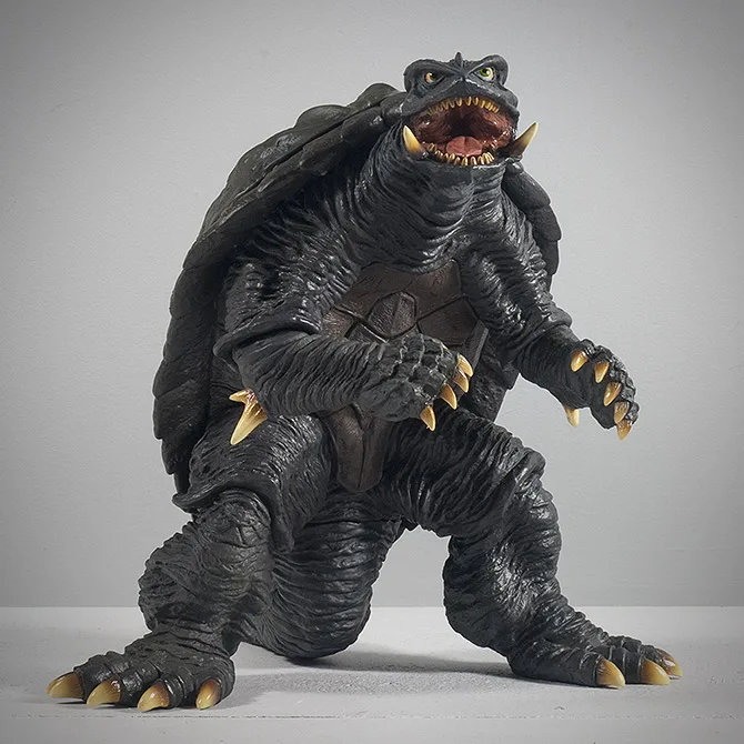
FIGURE SPECS
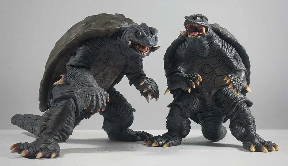
ガメラ2 レギオン襲来
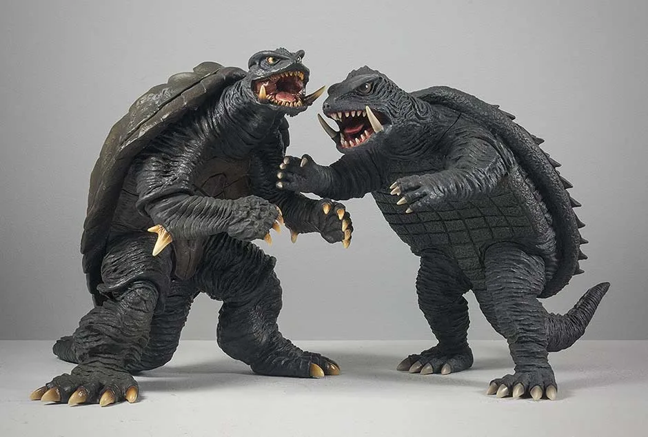
Like it’s taller 30cm brother, this figure is pretty much dead on. It came as both standard and Ric Boy exclusive versions. This review is on the latter.
THE BOX
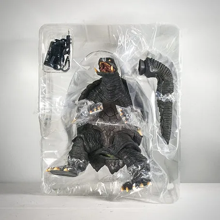
Note: the figure’s left leg is twisted at the knee so that it fits in the box. You’ll have to fiddle with that to get the foot to stand flat.
ATTACHING THE TAIL
SCULPT


The X-Plus 25cm Gamera 1996 is just that good. Maybe that’s why X-Plus sold out so quickly.
JOINTS & SEAMS
The only joint mentioned here which has a visible seam is on the neck. But even there it’s hidden somewhat well inbetween ridges in the sculpt. The elbows and knees are obscured even better by ridges in the sculpt. The tail joint is utterly hidden under the skirt of Gamera’s shell.
(Note: in order to fit Gamera into the box for shipping, its left leg was rotated out of position so the toes would flare to the side instead of forward. You’ll have to tweak this joint to get his foot to stand flat on the shelf.)
The only other seam I’m aware of is on the back. The back shell, minus the “trim”, is all one piece and is glued on. It’s edge naturally occurs at a line in the sculpt and is meant to be perfectly cloaked. (However, the figure I got in the mail recently isn’t so seamless and the edge on one side can be detected if looked for.)
POSE
PAINT JOB
The shell is an overall dark green. But closer examination reveals super-subtle variations between an olive green and a slightly more saturated green. The chest is a dull brown. The claws, spikes and tusks are a bright, boney color which flare into oranges and browns as they meet the body. And they look GREAT, especially the tusks. These boney colors do not blend into the black skin and so require hard edges. X-Plus did a masterful job (at least on the figure I got) of keeping the paint from slopping “outside the lines”. My only complaint is that the boney bits are a bit too bright and give this figure a slightly toyish look when considering them.
The teeth are a brownish yellow and look very un-toylike. Quality job! The inside of the mouth is a glossy, pinkish red which looks very organic… and wet!
Great job on the eyes, too. Black pupils floating in vibrant, green irises were expertly painted on with great precision. A dull orange was sprayed in the corners to add depth.
Note: the base coat of paint used on the claws is brushed on and is prone to scrapes.
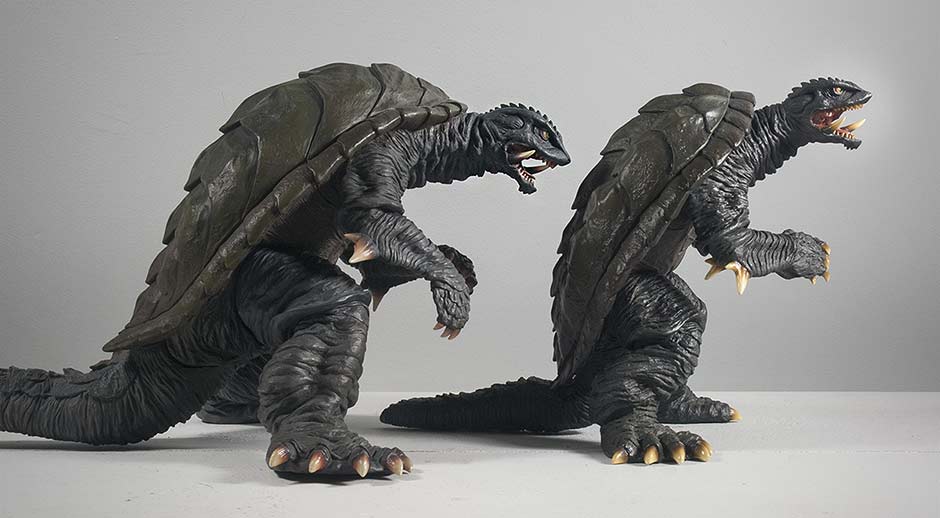
SIZE COMPARISONS

And, just for fun: this Gamera and Ultraman Tiga were the only kaiju game in town in 1996. (See the X-Plus Ultraman Tiga Figure Review!)
FOOTPRINT
RIC BOY EXCLUSIVE

Back to Gamera now: the light effect looks great. The glow on the chest does a good job of making it look like a very big can of whoop ass is building up behind those chest plates. And the glow in the mouth is even more impressive. It looks firey and organic at the same time.
A+ for the looks! But a C- for the flimsy, soft vinyl material used on the chest and head. The head piece is very soft and, if you were so inclined, you could squoosh the head and mouth and make it look like it was talking like a puppet. Those large tusks coming out of the lower jaw are also soft and are very bendy. Speaking for myself, I’d rather have the usual sturdy vinyl even if it meant I couldn’t have the light gimmick. And, don’t think you can get away from this super soft, translucent vinyl by buying the standard version; it’s made of the same stuff. The rest of the body is sturdy and fine.

The implementation of this dongle system on the Large Monster Series Gamera 1996 has a problem. The port on the back of the leg is too high and too close to the figure’s shell. In order to access it, you’ll need to rotate the leg at the knee joint. This joint is elliptical and I worry about it becoming loose if it were rotated too often.
Having rotated the leg and plugging in the battery pack, you’ll find that the figure’s left foot is no longer flat. And, when you go to rotate the leg back, you’ll find that the plug doesn’t have enough room because the shell gets in the way. You’ll need to pull the leg forward a little to complete the job. And in the end the plug will be pressing hard against the inside of Gamera’s shell which will bend the wire and press against it. Bending wires like this can lead to loose connections.
THE BAD NEWS
Now, it’s much cooler in this room and the feet are no longer sliding. However, it seems likely this figure is destined to follow in the footsteps of it’s 30cm brother and get wonky legs over time.
WONKY 30CM GAMERA 1996
When I first got my 30cm Series Gamera 1996, the legs were perfect and the feet were flush on the shelf. After only a year had passed both feet have started to slant. The figure’s weight pushes it’s diagonally posed legs outward. You can see it slightly above. If you watched Rich Eso’s video review, you can see his 30cm figure is even worse.
I was really hoping this 25cm version wouldn’t have the same trouble. Slide back up at the Pose Photo and look at the front view. You’ll see the legs are indeed diagonal. So my fear is hot, summer temperatures may make the 25cm Gamera figure’s legs a little wonky. It doesn’t weigh as much as the 30, so hopefully this little Gamera will keeps its feet flat on the ground.
SUPER SOFT TRANSLUCENT VINYL
Meh. The entire head piece is made of translucent vinyl and the variety which X-Plus is using is so soft, you can squeeze it like a stress toy. I don’t know, this just doesn’t feel like quality to me.
And finally, as already mentioned, the Ric Boy exclusive version’s battery plug doesn’t have enough room between the leg and shell to fit properly.
SUMMARY
And now let’s look to the future! Now that Heisei Gamera has found its way into the Large Monster Series, we can only hope that a Heisei Gyaos, Legion and Iris will follow!
EXTRAS

MORE INFORMATION
- Rich Eso Reviews the X-Plus Daiei Large Monster Series Gamera 1996 Vinyl Figure.
- DiegoDoom Video Review of the X-Plus Daiei Large Monster Series Gamera 1996 Vinyl Figure.
- GodzillaFanFreaks Large Monster Series Gamera 1996 Video Review.
- RELATED: Kaiju Addicts X-Plus 30cm Series Gamera 1996 Vinyl Figure Review.
- Published on
FIGURE SPECS
ゴジラVSビオランテ
X-Plus released this fan favorite from Godzilla vs. Biollante (1989) again as a Diamond Re-issue in December 2014.
THE BOX
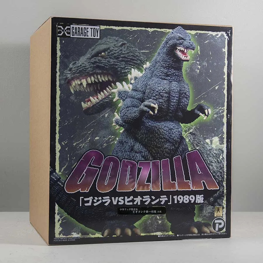

STANDARD AND RIC BOY
This is the box for the Ric Boy version. You can tell by the presence of the small black sticker under the Godzilla logo. (Click on the photo on the left for a larger view.) The standard box is identical sans the black sticker.
DIAMOND RE-ISSUE
The Diamond Reissue (most likely coming out later this year) should also have the same box, but will come with a small “PX – Previews Exclusive” logo adding in one corner.
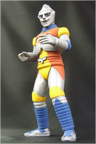
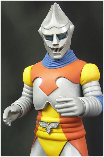
SCULPT
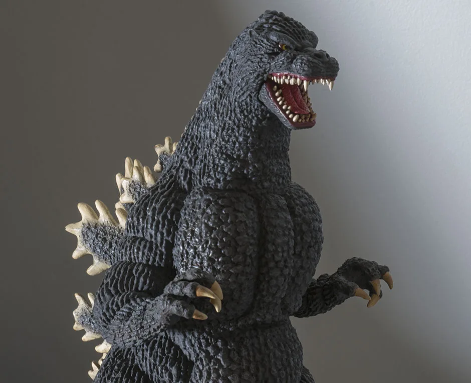

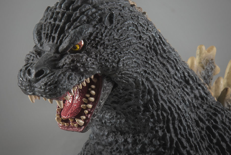
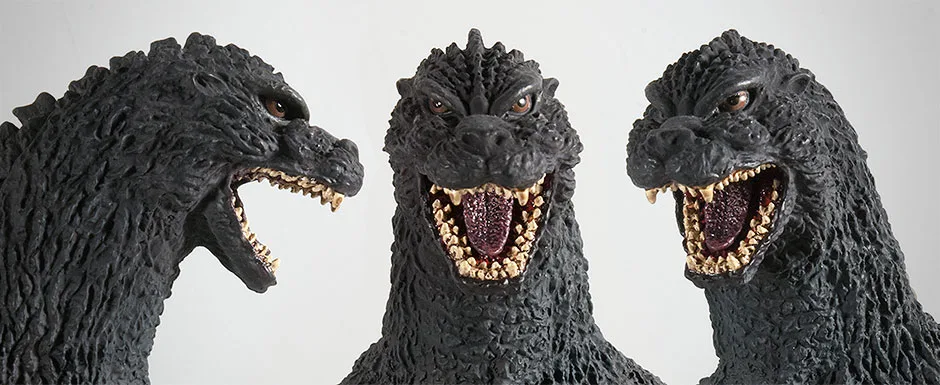
Godzilla 1989 is one of my all-time favorite designs. And the head is a big part of that. It makes him look fierce and powerful and Badass with a capital B. The X-Plus vinyl captures all of that in the head sculpt.

Some features to note are the piercing yellow eyes, the subtle point on the top of his head, even the texture on the tongue is reproduced with uncanny accuracy. I didn’t remember there being much detail on Godzilla’s tongue, but when I watched the movie again in preparation for this review, I got a good look and, WOW, X-Plus NAILED IT! It’s this super attention to detail that makes so many collectors hold X-Plus with such high regard.
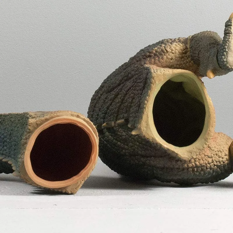
THE JAW
An unusual feature on the 30cm Godzilla 1989 is the hinged jaw which allows you to choose from a semi-closed mouth or a full roar position. While I appreaciate this option, I feel the gaping ventriloquist doll line under the jaw takes away from the near perfect look of this figure. This gap is more visible when the mouth is near closed, so I keep mine open wide.
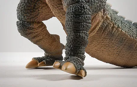
As usual, the teeth are individually sculpted… both rows of them! By the way, all of the fingers are also individually sculpted and very expressive.
JOINTS & SEAMS
The main tail joint is an excellent fit and match. Godzilla’s bulky thighs obscure the sides of this joint and you can see the join only from above, and even then, it’s worked into one of the sculpted tail segments. The tail has two additional “jiggle joints” that aren’t meant to move and they pretty much stay put if you leave them alone. They’re obvious only if you look for them.
The back piece from which the doral fins spring, as usual, looks seamless.
And then there’s the aforementioned hinged jaw which, when not opened all the way, has a very noticeable gap around it.
POSE
The figure has a slight lean to one side which I like. I feel this makes Godzilla look like he’s lumbering forward, swaying side to side. It’s pretty dynamic, but can only be appreciated from the front.
And, once again, (groan) this figure is leaning so far forward (almost as bad as the 30cm Series Godzilla 1984) that it looks like it’s about to topple over. There’s no danger of that, of course, but it looks really odd and unnatural. Fortunately this can only be UNappreciated from the right side and you’re probably not likely to position it on your shelves like that.
PAINT JOB
HIGHLIGHTS
There a super, super subtle highlight brushed over the chest, neck, arms and legs. So subtle that you really have to look for them. But, subconsciously they will register and give that black skin another layer of realism and detail.
CLAWS AND FINS
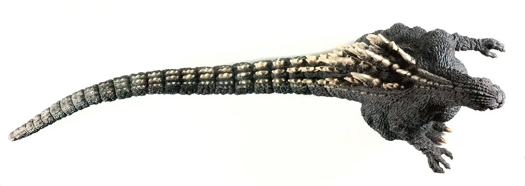
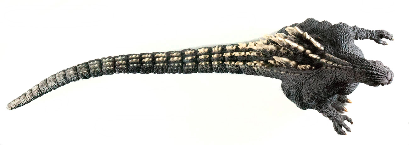
The claws at the ends of all four limbs are a smokey, boneish tan graduating to darker shades nearer the “cuticles”. The dorsal fins are a similar color but more on the lighter side. These lighter tones are expertly feathered over the tips of the fins. The smaller “bumps” that run all the way up to almost the top of the head are painted with hard edges while the smaller bumps running down the tail are very soft and “fuzzy” all the way down to the end.
MOUTH
The inside of the mouth is a deep, dark red as are the “cracks” on the tongue. The higher elevations of the tongue are a shade or two lighter; just enough to make the cracked pattern stand out a bit more. This has got to be the best-looking X-Plus tongue after the one on the Gigantic Series Godzilla 2001.
SIZE COMPARISONS

FOOTPRINT
The tail appears mostly straight but actually has three curves to it. Overall, the tail drifts toward the figure’s right side which means it will fit on the shelf better (if there is a wall at the back) if it faces slightly toward its left. The pose of the legs are ready to accommodate you with this position since the right leg is slightly further back. X-Plus seems to have planned for this to be its best angle.
RIC BOY EXCLUSIVE
SUMMARY
The X-Plus 30cm Godzilla 1989 looks great, looks accurate, has a pretty nice paint job, and few visible seams (apart from the gap around the jaw) and a great pose. This thing has got to be in the Top 5!
EXTRAS


MORE INFORMATION
- Published on
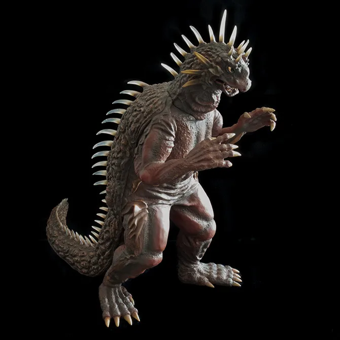
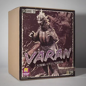
FIGURE SPECS
大怪獣バラン
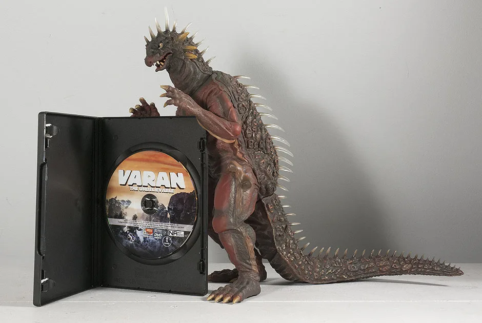
April 2014 saw the release of the Diamond Reissue, made by X-Plus especially for the North American market. Varan has once again become available to collectors who missed out the first two times around. This review is for the Diamond Reissue.
I have to say that I wasn’t expecting to get overly excited for this figure. Varan isn’t very high up on my favorite kaiju list. It was the completist in me that pushed the Add to Cart button.
However, when I finally had the figure in front of me I was kind of blown away! Especially with the sculpt of the head. I always saw Varan as having an unimaginative, short, snouty head, but this figure really made me appreciate the design. So, now, yeah, I LOVE THIS THING!
THE BOX / ASSEMBLY

THE TAIL
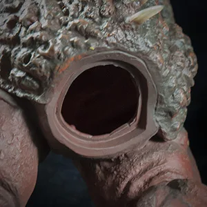
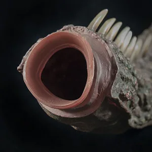
I have to admit I had a lot of trouble getting the tail attached on my Varan figure for a couple of reasons. One, the tail is made of much softer material than usual and collapses easily with the force required to push it into the body. Second, the body hole is very firm and difficult to soften with heat. The reason for this is that there is a double layer of vinyl there. The entire back piece from nape of the neck to tail, and straight down behind the shoulders is one, separate piece made of softer material. To reinforce the body hole, X-Plus molded the front piece to include an “arc” at the bottom for the hole. This double layer didn’t seem to want to let me soften it up with heat.
The solution is just to heat and soften it up as much as you can while making the tail as firm as it can get by putting it in the refrigerator for a SHORT while. (Do NOT put it in the freezer! You may wind up cracking the flange right off the tail.) That way the “suction cup” flange around the end of the tail won’t collapse onto itself when inserting it into the body.
NOTE
You may want to take this opportunity to insert something into the tail to weigh it down before attaching. I’ve heard many a tale of toppling Varans in the Summer heat. More on this later.
Okay, let’s move on. Behold! Varan The Unbelieveable! …X-Plus-Style.
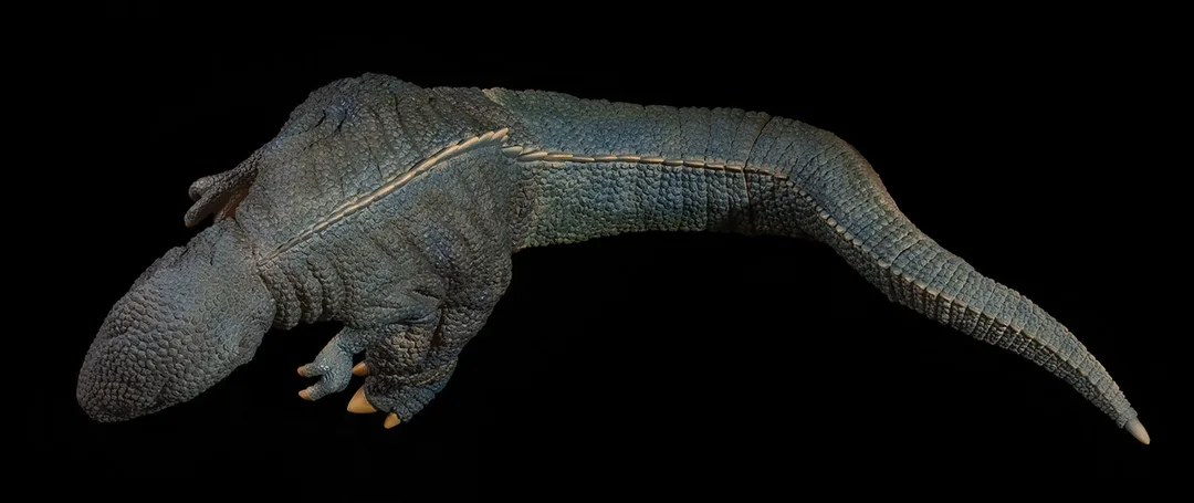
SCULPT

To my untrained eye for Varan, this figure is a knock-out representation of the ’50’s monster from the film. I mean, like… wow! I watched the movie last night with the X-Plus Varan on my lap to compare its sculpt to the big guy on screen. And I’d say it’s a very impressive likeness.
THE SPINES
When I watched Varan first crawl out of the lake on all fours, I noticed that the spines on my figure didn’t match up at all to what was on screen. The movie showed the spines being thicker and almost straight, a far cry from the thin, curved protrusions on the X-Plus vinyl. I wondered how X-Plus could get something so wrong. CUT TO: Varan walking upright. Suddenly the spines on screen matched the vinyl EXACTLY, with almost scary precision.
I realized that the appearance of the spines change depending on the angle in which they’re viewed. It turns out they appear wider from above and thinner from the side. Toho monster suit maker, Keizo Murase, made the spines for the suit by cutting pieces of a vinyl hose into short lengths, and then carefully slicing them length-wise so that they would come to a point from above and the side. This seems like a cheap way to add detail to a prop used in a movie, but he was required to make spines that wouldn’t break or impale the suit actor or any crew members. Still, I think it worked great. You’d never know you were looking at hoses in the movie.
So, not only did X-Plus get the sculpt of the spines dead right, they went even further! If you run your finger along the bottoms of the spines on this figure, you’ll notice that their undersides are concave, just like a sliced hose! X-Plus, why did I ever doubt you?

The spines on the head, back and tail are clear. If it weren’t for the refraction from the curved surfaces, you’d be able to see right through them. Light passes through them with ease giving this figure extra points for visual-interest. Plus, this just makes the figure look even more like the suit.
The clear vinyl used is very soft and if you run your finger down the back with some pressure, the spikes will bend out of your way. A nice touch. However, the downside is the squooshy back and soft tail I mentioned earlier.

Another impressive detail is the sculpt of Varan’s wings, or “membranes” as GodzillaFanFreaks called them. There’s just a ton of detail and texture all over this thing.
The head sculpt on the X-Plus Toho 30cm Series Varan is freaking amazing! It won me over very quickly and even made me do a 180 on my appreciation for the original design. I think it’s the spikes flaring out from his cheeks that gives him a kind of dragon feel that I never really noticed before.
If all the X-Plus figures got together and had a staring contest, Varan would win…
X-Plus’ devotion to suit accuracy over stylization becomes even more apparent with the inclusion of the peep holes molded into the neck which Haruo Nakajima used to see from inside the suit.
The fingers are only partially individually sculpted, but this may just be how the suit was just like with the Godzilla 1962.
This figure has individually sculpted teeth and if you peer into the mouth you’ll find that even the tongue looks like a separate piece. This is the kind of attention to detail X-Plus puts into their figures raising them above other vinyls. This is one toy that’s not a toy!
JOINTS & SEAMS
JIGGLE JOINTS noun \ˈji-gəl\ˈjȯints\
There are unglued joints below each knee. Both are free to move and rotate, but both ends are sculpted to fit precisely in a fixed position. So, basically, all you can do is jiggle them; the idea of changing their orientation should be off the table.
Apart from the seams on the tail and knees, there is very little else to interrupt your visual love affair with this figure.
The remaining seams are either filled in very well, or just not really noticeable. There are lines above both elbows but they really don’t stand out unless you look for them. The seams at the ankles are very well hidden. There is a seam along the bottom front of the neck which is worked into the sculpt pretty good. The face (upper jaw, eyes, nose and forehead) is a separate piece as is the bottom jaw. Both well hidden! Finally, the back has seams running down the length of the body, just behind the shoulders and are very well hidden by being worked into the sculpt. I didn’t even realize they were there until I noticed them when I had the figure in front of a very bright light while shooting photos.
I become very disappointed when I get an X-Plus figure cluttered with obvious seams and lines. But, the X-Plus 30cm Series Varan does not offend at all. They did a great job on it.
POSE
PAINT JOB
This color scheme no doubt came from Varan’s brief appearance in Destroy All Monsters since the original suit was simply a brown/dark tan. I don’t mind the change since the only image we have of a color Varan comes from his second appearance. I do wish, though, that the reds were a little more unsaturated since they seem to stand out a bit much. Overall, though, this is one of the more impressive X-Plus paint jobs I’ve seen.
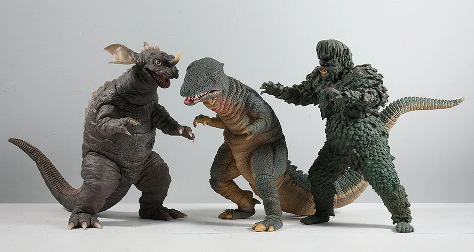
SIZE COMPARISONS
Here’s a size comparison with two of Varan’s buddies from the 50’s: the Toho 30cm Series Godzilla 1954 (which is a little taller than most figures in this line) and on the right, Anguirus 1955.
FOOTPRINT / SHELF CONSIDERATIONS
POTENTIAL TOPPLING
As mentioned earlier, The X-Plus 30cm Series Varan is apt to having tumbling issues. The figure’s right leg is so far behind the other that it’s very easy to tip it over if you bump his head just the right way. I don’t have any of the specifics behind these tales of toppling Varans, but I suspect that, in the summer months when vinyl gets softer than usual, that the right foot must start to bend under his weight which is only 3/4 of a pound. This is why I suggested putting marbles or something into the tail before attaching. This would weigh it down and help to hold him upright. Problem is having marbles in one of your figures can be annoying and we collectors shouldn’t have to do that.
Some alternatives would be to prop Varan up with support from another figure on his right side. Or, even better, use another figure’s tail (or some other weight) to lay over Varan’s tail (though the spikes may get in the way). I don’t know how likely it is that your Varan will begin to tilt down, but better safe than sorry. If you choose not to reinforce Varan, just keep an eye on his right leg and especially his right foot in the summer months and look for signs of bending. Hopefully none of this will be necessary. Some collectors have told me that their Varan is fine and always was.
SUMMARY
This figure made me a believer!

MORE INFORMATION
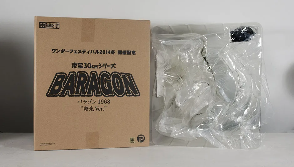
- Published on
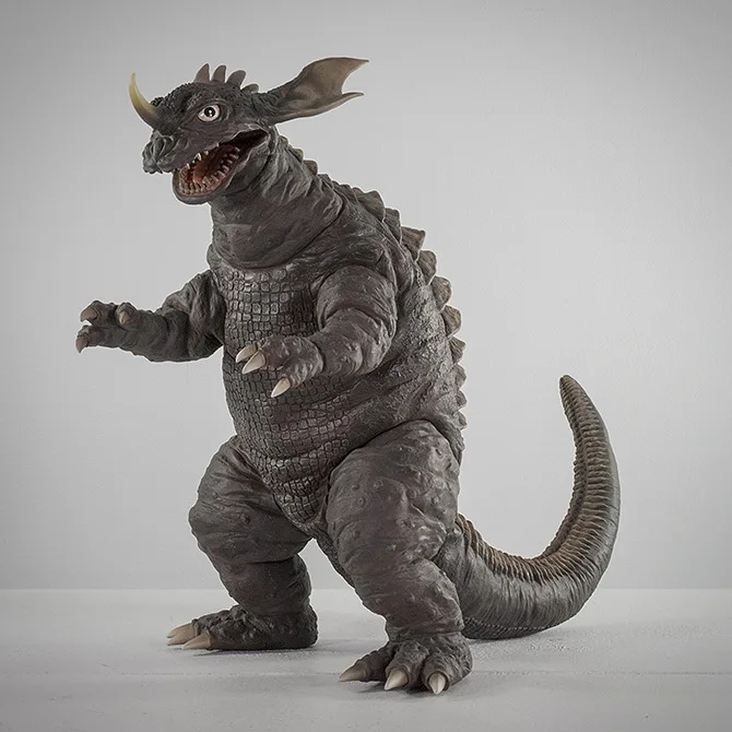
FIGURE SPECS
怪獣総進撃
This figure was re-issued in 2016 for the North American market through Diamond Distributors. The “Godzilla Kaiju Baragon 1965/1968 Version” was released, to everyone’s surprise, with a bonus alternate head so you could go for the Frankenstein Conquers the World look or the Destroy All Monsters look.
This review is for the 2014 Winter Wonder Festival Commemorative Edition. This figure should be mostly identical to the original release (sans the light gimmick).
THE BOX
Heat the hole on the body with a hairdryer until it’s soft, and then push the unheated tail in. The tail joint is a sort of triangular / elliptical shape and requires a little more effort attaching.
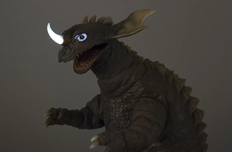
SCULPT
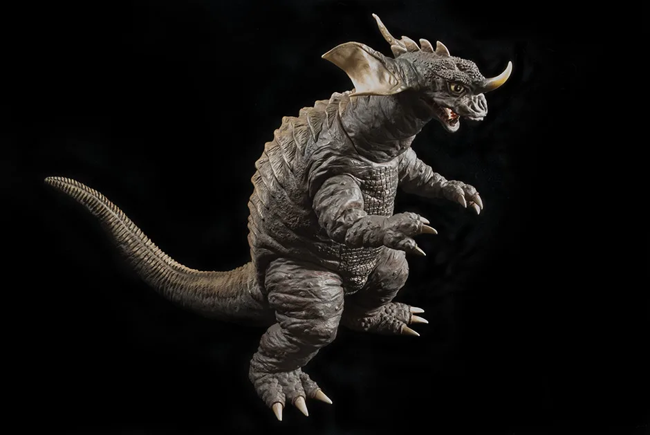
The head on this figure seems a little wider than it did in the movie. I suspect that would be because he’s standing and has nothing behind him, whereas in the movie he was crawling and had his bulk behind him.
The real giveaway that you’re looking at the 1968 version is that the horn is pointing up instead of forward as with the 1965 suit. As for details, they’re all there. Note that the corners of his mouth, as seen from the side view, really stretch far back into the head. I’m assuming this is because this suit was so beat up from being repurposed as Ultraman kaiju over and over again.
The jaw is crooked on my figure and leans towards the left. I don’t know if they are all like this or not but it’s not overly noticeable.


JOINTS & SEAMS
The ridges running down Baragon’s back and tail do a good job of concealing the tail joint.
POSE
And this standing pose demands less room on the shelf. His head is turned ever so slightly to his left so displaying him from a forward three-quarter angle on his left side would look best on the shelf. It also helps that his left arm is lower than the right so this angle of him looks especially nice. But this guy looks good from any angle!
PAINT JOB
The ridges which run down the back and tail are painted a lighter brown (almost tan) and is much more refined and subtle than on the Large Monster Series version. This looks top notch! That same lighter brown feathers over the claws and ears.
The teeth are a realistic-looking dirty white and look very un-toylike (which is a GOOD thing!) The inside of the mouth also has a more grown up unsaturated shade of red. The eyes are a brighter white and a bit stark, but that’s a good match for the real suit. They also have a glossy sheen to them.
The paint job is just great in my opinion.
SIZE COMPARISONS
FOOTPRINT
2014 Wonder Festival Special Feature
And then there are….
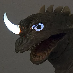
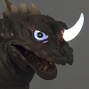
I’m sad to report that my Baragon figure is plagued with light leaks. Speckles show up all over his face and even more drastic are lines around the eyes. The figure you get may not be this bad, or have leaks at all. Then again, they might be worse.
I’m seeing light leaks from X-Plus figures all the time now. My 30cm Series Space Godzilla has them, and the entire right side of the face on my new Ultraseven Standing figure gets flooded with unwanted light when it’s turned on. I’m not sure how to fix this. Adding black paint on the inside may help, but in Baragon’s case, his face is deep inside the head piece and requires a 90-degree turn to get to it. Plus the wires are in the way. I guess there’s nothing to do about this problem except to keep the lights off.
Careful!

The paint on the claws and toes of most X-Plus vinyls can scrape very easily when handled. Toe scrapes usually happen when removing a figure from the shelf, moving it and, of course, drops. My Wonder Festival Baragon took a tumble while shooting photos for this review. Above you can see in the photo above: one toe was scraped and another lost a noticeable chunk of paint. My fault, yes, but it’s very easy to do, especially with Baragon’s long, thin toes.
The very nature of these vinyls tend to make one think that they’re safe, can take tumbles and don’t need the same care that, say, a resin model or statue require. But it’s that thinking that makes one overly carefree when handling these figures. Be careful!