

This section is a fully authorized reposting of content that appeared on Kaiju Addicts.com.

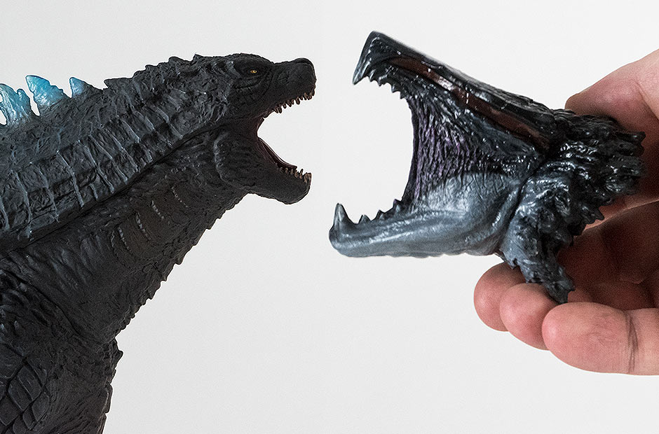
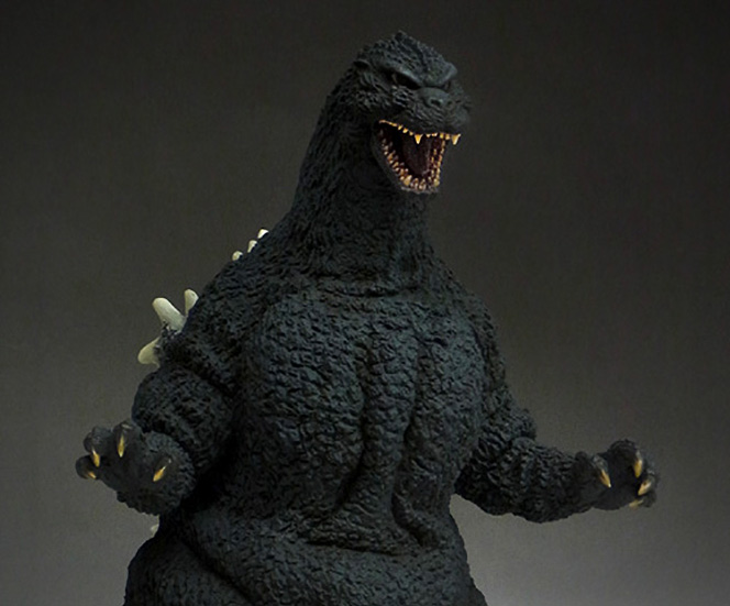
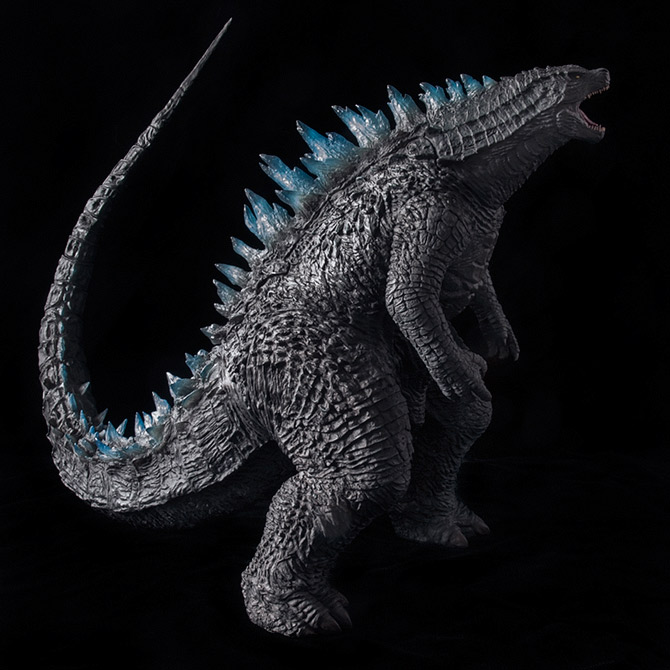 FIGURE SPECS東宝30CMシリーズ GODZILLA ゴジラ(2014) 限定咆哮VER. JAPAN ORIGINAL RELEASE: FEBRUARY 2016 NORTH AMERICAN DIAMOND REISSUE: FEBRUARY 2018 SERIES: TOHO 30CM SERIES MATERIAL: VINYL FROM: “GODZILLA”, 2014 HEIGHT: 13 INCHES / 33 CM WIDTH: (TOE TO TOE) 8.5 INCHES / 21.5 CM LENGTH: (HEAD TO TAIL) 17.5 INCHES / 44.4 CM FIGURE WEIGHT: 2LBS, 3OZ / 538 G REVIEW AND PHOTOS: © JOHN STANOWSKI The Toho 30cm Series Godzilla 2014 Roar Version vinyl figure by X-Plus (released February 2016) is mostly the same figure as the original version which was released seven months earlier. But, three key differences warrant its own review. Here, in this Quick Review, I will discuss the new head sculpt, translucent dorsal spines and nighttime paint scheme. You can get my thoughts on the rest of the figure in the Review for the Original Version. THE BOX
Unlike its predecessor, this new version of the figure comes in a plain, brown box with only a title and no art. If you are hunting for the Roaring version of this figure, this is what the box looks like. (The original version comes in a box with full color cover art.) If you need to measure your mail slot to see if this badass will fit through it on Box Day, I’ve added my phone in the shot to give you an idea of how big it is. Inside, the figure is in two pieces and wired into a plastic shell. You’ll need to connect the tail yourself.
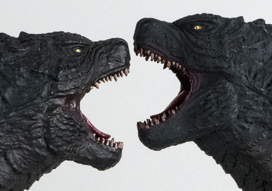
The tail joint is diamond-shaped so you’ll have to leave the “twist” out of the “insert, push and twist” routine when connecting the tail. RIGGING FOR LIGHT For those of you interested in rigging this figure with light: you probably can. The fins are already translucent and can let light pass, but they’re not that easy to get to. In the photos above you can see that the cavity inside the main body does go all the way up to the head, so you’ll be able to reach the topmost fins. Unfortunately, there is a wall along the back blocking access to the fins on the back. If you’re okay with it, you can remove the back fin piece and cut a hole or two through the back wall. Good news is, you’ll have a platform on which to attach your lights before glueing the fins back on. Note that you DON’T want to remove this wall. This is a big figure and that wall helps keep it stable. Plus, the head attaches to the body with the usual “suction cup”; it’s just been glued and filled. If you remove this back wall, the head won’t be as sturdy. (NOTE: Do NOT take this apart unless you know what you’re doing!!) As for the tail, you only have access to the upper half. Special thanks to Chatchai Shane Soychanawattana for the tail joint photos. This alternate roaring head sculpt looks awesome and I think it’s almost enough to change the whole feel of the figure. SCULPT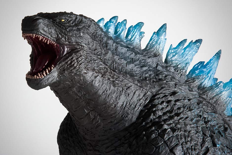 The Toho 30cm Series Godzilla 2014 Roar Version has virtually the same sculpt as the first version with the only difference being the head and neck which now extends upward in full roar. Actually, this is how we first saw this figure when it was teased at Super Festival 67 back in January 2015. An unpainted prototype sat on the X-Plus table with two different heads at this show. And it was the roaring head that sat on the figure while the standard head lie at its feet. 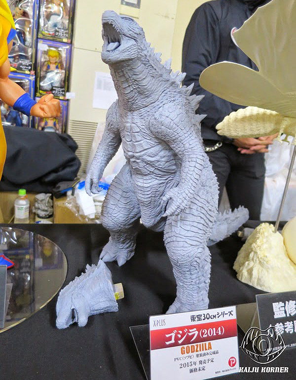 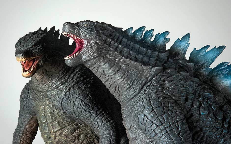 This alternate roaring head sculpt looks awesome and I think it’s almost enough to change the whole feel of the figure. POSE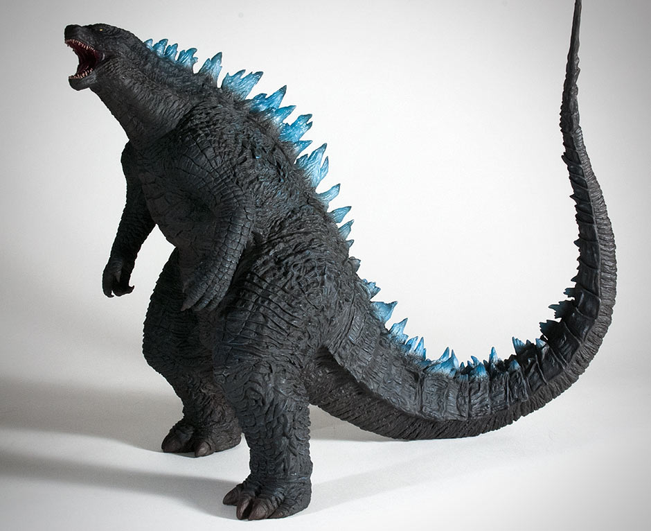 Funny how this version almost feels like a whole new figure with just a new head sculpt, blue fins and darker paint scheme. JOINTS & SEAMSThis figure has the same seam issues that the original had. Ring Around the Shoulders and Ring Around the Neck. I discuss the distraction they cause in the review for the original. The dorsal fins have been molded in translucent vinyl with a tint of blue to represent the powering up of Godzilla’s atomic breath. PAINT JOBX-Plus hasn’t come out directly and said that this new version has a nighttime paint scheme (like they did previously with the 30cm Series Gigan 1972), but it’s obvious that it does. The figure has an overall darker shade of black; perhaps with a tinge of blue added. Gone is the tan on the belly and under the tail. And gone is the mustard mustache around the mouth. This is kind of what I was expecting to get – colorwise – the first time around. 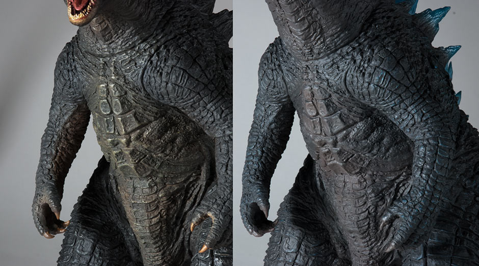 Dark blue highlights are added all over but you can’t really see them. To the naked eye, the figure looks like it’s all one shade of black (with the exception of the some visible highlights on the sides behind the arms.) My photos above have been slightly exaggerated so that you can see they really are there. 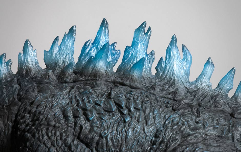 The dorsal fins have been molded in translucent vinyl with a tint of blue to represent the powering up of Godzilla’s atomic breath. Now, it’s REALLY starting to look different! I’ve heard comments online that the blue fins make the figure look toyish. I can assure you it’s not like that in person. Cameras have a way of exaggerating the blues. Trust me, it looks good in hand. It looks like they sprayed on a thin coat of white mid-fin before feathering the black color from the skin on the bases. Note: the blue highlights on the side texture. These are visible to the naked eye. 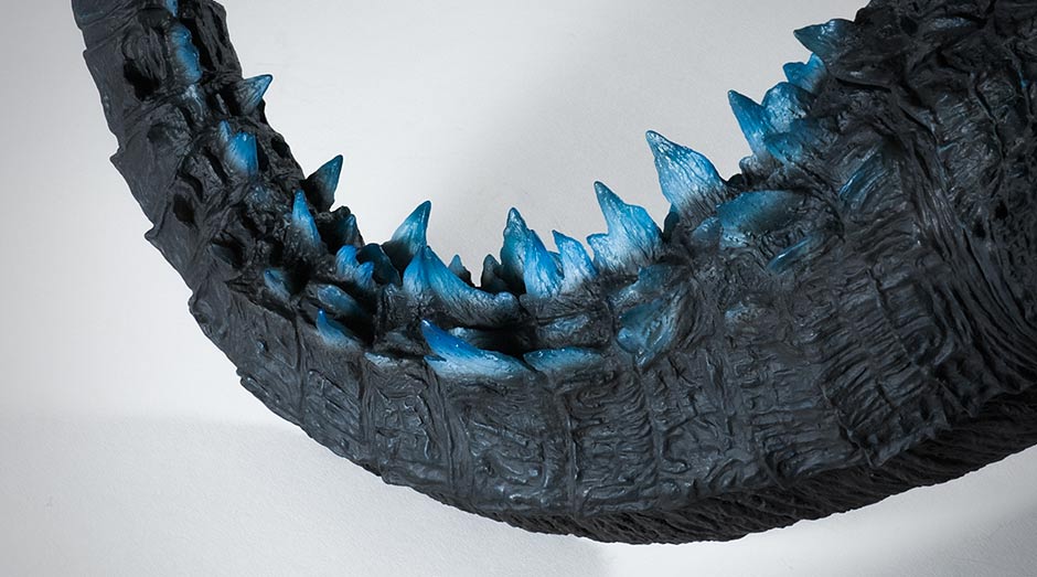 The paint on the fins is precise and looks fantastic. You can see the effort that went into this figure by looking at the tail where the fins start to become shorter and more spread out. 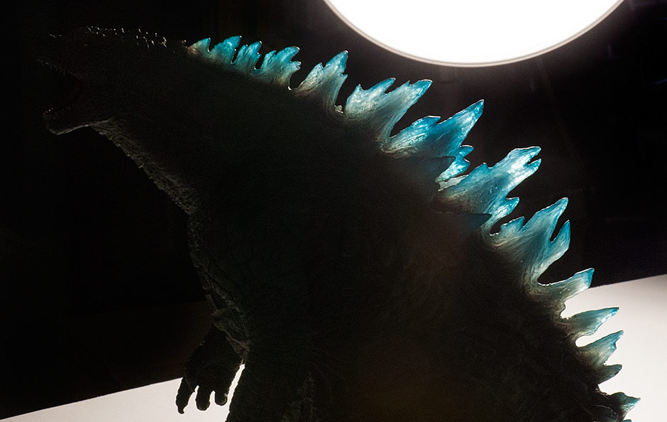 And, of course, light can pass through the fins. MOUTH One final difference in paint from the original release is the inside of the mouth. Blue has been mixed in for a sort of dark magenta color. Personally, I find this color distracting; it reminds me of nail polish. See for youself in the next photo below… COMPARISON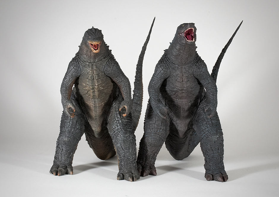 There’s little difference in the sculpt between the original Toho 30cm Series Godzilla 2014 (left) and the Roaring version (right). 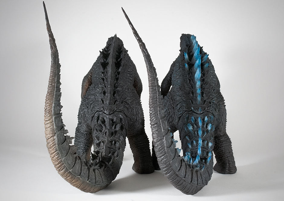 NORTH AMERICAN (DIAMOND) REISSUE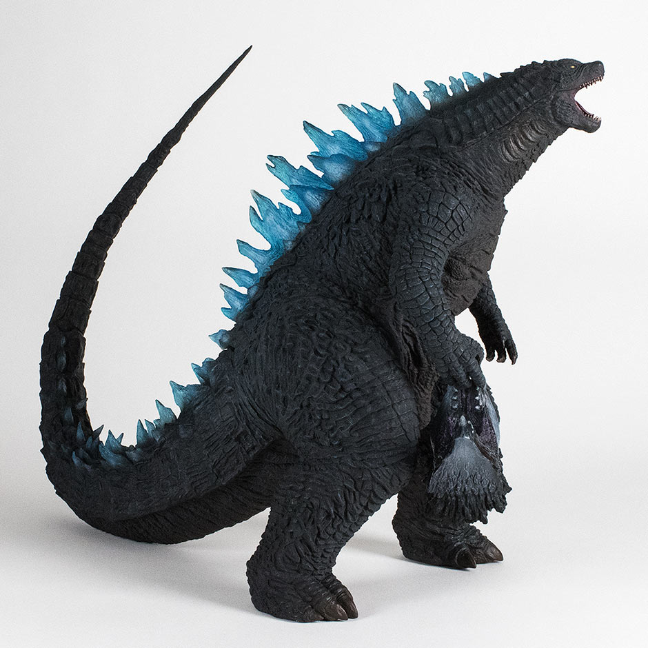
  SUMMARYThis figure is hot and I give it 4 1/3 Rads out of 5. You’ll want to wear a radiation suit while handling it. It has a fantastic sculpt that represents the 2014 design very faithfully and also captures the CGI monster’s personality in the pose. The blue fins are exciting and the tail joint is fairly well hidden. It still has, however, a distracting intersection of seams around the neck and shoulders. It also could have done with more highlights to counter the sea of black that it is now. Bad points aside, it’s an OUTSTANDING likeness. I’m really glad that I got it, even though I already had the original version. I now keep one with my collection, and another in my office. MORE INFORMATIONX-TRAS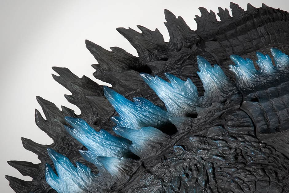 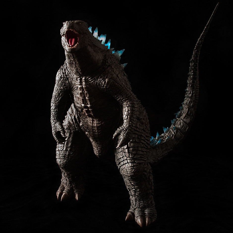  By John Stanowski Originally posted February 10th, 2016 on Kaiju Addicts.
0 Comments
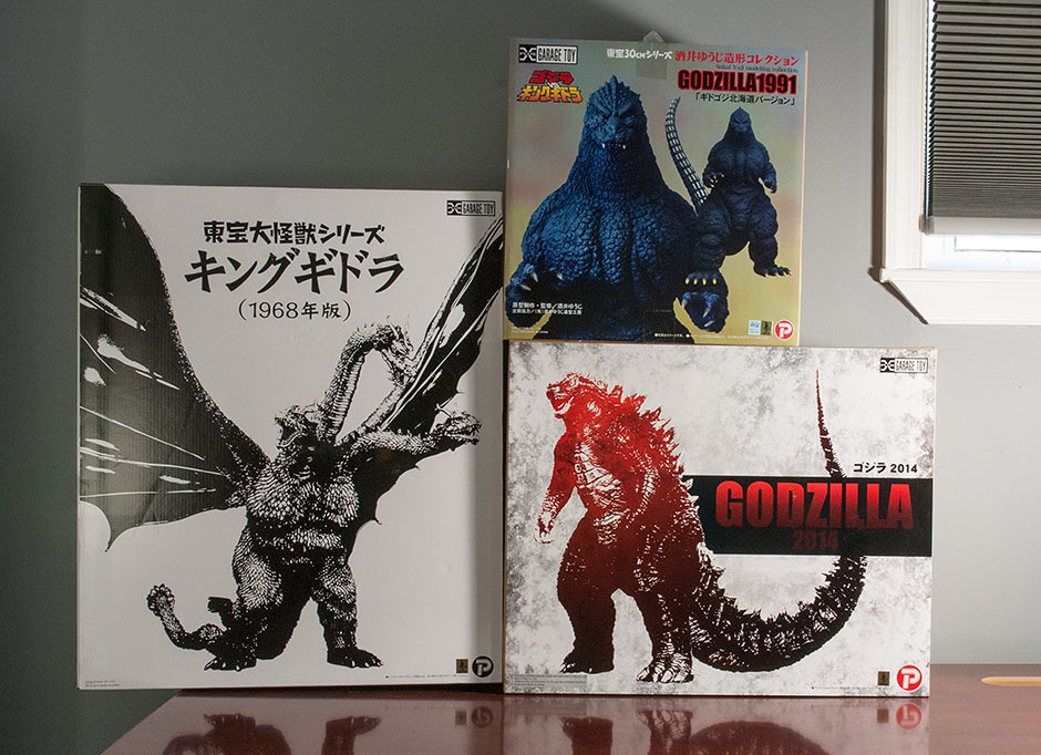
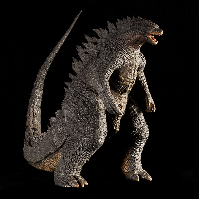 FIGURE SPECS東宝30CMシリーズ 「ゴジラ(2014)」 JAPAN ORIGINAL RELEASE: JULY 2015 NORTH AMERICAN DIAMOND REISSUE: JUNE 2017 SERIES: TOHO 30CM SERIES MATERIAL: VINYL FROM: “GODZILLA”, 2014 HEIGHT: (HEAD TO FLOOR) ABOUT 12.75 INCHES / 32.3 CM, (TAIL TO FLOOR) 14.5 / 36.8 CM WIDTH: (FOOT TO FOOT) 8 INCHES / 20.3 CM LENGTH (NOSE TO TAIL): ABOUT 17.5 INCHES / 44.4 CM FIGURE WEIGHT: 2 LBS 4 OZ / 1020 G REVIEW AND PHOTOS: © JOHN STANOWSKI The Toho 30cm Series Godzilla 2014 vinyl figure by X-Plus was released in Japan in July of 2015. It’s 12 3/4 inches tall from the top of the head down with a tail that reaches almost two inches higher. This looked cool as hell right out of the box, and after having spent so much time with it for this review, I’ve come to like it even more. I do have a few nitpicks, but they’re not enough to kill the excitement of adding this AWESOME vinyl to my collection. THE BOXFirst, I have to mention that the size of the box is a lot larger than I expected. Because of G’14’s long, curling tail, the box is about 150% wider than usual. Below the 2014 box are a couple other of other boxes from somewhat recent releases.
 The box sports a new cover design. Unlike X-Plus’ last attempt at new art (for the Sakai’s), this design is pretty freaking cool. If you’re shopping for this online, or you find this on a store shelf, this is what the box for the Standard Version looks like. If you’re after the RIC BOY version, the box is the same except that the RIC has a round, yellow sticker on it. Inside, as usual, the figure is nested in a plastic shell in two pieces: body and tail. ADDING THE TAIL
Hmm. Looks like we’ve got a diamond-shape thing going on here. That means not much twisting is possible when attaching it. Fortunately, adding the tail on this guy isn’t as bad as it looks. Just make sure you keep the tail end cool and/or hard while you soften up the butt with a hair dryer. You may have to soften it up more than usual since the leg joints are close to the hole which makes that area a bit less pliable even when heated. Also, note where the back fins meet the tail that there are two layers of vinyl which will restrict movement even more. As Rich Eso always says, “Make it Squishy Soft.” Even though you can’t fully twist this tail on, you can wiggle a little bit back and forth while you try to get the tail flange securely in the hole and not bunched up. Collectors are reporting this task as both easy and difficult. Make sure it’s easy for you and get that hole on the body really warm and soft first. Sad to say that this tail joint, like the Gigantic Series Godzilla 1995, leaves a little bit of a gap. It sort of looks like it’s not properly on but I think that’s just the way it fits due to all of the pieces which intersect at this joint. If you see this gap, just push again a little harder, wiggle it back and forth a little and then push even more. When that gap is mostly gone, PUT IT DOWN and let the body cool around the tail while it’s snug. You might also want to try running the joint under cold water to harden the figure while pressing the tail in. Before you do all of that though, take a look inside the figure and see how it was assembled. You’ll note that both arms and legs have joints the same as the tail (with the only difference being that they were glued and filled after assembly). Knowing this now, you might want to avoid lifting the figure up by grabbing just an arm or a leg. SCULPTAnd now, the figure: 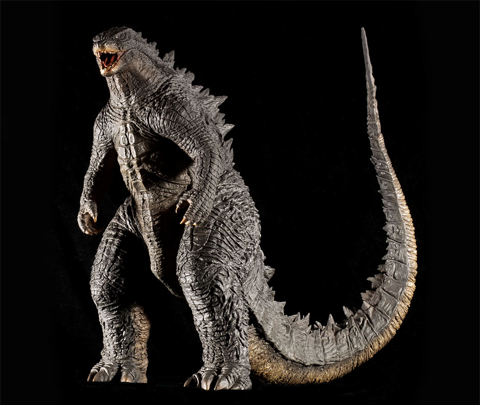 First let me say this: HOLY HELL! THIS FIGURE IS AWESOME! Next, I’ve only had a little over a year of seeing this Godzilla in action so I haven’t memorized every nook and cranny of the design. I’m relying more on the “image” of this Godzilla in my mind from seeing the movie about 6 or 7 times (often fast forwarding past most of the Aaron Taylor-Johnson scenes and many of the Serizawa gawking / having assistant speak all of his lines scenes (rant over)). And based on the Godzilla 2014 in my mind, this X-Plus sculpt is a Home Run. Well, mostly anyway. Kaiju-sized kudos to X-Plus for accomplishing such a complex sculpt! Think about it. All Godzilla designs in the past have been suits made by hand. And nothing against them (I love them), but they didn’t really take that long to design and build. But, this guy… This guy needed to have a plausible animal design to satisfy mainstream audiences while at the SAME TIME needing to appease US as well as 50 years of history! That’s a tall order. This design was pored over. And over and over. There were separate people nailing down the design on every part of his body. The scales alone had 4 CGI artists working for almost 6 months to get all of those textures looking the way they do now. That’s not animating or rendering; that’s just designing! What I’m saying is, every little part of this design was tweaked and tweaked and tweaked to perfection (or their idea of it). With so many people working on every part of this design, it’s bound to be more complex. The texture of the skin alone is complex changing from square scales to boney plates to pointy scales, etc. So what’s left for X-Plus’ sculptors to do? Nail every part of this complicated design in clay and vinyl. And, I think they did just that. I compared this X-Plus figure to NECA’s 24-Inch Head-to-Tail articulated figure which was created using CGI information right from the monster’s 3D model. I used NECA’s figure as a roadmap to the 2014 design and compared the X-Plus to it. And get this: TONS of details, some down to particular scales and fins, are extremely similar — even down to the spacing between these features! X-Plus absolutely took their time and looked at every square inch and replicated it. What this means is the Toho 30cm Series Godzilla 2014 vinyl figure has crazy-accurate detail far beyond the point with which you’re even aware of! So, just know this: this figure has a whole level of accuracy which you can’t even see. Now, that makes me feel good. I really, really like knowing that the 2014 sitting on my shelf right now is the shit. Once again, X-Plus proves it’s worthy of our devotion. 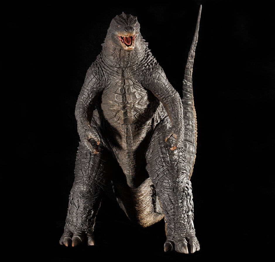 Ah, the front view. Not crazy about the front view. But that’s a design issue, not a sculpt issue. In fact, I’m not crazy about the front view on this X-Plus sculpt almost exactly as much as I’m not crazy about the front view seen in the movie. So, I reckon’ X-Plus did a devilishly good job of recreating this design in vinyl. 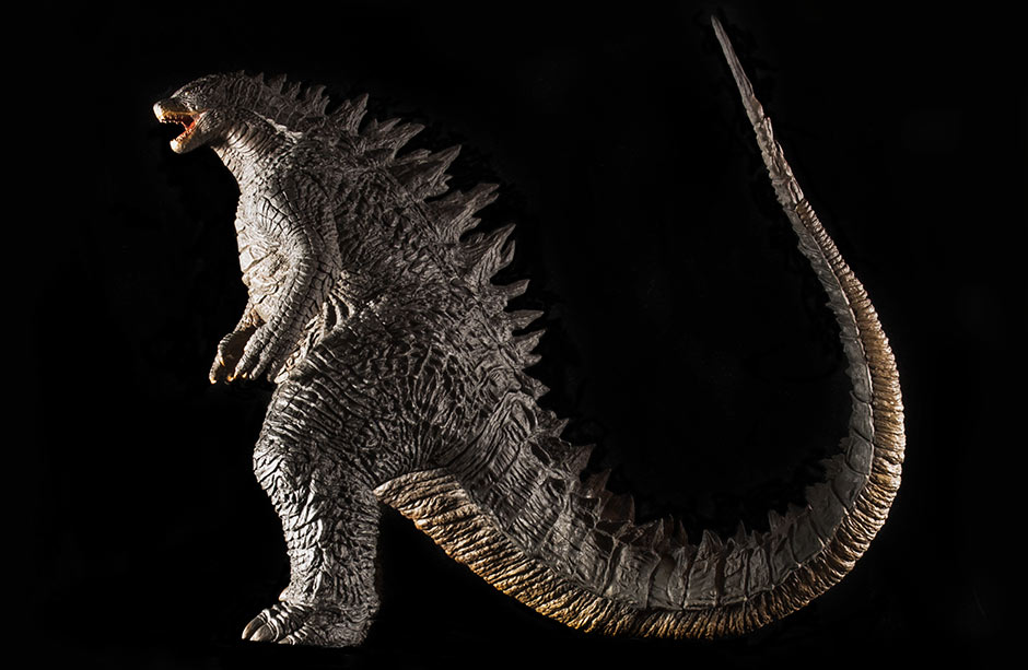 And here we have the flank. Once again, it’s a dead-ringer for the “real” thing, yah? Or maybe… it’s a bit fat? I know this design is intentionally fat, but… I don’t know. I think maybe this sculpt is a tad more bloated than it should be. Look at this photo of a comparison between it and the CGI-derived NECA. Keep in mind that the NECA is shorter. What do you think? 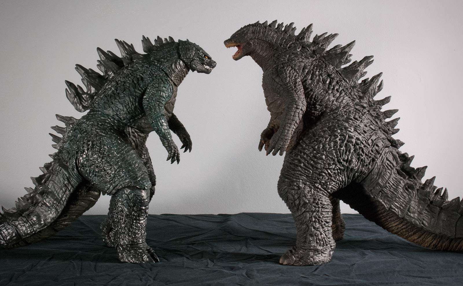 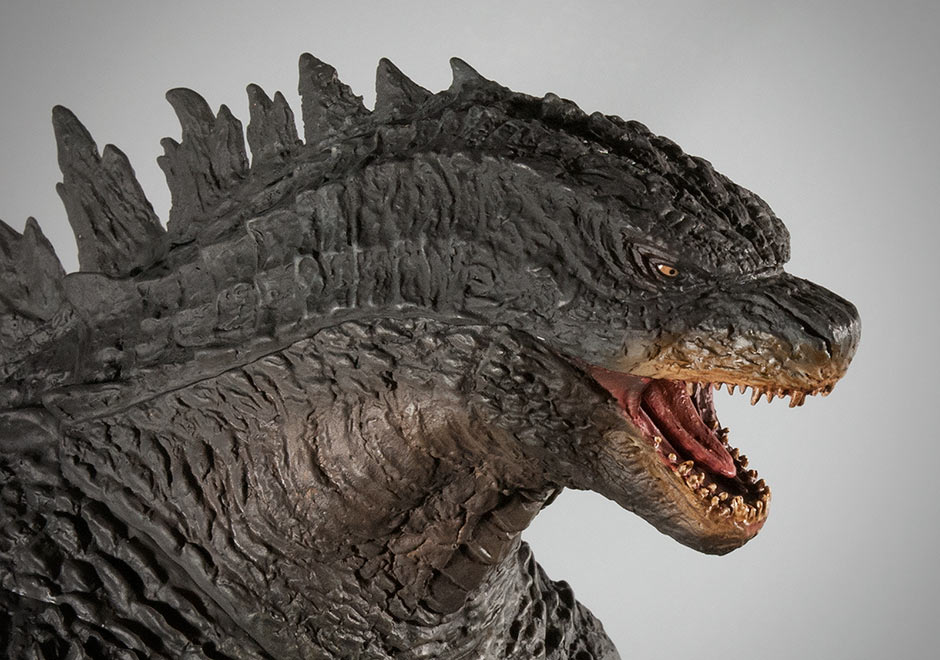 THE HEAD Impressive. Most impressive. I’m not a huge fan of the snouty look on the 2014, but I’m getting used to it. And now I can get used to it with my X-Plus figure because it’s a great replica. I’m totally impressed by the tiny eyes and tiny INDIVIDUALLY SCULPTED teeth. Granted, in close-up photos the teeth can look a bit rounded but… they’re TINY. You don’t see that rounding normally. With the naked eye they look FANTASTIC. I give them an A+. Also note the individually sculpted tongue. Yet another awesome perk feature from X-Plus. Oh. Not very happy with that mustardy overspray around the mouth. It’s on a bit thick. But, I’ll save the bitchin’ for the Paint Job Section.  Great googly moogly! LOOK at that! I freaking LOVE those crocodilian features on the back of the head so reminiscent of the GMK design (which also lended its “gills”). And they look crazy good on this figure. Not overly nuts about the wildly diverse and “leafy” patterns hugging the sides of the fins. But my opinion aside, X-Plus nailed those, too. They also nailed the dorsal fins. All hail X-Plus! I really, really like knowing that the 2014 sitting on my shelf right now is the shit. Once again, X-Plus proves it’s worthy of our devotion. POSEX-Plus says that this pose is right out of the movie, though I’m not sure which scene it came from. It certainly looks like a well-captured standard G’2014 look. And it’s neutrality is a big plus, at least for me. Extreme poses, like the one on that Sideshow statue kind of limit your interpretation of the piece. This pose here… looks good for all occasions.
One little thing I’d like to nitpick on is the position of the tail. It swoops up into the air, no doubt to make room for the figure to fit into an already large box. Thing is, at some angles it sort of reminds me of a scorpion or something. The tail looks alive and ready to stab like one of Iris’ tentacles. Fortunately, you don’t get this vibe when the figure is facing mostly forward. And one last thing I just noticed which shows the insane amount of attention this figure got: About 3 or 4 inches away from the very tip of the tail is a super slight kink. Almost looks like this Godzilla got his tail slammed in a door when he was a pup. This kink is right out of the movie. Remember right before the bridge scene when Godzilla’s tail towered out of the water over the battleship? You can see this kink there clearly. And now, thanks to mammoth OCD from X-Plus, it’s on the figure, too. X-Plus… more than meets the eye. JOINTS & SEAMSThere are no “working” joints on this figure. But, that’s not how the figure started. As I mentioned earlier in the Tail section, peering inside the figure reveals that both arms and legs are attached to the body in the same exact way the tail is. The only difference being that the joints were glued and the remaining seams filled and painted over. Now, collectors seem to be generally happy with this figure as far as seams go. And, I hate to be a whiner, but, I need to do it anyway. These seams on the legs are hidden only fairly well within the creases and texture of the sculpt. The arms, however, are not so well concealed. With nothing in the sculpt to help hide them, and a flat texture in that area, the arm seams have no choice but to reveal themselves. To me, I see them every time I look at the figure. It’s the fact that I keep reminding myself that this is a vinyl, and this is how vinyl’s can be, which is preventing me from actually getting annoyed with this. Not helping matters, these over-the-shoulder seams work in concert with the lower neck seam to create a cacophony of lines concentrated in too tight a space. This group of lines together make a sort of tank top pattern with a loop under the neck and around both shoulders. Sigh. At least that lower neck seam isn’t as deep as it was in the early production photos. There are other filled seams traveling away from the corners of the mouth, and down the side of the neck before angling to loop around the lower neck. This is all a separate piece. the lower jaw itself may actually be yet another separate piece, but if it is, it’s well hidden. As we’ve seen from the Tail Section, the tail is actually several pieces. Most notably the final segment. I don’t really detect any seams here. But the tail joint itselfisn’t very snug and leaves a gap. The back dorsal fins are sculpted onto a separate piece of vinyl which is glued onto the back which, as we’ve already seen from the Tail Section, actually has a wall there for added support. Seams running laterally along this piece are fairly well hidden. However, on my figure at least, I have a couple of tiny holes from either a poor fit or a poor filling job. (the same sort of holes which are common on the 30cm Series Gorosaurus 1967). I really didn’t even notice them though until I took the figure out under the sun to get a good look at the paint job. So, if you’ve got them too, they’re probably not very noticeable. PAINT JOBWhen photos of the X-Plus Godzilla 2014 first started appearing online, I began to panic. Many photos showed an overly vibrant and gaudy belly glowing in bright yellows. If you’ve seen these shots as well, rest assured: what you’re seeing is just crazy phone camera tricks. In hand, the figure has a very subtle paint scheme. The unsaturated yellows (or tans) on the chest spread out onto the insides of the arms and legs and traverses almost the entire length of the bottom of the tail. This touch of color is pretty much the only thing added over the flat, asphalt black base coat. Very un-toylike, very cool, very X-Plus. I’m especially glad this yellowish highlight is so subtle because, honestly, I didn’t even know why it was there in the first place. I don’t remember seeing this ‘yellow streak’ in the movie. And, I was perplexed when I saw it coming out on other toys like the S.H. MonsterArts, Bandai and NECA figures. It turns out this coloring is present on Gareth Edwards original maquette as seen below on a page from the book Godzilla The Art of Destruction. 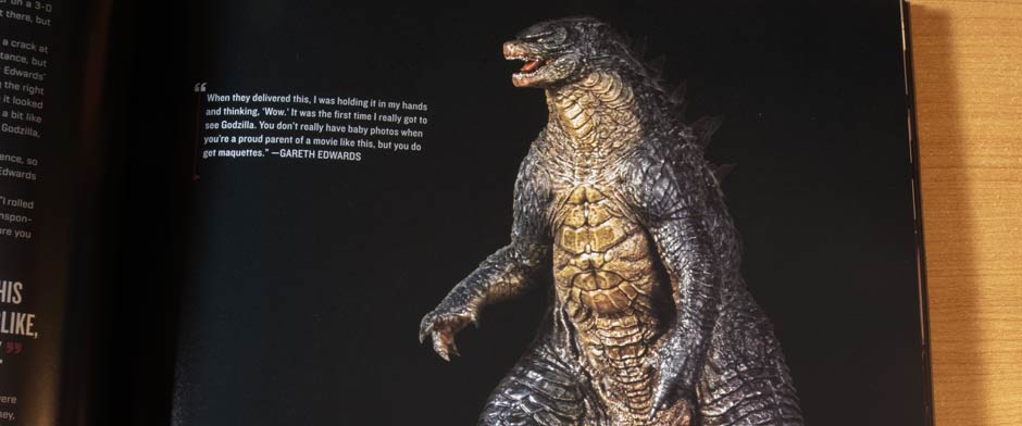 Okay, so the yellow is on the maquette. But I still don’t remember seeing it in the movie. Do you see any dominant yellow highlights contrasting the black in the shot below? (Keep in mind this is a warm, yellowish shot.) 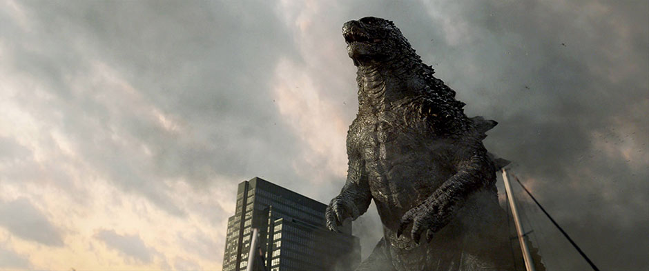 How about here? 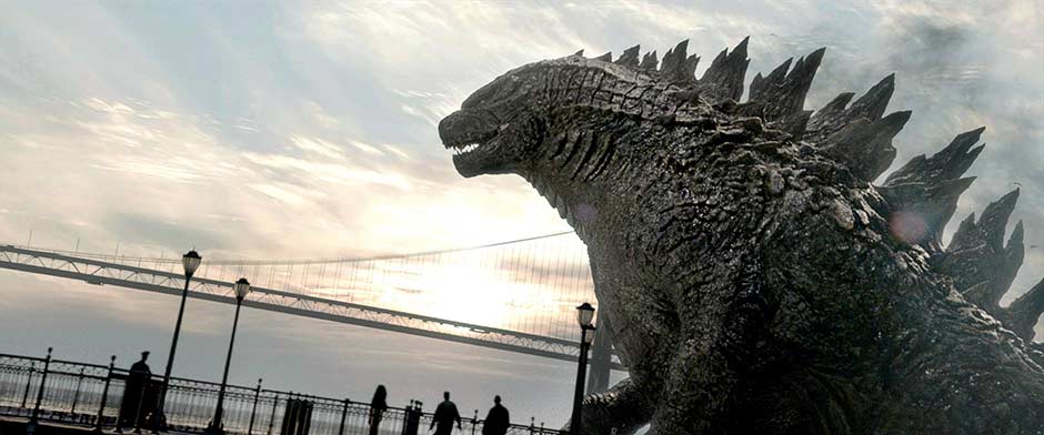 I’m not seeing it. I appreciate the fact that it’s “supposed” to be there. But, it just doesn’t show well in the CGI. So I guess what I’m saying is that I wish this coloring was a bit more subdued, as in almost not even there. ESPECIALLY around the snout. Surrounding the mouth is a gaudy spray of the same yellowish color applied to the chest. And there is far too much of it. Again, yes, it’s on the maquette. But I don’t pop the maquette into my DVD player every now and then. The only one who sees that maquette is Gareth Edwards who, I think, got to take it home. All in all, I’m not against the yellow. They do add a little something to the figure. I just wish there were less of it. Especially around the mouth. If I ever get the nerve to try to find a black paint which matches the figure, I just might drybrush over it. OTHER HIGHLIGHTS Lighter shades of the black bring new meaning to word “subtle”. Sparingly applied over the higher elevations on the sculpt, these are true highlights in that they are no doubt meant to use brightness in order to mimic light hitting some of the peaks on the skin texture in the sculpt. They are applied mostly on the sides of the legs and can also be easily seen on the top and sides of the head. You have to really look for them on other parts of the vinyl. But they are there. Seems a lot of effort went into applying a nearly invisible shift in color. Kudos to X-Plus for making that effort. This figure wasn’t just churned out of the paint department. They really worked on it. EYES The eyes are freakishly tiny on this 30cm Series figure. And, get this, they measure LESS than 1/32 of an inch! And yet, somehow, they managed to add color there without “going out of the lines”. On top of that: they managed to paint ULTRA SMALL black dots to represent the pupils and irises. Once again: AMAZING effort and attention to detail. MOUTH INTERIOR & TEETH The mouth interior has a medium, unsaturated red/pink coat which is just enough color to make it look… mouthy, and yet not toyish. Now the teeth… WOW. I’ve already gone into how TINY the individually sculpted teeth are. But, can you imagine the nightmare it would be for one to paint those? And to paint them realistically? Well, they’ve gone and done just that. They are colored with a bony tan with dabs of overly bright white added to make them stand out. Now, usually I am against bright whites on teeth as they are too bold and unrealistic and toyish. But these practically microscopic dabs of bright white blur into the surrounding colors when viewed by the naked eye. Again, highlights done right. Now you may see photos of the teeth and think that perhaps they look gunky in a Sakai ’89 sort of way, but keep in mind you don’t stand a chance of seeing the same thing with your naked eyes as a good camera close-up could. All in all, teeth are painted surprisingly well. CLAWS The claws on the hands are painted fully with an orangeish, bony tan. Very subtle, yet they stand out just the right amount. The claws on the feet, however, did not get the same treatment and were, instead, lightly sprayed at the tips. Not sure if it is supposed to be that way or if this was a creative decision. Either way, I’m actually GLAD the toes were merely misted on the tips with an airbrush. The toes are too large and painting them fully would have made them stand out more. JUST ADD LIGHT The overall paint job can look a bit flat in certain lighting conditions. If you want to really make your 2014 shine, just add some hard light and let it play off the insanely awesome skin textures in the sculpt. It’s big. It’s detailed. It’s accurate. And it’s AWESOME! NECA COMPARISON Up until now, our best option to have Godzilla 2014 on our shelves at this scale was the NECA 24-Inch Head-to-Tail articulated figure. And so, a comparison is in order. Especially for those non-X-Plus collectors who are trying to decide which figure suits them best. Right off the bat, the X-Plus vinyl is noticeably taller (and un-riddled with joints), but even coming in over 2 pounds, it’s a lot lighter than the NECA which has a lot of I-must-be-expensive heft to it (even though it’s only around $60). I suppose the most important comparison should be made against the sculpts. Supposedly, the NECA is built from 3D data from the original 3D model. It doesn’t get any more accurate than that. That’s why I’m comparing the X-Plus to it. And it’s close! At a glance, there’s little difference between the two. Looking closer, the X-Plus seems fatter from certain angles. Most of the differences seem to be found on the head, even though it looks totally fine to me. For those of you who had been using the NECA as a placeholder for the X-Plus version on your shelves, there’s no reason to discard it now. It’s still a great figure. Put it in a different room. If you have a desk job, take it to work. (Just lay off the roar feature!) SIZE COMPARISONS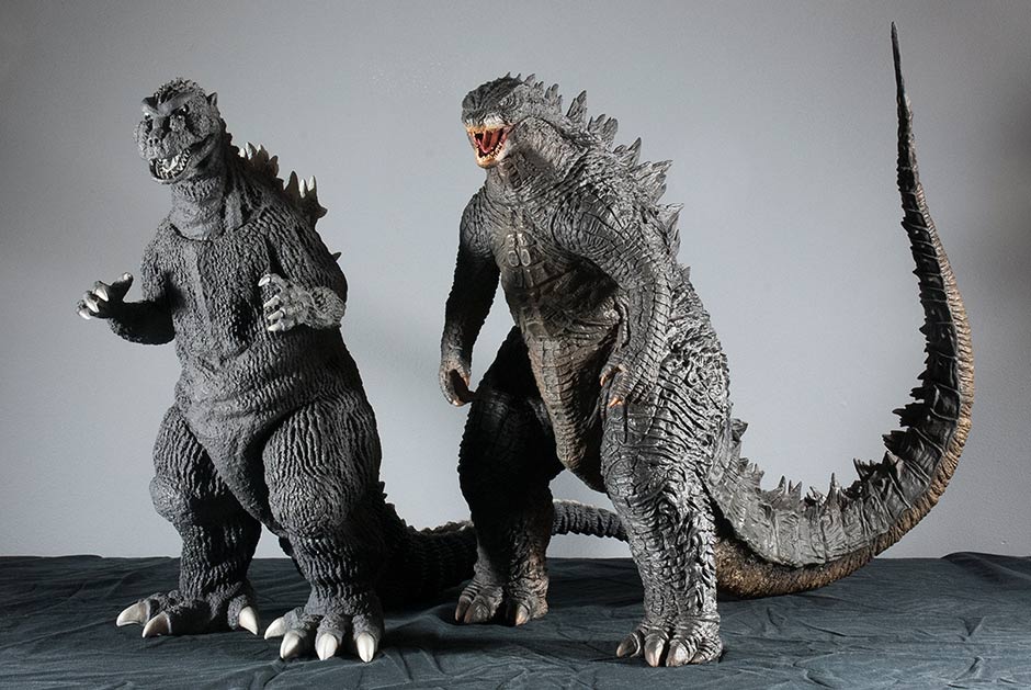 On the left, we have the original King of the Monsters, the Toho 30cm Series Godzilla 1954. And on the right, X-Plus’ newest entry: the Toho 30cm Series Godzilla 2014. At 12 1/2 inches, both are some of the taller figures from the 30cm Series. 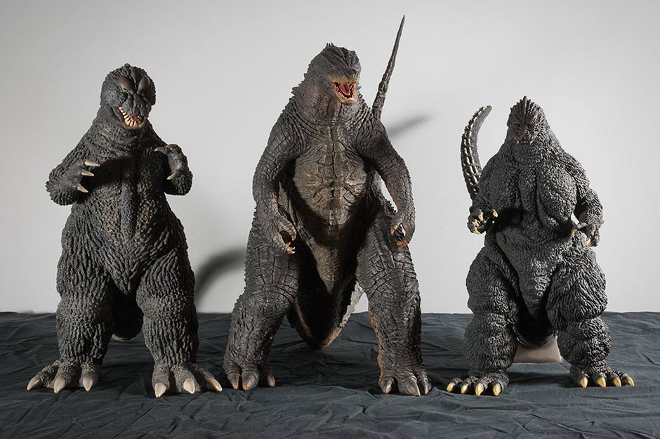 Here’s the new guy flanked on the left by fan favorite: the Toho 30cm Series Godzilla 1964 which has a very typical height from this series. The new 2014 stands just a tad taller than the ’64 and most other 30cm vinyls. To keep the size comparison relevant to recent releases, on the right we have the Toho 30cm Series Yuji Sakai Modelling Collection Godzilla 1991, way shorter than Godzilla 2014, and shorter than any other 30cm Series Godzilla for that matter. (But I think it’s still, hands down, figure of the year with Godzilla 2014 being a contender for second place… so far.) 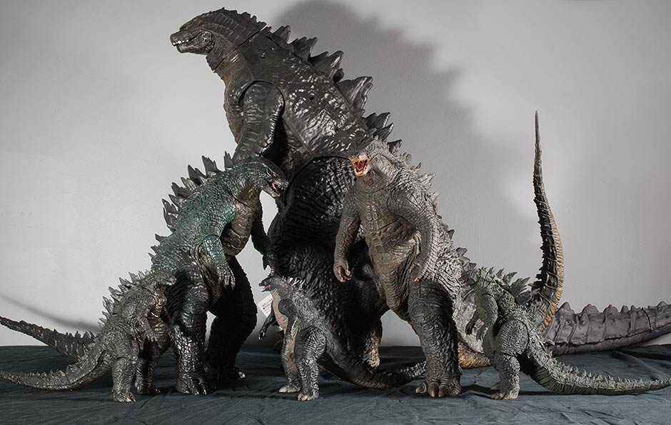 For those not avidly into X-Plus as a line, but still love to collect the Hollywood Goji figures, this size comparison is for you. Towering in the rear is the Jakks Pacific. In the middle row is the NECA 24 Inch Head-to-Tail figure and to the right is X-Plus. In the front row, left to right: the NECA 12 Inch Head-to-Tail quasi-articulated figure, the Bandai Movie Master Series vinyl and finally the S.H. MonsterArts articulated figure. FOOTPRINT / ON THE SHELF The X-Plus Godzilla 2014 is surprisingly friendly on the shelf, assuming said shelf has enough headroom for the 14 1/2 inches of the upraised tail. But, it’s thanks to that upward tail that this figure doesn’t cause any trouble on the sides. As you know, long tails run to the back of the shelf, hit the wall, and force us to pose them at angles (at least on narrow shelves) whether we want to or not. This figure is 17 1/2 inches from the tip of the nose to the back of the curved tail. As usual, subtract 2 or 3 inches if you place the feet right at the edge of the shelf and let the figure’s head hang over the edge. (14 1/2 inches long if you go that route.) Not bad. The figure’s 8-inch legspan is only a tad wider than what we’re already used to and also doesn’t hog extra space on the shelf. RIC BOY EXCLUSIVE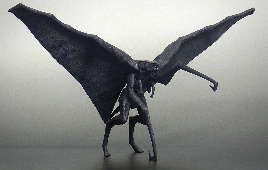 I have the Standard Version of this figure so I do not have this mini Male MUTO which comes with the Ric Boy Exclusive Version. I can’t really comment on anything which I can’t glean from the above photo taken by X-Plus. I can tell you that this mini figure is definitely NOT in scale with the main figure, but if placed at the rear of the shelf, you could go for a faux perspective look (as in: it looks smaller because it’s further away.) I heard this mini MUTO has a nice “sand paper” texture on its wings. And though it lacks the whiteish front from the “real” monster in the movie, it looks like a decent replica. SUMMARYOverall, I give this figure an A-. It has some flaws: seams, gappy tail joint and mustard moustache. Everything else, though, is FANTASTIC! It’s my favorite Godzilla 2014 figure/statue to date and I think it’s a runner up for X-Plus Figure of the Year. It’s big. It’s detailed. It’s accurate. And it’s AWESOME! WHAT’S NEXT?Do you know what would make me flip out right now? A female MUTO by X-Plus. Is it possible? I don’t know. But what do you think about the very idea? Do you want a 30cm female MUTO? Say so in the comments; X-plus looks at this site! MORE INFORMATION
X-TRAS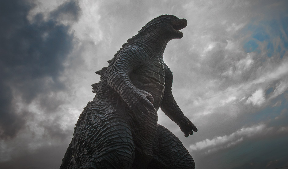 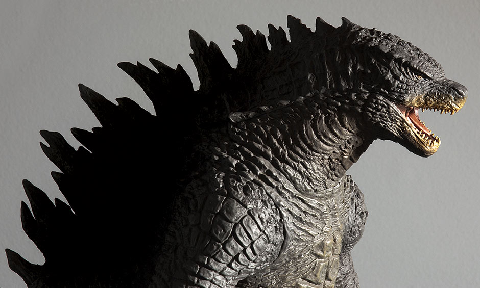  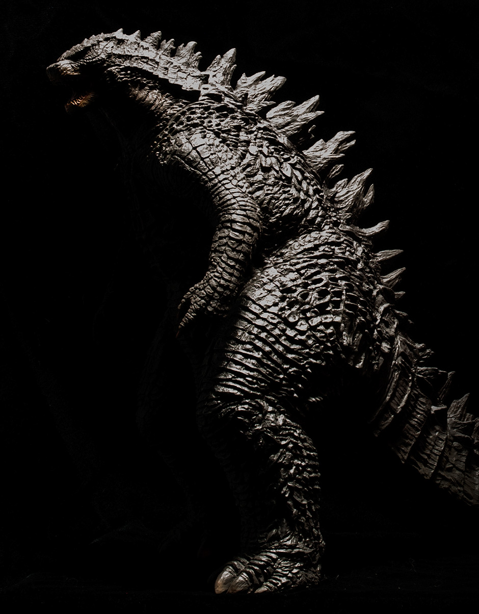 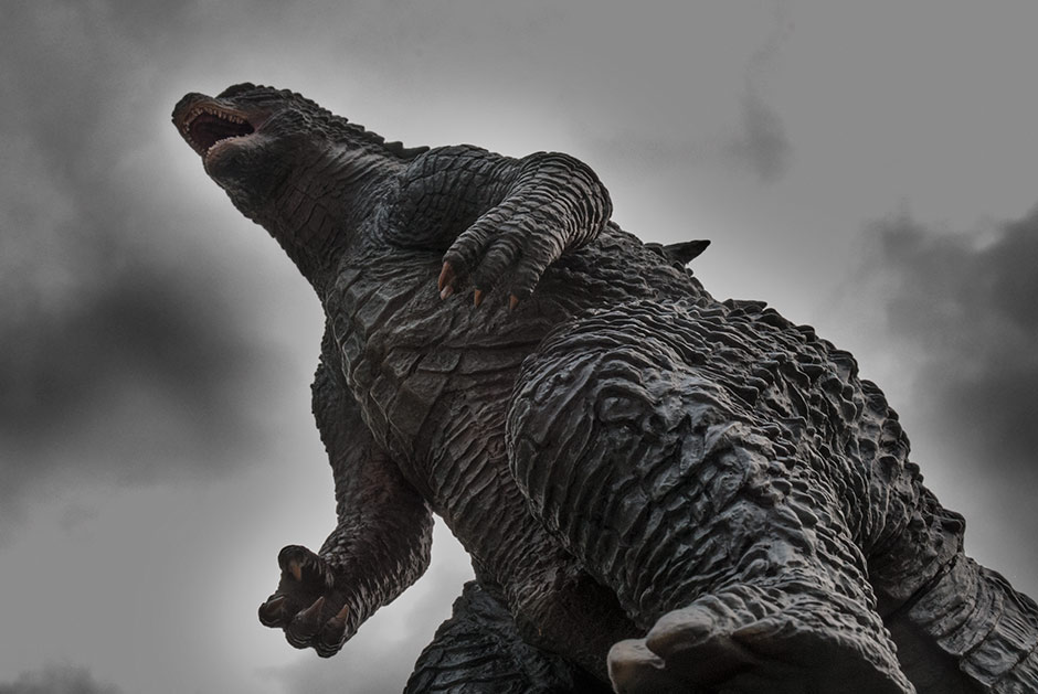 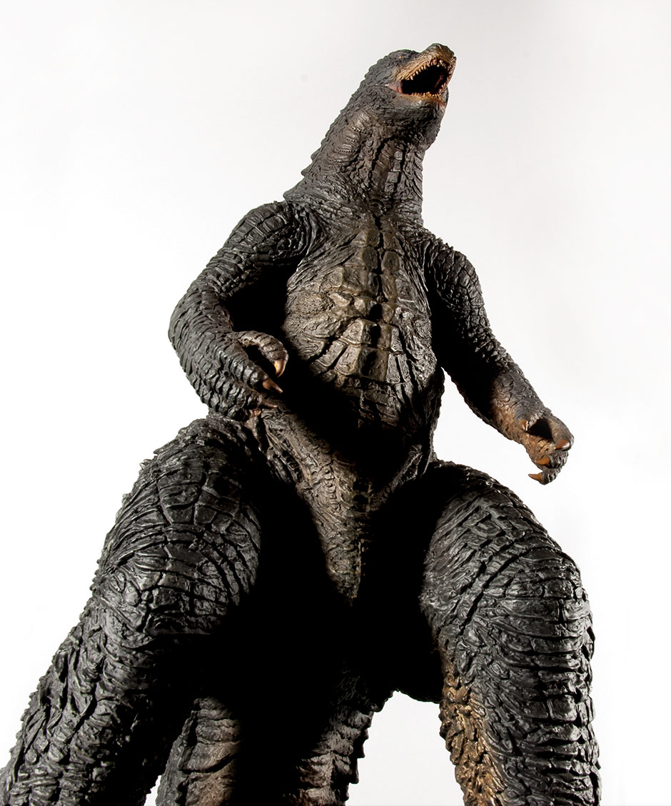 COLLECTORS GALLERYBy John Stanowski Originally posted July 18th, 2015 on Kaiju Addicts.
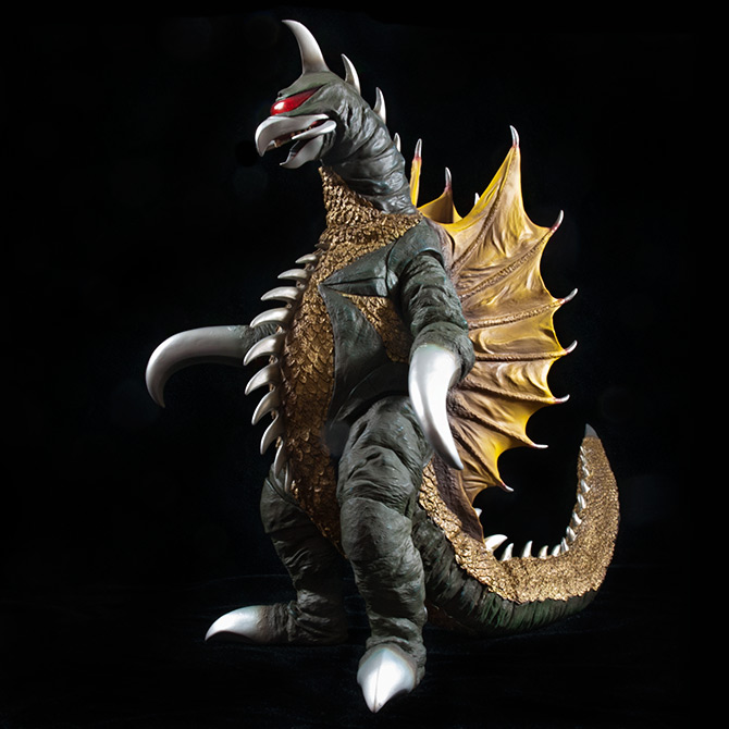 FIGURE SPECS東宝30CMシリーズ 「ガイガン(1972)」 JAPAN ORIGINAL RELEASES: 2010, 2011, 2015 DIAMOND RE-ISSUE: MARCH 2016 SERIES: TOHO 30CM SERIES MATERIAL: VINYL FROM: 地球攻撃命令 ゴジラ対ガイガン “GODZILLA VS. GIGAN”, 1972 HEIGHT: 12 INCHES / 30.4 CM WIDTH: 8 INCHES / 20.3 CM LENGTH (TOES TO TAIL): 11.5 INCHES / 29.2 CM FIGURE WEIGHT (WITH BASE): 1 LB / 453 G REVIEW AND PHOTOS: JOHN STANOWSKI. The Toho 30cm Series Gigan 1972 vinyl figure by X-Plus was first released in 2010. A polyresin Real Master Collection version was also released in 2010. It was re-issued in 2011 with an exclusive nighttime paint scheme for Wonder Festival. Most recently it was re-issued again as a Ric Boy Exclusive in March 2015. This review is for the 2015 Re-issue but should be relevant to all releases with only minor differences, mostly with paint. At first, I planned on getting this figure simply because I’ve succumbed to becoming a completist. Over the past two years I became tired of seeing the same old photos of this figure over and over. Plus I knew that he was short compared to most other figures in the line. But when I pulled it out of the box, yet again, I was floored. And the more time I spent shooting it for this review I’ve become a big, big fan. THE BOX
The original Toho 30cm Series Gigan 1972 vinyl came in a blind box with color cover art on the front seen above on the left. If you’re hunting for an original release, this is what the box will look like. Also, it’s likely that when this figure is re-issued again through Diamond Distributors that this is the box design they will use. The recently released 2015 Ric Boy re-issue of this figure comes in a plain, blind box with monochrome artwork on the front. INNER PACKAGING Inside the figure is wire-tied into a plastic shell in two pieces: body and tail. You also get the battery pack for the light-up feature on this version. There are additional pieces of plastic nested between each fin to help prevent them from getting distorted while in the box. Although I suspect that once again, the box has failed some of us on this release. Sometimes the figure in the box is too close to the inside of the lid and pressure on the box does get transmitted to the figure. (I.e. King Ghidorah and the 30cm Anguirus 1955 often has damage because of this). I’ve seen photos of this Gigan figure with its leftmost fin curved inward. It shouldn’t be like that. All three fins on my figure are perfectly straight. If yours is curved and it bothers you, take a hairdryer to it and set it straight. SEE AN UNBOXING Check out the X-Plus Gigan 1972 Unboxing Video from YouTube user Ohgod itsoniichan for a great look at how this figure is packaged. ADDING THE TAIL Damn. This tail was one of the most difficult tails I’ve ever had to attach. The flange on the tail piece is not thin and flared like most are but is, instead, short and thick. To make things just a bit harder, the back piece (holding the fins) runs all the way to the tail hole on the figure so, even when you take a hairdryer to the body hole to soften it up, the top of the hole remains firm. If I had to attach this again, I probably wouldn’t try to get the hole overly soft with heat since the rest of the body will reach a consistency comparable to a piece of foam before the top part gives. Anyway, do you best. Ganbatte ne! ADJUST THE FEET The legs are attached to the body with unglued joints so that means they can move, but only a little because of restrictions in the sculpt. But they do move enough for you to adjust them which is something you’ll need to do if you want his feet flat on the shelf. Try to get eye level with the feet, make sure the tail is lying flat and then rotate each leg until the feet are flush with the floor. FIX FINS AND SPIKES IF NECESSARY As I mentioned before, I’ve seen some figures come out of the box with its left fin curved inward toward the center of the back. Hit it with a hairdryer and straighten it out. Some of the spikes may also be bent out of shape. I had one bent spike on my figure and it took very little to coax it back into position. SCULPT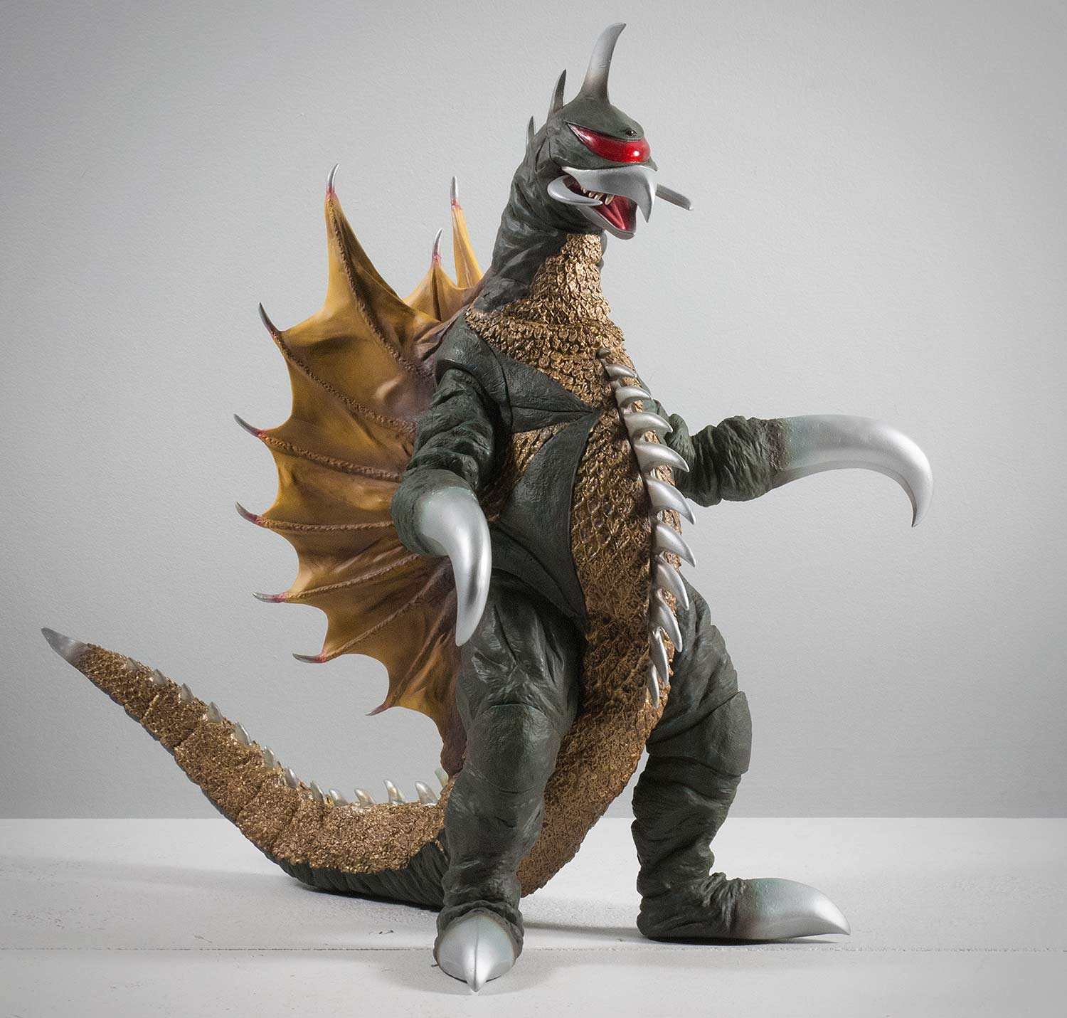 At first glance, I think it’s safe to say that X-Plus captured the Gigan suit very, very well. This is indisputably Gigan we’re looking at here! Once again, X-Plus knocks it out of the park. As a figure, it’s a big winner. This multi-textured sculpt no doubt kept the sculptor on his toes with it’s combination of crinkly skin, scales, smooth areas and fabric-like fins. All this is on one figure and for that alone I think it deserves a prize. But as part of a series, we should knock off points for it’s lack of height when compared to the group in which it belongs. Oh! What could have been. Can you imagine this thing an inch or two taller? I’d be first in line should X-Plus ever decide to do a Gigan V2 as they did with the Large Monster Series Baragon. LIKENESS There are actually a lot of shots of Gigan in the movie which don’t seem to agree with the X-Plus sculpt. No doubt this is because the suit bunched and bended in ways the X-Plus figure doesn’t recreate. And there are some suit details on which this sculpt outright fumbles. The “knee pads” for example are way too big on the figure. And the spines running through his back fins seem a tad too thick. However, if you keep watching the movie, there will be several wow moments where you’d swear your figure crawled into the television. Overall, I’d say the X-Plus 30cm Series Gigan 1972 is a fantastic likeness. It’s a winner! 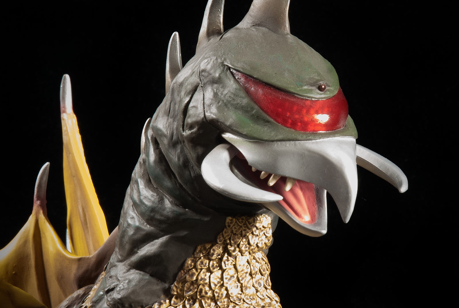 The figure has individually sculpted teeth which some say are too big. I’m inclined to agree, but not by much since his teeth were bigger and more spread out than on other monsters. I do think they’re a bit too bright though. I would have liked to see them a shade or two darker. The tongue is molded into the lower jaw. The side pincers are separate pieces, somewhat soft and pliable. I don’t expect anything bad will happen if you mess with them, though. Worst case scenario, it pops out; you glue it back in. A nice touch, and also a favorite X-Plus trick is the visor. It’s made of transparent plastic colored red and allows a bumpy pattern on the inside to be visible giving it that compound eye effect we’ve seen on other figures like Kumonga and Mechagodzilla. 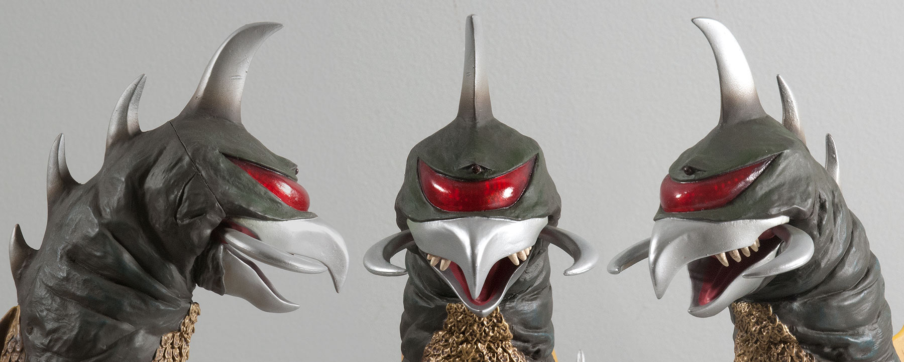 And it looks good from all angles. 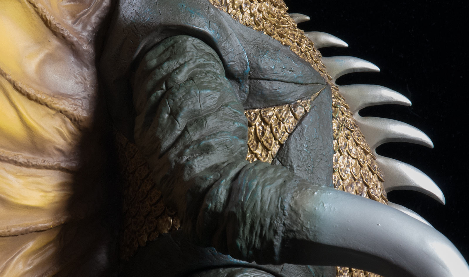 THE SKIN The sculpt of the skin looks awesome! These rough and crinkly bunches and creases are reminiscent of the suit and are very detailed. In fact, if you look really close, you’ll find a bunch of grungey scratches. I didn’t even notice these until my close-up photos revealed them to me. THE SCALES The sculpted scales look great. They are no where near as good as the scales on the Large Monster Series King Ghidorah. But they still have good depth to them on the sides and bottom. And the dark paint wash on them make them look busy and realistic. However, this wash, to me, creates the illusion that the properly-sized scales are actually made up of yet even smaller scales. More on that later. 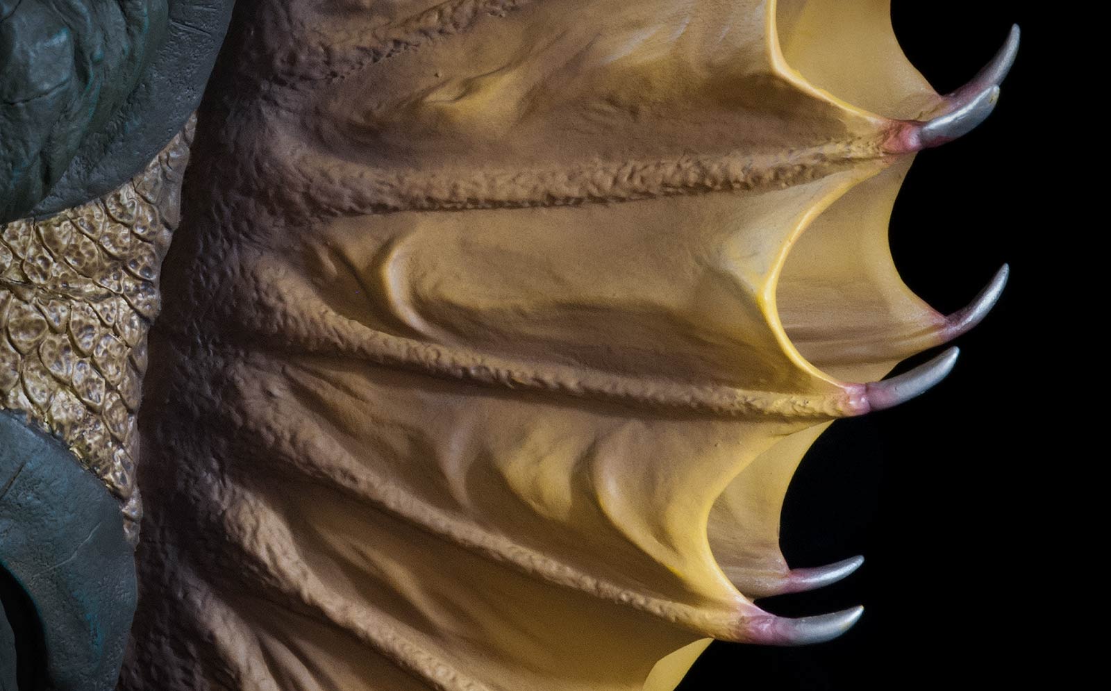 The fins (wings?) look great and the sculpt does a great job of reproducing that fabric look from the suit. The spines running through them seem to be a little thicker than they should be, but I’m not complaining. SCULPT COMPARISON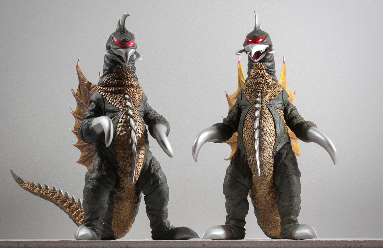 This is a forced perspective camera trick to make both figures appear to be the same size. On the left is the Large Monster Series Gigan 1972 (25cm series) and the 30cm Series version on the right. With them lined up like this, we can compare the sculpts. The 25cm Gigan seems sturdier but I think the 30 got the head right. What do you think? …There are a lot of subtle bluish/greenish highlights brushed on which aren’t overly obvious to the naked eye, but which must somehow register subconsciously. Very, very nice touch, X-Plus! JOINTS & SEAMSJOINTS This figure has unglued joints at the top of both legs, both arms and, of course, the tail. The legs don’t have a lot of movement available yet they move enough to allow you to make sure the feet are flat on the shelf. The arms have a LOT of room for posing and can be placed hanging down, forward or up. Both of these joints do seem to have a place that they “want” to be, though, and that’s hanging down. You can detect this when you move the arm up and then back down again as it seems to sort of snap into place again. SEAMS Oh, ouch. You had to bring that up. Okay, let’s get this over with. There is a seam running around the base of the neck and because of the scale pattern, this seam is somewhat visible from the front. Nothing terrible, but it’s there. One nasty seam, though, runs from both cheeks up around the back of the head. This seam runs over smooth terrain and so can be detected fairly easily. The back piece, which includes the fins (fans?) is glued really well into place. On the sides, this seam is mostly hidden from view and can be seen only with super bright light and a close eye. This piece runs up the back of the neck and is a bit awkward looking. The seam from the tail joint is, again, more obvious than usual because of the scale pattern not meeting completely flush. I’m not complaining about any of the seams. This is a vinyl figure. Vinyl figures have joints and seams. I’m just telling you what I see and I don’t really have a problem with any of them. …except that friggin’ seam on the head! POSE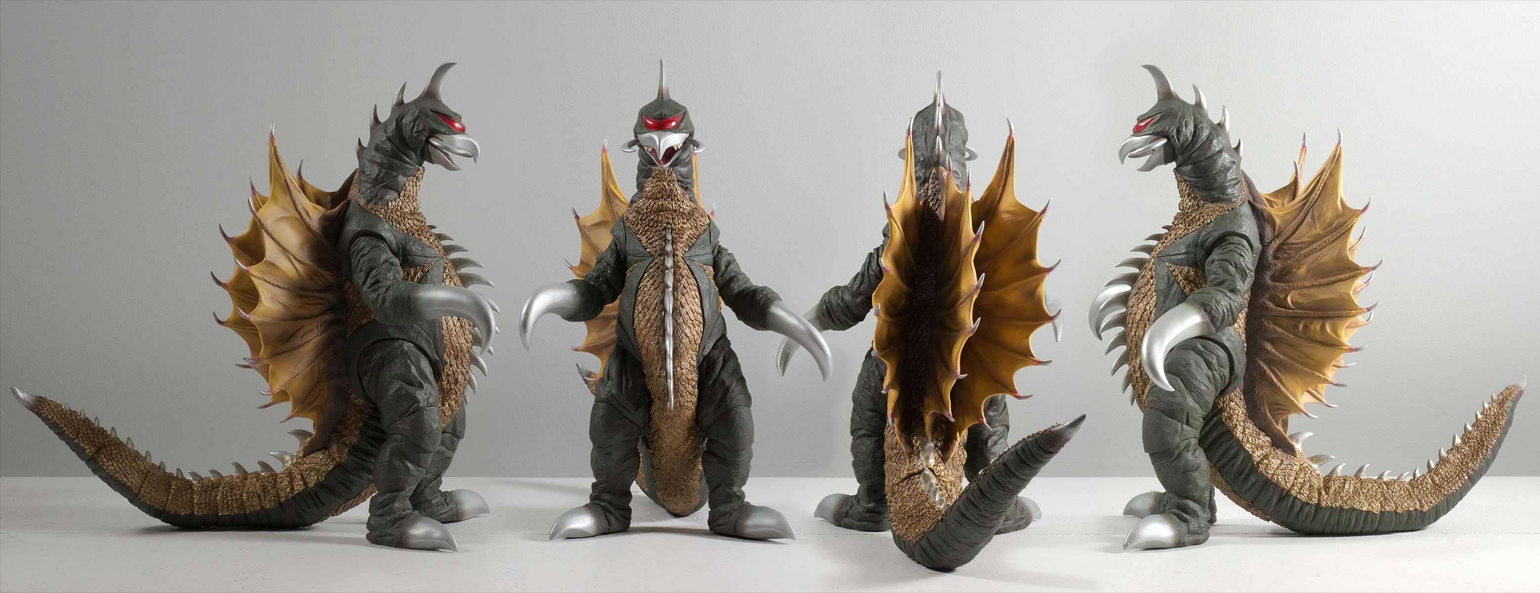 At first glance the pose is pretty standard. Gigan is just standing there facing forward in a pretty standardy way. He comes out of the box with his arms hanging down and that seems to be the way the sculptor intended it to be, but as mentioned, they can be posed. The head is turned ever so slightly to the figure’s right. And the fins, as one whole unit, also veer toward the figure’s right side. This off-balance direction of the fins is very obvious when looking at the figure head on. I don’t see this as completely terrible though since the fins on the suit were pretty flimsy stuff and prone to swaying. Final judgement: looks good. Now, looking even closer we see that Gigan seems to be tilted backward, the same way you might if someone got too far into your “space”. This pose also reminds me of a post I-can’t-believe-I-ate-the-whole-thing Thanksgiving dinner back lean and belly tap. OR, a better way to look at it is a sort of “yo, check out this saw, you want some of this?” pose. This is actually a pose unique to Gigan and I’m glad that at least one the X-Plus Gigan sculpts captured it. He was often in this pose in the movie Godzilla vs. Gigan. Two scenes that come to mind is when he approached Anguirus with his chest saw spinning away. Gigan stood like this again when he and King Ghidorah watched as Godzilla tried to stand after the tower was finally destroyed and its relentless laser beam attack ended. I’d probably rather that this figure stood taller like his shorter 25cm counterpart (huh?). But what we got is accurate and it’s nice to know that X-Plus’ sculpt not only captured the details of the suit, but the personality of the monster as well as his stance. F, yeah! X-Plus, I love you. And, once again, the arms can move allowing you have some say in the pose as well. PAINT JOB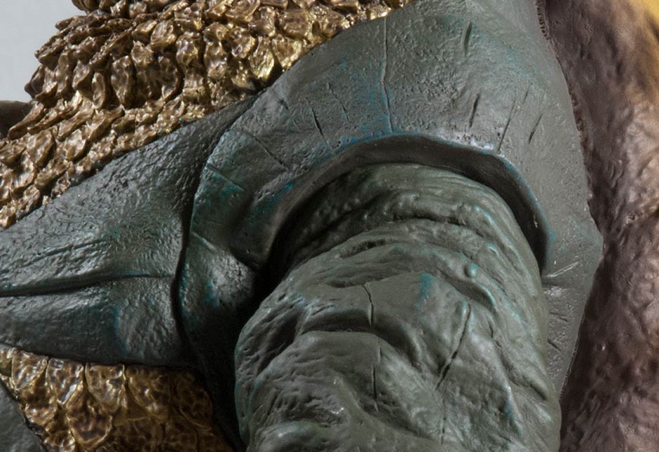 THE GREEN The Toho 30cm Series Gigan 1972 vinyl figure from X-Plus has a muted, dark green coat on his non-scaley skin areas. It seems it’s a bit darker than on previous versions of this release. This coat appears to come in different shades as light plays off the sculpt, creating shadows and highlights against the skin’s creases and folds. Now, when you look closer (see photo above) you’ll find there are a lot of subtle bluish/greenish highlights brushed on which aren’t overly obvious to the naked eye. Nice to know they’re there. Nice touch, X-Plus! THE GOLD The scales are painted with a semi-glossy gold. Again, the light plays off the sculpt creating shadows and thus creating the impression of different shades of gold. But not all of those impressions are just impressions. The scaly areas have a darker paint wash applied. (A wash is the addition of a second color meant to fill in the gaps of a sculpt and remain there while the paint is wiped away off the higher elevations.) This wash totally enhances the look of the scales adding “texture” on a hue level. Definitely a nice touch, however, the puddles of darker paint left behind can give the impression that the sculpt isn’t as intricate as it really is, but only when looking at it super close like only a camera can. My point is, if you see what appears to be sloppy work on the scales in the photos of this review, keep in mind you really can’t see that with only your eyes. As mentioned earlier in this review, this darker wash can give the impression that the scale pattern is busier and finer than it should be. Well, I won’t nitpick any longer. I’m actually glad it’s there as it gives the scaly areas a realistic appearance and avoids a toyish look. THE SILVER Gigan’s beak, pinchers, horn, spikes, claws and saw are painted in a bright silver with only a super slight gloss to them enough to make those bits seem like metal without being overly shiny. They are, though, in my opinion, too bright. When I look at it with the lights low, the silver seems perfect. But in normal light: too bright. I’m probably just over thinking this. The silver feathers fairly well into the green. But it’s too clean. There was clearly more ‘grunge’ on the the claws in the movie. THE FINS The fins (back flaps?) have a muted, mustardy yellow base coat which feather into brown near the back and then slightly outward along the spines in the wing. Shadows are applied strategically along folds in the sculpt making them stand out even more. Light sprays of muted red highlight the base of each silver spike reaching out beyond the yellowish membranes. The teeth are painted in an off white and the inside of the mouth is a sort of pinkish color and the visor is molded in dark red. Overall a fine, fine paint job. …having one of these on your shelf is the next best thing to going back in time and using a shrink ray on the original suit. SIZE COMPARISONSBefore getting into size comparisons I should point out to those who don’t already know that this Gigan figure is short. Noticeably shorter and thus technically out of scale with other figures in the series. However, when I finally got this figure in front of me, it didn’t seem all that bad. Still, I wish it was taller. 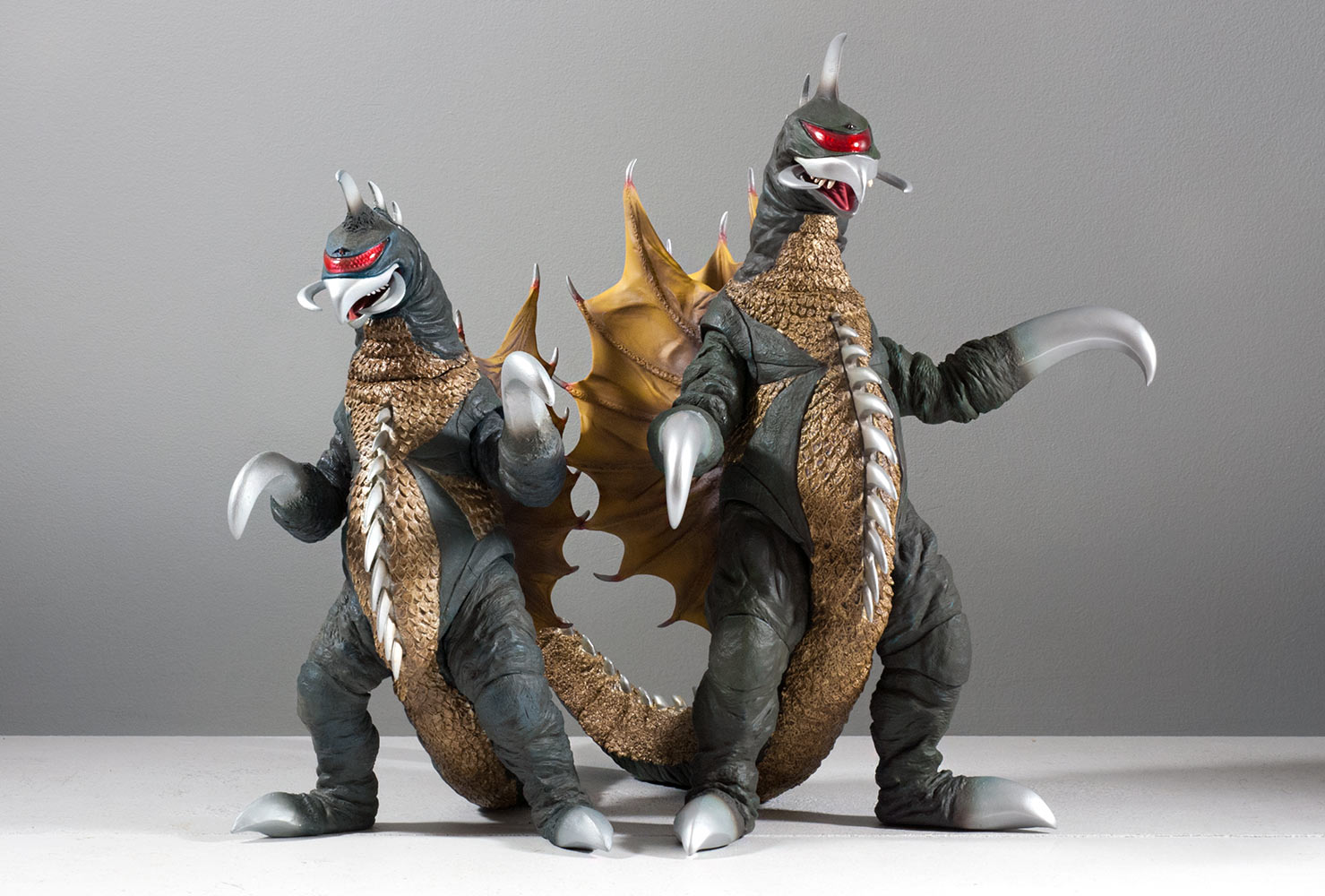 If you already own the Large Monster Series (25cm) Gigan 1972 then this should give you a good feel for the size of the 30cm version seen on the right. I had heard that the 30cm version is barely taller than the 25. Glad to see that’s not quite the case. 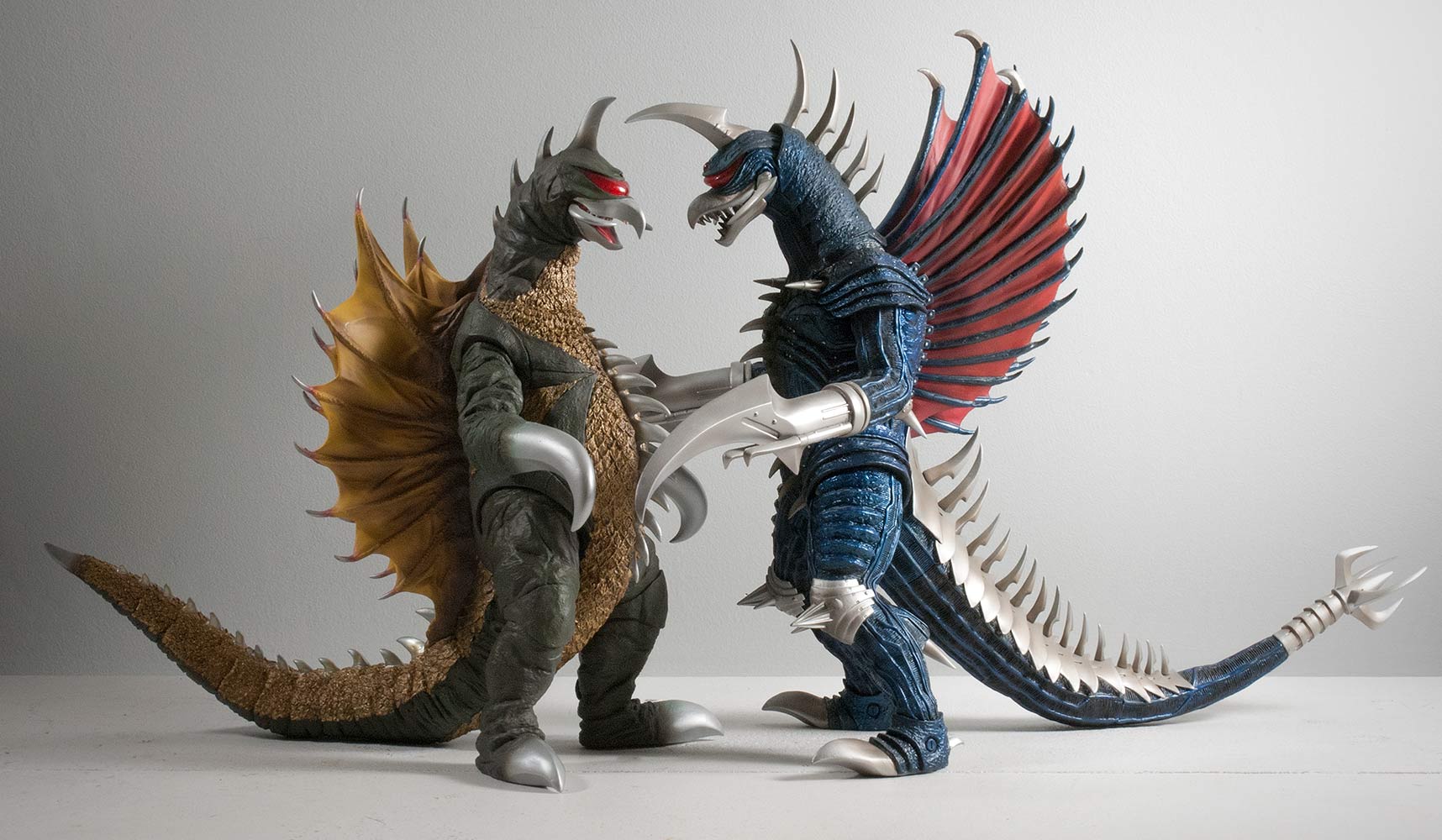 Toho 30cm Series Gigan 1972 and Gigan 2004 seem to see eye to eye, or visor to visor. Note that the 04’s shoulders and hips are higher than the on the 72 which means he’s bigger. Even so, visually, they size up pretty well next to each other. 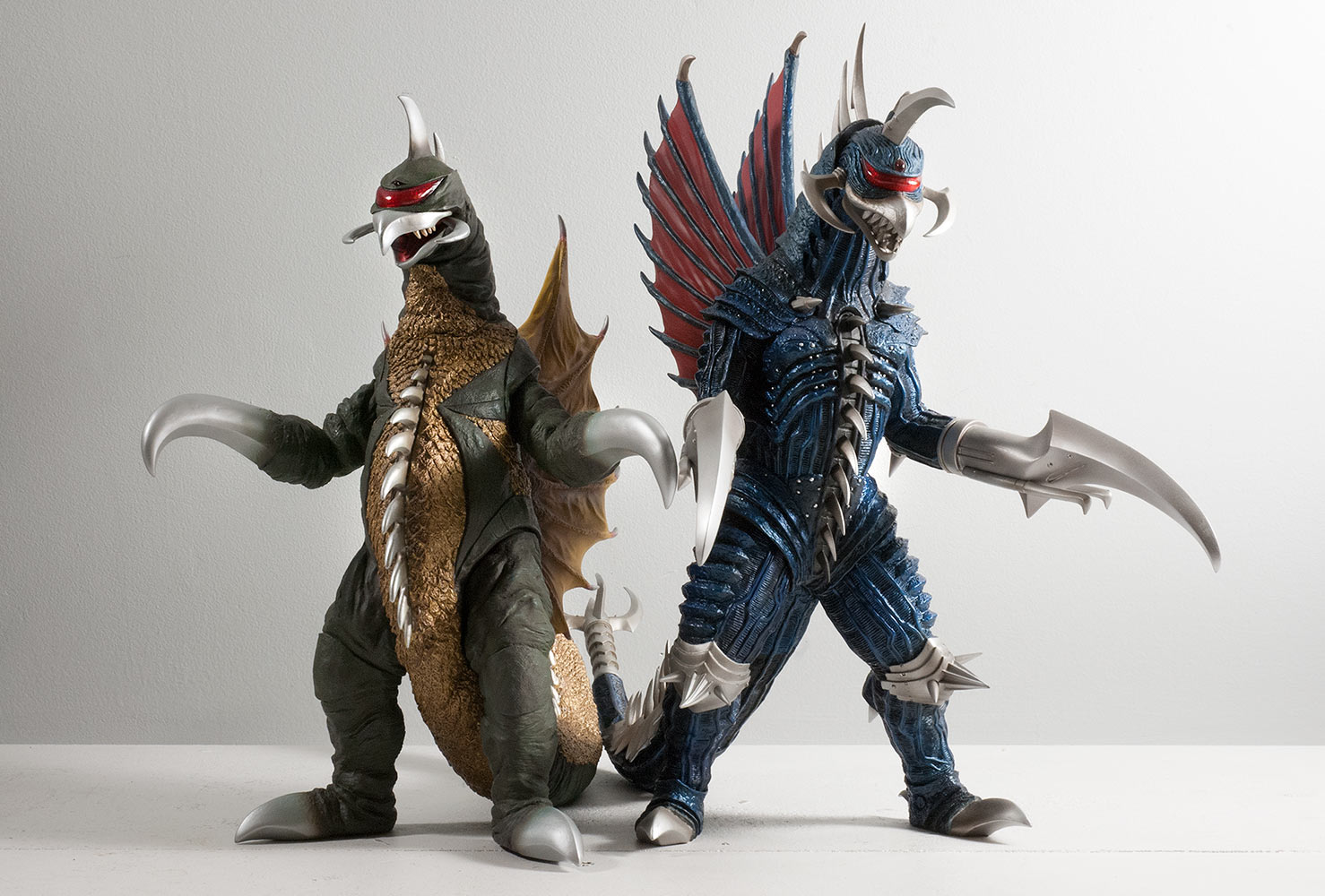 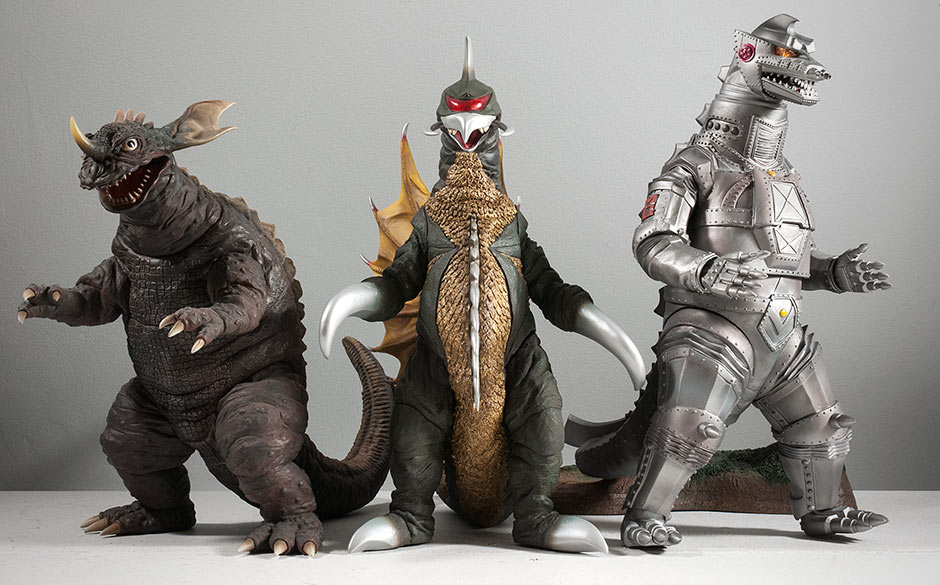 Here we have some 30cm Series up-and-down height craziness. The 30cm Series Baragon 1965 vinyl manages to be even shorter than Gigan. And the X-Plus Mechagodzilla 1974 is clearly a whole head taller. 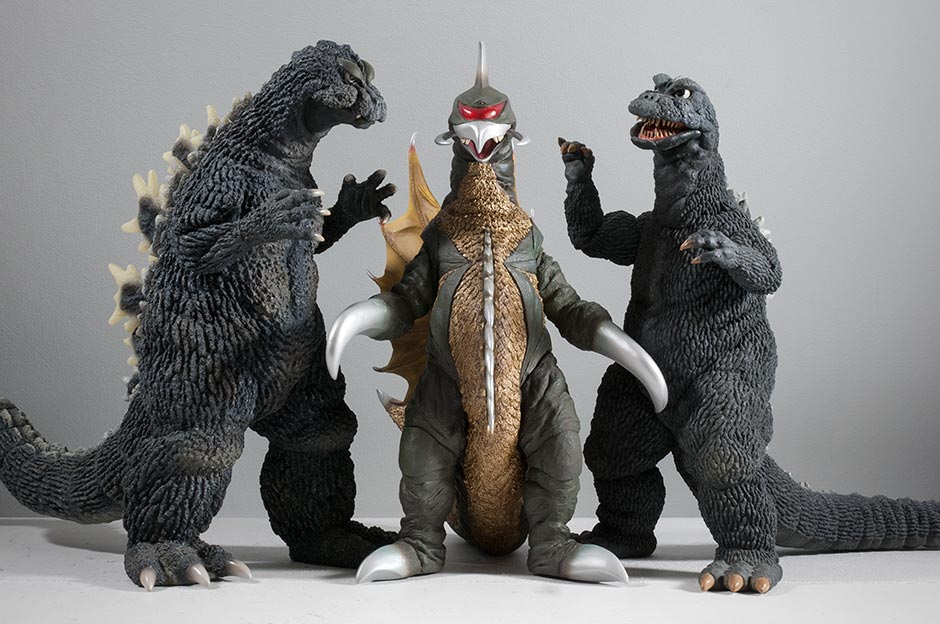 On the left, the 30cm Series Godzilla 1964 vinyl’s grumpy mug needs to look down on Gigan. On the right, the 30cm Series Godzilla 1968 is a bit closer to Gigan in the Height Department. Or should I say the Lack of Height Department, since the X-Plus G’68 is notorious for being short as well. 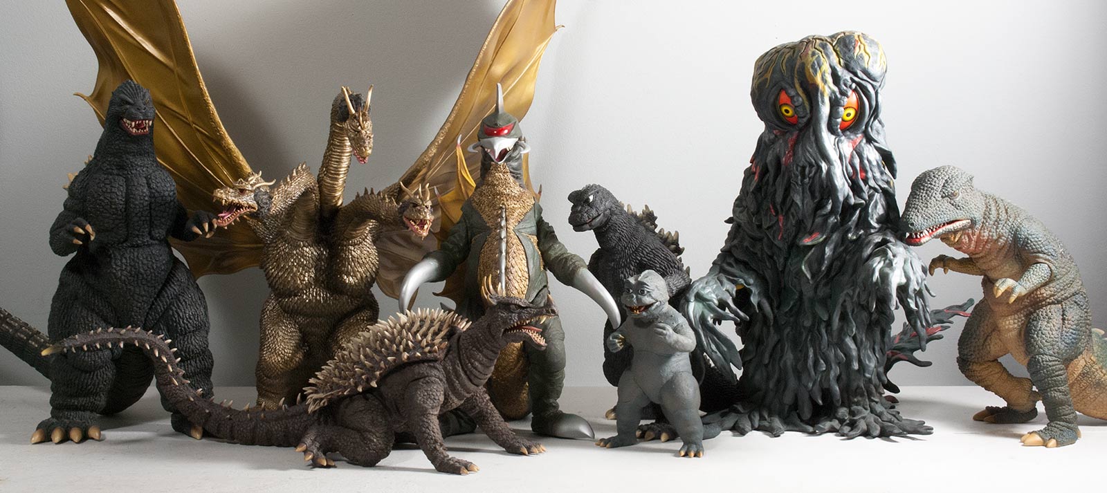 Here’s a new size comparison which I thought would be handy for new collectors. Here, the 30cm Series Gigan 1974 is surrounded by many of the most recently released figures, currently available figures and figures coming soon. From left to right: 30cm Series Godzilla 1989, Large Monster Series King Ghidorah 1968, Large Monster Series Anguirus 1968, Gigan, Large Monster Series Godzilla and Minya 1968, 30cm Series Hedorah and the 30cm Series Gorosaurus 1967. 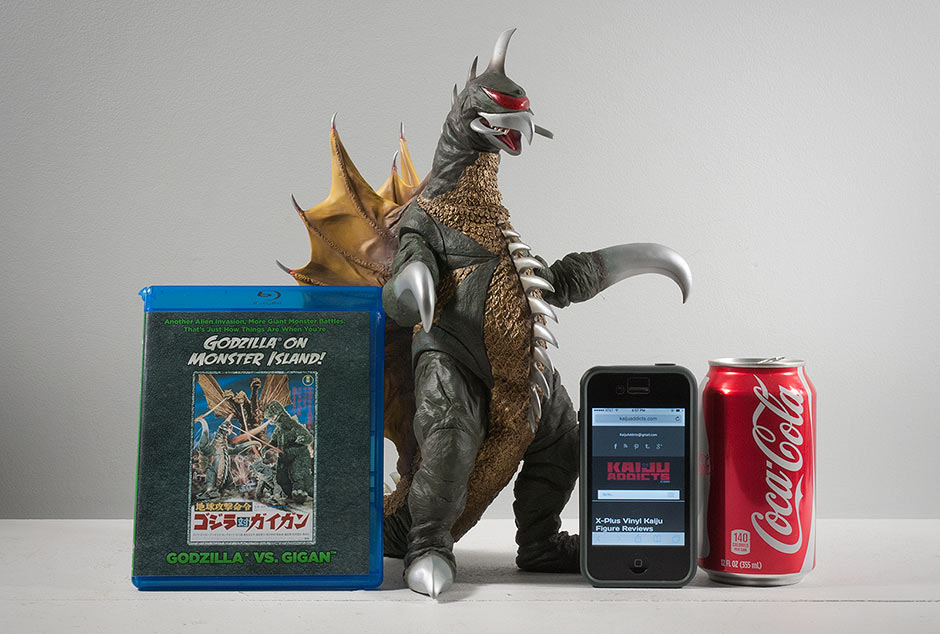 And for those who have no figures shown above we have a real world size comparison with a Godzilla vs. Gigan blu ray case, and iPhone set to one of my favorite websites and our old friend, the Coke can. (Did you miss him?) FOOTPRINT ON THE SHELF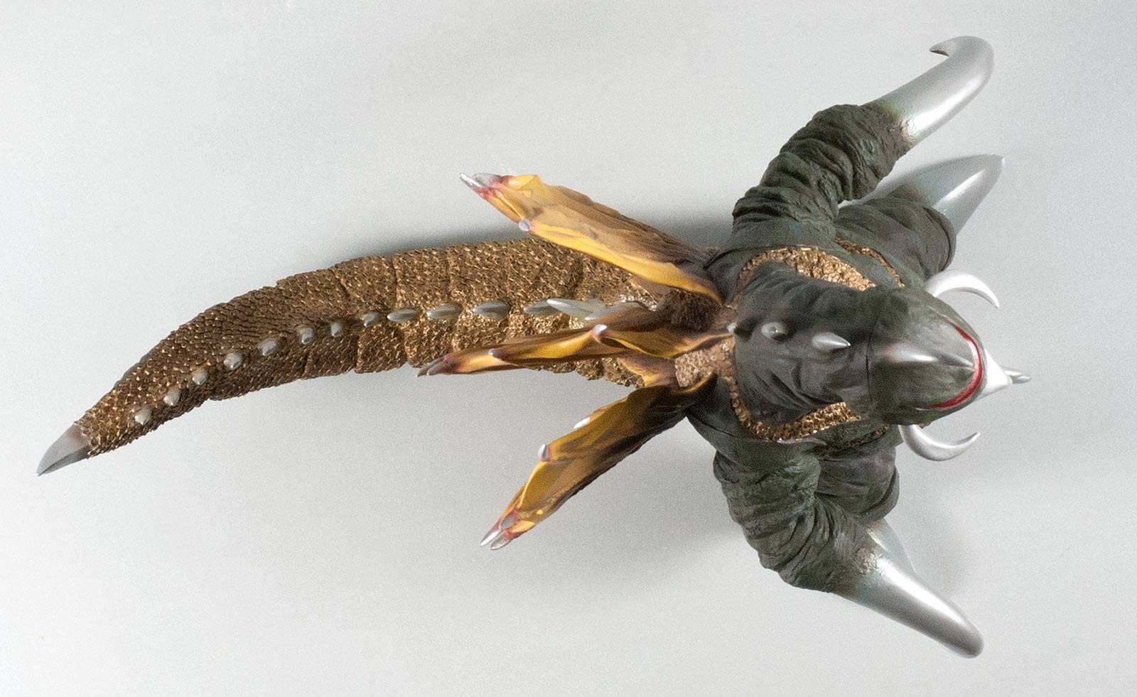 At only 11.5 inches long for a tailed biped, the 30cm Series Gigan 1972 doesn’t cause trouble on the shelf. It will slip in nicely between two other figures and won’t take up a lot of space. His tail even curves slightly to one side so that if you place him on an angle facing the right he still won’t hog up space. RIC BOY EXCLUSIVE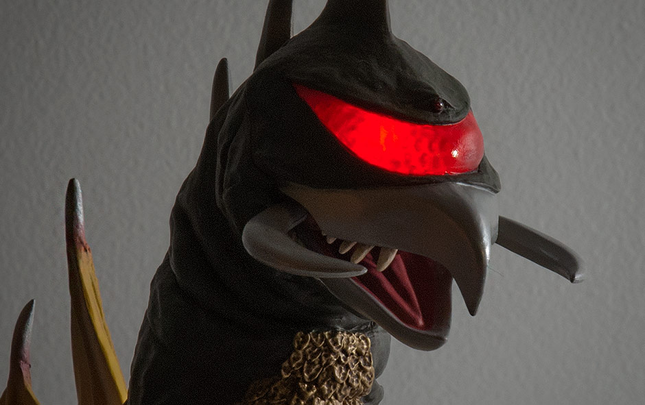 The exclusive Ric Boy version of the original release and March 2015 Japanese re-issue both have light-up visors. (The March 2016 Diamond Reissue does not have the light gimmick.) I’ve been bad mouthing light gimmicks for a while now but that has been because the translucent, plastic-looking fins lacking paint and paint detail on light gimmick Godzilla figures were not made up for by a light effect which would be used only occasionally. But Gigan’s visor is already plastic and nothing is lost here. And it LOOKS FANTASTIC!
The entire head is likely made of the softer, translucent plastic since it’s so squishy as pointed out in Ohgod itsoniichan’s review (see link below). I should have realized myself though since this gimmick unfortunately has light leaks creeping through the paint on the back of the head. And it’s not just the figure I have. Others have reported the leaks as well. On the bright side, these leaks can mostly be seen only from the back. The light effect requires you taking the battery box/pack/dongle thingy and plugging it into the rear of the figure’s left foot and switching it on. The box takes two LR44 watch batteries (I believe) and can be replaced. 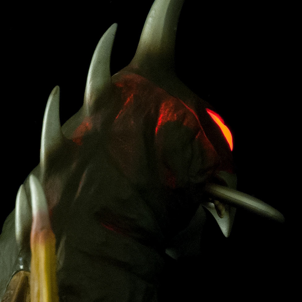 SUMMARYApart from being a little short, the Toho 30cm Series Gigan 1972 Vinyl Figure by X-Plus does not disappoint. It has a couple of awkward seams, but all of its many contrasting textures are masterfully sculpted. The arms are poseable, which is a plus. And the visor lights, which is a big plus. It’s an amazing likeness and having one of these on your shelf is the next best thing to going back in time and using a shrink ray on the original suit. MORE INFORMATIONX-TRAS 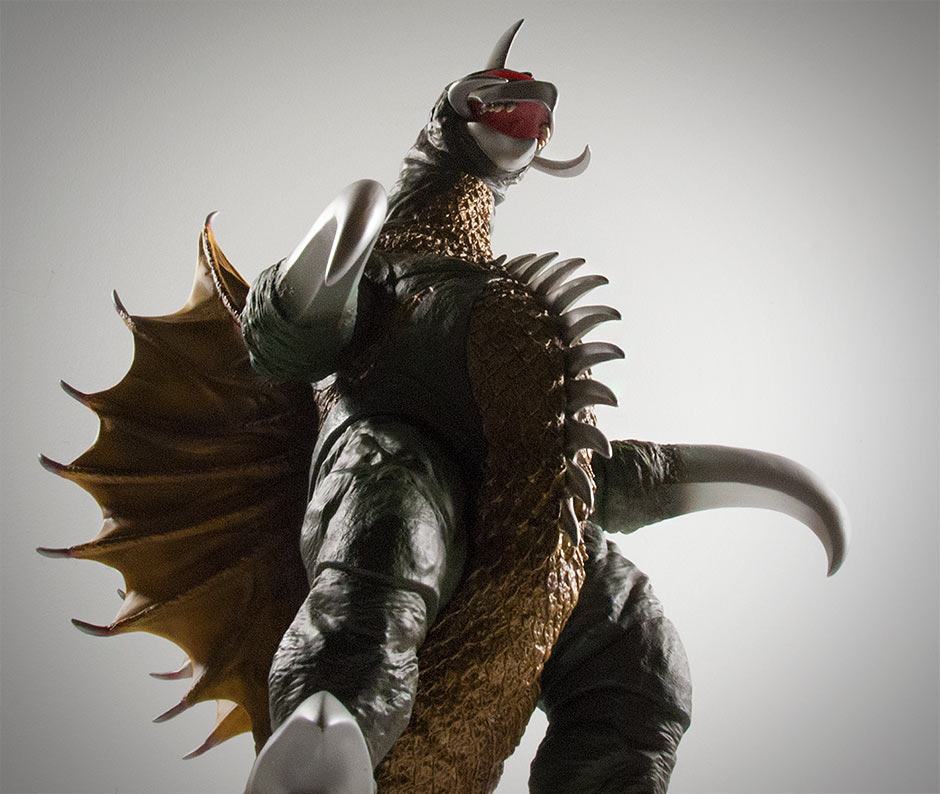 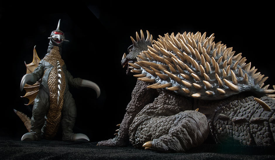 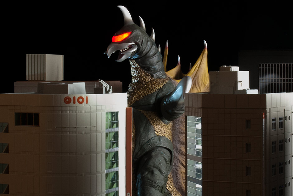 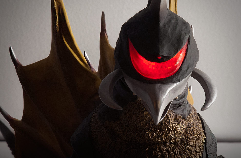 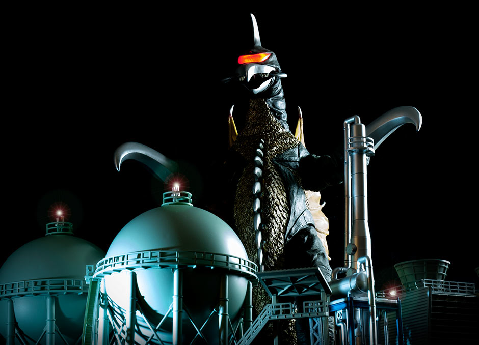 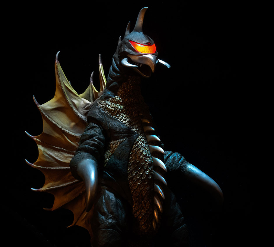 COLLECTORS GALLERYBy John Stanowski Originally posted March 11th, 2015 on Kaiju Addicts.
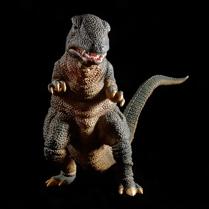 FIGURE SPECS30CMシリーズ ゴロザウルス JAPAN ORIGINAL RELEASE: 2008 RESIN KIT RELEASE: 2010 DIAMOND RE-ISSUE: DEC. 2014 SERIES: TOHO 30CM SERIES (12 INCH SERIES) MATERIAL: SOFT VINYL FROM: キングコングの逆襲 “KING KONG’S COUNTERATTACK”, 1967. (“KING KONG ESCAPES”, 1968) HEIGHT: 9.5 INCHES / 24.10 CM WIDTH: 6.25 INCHES / 15.8 CM LENGTH: 16 INCHES / 40.6 CM FIGURE WEIGHT: 15 OZ / 425 G ARTICULATION: ELBOWS, KNEES, ANKLES. REVIEW AND PHOTOS: JOHN STANOWSKI Gorosaurus appeared in the 1967 film King Kong’s Counterattack and Hollywood’s version of it, King Kong Escapes, a year later. Gorosaurus sported krazy, kangaroo-style kaiju kicks before getting downed by Kong – all in less than five minutes of screen time. He appeared again as a member on the DAM roster in Destroy All Monsters in 1968. The Toho 30cm Series Gorosaurus 1967 vinyl figure was first released in 2008, at the very beginning of X-Plus‘ current ‘way of doing things’. It appeared again as a kit in 2010, and yet again as a special 1968 repaint version in 2011 and, finally, as a re-issue licensed for North America via Diamond Distributors. This review is for the Diamond Reissue. Before I go on, I just want to say that I was never much of a Gorosaurus fan. I got this figure only because the completist in me just couldn’t say ‘no’ to another X-Plus. And, just as with Varan (also not previously a huge fan of), I was wowed by the figure as soon as I took it out of box. It looks so much better in person than it did in the same old photos I saw on the web for the last two years. What is this power X-Plus has to win me over? THE BOX
As usual, this 30cm Series vinyl figure comes in a plain, brown box with box art on the front. This Diamond Reissue cover sports a new design which brings it up-to-date with current releases. If you’re not familiar with the original box design, the PX Previews Exclusive logo on the front lets you know you’re getting the North American Reissue. Inside, the figure is wired into a plastic shell. The tail needs to be attached.
Instead of the larger suction cup-style flange we’re used to seeing on newer figures, Gorosaurus’ tail has a very short, squareish rim. Because of this, the tail can pop off the figure with very little effort. Fortunately, it pops back in just as easily. Getting the tail on the first time, though, was troublesome for me. The “butt” hole on my figure was squooshed into a horizontal ellipse. The tail hole was squooshed vertically in the opposite direction. Because of this, I blasted the butt with the hair dryer since it was obvious it needed some re-shaping. With the tail end still cool and stiff, I pushed and twisted and it just did not want to go in at first. The hole on the body just completely capitulated to the tail and didn’t have the strength to push its way over the tail’s rim. Blah, blah, blah. Let me just suggest that when you attach the tail yours that you heat and soften the body hole just a little and not as much as you’re used to. OTHER OUTTA THE BOX STUFF
You may notice jacked up feet running at extremely different angles on your Gorosaurus before you even get him out of the plastic shell. Don’t panic, this is easily corrected. This figure has joints at both knees and ankles. AFTER you have the tail attached, stand Goro on the edge of a table and get down low and look at the feet from as close to a zero-degree angle as you can. Then twist both knees until both feet are flat on the floor. Keep in mind that the back of the right foot curves up away from the floor; that’s normal. Also, the figure’s right knee has a subtle step in the sculpt which gives a clue as to where that legs wants to be; start there first. ALIGN THE TAIL Goro’s tail has two joints on it and chances are yours won’t be aligned right out of the box. Give ’em both a tweak and set ’em straight. You probably want to do this after you attach the tail to the body since they’re a bit loose. SCULPT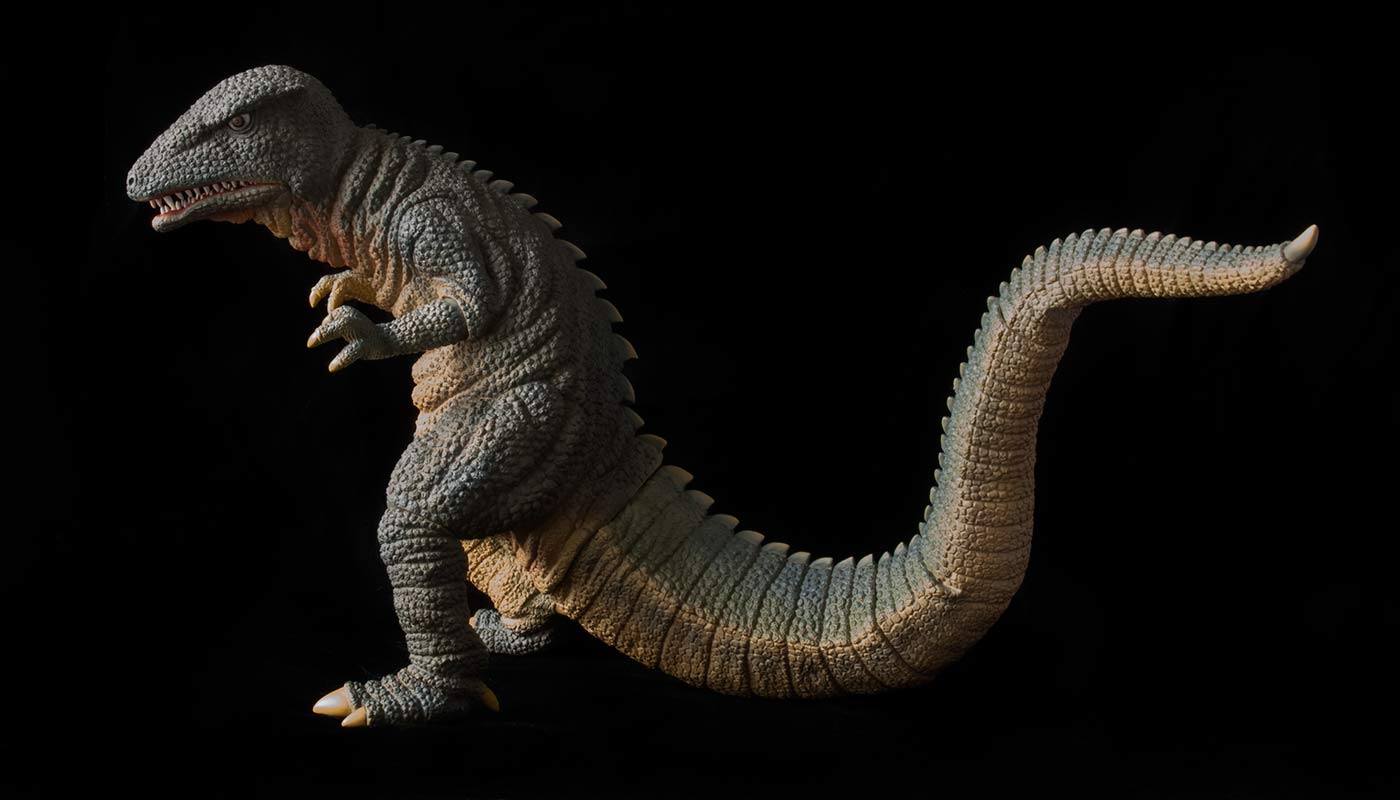 As far as my untrained, previously-non-Goro-fan eyes can see: this is one helluva likeness. And what an awesome sculpt! It captures the suit from every every angle! Check out the Pose section for more on that. 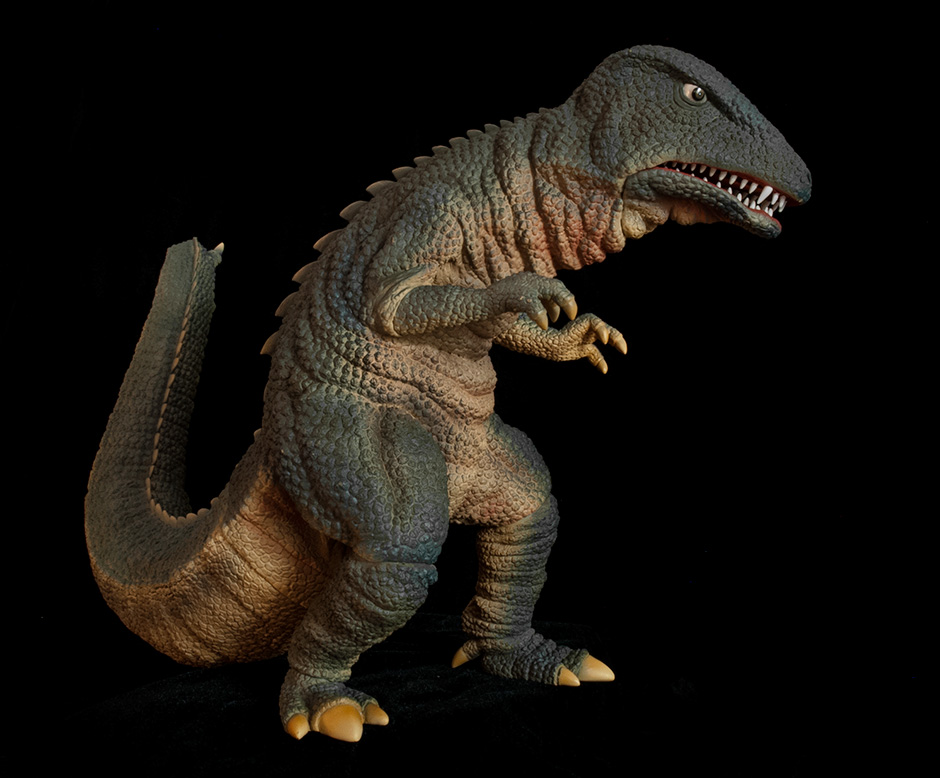 I’m in awe of the detailed reptilian skin texture on this figure. It’s like every single bump got individual attention. All of the sculpted folds in the skin is just crazy. Hate to keep repeating myself, but for the new collectors: check out those individually sculpted teeth! Also, you’d expect no one to bother with the tongue since the mouth is almost closed… but it’s in there! You can’t see it unless you tilt it back and squint yer eyes in there. The pose is unmistakably Goro all the way and it looks good from so many angles. JOINTS & SEAMSThe X-Plus Gorosaurus has joints at both elbows. The right elbow joint is elliptical and will complain if you try to move it. The left elbow is more round and will gladly let you tweak the rotation. As stated previously, both knees have joints and you need them to straighten his feet when preparing it for the shelf. Unfortunately, all four of these joints are somewhat noticeable; especially the elbows. For some reason, I’m not very annoyed by this. The figure looks cool and it is, after all, a vinyl figure. This is an early figure and X-plus has since gotten much better at hiding these connections. The ankles have joints which just don’t want to bothered. Leave them be unless they came out of place. They are reasonably unnoticeable. The two joints on the tail are, for the most part, well hidden between the segments in the sculpt. However, they are a bit loose and may easily move out of alignment with handling. The tail matches the body fairly well on the top, yet has a slight gap on the underside. As for glued seams: there are two. The bottom jaw is a separate piece and has a seam which is only somewhat noticeable, but only if you look. Mine has a bit of a gap on one side and I expect the degree of this varies on each figure. The main body is in two piece as so there is a seam running along the front right above the waist and up the back. Again, it’s mostly unseen unless you look for it. Photos have already turned up online where some figures have large gaps and outright holes along this connection. POSEThe pose is unmistakably Goro all the way and it looks good from so many angles. This is one of the reasons why I was taken aback when I first pulled it out of the box. I had gotten used to seeing the same old production photos of this figure online for the past two years. I had no idea its pose had so much more to offer.
With so many choices, I can’t decide how I want this figure to stand on the shelf! PAINT JOB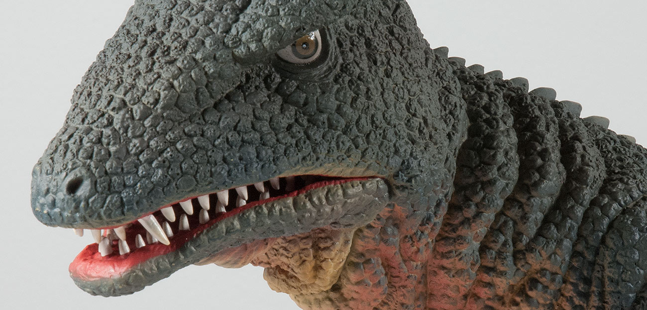 Gorosaurus is covered with a dark, dull, unsaturated green (bluish-green?) which seems to be a few notches lighter than it should be when comparing it to the suit in the movie. There are even darker shades sprayed in the creases on his back. (See the Footprint section for a look at that.) His throat, belly and underside of the tail is a reserved tan which fades well into the green. This tan, however, is applied a bit more liberally than on the actual suit. There are dull red highlights (shadows?) sprayed onto the throat, belly and inside the thighs. These red highlights looks great on the figure, though the throat looks as though it needs more of it. 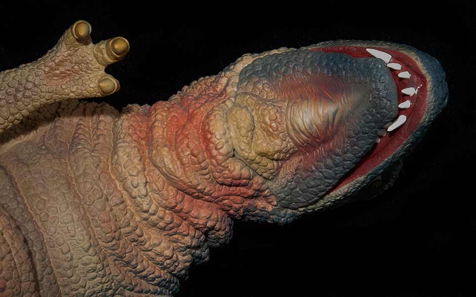 The inside of the mouth and gums are a dark red and, as usual, the individually sculpted teeth are individually painted which makes them really look like they’re protruding out of the gums. Despite being expertly applied, though, the white used on the teeth is too bright and looks somewhat toyish, especially since it contrasts so much against the overly dark colors around it. Despite the liberties this paint job takes from the suit, it’s look fan-f’n-tastic! The throat is particularly impressive. SIZE COMPARISONSI saved some potentially bad news for last. The X-Plus Gorosaurus is short compared to other 30cm Series Figures. You may not mind this as much if you consider that he’s leaning strongly forward. Myself, I don’t care. I’m having trouble not loving this thing. 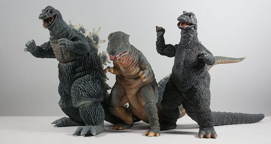 Flanked by 30cm Series figures Godzilla 1962 and Godzilla 1968 (which is a shortie, too), Gorosaurus is noticeably challenged in the height department. But he’s not the only one… 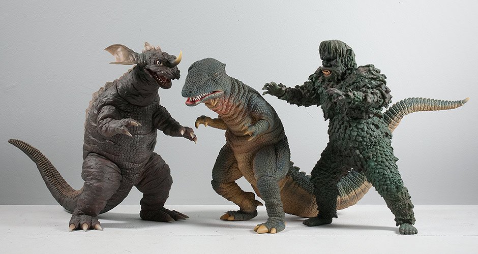 There are 30cm Series figures with heights similar to Gorosaurus such as Baragon 1968 and Gaira. 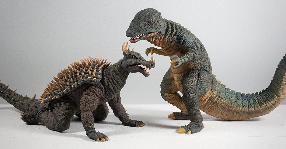 Hell, at least he’s taller than Anguirus 1968. Which reminds me… 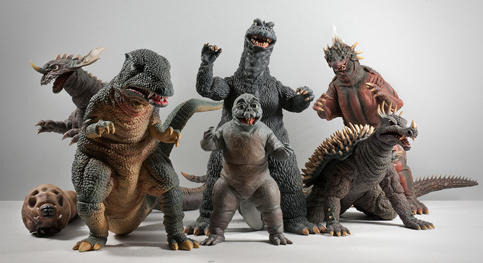 Gorosaurus would make a nice addition to your collection, especially if you have a 30cm Series Destroy All Monsters shelf. FOOTPRINT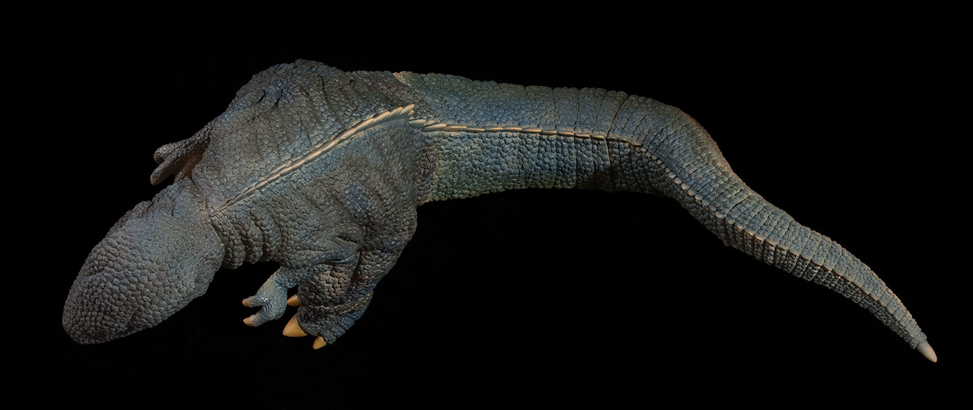 The X-Plus Gorosaurus is about 9.5 inches (24cm) tall, 6.25 inches (15.8cm) wide toe to toe and about 16 inches (40.6cm) long nose to tail, however it’s only 12 inches from toes to tail (if you don’t mind your figure reaching over the edge of the shelf.) The tail makes a bend toward the figure’s left side which is perfect for scooping up behind it’s nearest neighbor on the shelf, assuming that the tails don’t collide. This figure seems to fit in well on a crowded shelf. It’s tail could limit the angles you display it at in tighter spaces. SUMMARYThe X-Plus Toho 30cm Series Gorosaurus is far from being 30cm tall. Despite its lack of height, it is an incredible likeness of the suit in both sculpt and pose. It has a detailed paint job which (mostly) represents the “real” thing and brings variety to the shelf. It has noticeable joints but looks great from SO MANY angles. I am so STOKED to add this figure to my collection despite not really previously being into this kaiju. The X-Plus Gorosaurus made a fan out of me. MORE INFORMATIONEXTRAS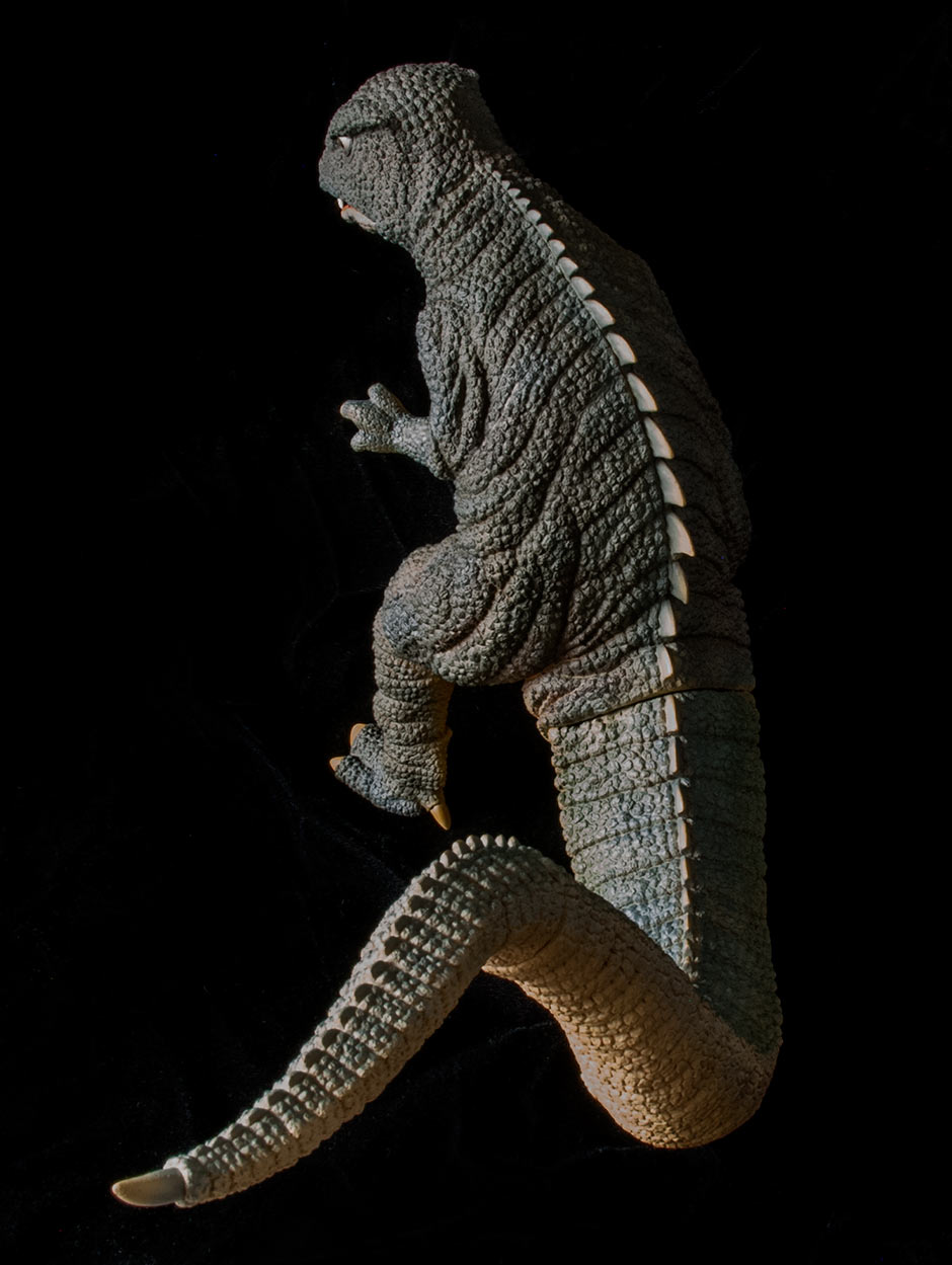 By John Stanowski Originally posted December 21st, 2014 on Kaiju Addicts.
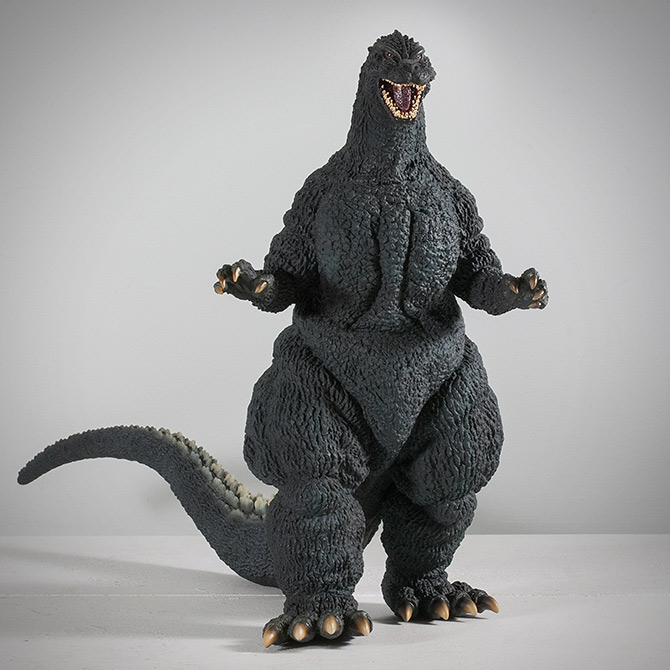 FIGURE SPECS東宝30CMシリーズ 酒井ゆうじ造形コレクション ゴジラ(1989)「第四種警戒体制 大阪上陸」 JAPAN ORIGINAL RELEASE: OCTOBER 2014 NORTH AMERICAN DIAMOND REISSUE: APRIL 2017 JAPAN CLOSED MOUTH VERSION: EXPECTED DECEMBER 2018 SERIES: TOHO 30CM SERIES YUJI SAKAI MODELLING COLLECTION MATERIAL: SOFT VINYL FROM: “GODZILLA VS. BIOLLANTE”, 1989 ゴジラVSビオランテ HEIGHT: 11.25 INCHES / 28.5 CM WIDTH (TOE TO TOE): 6.25 INCHES / 15.8 CM LENGTH (NOSE TO TAIL): 19.5 INCHES / 49.5 CM FIGURE WEIGHT: 18 OZ / 510 G REVIEW AND PHOTOS: JOHN STANOWSKI  It’s here! The Toho 30cm Yuji Sakai Modelling Collection Godzilla 1989 (Fourth Kind Warning Systems / Osaka Landing) vinyl figure… has landed! It’s molded from a sculpt from renowned Godzilla sculptor Yuji Sakai’s ‘Landing Series’. It depicts Godzilla shortly after he climbed out of Osaka Bay and began his rampage through the city. “Fourth Kind Warning Systems”, or “Alert Level 4” as it’s known in English subtitles, is the warning given when it’s certain Godzilla will make landfall in a specific place, in this case Osaka (home of X-Plus headquarters, by the way. Coincidence?). Take a look at the photo below.  Look familiar? Is it Real or is it X-Plus? This time it’s real! I used to say “it looks like it walked right out of the TV screen” a lot in my earlier reviews. It’s time to dust that line off for this figure because, as you can see, it literally looks it was taken right out of this scene! Okay, let’s dig in. THE BOX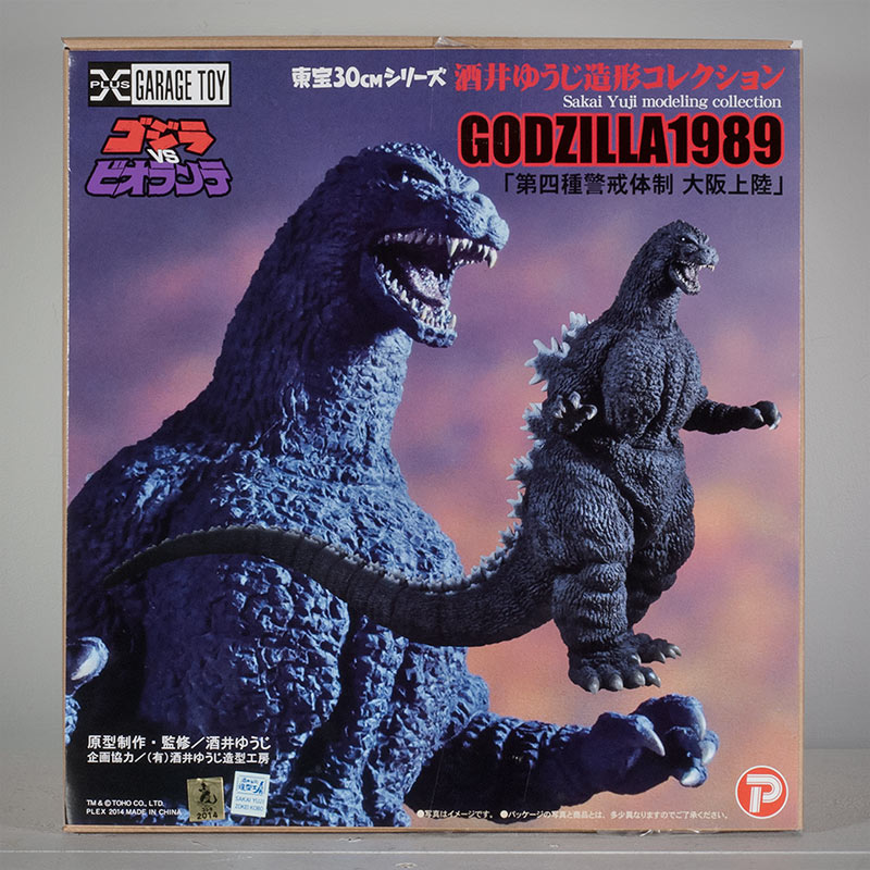 With the new Yuji Sakai Modelling Collection comes a new box design that starkly contrasts the cool, stylized box art that we’re used to. I’ve heard it described as everything between being the work of an intern to looking like a 70s record album cover. Okay, so it stinks. But, I’m resolved to look at it this way: it looks like a garage kit box. And that’s ‘sort of’ what this is. Right? The box comes with the usual X-Plus Garage Toy logo in one corner and the Plex logo in another. A new detail here is the inclusion of a Godzilla vs. Biollante logo. And for those who need to know, the text reads (in kanji and katakana) Toho 30cm Series Sakai Yuji Modelling Collection. It then repeats “Yuji Sakai Modelling Collection” in English, along with “Godzilla 1989”. Then, in kanji: “fourth kind warning system, Osaka Landing”. Also new: next to the usual Toho Godzilla licensing sticker is another licensing sticker from Sakai’s company, Zokei Kobo. It says “SAKAI YUJI, ZOKEI KOBO”. Now, on to what’s inside! ATTACHING THE TAIL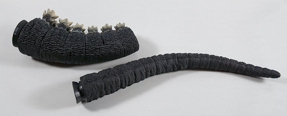 The figure, as usual, comes with the tail unattached (in this case, two pieces) which needs to be inserted by you. The tail assembly process should be well known by now: use a hair dryer to heat the “female” end of the joint. This is typically the “butt” of the figure. Warming it will make it soft and agreeable to being invaded by the “male” end (the end with the suction cup-looking flange). Keep the male end cool so that it will be firm. If you are doing this in the summer, you may want to put the tail in the refrigerator (NOT THE FREEZER: you may wind up cracking the flange right off the tail!) for a SHORT while to get it firm and sturdy. Then, just insert, push and twist. The joints on the tail pieces are not completely round, but this does not get in the way of inserting them. They went in really easy for me. Since this figure has two pieces, attach the larger tail piece to the body first. Then add on the second, smaller piece. (Attaching the smaller tail piece to the larger tail piece first would require you to heat the larger piece and, in the process, could soften its male end making it harder to attach to the body.) SCULPT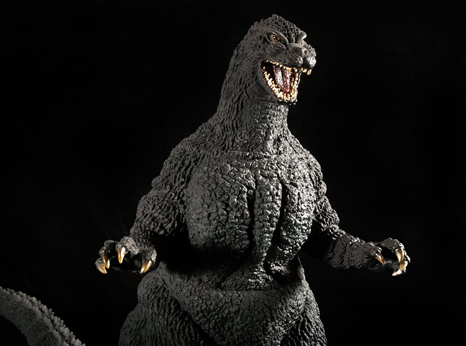 And here it is. I had some doubts about this figure when it was first revealed. Especially with how it looks from the front. But, I ordered one anyway. (Of course, I did!) And now that it’s in front of me I am just blown away by it. Sculpt-wise… THERE’S NOTHING WRONG WITH IT! There are little things that bug me about the other two X-Plus Heisei Godzilla entries, but this… nothing! As usual, when reviewing a new figure, I sat down to watch the movie with the figure in front of me, my eyes darting back and forth between it and the screen, comparing every detail I could get a good view of and pause on. Every single time, the figure failed to disappoint. 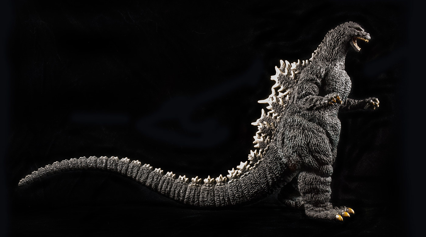 This is my first time seeing a sculpt by Yuji Sakai that wasn’t either three inches high or riddled with articulation joints. I can see now why his name is so revered. 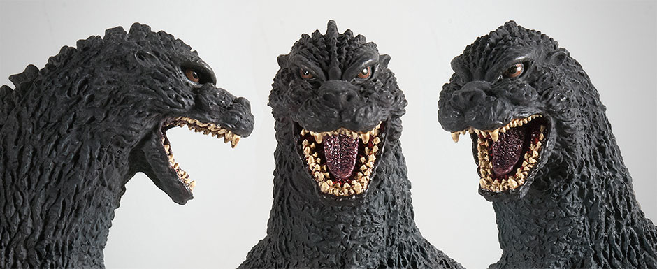 The 1989 Godzilla suit had a bit of a pointy head but that feature is absent from this figure. (Not that I mind; that point always kind of bugged me.) Other than that, the head sculpt looks accurate, fantastic and awesome! [ UPDATE: It was just mentioned in the comments that the ‘pointy head’ was only on the ‘sea suit’, so Sakai’s sculpt is right; I’m wrong! ] Okay, so there is just one thing. From the front, the head seems a little skewed to one side. His eyes, nose and mouth don’t line up perfectly. His left cheek seems lower than his right. Something isn’t quite right here. Thankfully, it’s not overly obvious and from angles other than the front, a non-issue. 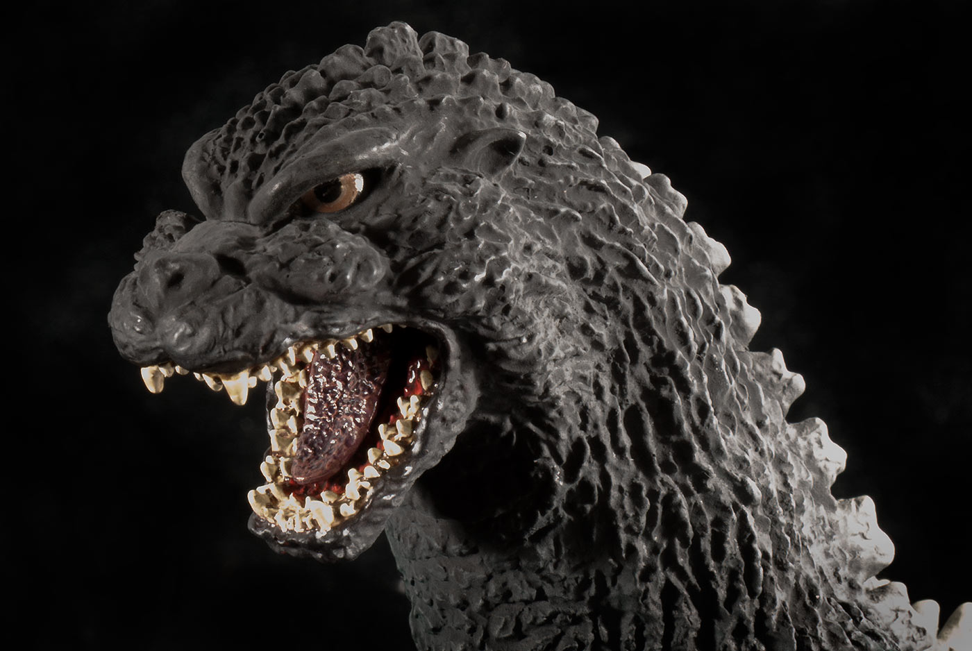 Check out the mouth on this thing! I’ve never seen so much attention given to the mouth of an X-Plus figure that wasn’t part of the Gigantic Series! W.O.W.! The inside of the mouth has a deep ridge pattern under the tongue and even on the roof of the mouth! The tongue has a similarly detailed texture, even though it wasn’t nearly that coarse on the suit. This is just unbelievable detail squeezed into a space smaller than a quarter! The teeth are not individually sculpted like those on the original X-Plus 30cm Series Godzilla 1989 vinyl, but they are much, much closer to being accurate. The downside is that since they are so small and have a weak paint job and they can look like a fat row of gunky molars rather than the double row of sharp wedges that they were on the suit. More on the mouth, including photos, are down in the Paint Job section. 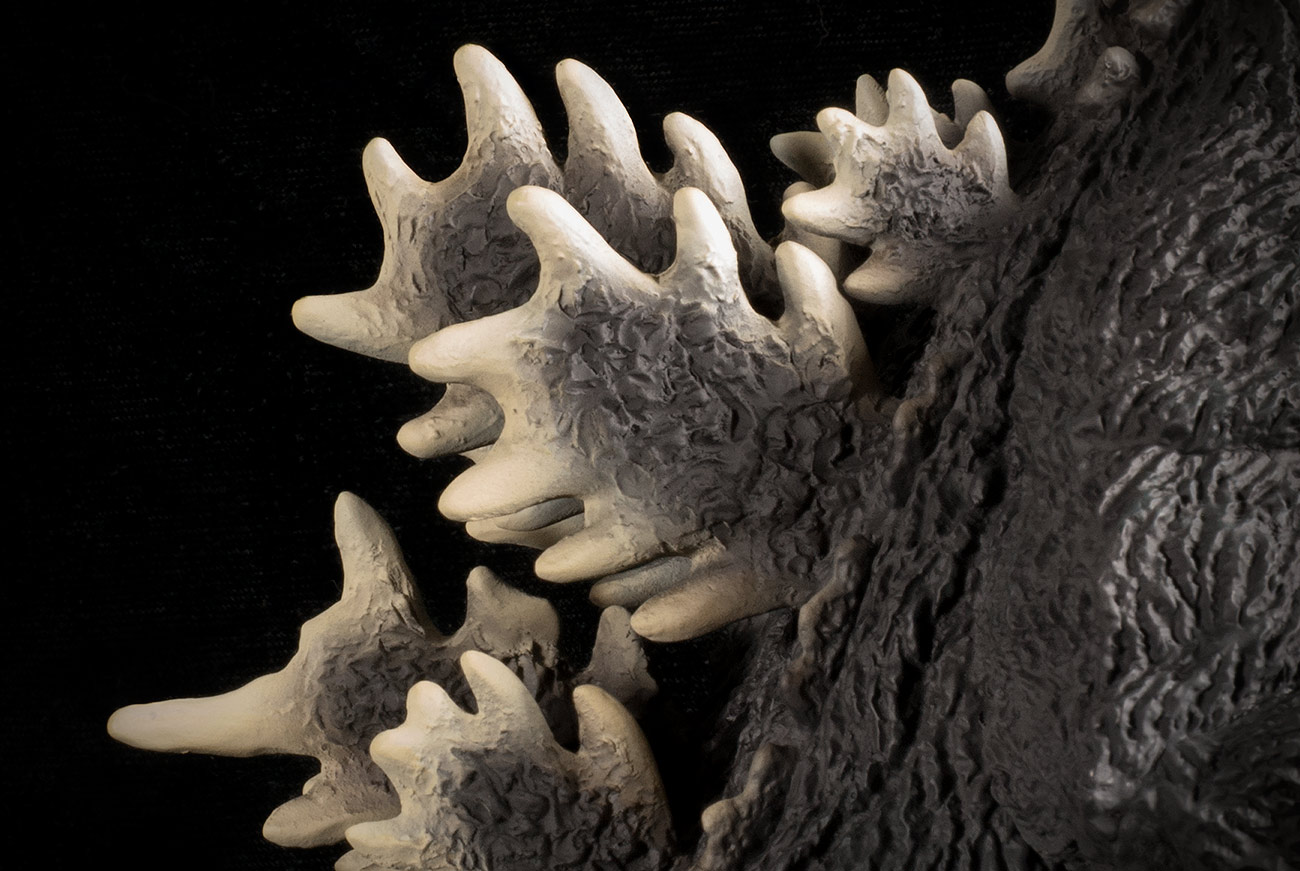 As usual with X-Plus, the dorsal fins look great. But this sculpt goes above and beyond the call for accuracy and detail. I paused the Godzilla vs. Biollante blu ray a couple of times to compare the fins on screen to the figure in front of me. I expected them to simply capture the ‘spirit’ of the shapes but I discovered much more than that. Yuji Sakai actually took the time to mimic individual spikes on the larger fins. Look at the photo above. There are short spikes, long spikes, spikes curving this way and that, spike huddled in pairs, etc. Seems kind of random, yes? Well it’s not completely. Many of these “random” dorsal fin shapes are actually ridiculously accurate… down to the spike! The X-Plus Yuji Sakai Godzilla 1989 not only looks accurate, but is more accurate than you can see! But, wait, there’s more! The upcoming Ric Boy version of this figure will have light-up fins. In cases like this, X-Plus typically makes the Standard versions the same exact way as the Ric’s, sans the lights and wires. And, also typically, light-up fins don’t look anywhere near as good as those made without the soft, translucent vinyl. But, these fins LOOK GOOD! So, either X-Plus decided to make totally opaque fins for the standard, or they’ve stepped up their game and found a way to make the fins look good and light up at the same time. We’ll have to wait for the Rics to come out at the end of October to find out. JOINTS & SEAMSI’m very happy to say that the X-Plus Yuji Sakai Godzilla 1989 seems to be seamless! There are sealed joints above both biceps, below both knees and at both ankles. The back strip with the dorsal fins are also a separate piece. And at each and every one of these spots, the joints are virtually invisible. The tail is in four pieces, all of which are not glued and sealed and two of which you need to attach yourself. And all four joints are PERFECTLY matched and practically invisible thanks to the ribbed segments in the sculpt. I can’t help thinking that there must be a seam around the jaw because I can’t see how the intricate paint job inside the mouth could have been applied otherwise. But I just can find a line. A+, X-Plus! POSE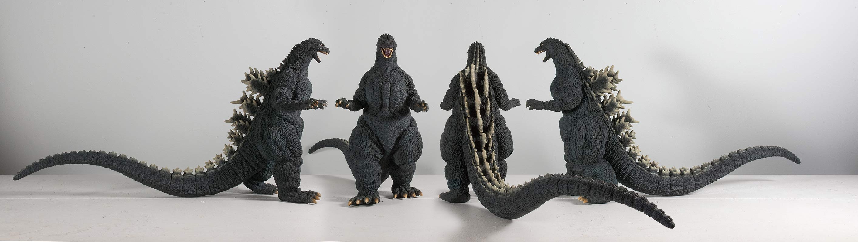 I kept changing my mind on how much I liked the pose (from the front, anyway). I couldn’t help thinking that its slightly outstretched arms made it look like a cartoon character tip-toeing up behind Biollante for a surprise attack. But when I gave the Godzilla vs. Biollante blu ray a spin and saw the scene it came from I was surprised to see how faithfully Yuji Sakai captured the pose. (See the photo from the movie at the top of this page.) Now, I think I very much like its ‘realistic’, un-posed look. Most X-Plus figures look like they’re posing for the camera — trying to look perfect from every angle. (Not that there’s anything wrong with that.) The Sakai ’89, though, seems realistic and “alive” to me. It’s also interesting that this figure’s walking pose has one heel off of the ground. Which brings me to … UH-OH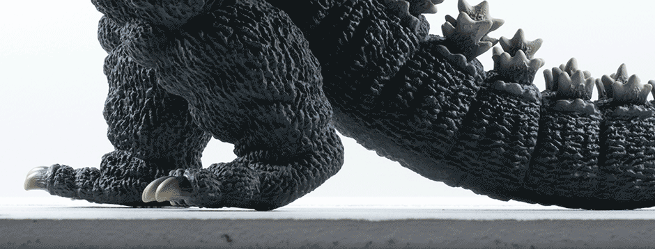 I wasn’t going to mention this, but it seems clear that I’m not alone with this little problem. The feet do not meet the floor flush as they should. Instead the figure rests on the ball of the left foot and the right foot heel. Raising the tail up about three eighths of an inch (.95 cm) fixes this problem, but leaving you with another problem. It may not seem like it’s off by much by looking at the animated GIF above, but in person, and at a low angle, it is kind of obvious. Thankfully, it doesn’t look like that big of a deal when looking at it from higher angles. Still, I’m not sure we should have this problem for a figure that costs well over $200. UPDATE: Apparently Yuji Sakai likes to sculpt these with the tails slightly in the air. I somewhat confirmed this by taking a peek at the Dream Evolution book and found other sculpts that do the same thing. So, maybe the figure is just following the original sculpt. Well. Um. At the end of the day the figure leans back so I don’t get it. The X-Plus Yuji Sakai Godzilla 1989 not only looks accurate, but is more accurate than you can see! PAINT JOBThe X-Plus Yuji Sakai Godzilla 1989 has a base coat of dusty, asphalt black. But the quality of this black seems different somehow from the other figures in the line. It looks richer. (See the Size Comparison photos below and you can see the difference.)  HIGHLIGHTS I noticed later, under bright light, the reason for the richer-looking black is that the figure is smothered with subtle blueish highlights. They’re almost invisible to be seen as actual highlights, yet they’re there enough to affect the overall look. The photo above shows an exaggerated view of the highlights which I made obnoxiously visible with Photoshop by cranking up the saturation values of just the blues and aquas. Now you can clearly see how extensive the highlights are. If you’re looking at this review on a computer (and not a phone) you can just faintly see these highlights in the first photo at the top of this page. While I appreciate the work that went into applying the stealthy blue highlights which I can only faintly detect with my eyes, I still feel this figure could do with a few visible splashes, like a bit of dirt here and there (as on the ’64) to break up its overly clean feel.
MOUTH The inside of the mouth has a meticulously detailed reddish/purple color filling the lower regions of a very detailed texture in the sculpt. A meaner red coats the higher elevations of this veiny ridge pattern. And if that’s not cool enough for you… look up! They did the same thing to the roof of the mouth which looks even better! The tongue gets the same two-color treatment but with a muddy purple. (Which confuses me because the tongue was clearly red in the movie.) It’s not really visible in my photos, but my figure has some slight red overspray around the mouth which, fortunately, can’t be seen with out a camera close-up. TEETH Unfortunately, the teeth don’t look as great as the rest of the mouth. And don’t even begin to compare to the simpler, superior paint job on the original X-Plus 30cm Series Godzilla 1989. The care taken to paint each single tooth on the original (which you can see below) just didn’t happen on the Sakai version. But, it probably couldn’t happen. The teeth on the Sakai ’89 are so small that they must have been very difficult to paint. They just covered them all in an off white and then added a tartar brown dabbed into the tiny crevices in between each tooth for shadowing. But the result is somewhat of a gunky mess if you look too closely. Even from normal viewing distances, the results look a little sloppy. Despite the failed paint job, the teeth on the Sakai ’89 absolutely crush the original figure when it comes to being sculpted accurately. 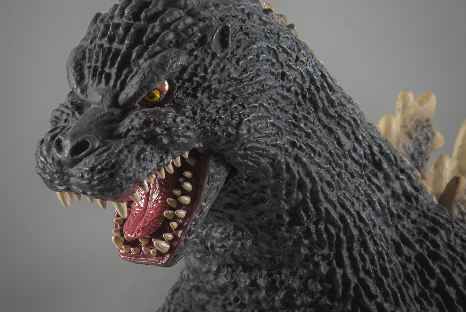 EYES The eyes on the Sakai ’89 are painted far more simply than the eyes on the original 30cm Series Godzilla 1989 which had a palate of brown, black and yellow. The Sakai has only black balls floating on a light brown. Fortunately, the glossiness of the paint used on the eyes picks up the light in the room adding a little specular twinkle for a “third color”. But which eyes are more accurate? The original figure wins here. The Sakai ’89 eye colors are technically painted too simply. There are plenty of close-ups in the movie which show Godzilla’s eyes looking more complex than depticted on the Sakai ’89. However, there are scenes where the eyes “appear” to be just black and brown. You decide. BONEY BITS As is typical with X-Plus, the dorsal fins feather into a boney white along the edges and look great as usual. The smaller dorsal ridges that creep up to the head and all the way down to the tip of the tail fade out nicely. The claws seem to have gotten extra attention on this figure. They’re darker than usual, fading from a black to dark brown to dark tan at the tips. SIZE COMPARISONS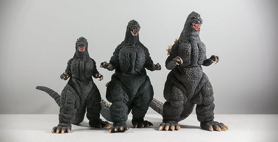 THE 89ers Left to right: X-Plus Large Monster Series Godzilla 1989, 30cm Yuji Sakai Godzilla 1989 and the original 30cm Series Godzilla 1989.  TOHO 30CM SERIES YUJI SAKAI MODELING COLLECTION Left to right: The Sakai Godzilla 1989, 1991, 1992 and 2001. This collection lines up perfectly with itself. 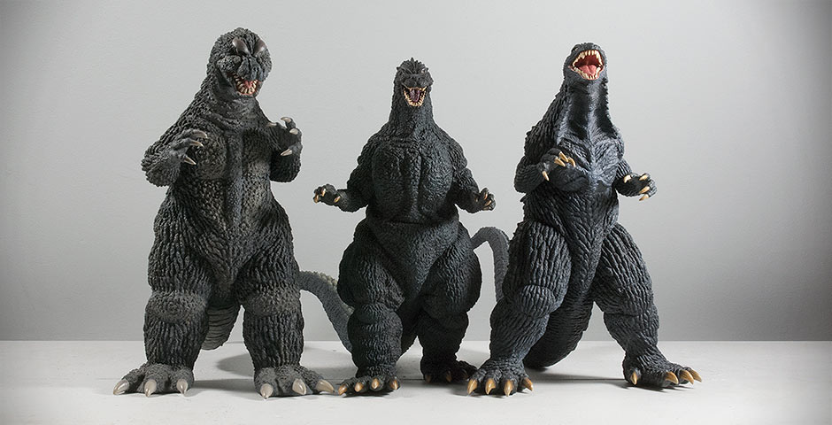 30CM SERIES Left to right: Toho 30cm Series Godzilla 1964, Yuji Sakai Godzilla 1989 and Godzilla 2003. The Sakai ’89 will produce a dip in your 30cm Shelf skyline. 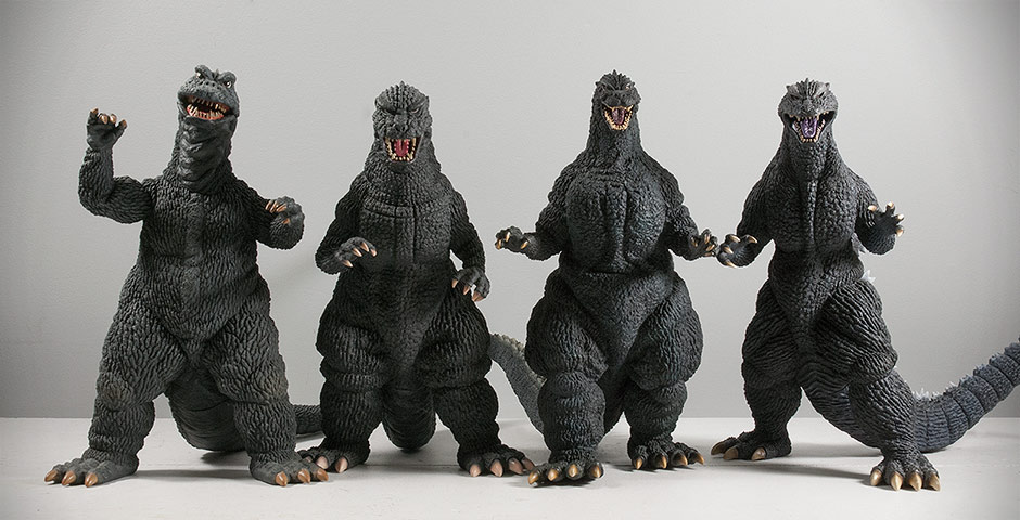 THE SHORTIES Left to right: Toho 30cm Series Godzilla 1968, 1984, Sakai 1989 and 2004. The ’68 was the first “shortie” and was, for quite a while, the only one. But then came the ’84 and shortly after, the ’04 and now the Sakai ’89. This foursome is frustratingly short compared to the typical height of other Godzillas in the 30cm Series. But now they number high enough to make up exactly one third of the 30cm Series Godzilla catalog. If this keeps up, we won’t be able to call them short anymore and just accept the fact that the 30cm Series figures are simply no longer in perfect scale with each other.  Being short ain’t all bad! The fact that the Sakai ’89’s height really places it in a middle category between the Large Monsters Series and the 30cm Series makes it just a little closer to being in scale with the Large Monsters Series Biollante. I don’t think many OCD scale freaks will complain that much if you pair these two together on the shelf. FOOTPRINT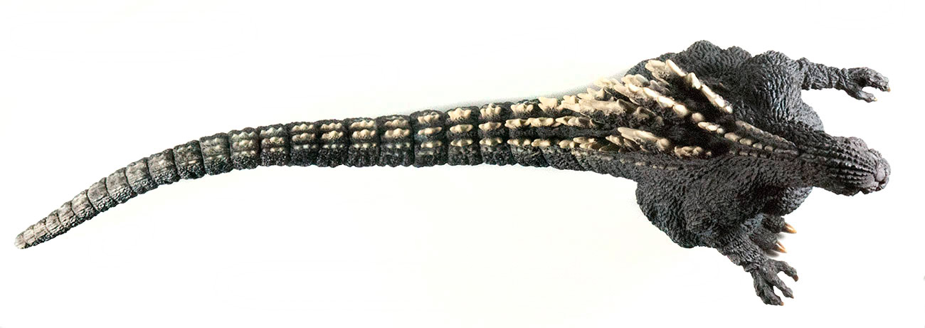 Despite it’s lack of height, this figure has a tail longer than most other figures in the series. It’s a whopping 15 inches long (20 inches from tail tip to toes) and reaches almost straight back with very little curves. This makes it just a little bit unfriendly on the shelf. For what’s it’s worth, the tail curves ever so slightly to the figure’s right so placing him on the shelf facing the right is the way to go, especially since this angle matches the scene from which this sculpt sprung. SUMMARYThis figure is freakishly AWESOME. It has a crazy-accurate sculpt and impressive details all over. While it lacks noticeable highlights and has gunky teeth, it’s good points far outweigh the bad. Despite my early apprehensions, the 30cm Series Yuji Sakai Godzilla 1989 is now one of my all-time favorite X-Plus figures. And certainly my absolute favorite Heisei figure. I’m drooling over the very idea of a second entry into the Yuji Sakai Modelling Series. I pulled out my copy of the Yuji Sakai Dream Evolution book to take a peek at what could possibly come next but found very little as far as entries in the 30cm size range. I’m hoping this book either isn’t complete or that perhaps brand new sculpts might be on the way from Sakai. Hurry, X-Plus! More of this, please! EXTRAS  MORE INFORMATION
By John Stanowski Originally posted October 13th, 2014 on Kaiju Addicts.
 ALL PHOTOS: X-PLUS. It was only two weeks ago that news of a Yuji Sakai sculpt being used for a new X-Plus vinyl broke at Summer Wonder Festival in Tokyo. And before we could spend much time wondering when it would go up for pre-order, X-Plus dropped a kaiju bomb. The time… is now! On Friday, August 8, the Toho 30cm Series Yuji Sakai Model Collection Godzilla (1989), “Osaka Landing” Vinyl Figure showed up on X-Plus’ Ric Boy site, ready for orders! By the way, how about that name! It’s longer than Godzilla’s tail! And it’s even LONGER in Japanese: 東宝30cmシリーズ 酒井ゆうじ造形コレクション ゴジラ(1989)「第四種警戒態勢 大阪上陸」. NOTE: I’m familiar with only a handful of kanji, katakana and hiragana. So I can’t read Japanese. And I’m not all that good at deciphering Google translations of Japanese either. So, keep in mind that I did my best to glean information you could use from a Japanese-only source. Now, on to what we know: 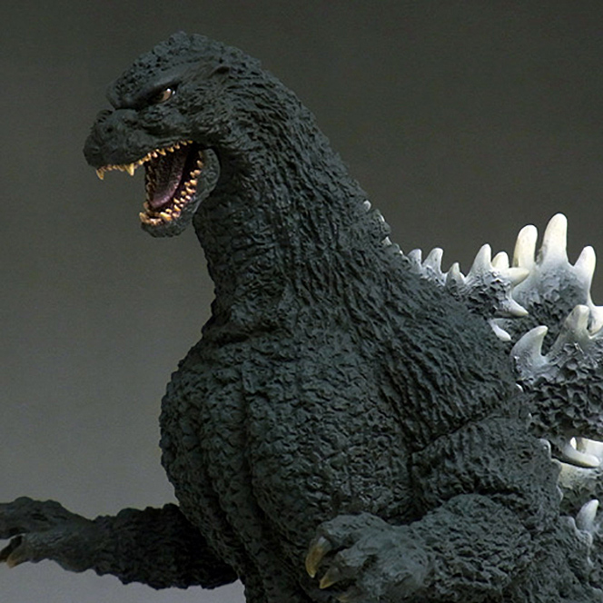 IT’S SCULPTED BY YUJI SAKAI I won’t pretend to know everything about this guy who is so incredibly verbose with his hands and a bit of clay. But I can tell you he’s one of the most respected Godzilla model sculptors. If you can shed more light on Sakai-san, please do in the comments. If you’ve never heard of him, I can say you’ve probably seen his work. Most of the S.H. MonsterArts figures were sculpted by him. This guy is good. He knows every Godzilla suit by heart and has proved it time and time again. His work can be found in the book Godzilla Dream Evolution. You can get it from Amazon.com. You can also get it a lot cheaply from Amazon.co.jp. (It’s okay, it’s a book. They will accept your money and will ship directly to you.) The sculpt for the Osaka Landing ’89 figure was originally released by Sakai as a resin kit. X-Plus has many times in the past made figures from previous resin kits so this isn’t something new. REGULAR RELEASE: RIC BOY AND STANDARD This isn’t a web special or limited run. It will come in two flavors like we’re used to. The Ric Boy version has translucent fins and a light gimmick. And, even though the standard version does not, it will likely still have the same, soft, translucent fins. 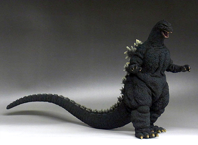 IT’S EXPENSIVE Yuji Sakai’s name and work come at a price. The Ric Boy version will cost you ¥28,944 ($284). The standard is reported to cost ¥27,000 ($264). Ouch! IT’S SHORT X-Plus openly admits this figure stands only at 28cm (about 11 inches). Though very disappointing, it’s not something most of us are not used to. The X-Plus Godzilla 1968, 1984 and 2004 also come in at around 28cm. (Not that we’re happy with that.) This is the part I find confusing. Apparently the original Sakai sculpt is a full 30cm. They used the original master mold to make a wax cast, which was then used to create a new mold for X-Plus to use. And somewhere along the line there was some shrinkage, leaving us with a final product of only 28cm. 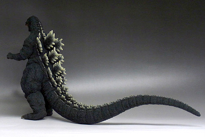 WHEN? WHERE? NOW! If you’re set up with the Ric Boy site you can preorder an exclusive right now. Orders will be taken until August 25. No doubt the Standard version will begin to show up on sites like Hobby Search, AmiAmi and Hobby Link Japan. The figures are expected to release in Late September / Early October. WHY ARE THE PHOTOS SO DARK? From what I understand, these photos show a prototype figure which was painted on the spot at X-Plus Headquarters in Osaka. So what the photo shows paint-wise hasn’t been finalized yet. I’ve lightened the photos just so that you can see more detail in the sculpt. 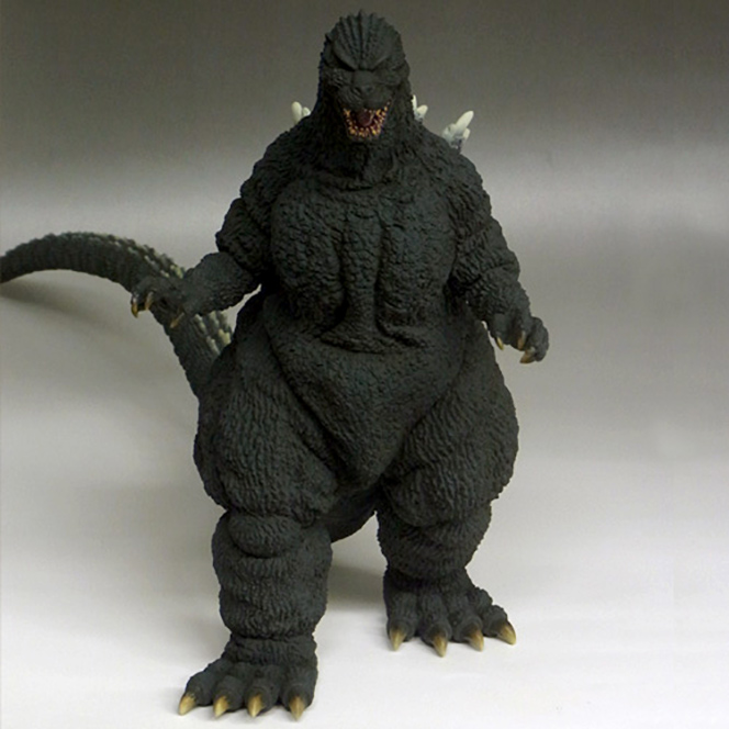 DIAMOND RE-ISSUE OF ORIGINAL X-PLUS 30CM SERIES GODZILLA 1989 ON THE WAY If this new Sakai figure is too short or too expensive for you, it’s good to know you have another option. Diamond announced at SDCC this year that Wave 7 will include a re-issue of X-Plus’ original Godzilla 1989 figure which is a full 12 inches tall and will cost between $139 and $159. It will go up for pre-order later this year. Check out the Kaiju Addicts X-Plus Godzilla ’89 Review for a closer look. By John Stanowski Originally posted August 9th, 2014 on Kaiju Addicts.
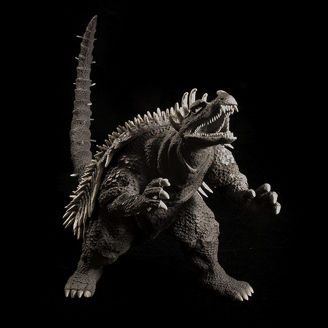 FIGURE SPECS東宝30CMシリーズ「アンギラス(1955版) ゴジラの逆襲」 モノクロ塗装版 JAPAN ORIGINAL RELEASE: 2011 DIAMOND RE-ISSUE: DECEMBER 2014 BANDAI RE-ISSUE: MAY 2015 SERIES: TOHO 30CM SERIES MATERIAL: SOFT VINYL FROM: “GODZILLA RAIDS AGAIN”, 1955 ゴジラの逆襲 HEIGHT: ABOUT 10 INCHES / 25.4 CM WIDTH (TOE TO TOE): ABOUT 8 INCHES / 20 CM LENGTH (NOSE TO TAIL): 19 INCHES / 48.2 CM FIGURE WEIGHT: 1 LB, 4 OZ / 566 G REVIEW AND PHOTOS: JOHN STANOWSKI The X-Plus Toho 30cm Series Anguirus 1955 vinyl figure was originally released in 2011, shortly after the Godzilla figure from the same movie. Godzilla Raids Again was the second movie in the franchise and the first ever to include a foe for the title character. Anguirus was that foe and was, if you ask me, the most fierce version of all the incarnations to follow, including the one from Godzilla: Final Wars in 2004. (Yeah, Anguirus was pretty cool in 2004, but rolling around and hitting your enemies with your back while your head and limbs are safely tucked in is as admirable as kicking in a fight if you ask me.) Despite his badassery, Anguirus 1955, or Angilas if you prefer, isn’t as popular as the suit design which came after it. And collectors most likely have set their sights on going after an X-Plus Anguirus 1968. Fair enough. But there’s no reason to turn your head and pfft at this historical kaiju suit and X-Plus’ beyond awesome vinyl rendition of it. There’s lots to love here, whether you grew up with the movie or you just dig the 1950’s retro thing. The Toho 30cm Series Anguirus 1955 is a prize.
SCULPT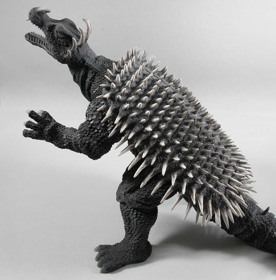 As with (most) other X-Plus vinyl figures, the Toho 30cm Series Anguirus looks freakishly similar to the original suit. As far as I can tell, every minute detail was studied and faithfully recreated in this sculpt. It’s hard to appreciate at first since Anguirus was veiled behind dark, grainy 1950’s film stock quality. But if you compare it to good photos from the film you’ll find that it’s an outstanding likeness. 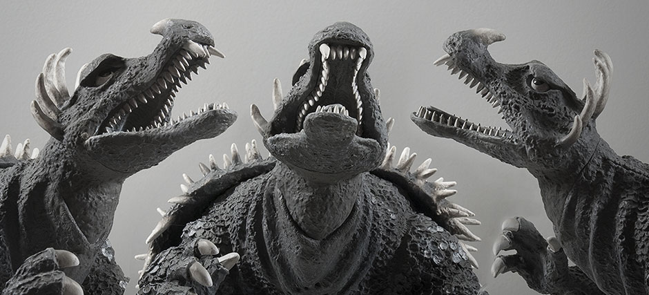 They got the head right, and from every angle. And, once again, individually sculpted teeth… and lots of them. And even though it lays flat in the mouth, the tongue is also a separate piece glued in on one end and loose at the tip.  The texturing on this figure is just kerr-aazay! Folds of rough skin and scales cover this beast. New collectors: note the sculpted holes in the neck which recreates the holes the suit actor used to see through!
Now about those scales. Holy. Shit. They look like they were sculpted one at a time and pressed into the body. This is in no way a “toy”. The back is covered with individually sculpted spikes. There was no cheap, easy-way-out sculpting done here. This must have been a tedious labor of love to create. 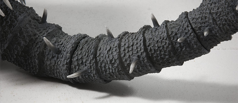 The tail is a masterpiece of foldy skin covered with the same precisely sculpted scales found on the arms and legs along with more sharp spikes which vary from a quarter of an inch to half an inch long. And, yes, these things can hurt you if mishandled! JOINTS & SEAMSNot much to complain about here! The only truly visible seam is around the neck and most of that is cleverly conceiled in sculpted folds of skin. The elbows and knees are all joints which seem to be glued into place and hidden the same way as the neck. The tail is in 4 pieces. One joint is glued and two aren’t but are tight. The final joint is where it connects to the body and that seam is masterfully hidden by the sculpt. Overall: it seams to be pretty seamless. (Yes, that was a pun). POSE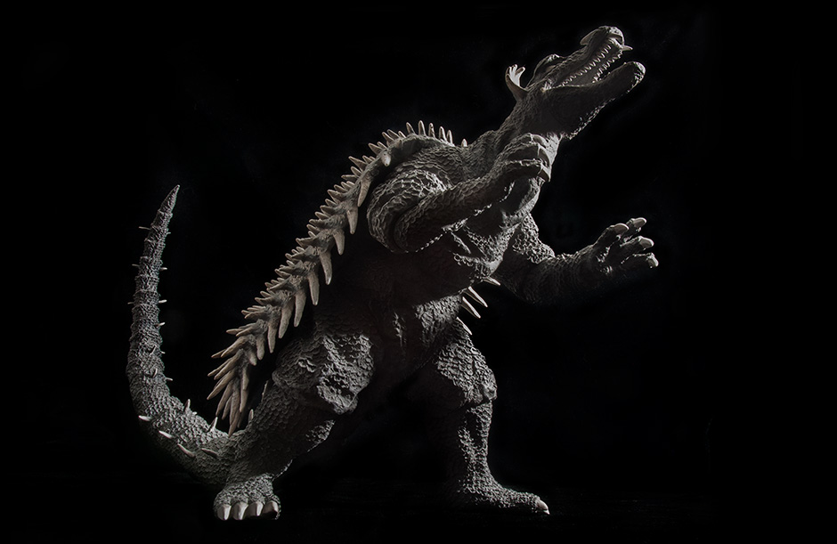 As for the pose… it’s PERFECT! It literally looks like a snapshot from the movie. Angilas was often balancing on his two rear legs and aiming his front claws and teeth at Godzilla. Even if you don’t recognize the pose from the film, it’s still an awesome position for a monster of a vinyl figure. 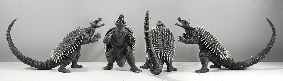 And it looks good from all angles. Though its left side is better than its right because of the leg positions. Click on the photos for larger versions. POSE UPDATE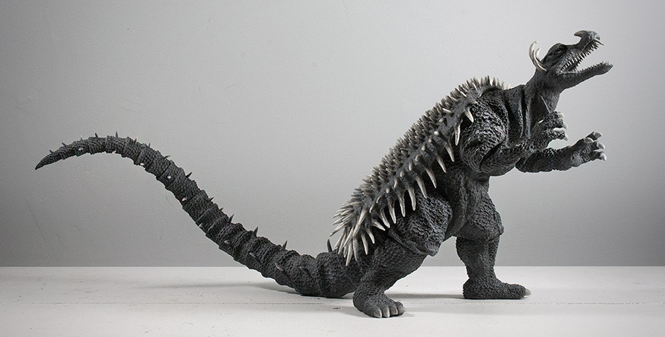 Doh, I feel so stupid. After two years on my shelf and after taking all of these photos I find out that Anguirus’ tail should curve DOWNWARD. As you can see in all the photos on this review, I have Angy’s tail curving straight up in the air. And why wouldn’t I? That’s how it came out of the box. But X-Plus collector Michael Erickson set us straight on the X-Plus Kaiju Collectors Facebook Group by posting one of the original production photos. It’s clearly pointing down. Michael told us to line up the spikes. I never noticed but Anguirus has only 3 rows of spikes: one down the top and one on each side. Use those as your guide. There are two joints you’ll need to rotate to get the right look. And right it is! Now it more resembles the tail on the suit as it was tugged on by a wire on the set. It would seem the X-Plus factory folk rotated the tail out of shape and into a single curve in order to make it fit into the box. Oh well. Now we know. Take note, though, that twisting the tail into the correct position will add a few inches to Anguirus’ overall length. Yeees, he’s even longer now. If he doesn’t fit on the shelf anymore, you could always just put it back the way it was. …it does wonders to summon up visions from Godzilla Raids Again when gazed upon. It may not be your favorite Anguirus suit, but it is one hell of a figure. PAINT JOBThe X-Plus Toho 30cm Series Anguirus 1955 is monochromatic to match his look in the black and white film. The figure is a very light, dusty black; some might say it’s gray. The eyes, teeth and claws are a super light gray, almost white. And the spikes on its back are a brighter, dirty white. The feathering of this white into the base of each spike is beyond impressive. Also, many of the spikes, especially the crown of them on the head have a nice grungey texture to them. Subtle highlights are brushed on to the higher ridges on the belly. And perhaps most impressive is the freckling of silver scales on each shoulder. The painters in the factory actually targeted individual scales to brighten. And it looks exactly like it did in the movie. Now, all of this was done back in 2011 when X-Plus was still trying to prove itself with this line. Let’s just hope that the upcoming Diamond Reissues will have paint jobs which match the quality of the original. SIZE COMPARISONS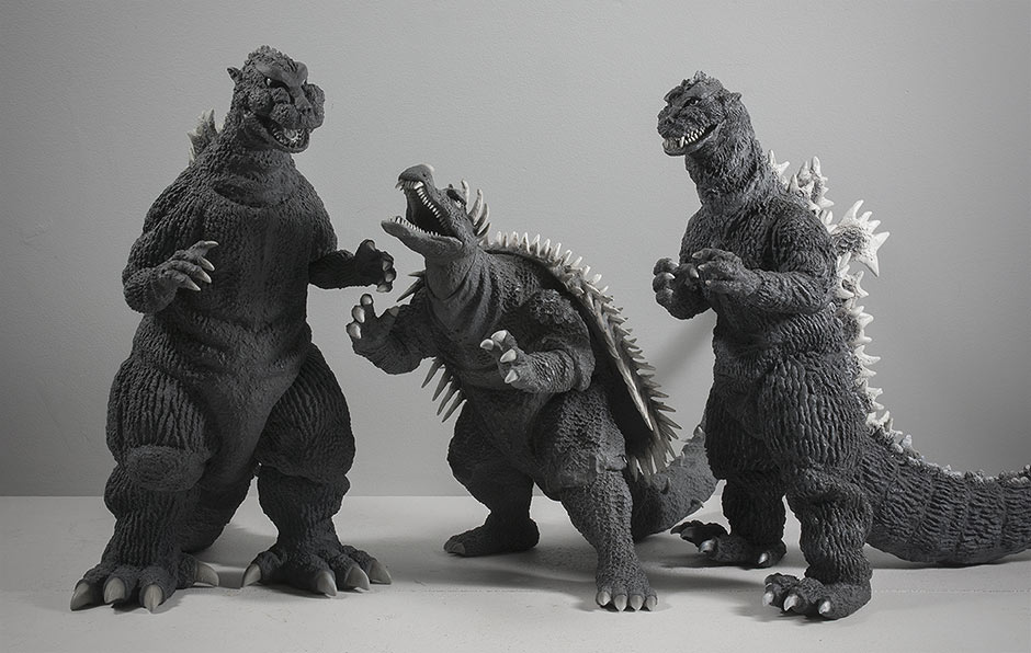 The X-Plus 1950s monochrome monsters. The 30cm Anguirus fits right in with the 30cm Series Godzilla 1954 and 1955. His height is only 10 inches compared to the 12ish of the other two, but remember, Anguirus is leaning forward. 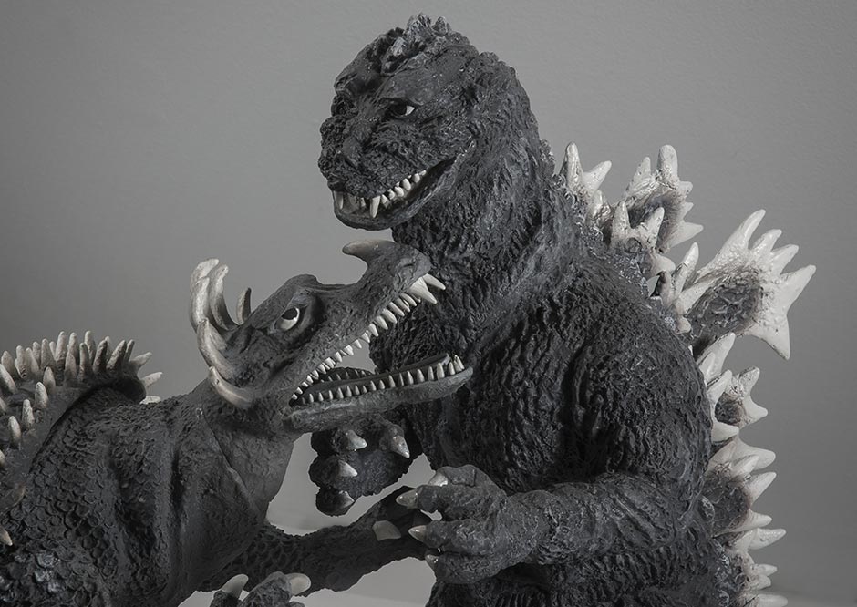 While we’re comparing Anguirus ’55 with Godzilla ’55… One possible annoyance is that, however they’re arranged, these two monsters just don’t see eye to eye. Anguirus almost looking straight up, while Godzilla seems to have set his sights on something at the horizon. It would have been nice if this pair could at least look at each other. But I won’t complain any more. Both of them have perfect poses copying signature moves from the movie and they look GREAT next to each other on the shelf. 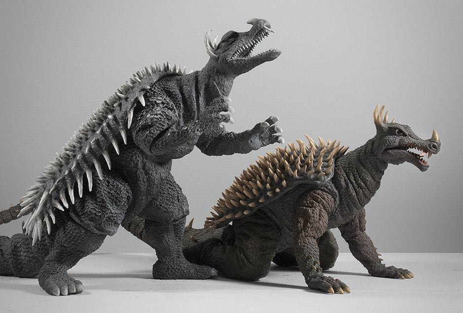 And here’s probably the second most obvious comparison to make. On the right is the Toho 30cm Series Anguirus 1968. They size up….. Uh, hello? Are you still reading? You’re staring at the ’68, aren’t you? Come on, this review is all about the ’55. Fine, stare away. I’m moving on.  And, finally, for those who don’t yet have an 30cm X-Plus, here’s a shot of the figure with a DVD to give you a good idea of its size. FOOTPRINT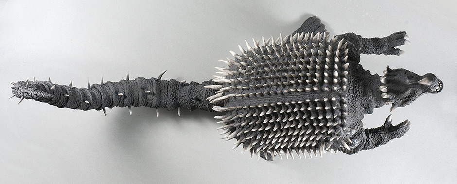 WARNING: SHELF HOG Even with its tail curved up into the air to cut it’s length, this figure is still 19 inches (48.25 cm) long! If your shelves aren’t that deep, you’ll need to pose this guy on an angle (which you’re likely to do anyway). But, if needed, you can subtract 4 to 5 inches off the length if you’re only concerned with keeping his feet inside the edge of the shelf. 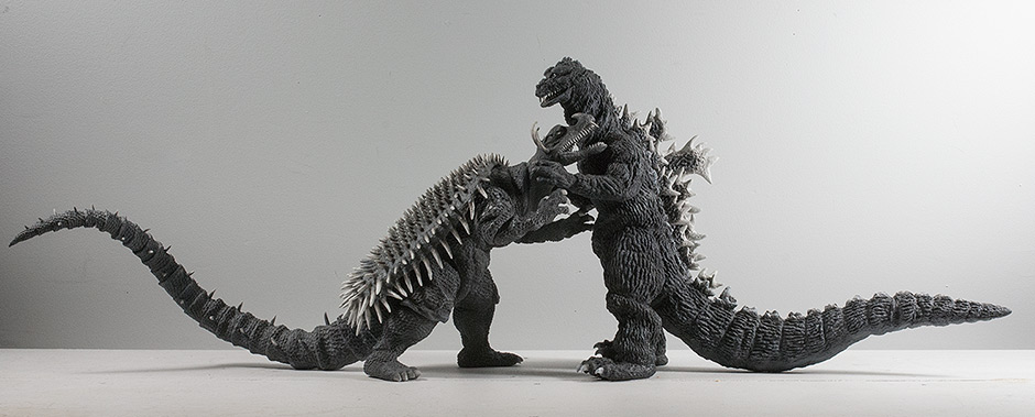 If you also have the X-Plus Toho 30cm Series Godzilla 1955 you’ll be pleased to know that you have the option of interlocking it with the Anguirus ’55. I don’t know if it was planned this way or not, but these two figures actually fit pretty damn closely together. Anguirus’ head fits in between Godzilla’s outstretched arms like he’s going for the throat! And Godzilla’s and Anguirus’ arms are all at different heights so they allow for a really close fight! This kind of set-up is probably only for diehard Godzilla Raids Again fans since it takes up three feet of shelf space. SUMMARYThe sculpt, likeness, detailing, texture, pose and paint job on the Toho 30cm Series Anguirus 1955 is very, very impressive. No, really. This figure is a fine example of the sort of quality you would expect from X-Plus. And it does wonders to summon up visions from Godzilla Raids Again when gazed upon. It may not be your favorite Anguirus suit, but it is one hell of a figure. EXTRAS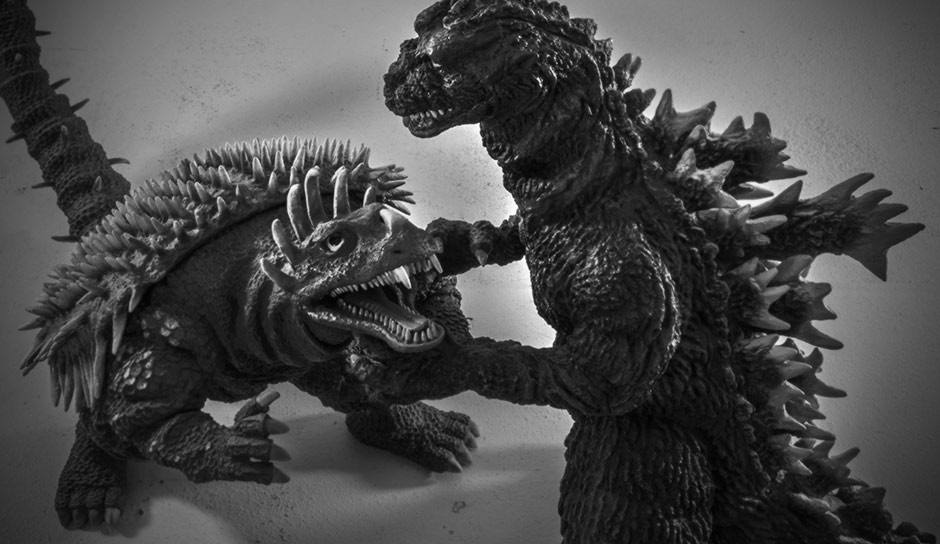 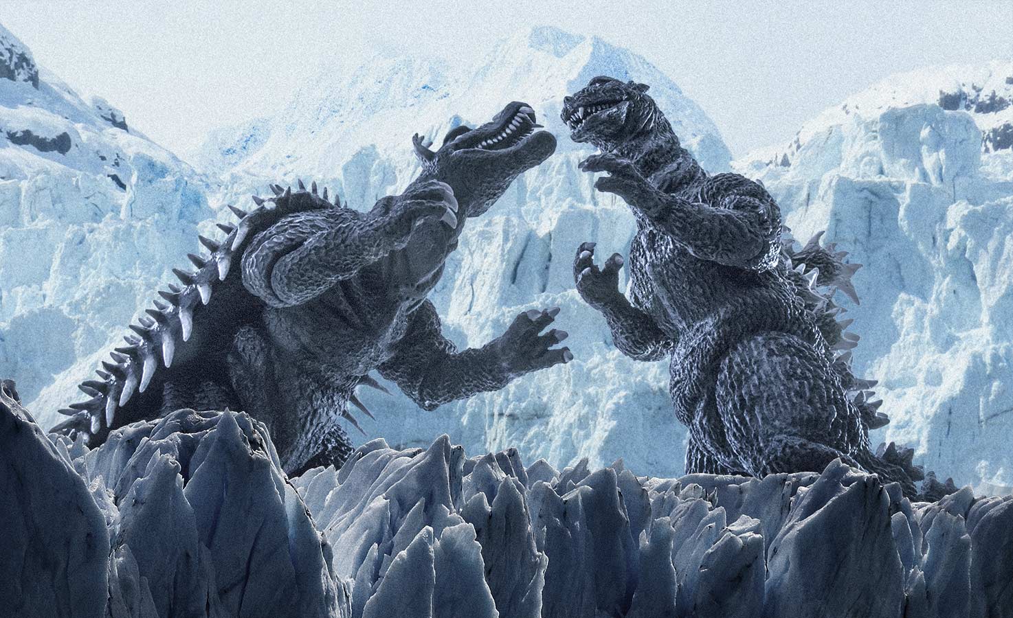 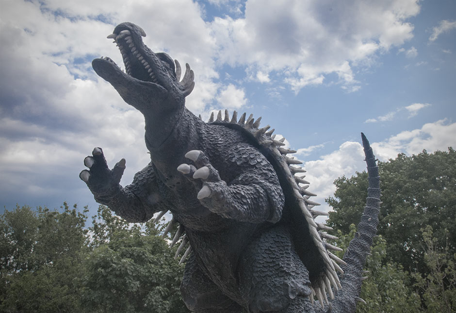 MORE INFORMATIONBy John Stanowski Originally posted July 16th, 2014 on Kaiju Addicts.
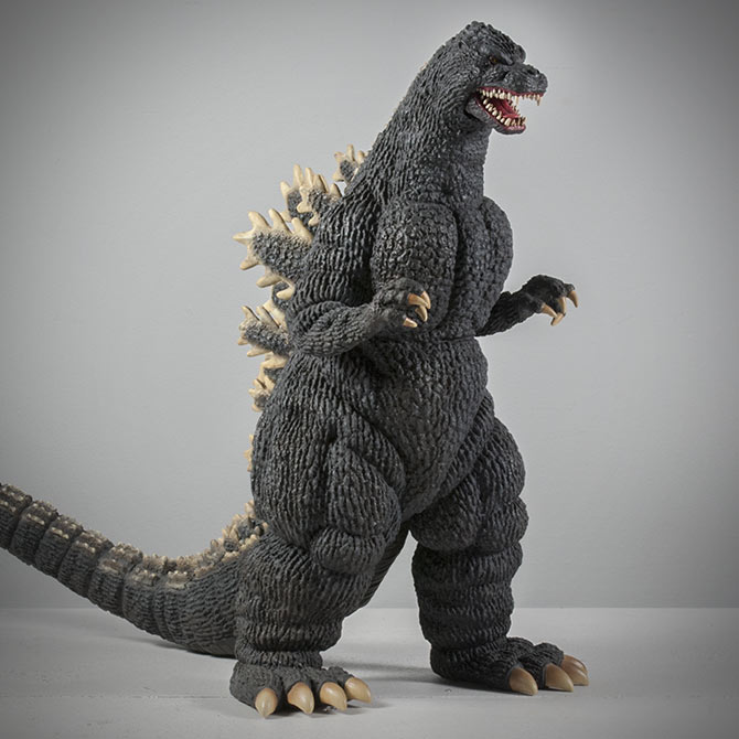 FIGURE SPECS東宝30㎝シリーズ 「ゴジラ1989」 JAPAN ORIGINAL RELEASE: 2012 JAPAN POLYRESIN RELEASE: 2014 DIAMOND REISSUE: DECEMBER 2014 SERIES: TOHO 30CM SERIES MATERIAL: SOFT VINYL FROM: “GODZILLA VS. BIOLLANTE”, 1989 ゴジラVSビオランテ HEIGHT: 12 INCHES / 30.4 CM WIDTH (TOE TO TOE): 7.5 INCHES / 19 CM LENGTH (NOSE TO TAIL): 18.5 INCHES / 46.9 CM FIGURE WEIGHT: 22 OZ / 623 G ARTICULATION: JAW REVIEW AND PHOTOS: JOHN STANOWSKI The X-Plus Toho 30cm Series Godzilla 1989 vinyl figure was first released in 2012. Slowly but surely, it became scarce, as usual, and aftermarket prices became steep. Some collectors found relief in a polyresin version which was announced, I think, in April. But only 50 were made. X-Plus released this fan favorite from Godzilla vs. Biollante (1989) again as a Diamond Re-issue in December 2014. THE BOX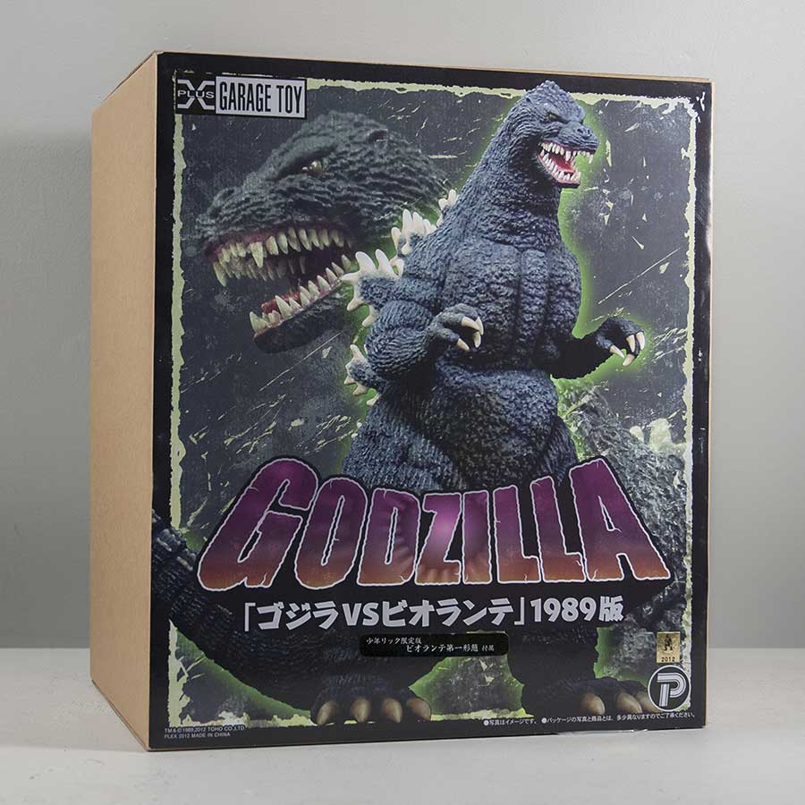 The X-Plus 30cm Godzilla 1989 vinyl figure comes in the usual 30cm plain box with art on the front. Inside the figure is twist-tied into a plastic shell. It comes in two pieces: the main body and the tail. Click here for tips on connecting the tail from Rich Eso. STANDARD AND RIC BOY This is the box for the Ric Boy version. You can tell by the presence of the small black sticker under the Godzilla logo. (Click on the photo on the left for a larger view.) The standard box is identical sans the black sticker. DIAMOND RE-ISSUE The Diamond Reissue (most likely coming out later this year) should also have the same box, but will come with a small “PX – Previews Exclusive” logo adding in one corner. SCULPT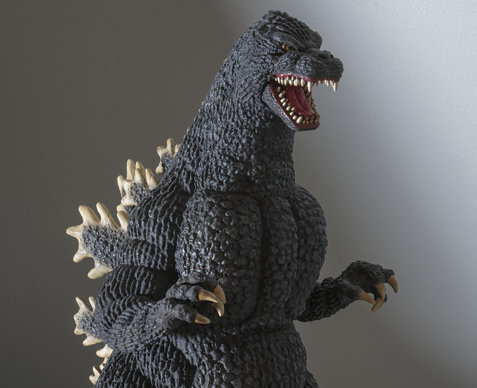 It goes without saying that the X-Plus Toho 30cm Series Godzilla 1989 is FREAKING AMAZING and should be in everyone’s collection. X-Plus has made only three Heisei Godzilla’s. The 1984, 1989 and the 1992. All three have their good points. But, if I had to choose a favorite, it would be the ’89.  HEAD Godzilla 1989 is one of my all-time favorite designs. And the head is a big part of that. It makes him look fierce and powerful and Badass with a capital B. The X-Plus vinyl captures all of that in the head sculpt. 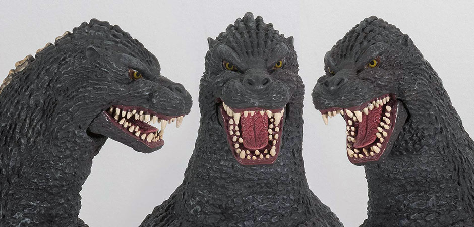 What I find amazing is that the head design is captured so well from every angle. Some features to note are the piercing yellow eyes, the subtle point on the top of his head, even the texture on the tongue is reproduced with uncanny accuracy. I didn’t remember there being much detail on Godzilla’s tongue, but when I watched the movie again in preparation for this review, I got a good look and, WOW, X-Plus NAILED IT! It’s this super attention to detail that makes so many collectors hold X-Plus with such high regard. THE JAW An unusual feature on the 30cm Godzilla 1989 is the hinged jaw which allows you to choose from a semi-closed mouth or a full roar position. While I appreaciate this option, I feel the gaping ventriloquist doll line under the jaw takes away from the near perfect look of this figure. This gap is more visible when the mouth is near closed, so I keep mine open wide. As usual, the teeth are individually sculpted… both rows of them! By the way, all of the fingers are also individually sculpted and very expressive. JOINTS & SEAMSThis figure is “mostly” free of visible seams. There are glued, sealed and filled joints at the elbows and below the knees and they’re practically invisible unless you look for them. The main tail joint is an excellent fit and match. Godzilla’s bulky thighs obscure the sides of this joint and you can see the join only from above, and even then, it’s worked into one of the sculpted tail segments. The tail has two additional “jiggle joints” that aren’t meant to move and they pretty much stay put if you leave them alone. They’re obvious only if you look for them. The back piece from which the doral fins spring, as usual, looks seamless. And then there’s the aforementioned hinged jaw which, when not opened all the way, has a very noticeable gap around it. POSE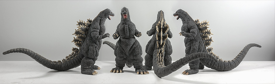 Once again, pretty standard stuff in the pose department. And, again, that’s how I like it! One thing I particularly like with this figure’s stance is that the legs are not spread extra wide like so many other X-Plus Godzillas. The stance is more subtle and more movie accurate. The figure has a slight lean to one side which I like. I feel this makes Godzilla look like he’s lumbering forward, swaying side to side. It’s pretty dynamic, but can only be appreciated from the front. And, once again, (groan) this figure is leaning so far forward (almost as bad as the 30cm Series Godzilla 1984) that it looks like it’s about to topple over. There’s no danger of that, of course, but it looks really odd and unnatural. Fortunately this can only be UNappreciated from the right side and you’re probably not likely to position it on your shelves like that. PAINT JOBThe X-Plus Toho 30cm Series Godzilla 1989 has a base coat of that oh-so-awesome asphalt-like, off black which so many other Godzilla figures in the line have. This is first clue you get that your not holding just another toy in your hands but something much, much better. This dusty, dark color looks more realistic than a solid, dark black as often used on toy versions. HIGHLIGHTS There a super, super subtle highlight brushed over the chest, neck, arms and legs. So subtle that you really have to look for them. But, subconsciously they will register and give that black skin another layer of realism and detail. CLAWS AND FINS The claws at the ends of all four limbs are a smokey, boneish tan graduating to darker shades nearer the “cuticles”. The dorsal fins are a similar color but more on the lighter side. These lighter tones are expertly feathered over the tips of the fins. The smaller “bumps” that run all the way up to almost the top of the head are painted with hard edges while the smaller bumps running down the tail are very soft and “fuzzy” all the way down to the end. MOUTH The inside of the mouth is a deep, dark red as are the “cracks” on the tongue. The higher elevations of the tongue are a shade or two lighter; just enough to make the cracked pattern stand out a bit more. This has got to be the best-looking X-Plus tongue after the one on the Gigantic Series Godzilla 2001. SIZE COMPARISONS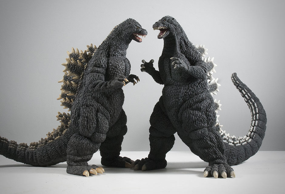 The most obvious comparison to make right away would be with the X-Plus Toho 30cm Series Godzilla 1992. 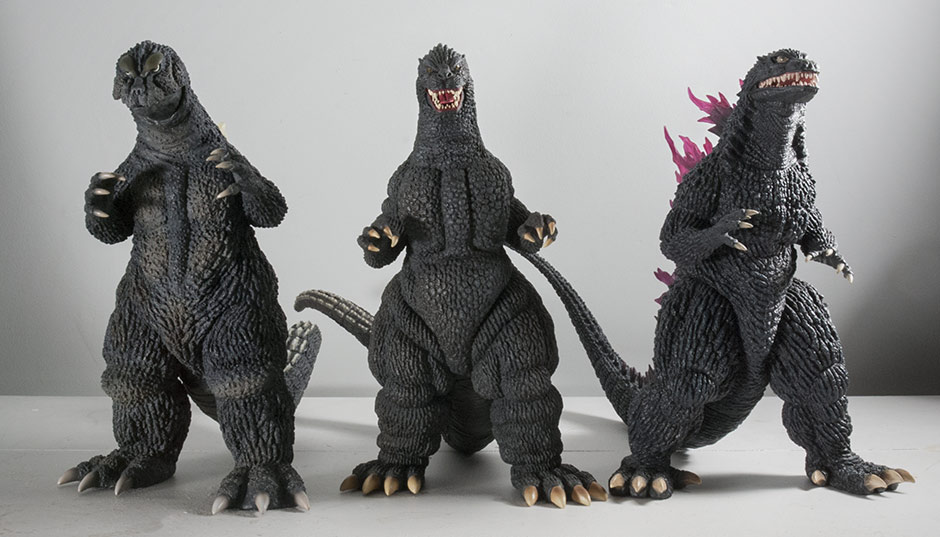 Size comparison with the X-Plus Godzilla 1964 Japanese Reissue Ric Boy and the X-Plus Godzilla 1999 (2000). The ’89 seems just a bit shorter than the other two, yet still fits in. 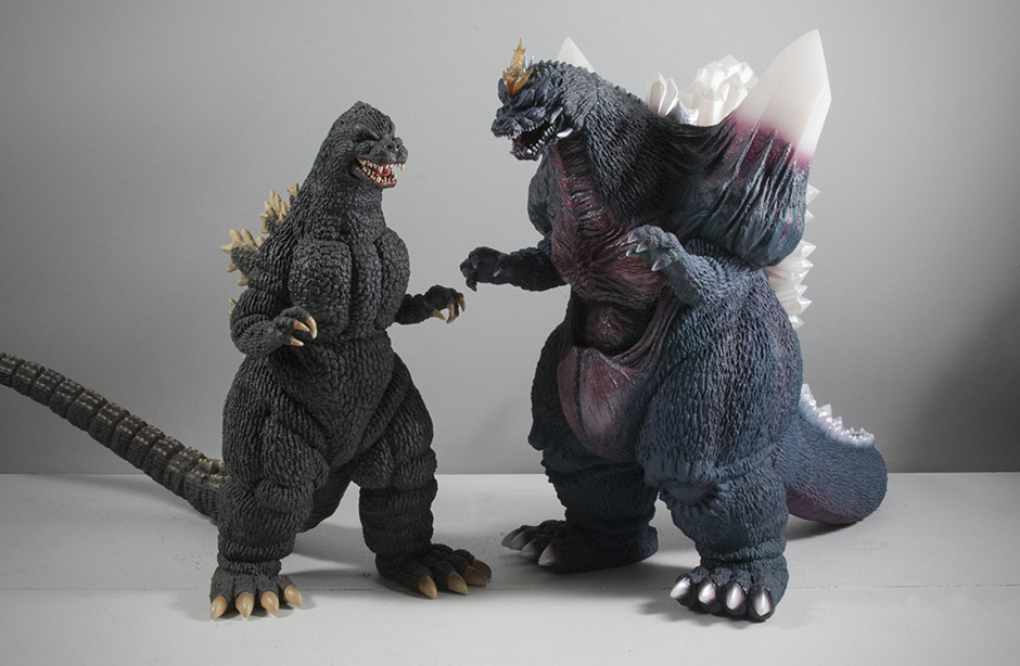 And here’s the ’89 with the only Heisei villain in the 30cm Series: Space Godzilla. He’s noticeably shorter. But don’t blame him, SG is supposed to be larger. And this vinyl is probably a bit larger than it should be. 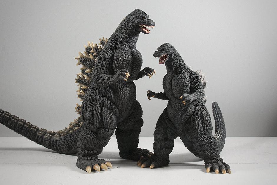 And here’s the 30cm Series version with its Large Monster Series (25cm) counterpart. This photo shows the DeAgostini version with warmer fins. 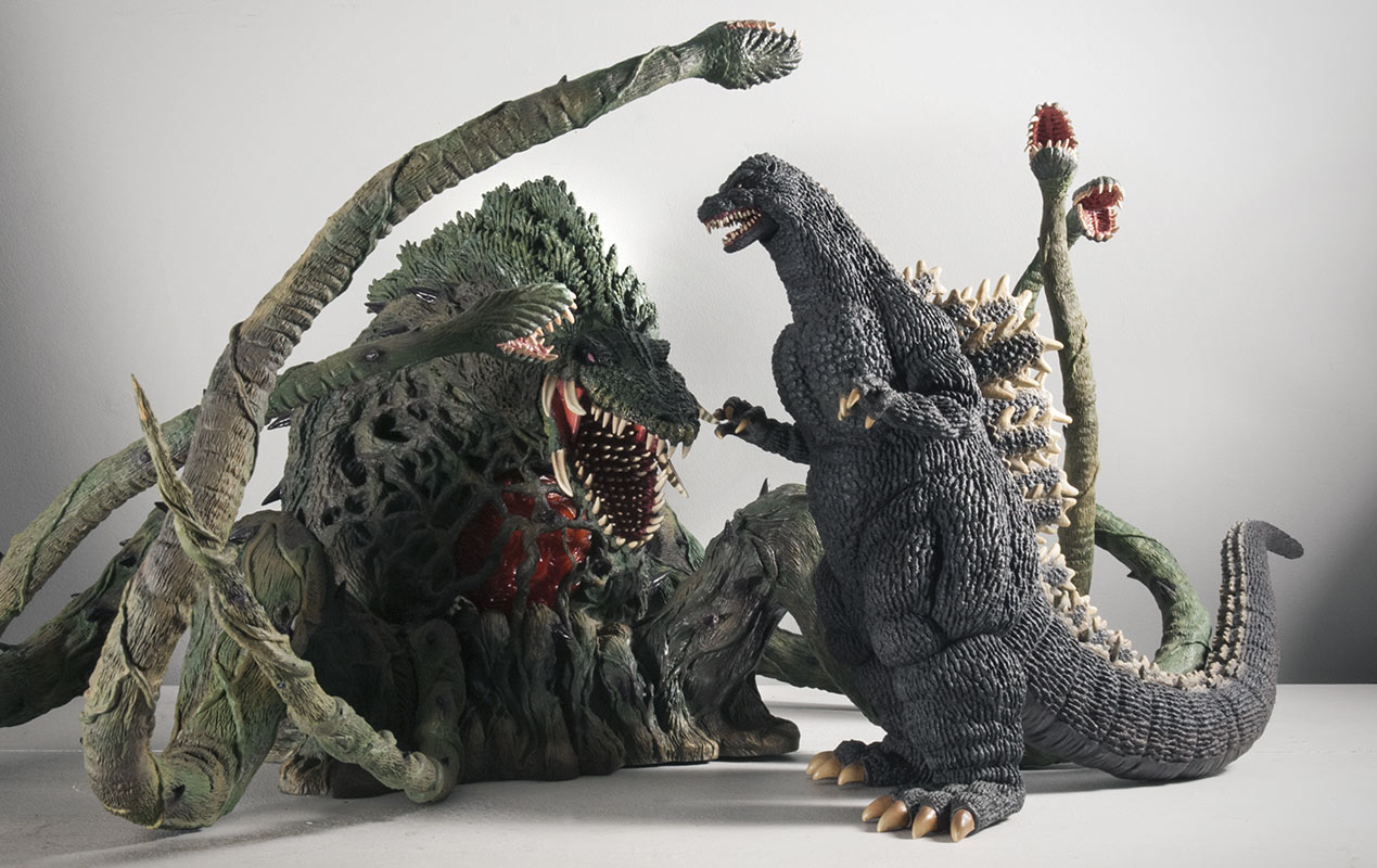 It’s not in scale with the Large Monster Series Biollante, but I couldn’t pass up this chance to get this big, green beast in front of the camera again. They still make quite a pair. FOOTPRINT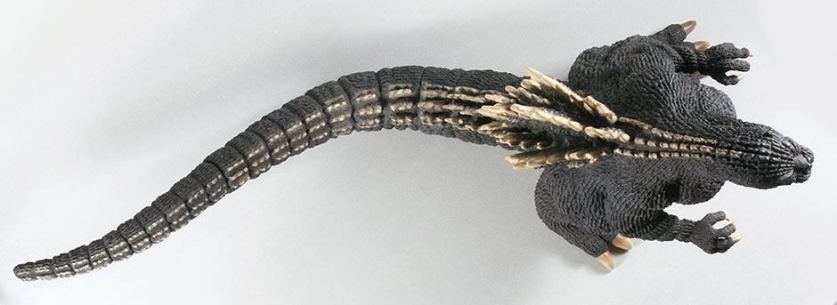 The X-Plus 30cm Godzilla 1989 vinyl figure is about 18.5 inches long from the tip of the nose to the end of the tail. Take off two inches if you only care about the length from toes to tail. The tail appears mostly straight but actually has three curves to it. Overall, the tail drifts toward the figure’s right side which means it will fit on the shelf better (if there is a wall at the back) if it faces slightly toward its left. The pose of the legs are ready to accommodate you with this position since the right leg is slightly further back. X-Plus seems to have planned for this to be its best angle. RIC BOY EXCLUSIVE The Ric Boy Exclusive version came with a mini Rose Form Biollante. It’s almost 4.5 inches tall. SUMMARYAwesome! Awesome! Awesome! The X-Plus 30cm Godzilla 1989 looks great, looks accurate, has a pretty nice paint job, and few visible seams (apart from the gap around the jaw) and a great pose. This thing has got to be in the Top 5! EXTRAS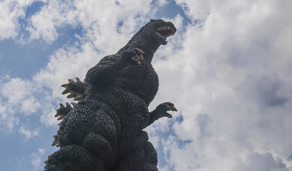 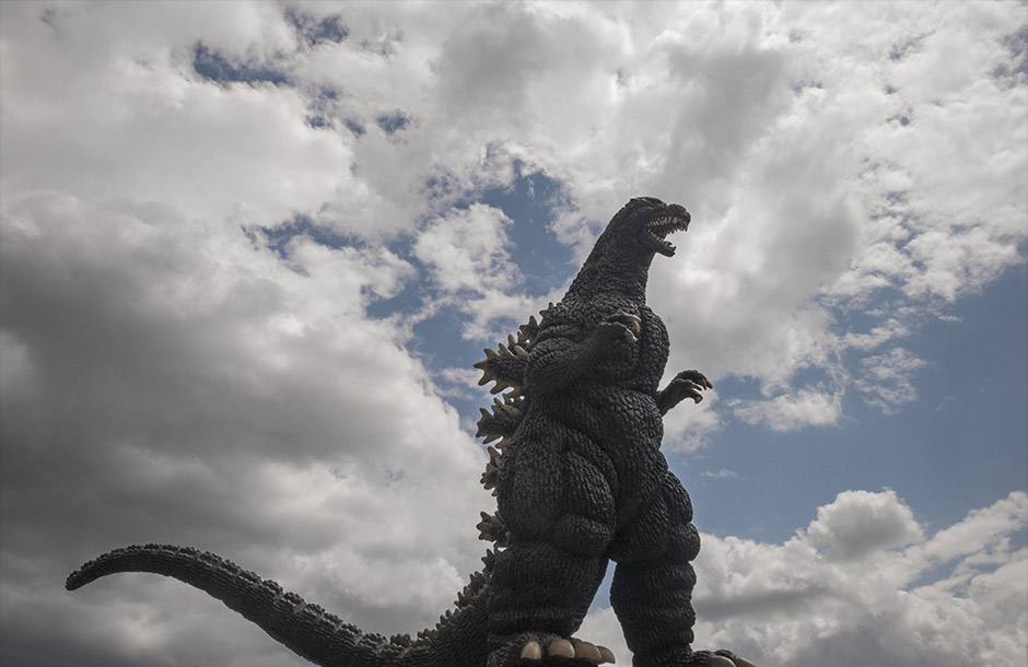 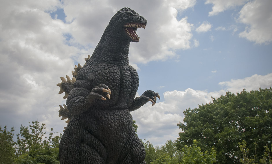 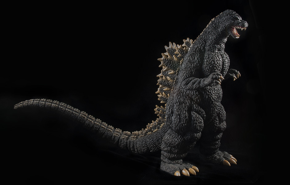 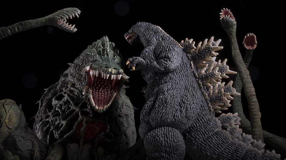 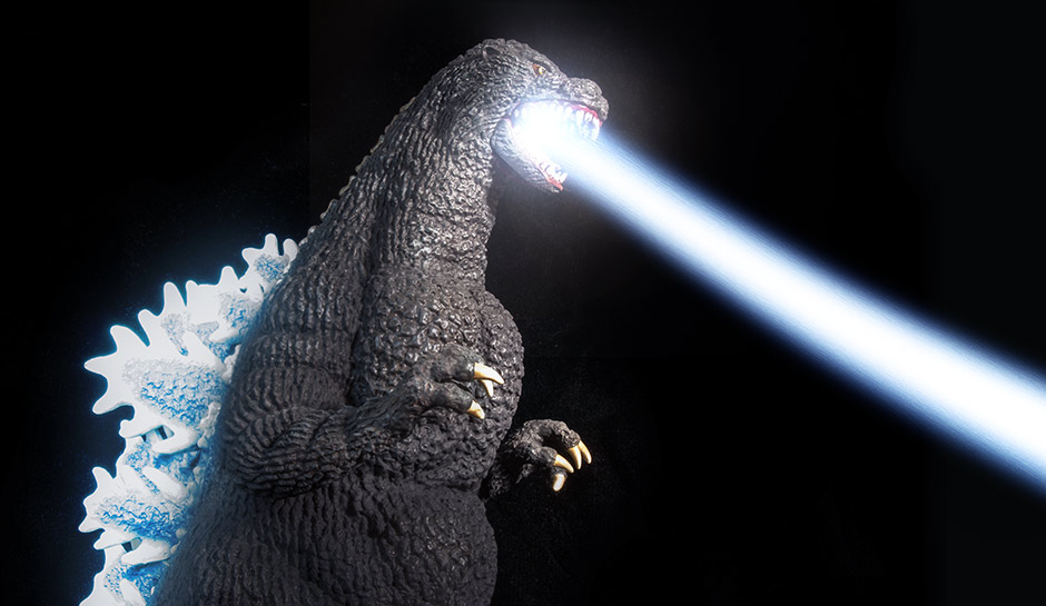 MORE INFORMATIONBy John Stanowski Originally posted May 28th, 2014 on Kaiju Addicts.
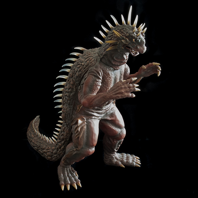 FIGURE SPECS東宝30CMシリーズ 「バラン(1958版) 大怪獣バラン」 JAPAN ORIGINAL RELEASE: 2012 JAPAN REISSUE: (MONOCHROME) 2013 DIAMOND REISSUE: APRIL 2014 SERIES: TOHO 30CM SERIES MATERIAL: SOFT VINYL FROM: “VARAN THE UNBELIEVABLE”, 1958 大怪獣バラン HEIGHT: 12 INCHES / 30.4 CM WIDTH: 7 INCHES / 17.7 CM LENGTH: 14 INCHES / 35.5 CM FIGURE WEIGHT: 12.7 OZ / 360 G ARTICULATION: NONE REVIEW AND PHOTOS: JOHN STANOWSKI X-Plus first released the Toho 30cm Series Varan vinyl figure (based on Varan The Unbelieveable, 1958) in 2012. This was followed by a limited release of a monochrome version in 2013. While not impossible to get, both were mostly rare and getting pricey in the aftermarket. April 2014 saw the release of the Diamond Reissue, made by X-Plus especially for the North American market. Varan has once again become available to collectors who missed out the first two times around. This review is for the Diamond Reissue. I have to say that I wasn’t expecting to get overly excited for this figure. Varan isn’t very high up on my favorite kaiju list. It was the completist in me that pushed the Add to Cart button. However, when I finally had the figure in front of me I was kind of blown away! Especially with the sculpt of the head. I always saw Varan as having an unimaginative, short, snouty head, but this figure really made me appreciate the design. So, now, yeah, I LOVE THIS THING! THE BOX / ASSEMBLY
The Diamond Reissue Box is identical to the one used for the original Japanese release with the exception of English being used on the rear warning label and the “PX Previews Exclusive” logo on the front, lower left. (Previews is the publication Diamond Distributors puts out to alert comic shops of their products.) So, let the Previews logo be your guide when considering purchasing. The Diamond release has a slightly more vivid paint scheme compared to the original release. It also has softer vinyl used on the back and tail. Other than that, they’re identical. THE TAIL I have to admit I had a lot of trouble getting the tail attached on my Varan figure for a couple of reasons. One, the tail is made of much softer material than usual and collapses easily with the force required to push it into the body. Second, the body hole is very firm and difficult to soften with heat. The reason for this is that there is a double layer of vinyl there. The entire back piece from nape of the neck to tail, and straight down behind the shoulders is one, separate piece made of softer material. To reinforce the body hole, X-Plus molded the front piece to include an “arc” at the bottom for the hole. This double layer didn’t seem to want to let me soften it up with heat. The solution is just to heat and soften it up as much as you can while making the tail as firm as it can get by putting it in the refrigerator for a SHORT while. (Do NOT put it in the freezer! You may wind up cracking the flange right off the tail.) That way the “suction cup” flange around the end of the tail won’t collapse onto itself when inserting it into the body. NOTE You may want to take this opportunity to insert something into the tail to weigh it down before attaching. I’ve heard many a tale of toppling Varans in the Summer heat. More on this later. Okay, let’s move on. Behold! Varan The Unbelieveable! …X-Plus-Style. SCULPT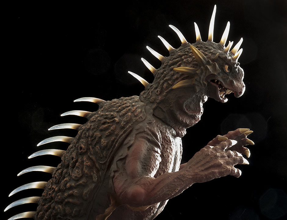 LIKENESS To my untrained eye for Varan, this figure is a knock-out representation of the ’50’s monster from the film. I mean, like… wow! I watched the movie last night with the X-Plus Varan on my lap to compare its sculpt to the big guy on screen. And I’d say it’s a very impressive likeness. THE SPINES When I watched Varan first crawl out of the lake on all fours, I noticed that the spines on my figure didn’t match up at all to what was on screen. The movie showed the spines being thicker and almost straight, a far cry from the thin, curved protrusions on the X-Plus vinyl. I wondered how X-Plus could get something so wrong. CUT TO: Varan walking upright. Suddenly the spines on screen matched the vinyl EXACTLY, with almost scary precision. I realized that the appearance of the spines change depending on the angle in which they’re viewed. It turns out they appear wider from above and thinner from the side. Toho monster suit maker, Keizo Murase, made the spines for the suit by cutting pieces of a vinyl hose into short lengths, and then carefully slicing them length-wise so that they would come to a point from above and the side. This seems like a cheap way to add detail to a prop used in a movie, but he was required to make spines that wouldn’t break or impale the suit actor or any crew members. Still, I think it worked great. You’d never know you were looking at hoses in the movie. So, not only did X-Plus get the sculpt of the spines dead right, they went even further! If you run your finger along the bottoms of the spines on this figure, you’ll notice that their undersides are concave, just like a sliced hose! X-Plus, why did I ever doubt you? 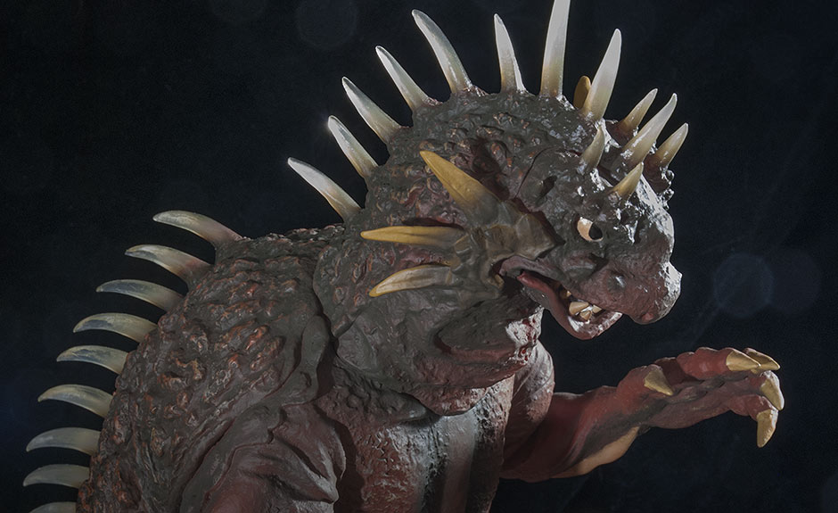 MORE ABOUT THE SPINES The spines on the head, back and tail are clear. If it weren’t for the refraction from the curved surfaces, you’d be able to see right through them. Light passes through them with ease giving this figure extra points for visual-interest. Plus, this just makes the figure look even more like the suit. The clear vinyl used is very soft and if you run your finger down the back with some pressure, the spikes will bend out of your way. A nice touch. However, the downside is the squooshy back and soft tail I mentioned earlier. 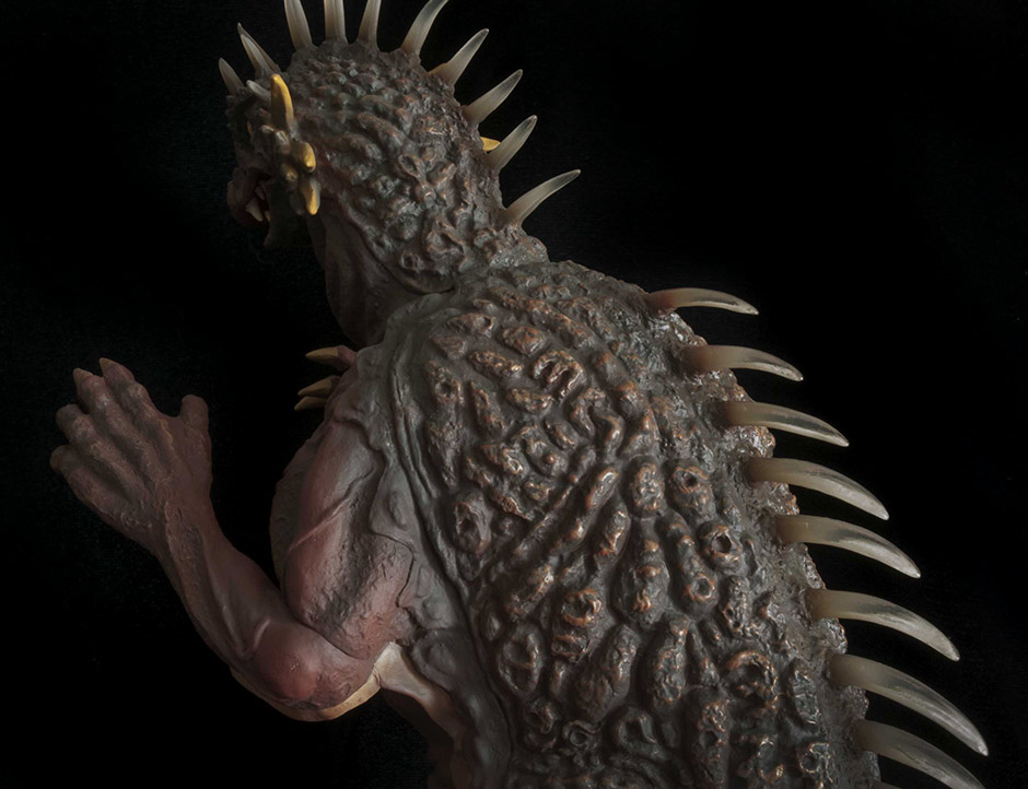 The unique texture Keizo Murase created for Varan’s back (inspired by peanut shells) is faithfully reproduced on the figure and looks unmistakably Varan-ish. Another impressive detail is the sculpt of Varan’s wings, or “membranes” as GodzillaFanFreaks called them. There’s just a ton of detail and texture all over this thing. 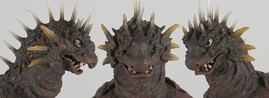 HEAD The head sculpt on the X-Plus Toho 30cm Series Varan is freaking amazing! It won me over very quickly and even made me do a 180 on my appreciation for the original design. I think it’s the spikes flaring out from his cheeks that gives him a kind of dragon feel that I never really noticed before. If all the X-Plus figures got together and had a staring contest, Varan would win… And the eyes. Those eyes! Those pissed-off-why-are-you-dumping-chemicals-in-my-lake eyes! Wow! If all the X-Plus figures got together and had a staring contest, Varan would win. Well, it may be a draw between him and the 30cm Godzilla 1964. But, that’s not bad! X-Plus’ devotion to suit accuracy over stylization becomes even more apparent with the inclusion of the peep holes molded into the neck which Haruo Nakajima used to see from inside the suit. The fingers are only partially individually sculpted, but this may just be how the suit was just like with the Godzilla 1962. This figure has individually sculpted teeth and if you peer into the mouth you’ll find that even the tongue looks like a separate piece. This is the kind of attention to detail X-Plus puts into their figures raising them above other vinyls. This is one toy that’s not a toy! JOINTS & SEAMSThe seam at the tail joint is somewhat apparent and seems to me to be needlessly so. The sculpt is tucked in at the joint, like string tied tightly around a finger. And it doesn’t look like there was any attempt to make the back texture cross this line. Perhaps X-Plus was merely following the look of the suit, but I couldn’t get a good look at this area in the movie. JIGGLE JOINTS noun \ˈji-gəl\ˈjȯints\ There are unglued joints below each knee. Both are free to move and rotate, but both ends are sculpted to fit precisely in a fixed position. So, basically, all you can do is jiggle them; the idea of changing their orientation should be off the table. Apart from the seams on the tail and knees, there is very little else to interrupt your visual love affair with this figure. The remaining seams are either filled in very well, or just not really noticeable. There are lines above both elbows but they really don’t stand out unless you look for them. The seams at the ankles are very well hidden. There is a seam along the bottom front of the neck which is worked into the sculpt pretty good. The face (upper jaw, eyes, nose and forehead) is a separate piece as is the bottom jaw. Both well hidden! Finally, the back has seams running down the length of the body, just behind the shoulders and are very well hidden by being worked into the sculpt. I didn’t even realize they were there until I noticed them when I had the figure in front of a very bright light while shooting photos. I become very disappointed when I get an X-Plus figure cluttered with obvious seams and lines. But, the X-Plus 30cm Series Varan does not offend at all. They did a great job on it. POSE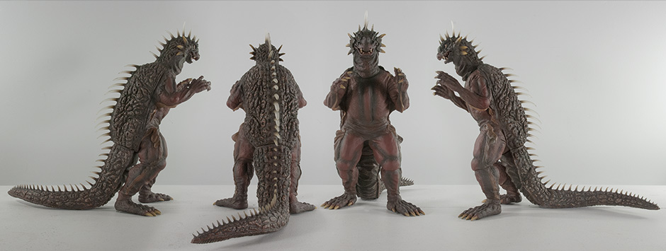 The pose is typical of Varan as he marched through the woods against the Defense Force and again as he bulldozed his way through the airport. My only gripe is that his right leg is so far back that this figure is prone to toppling. PAINT JOBThe X-Plus 30cm Series Varan vinyl figure may look “just brown” at first, but there really is lots to see. This figure does have a base coat of a very dark brown; almost a light, dusty black. Reddish brown patches cover the chest, arms and legs; the dark brown creeps in to fill the creases in these areas. The peanut shell texture on the back and tail have light brown/tan highlights. This color is also used on the claws which are feathered in on the feet, yet abrupt on the hands. A similar color coats the strips of folded wing membrane on the sides which are also expertly shadowed with dark brown. A more vivid yellowish brown covers the spikes flaring out from Varan’s cheeks. The whites of Varan’s eyes are clouded in a brown tinge making this toy look all the more un-toylike. Finally, the brown creeps up the bases of the clear spines for an awesome looking feathered transition. This color scheme no doubt came from Varan’s brief appearance in Destroy All Monsters since the original suit was simply a brown/dark tan. I don’t mind the change since the only image we have of a color Varan comes from his second appearance. I do wish, though, that the reds were a little more unsaturated since they seem to stand out a bit much. Overall, though, this is one of the more impressive X-Plus paint jobs I’ve seen. SIZE COMPARISONS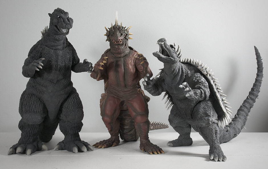 1950’s Here’s a size comparison with two of Varan’s buddies from the 50’s: the Toho 30cm Series Godzilla 1954 (which is a little taller than most figures in this line) and on the right, Anguirus 1955. 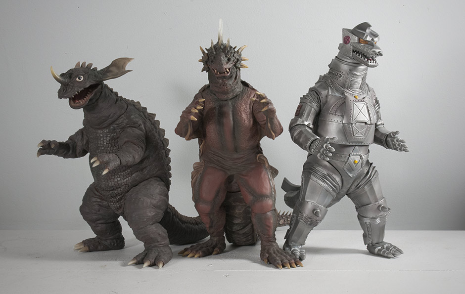 The 30cm Series Baragon 1968 (a tad shorter than most figures) and Mechagodzilla 1974 (a bit taller than most). Still a good-looking scale match.  The 30cm Series Varan with its Large Monster Series (25cm Series) counterpart. 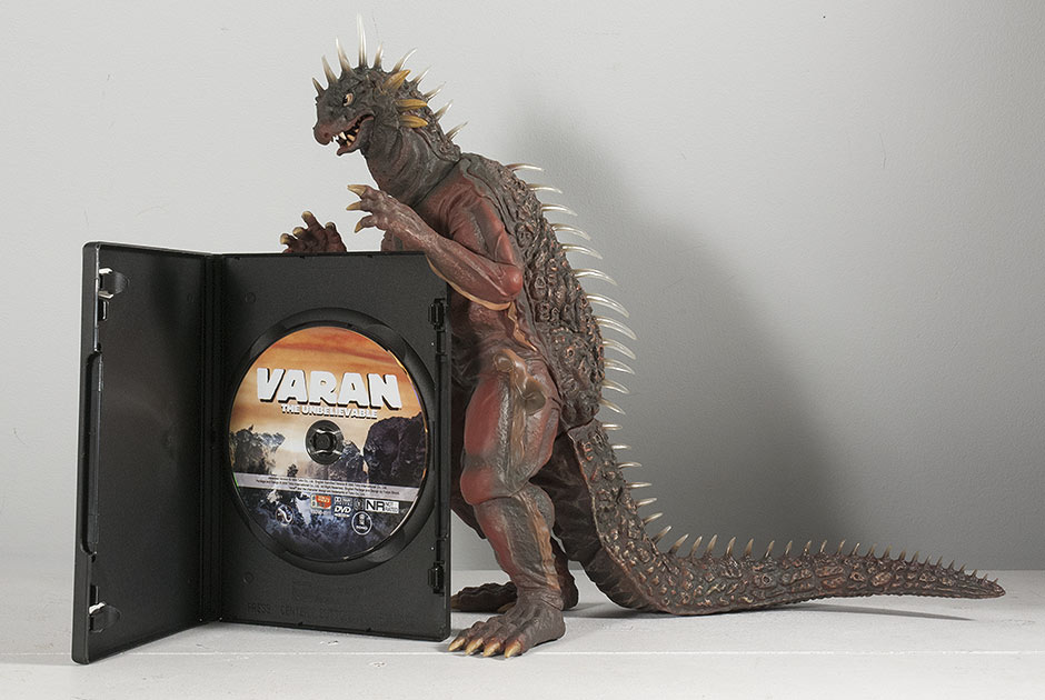 For those of you who don’t have their first X-Plus vinyl yet, here’s the Varan figure with a DVD for a real-world size comparison. FOOTPRINT / SHELF CONSIDERATIONS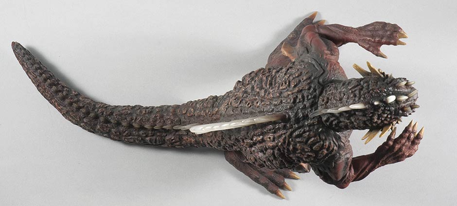 The 30cm Series Varan is about 14 inches (35.5 cm) long from nose to tail, and about 12 inches (30.4 cm) long from toes to tail. The tail curves slightly to the figure’s left and this makes it a little more accommodating for space if your shelves are up against a wall. This Varan looks good facing front or angled to either side; although the tail might get in the way if you place him facing the the right. POTENTIAL TOPPLING As mentioned earlier, The X-Plus 30cm Series Varan is apt to having tumbling issues. The figure’s right leg is so far behind the other that it’s very easy to tip it over if you bump his head just the right way. I don’t have any of the specifics behind these tales of toppling Varans, but I suspect that, in the summer months when vinyl gets softer than usual, that the right foot must start to bend under his weight which is only 3/4 of a pound. This is why I suggested putting marbles or something into the tail before attaching. This would weigh it down and help to hold him upright. Problem is having marbles in one of your figures can be annoying and we collectors shouldn’t have to do that. Some alternatives would be to prop Varan up with support from another figure on his right side. Or, even better, use another figure’s tail (or some other weight) to lay over Varan’s tail (though the spikes may get in the way). I don’t know how likely it is that your Varan will begin to tilt down, but better safe than sorry. If you choose not to reinforce Varan, just keep an eye on his right leg and especially his right foot in the summer months and look for signs of bending. Hopefully none of this will be necessary. Some collectors have told me that their Varan is fine and always was. SUMMARYFor a figure I wasn’t expecting much from, this thing totally surprised me and is pretty damn nice. It has an accurate sculpt that’s so good it made me appreciate the actual suit more than I ever did. It has an extra nice paint job and (mostly) well-hidden seams. I’m not up on all the Varan figures ever made, but the X-Plus has surely got to be near the top of the Essential Varans to own list! This figure made me a believer! 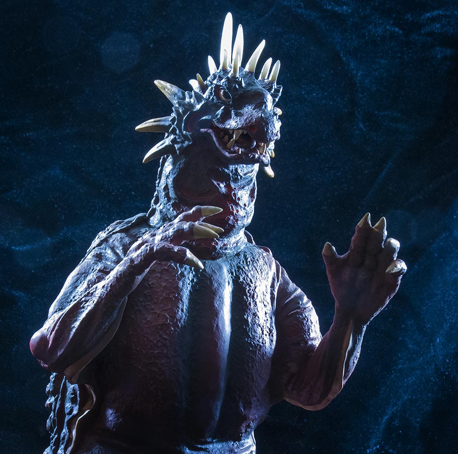 MORE INFORMATIONBy John Stanowski Originally posted April 30th, 2014 on Kaiju Addicts.
 FIGURE SPECS東宝30CMシリーズ 「バラゴン(1968) 発光版VER.」 WF2014 冬 開催記念商品 JAPAN ORIGINAL RELEASE: 2010 WF RE-ISSUE: 2014 DIAMOND RE-ISSUE: APRIL/MAY 2016 SERIES: TOHO 30CM SERIES MATERIAL: SOFT VINYL FROM: “DESTROY ALL MONSTERS”, 1968 怪獣総進撃 HEIGHT: 10.5 INCHES / 26.6 CM WIDTH: 7.75 INCHES / 19.6 CM LENGTH: 14 INCHES / 35.5 CM FIGURE WEIGHT: 15.4 OZ / 436 G ARTICULATION: NONE REVIEW AND PHOTOS: JOHN STANOWSKI The 1968 Destroy All Monsters version of Baragon was first put out in the Toho 30cm Series by X-Plus back in 2010 making it a rarity today. But eighty lucky collectors got their hands on a 2014 Re-issue made specially for the Wonder Festival toy show in Japan in February 2014. Forty figures were sold at the show, and forty more were sold online. This figure was re-issued in 2016 for the North American market through Diamond Distributors. The “Godzilla Kaiju Baragon 1965/1968 Version” was released, to everyone’s surprise, with a bonus alternate head so you could go for the Frankenstein Conquers the World look or the Destroy All Monsters look. This review is for the 2014 Winter Wonder Festival Commemorative Edition. This figure should be mostly identical to the original release (sans the light gimmick). THE BOX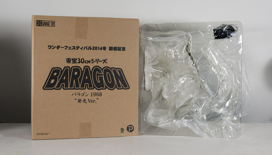 The 2014 Wonder Festival version of this figure comes in a plain 30cm box. If you’re hunting down the original version online, the box will have art on the front. The figure comes in two pieces (body and tail) twist-tied in an open plastic shell. Heat the hole on the body with a hairdryer until it’s soft, and then push the unheated tail in. The tail joint is a sort of triangular / elliptical shape and requires a little more effort attaching. SCULPT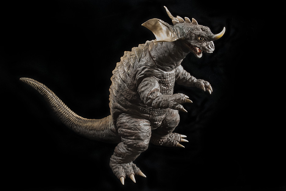 If you’ve been looking at the same production photos available on the web over and over when trying to decide whether or not to get this guy, know this: it looks a whole lot better in person! 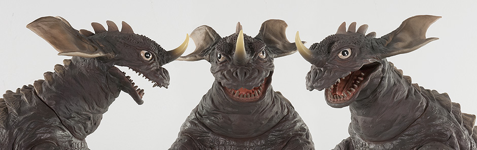 HEAD The head on this figure seems a little wider than it did in the movie. I suspect that would be because he’s standing and has nothing behind him, whereas in the movie he was crawling and had his bulk behind him. The real giveaway that you’re looking at the 1968 version is that the horn is pointing up instead of forward as with the 1965 suit. As for details, they’re all there. Note that the corners of his mouth, as seen from the side view, really stretch far back into the head. I’m assuming this is because this suit was so beat up from being repurposed as Ultraman kaiju over and over again. The jaw is crooked on my figure and leans towards the left. I don’t know if they are all like this or not but it’s not overly noticeable. 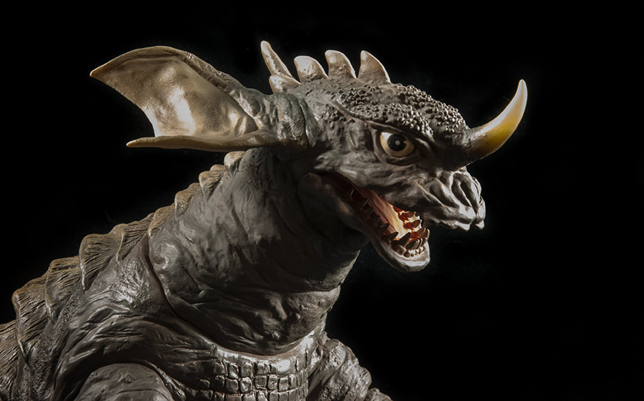 As usual, X-Plus figures have individually sculpted teeth. 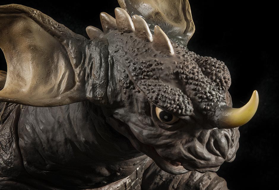 The bumpy texture on the top of the head looks amazing! But, I think, the details on the nose and snout are a little soft and look flat under normal lighting. I’m not complaining, though. If you’re a fan of Baragon, this is a must have! 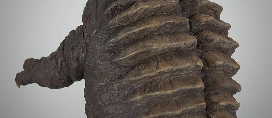 The mushroom-combed texture on the back ridges is very detailed.
The chunky, bunchy nature of the smooth-skinned Baragon suit shines on this figure. The reptilian-pattern on the chest looks fantastic. JOINTS & SEAMSThe Toho 30cm Series Baragon has more visible joints than on most other X-Plus figures. The arm and leg joints are visible and aren’t glued or sealed. The sculpt, though, attempts to hide these seams with bulges and ripples in the suit. Unfortunately, nothing can hide the line running around the bottom of Baragon’s neck. It’s times like this that I need to remind myself that these are almost, but not quite, the super perfect statues I’ve always wanted to collect. They are still vinyl figures, and vinyl figures have a long history of doll-like joints. X-Plus just does a better job of hiding them… most of the time. The ridges running down Baragon’s back and tail do a good job of concealing the tail joint. POSE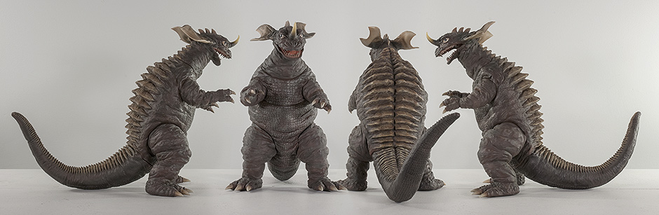 The pose is simple and I like that. Though I don’t know where the inspiration for this pose came from. The only scene with Baragon in Destroy All Monsters that I can recall, which was really more of a super quick cameo, had him on his hands and knees in crawling position. But I’m actually glad this figure is bipedal since it’s from the 30cm Series. They’re so big, they look better standing up on two legs. And this standing pose demands less room on the shelf. His head is turned ever so slightly to his left so displaying him from a forward three-quarter angle on his left side would look best on the shelf. It also helps that his left arm is lower than the right so this angle of him looks especially nice. But this guy looks good from any angle! PAINT JOBThe Wonder Festival Baragon Commemorative Edition has a base coat of a dull brown, with plenty of reddish brown highlights which are awesome. They are very subtle and give the base color an overall realistic quality. It does lack, though, the extra layer of brighter highlights which the Large Monster Series Standing Baragon had. The ridges which run down the back and tail are painted a lighter brown (almost tan) and is much more refined and subtle than on the Large Monster Series version. This looks top notch! That same lighter brown feathers over the claws and ears. The teeth are a realistic-looking dirty white and look very un-toylike (which is a GOOD thing!) The inside of the mouth also has a more grown up unsaturated shade of red. The eyes are a brighter white and a bit stark, but that’s a good match for the real suit. They also have a glossy sheen to them. The paint job is just great in my opinion. SIZE COMPARISONS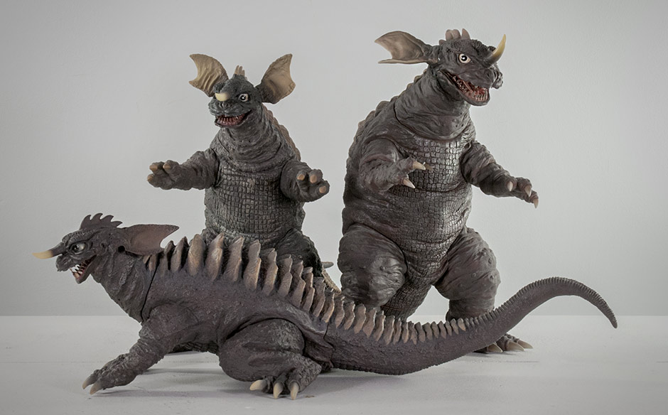 The X-Plus 30cm Series Baragon is, as one would expect, taller than the Large Monster Series (25cm) Standing Baragon released in 2013, even though the smaller figure is really big for the line it belongs too. Pictured in front is the Large Monster Series (Crawling) Baragon. 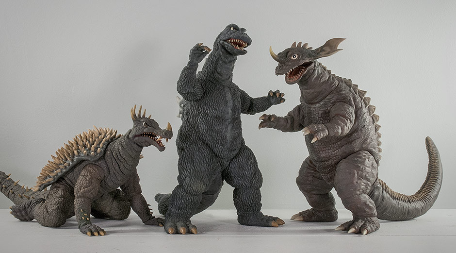 It fits in well with his Destroy All Monsters buddies, X-Plus 30cm Series Anguirus 1968 and Godzilla 1968. 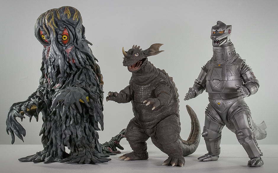 Baragon sizes up well with the rest of his Toho 30cm Series buddies. Shown here: Hedorah and Mechagodzilla 1974. FOOTPRINT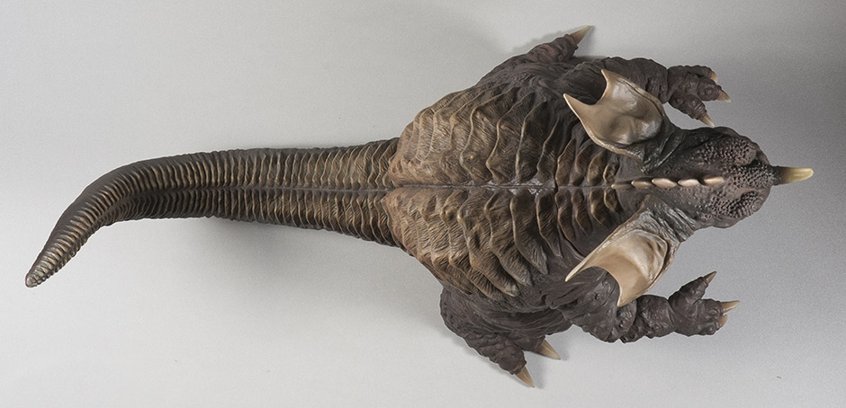 Baragon’s tail is short and curled up in the back which gives him a length of only 14 inches, three of which you can subtract if you only care about the distance from the toes to the tail. This figure is very accommodating when it comes to finding room on the shelf. 2014 Wonder Festival Special Feature The Ric Boy version of the 2010 release came with an extra alternative head sculpted to look like the 1965 version. That extra head does NOT come with the Wonder Festival Commemorative Edition. Instead you get yet another light gimmick. The horn lights up brightly. The eyes light up as well, but not as bright. And then there are….
LIGHT LEAKS I’m sad to report that my Baragon figure is plagued with light leaks. Speckles show up all over his face and even more drastic are lines around the eyes. The figure you get may not be this bad, or have leaks at all. Then again, they might be worse. I’m seeing light leaks from X-Plus figures all the time now. My 30cm Series Space Godzilla has them, and the entire right side of the face on my new Ultraseven Standing figure gets flooded with unwanted light when it’s turned on. I’m not sure how to fix this. Adding black paint on the inside may help, but in Baragon’s case, his face is deep inside the head piece and requires a 90-degree turn to get to it. Plus the wires are in the way. I guess there’s nothing to do about this problem except to keep the lights off. Careful!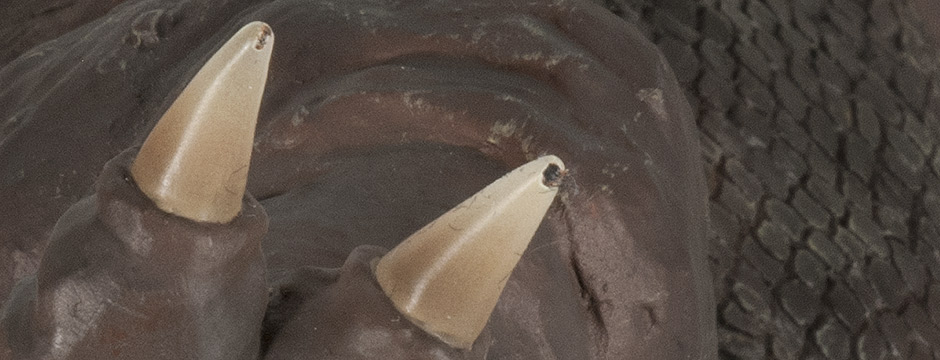 WATCH OUT FOR TOE SCRAPES The paint on the claws and toes of most X-Plus vinyls can scrape very easily when handled. Toe scrapes usually happen when removing a figure from the shelf, moving it and, of course, drops. My Wonder Festival Baragon took a tumble while shooting photos for this review. Above you can see in the photo above: one toe was scraped and another lost a noticeable chunk of paint. My fault, yes, but it’s very easy to do, especially with Baragon’s long, thin toes. The very nature of these vinyls tend to make one think that they’re safe, can take tumbles and don’t need the same care that, say, a resin model or statue require. But it’s that thinking that makes one overly carefree when handling these figures. Be careful! SUMMARYDespite having more visible joint seams than usual, this figure is multi-textured, highly detailed and deliciously retro-60’s-kaiju-looking! And the careful and detailed paint job makes it even better! Either release of the X-Plus Toho 30cm Series Baragon is sure to add some awesome sauce to your shelves! By John Stanowski Originally posted February 25th, 2014 on Kaiju Addicts.
|
This section is a fully authorized reposting of articles from Kaiju Addicts, why, because in time Kaiju Addict will be going away in the near future and we wanted to persevere the great reviews, tips, and more on the site. All articles are being reposted with the integrity on the original articles intact as much as possible (there are some minor edits, and dead links that have been removed). Even though these may be older articles they can provide useful information to both new and old fans alike. We thank John for providing us this opportunity.
Author/AboutJohn Stanowski
Owner/Blogger of Kaiju Addicts, a premiere X-Plus and figure related website. Kaiju Addicts is a guide to collecting X-Plus Godzilla/Kaiju vinyls. It is site that is a web portal featuring all things X-Plus including his own written figure reviews, news, release schedules as well as content from other collectors and reviewers. Kaiju Addicts Reviews and Original photos by John Stanowski, do not copy and reuse without permission. Photos are NOT to be used for selling. Kaiju Addicts also posts content from other reviewers and user submitted photos which are copyrighted by their owners and can not be copied without permission. All articles on this page are
Copyright 2013-2021, John Stanowski All Rights Reserved. Please do NOT copy photos without permission. Archives
October 2021
Categories
All
|
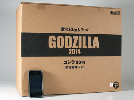
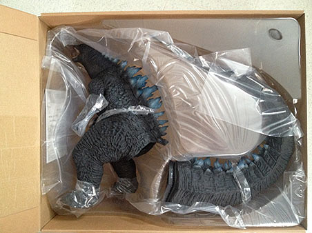
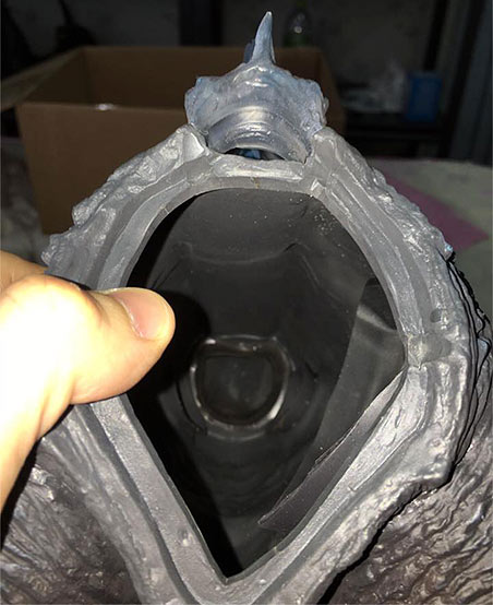
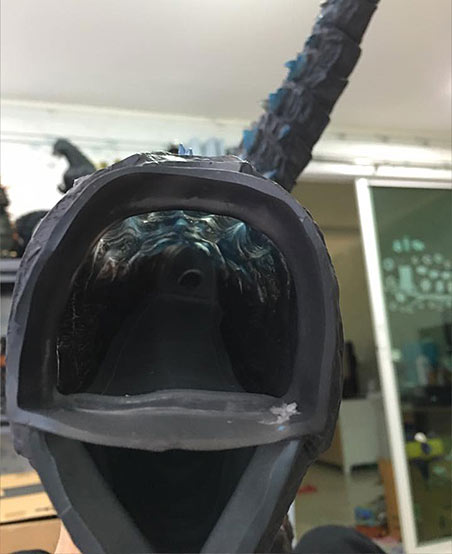
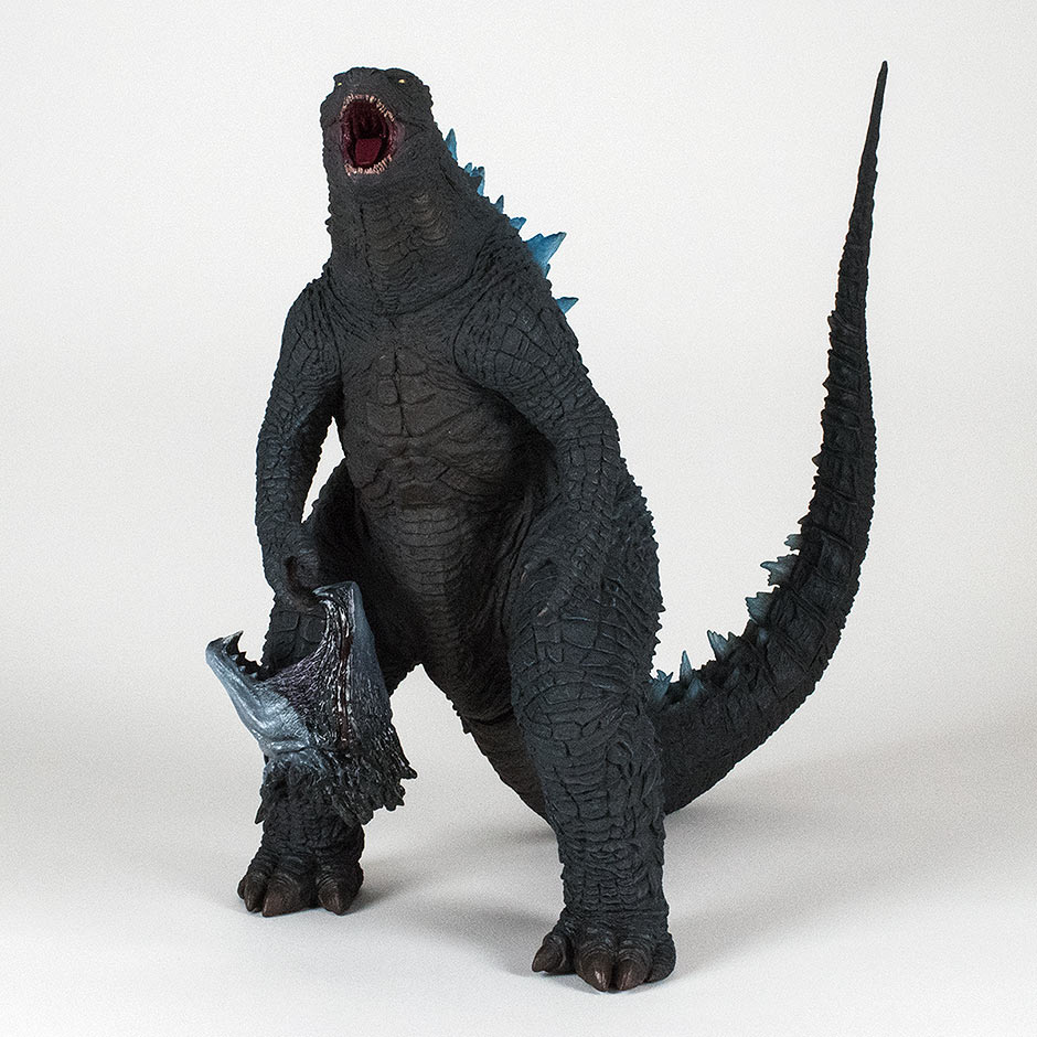
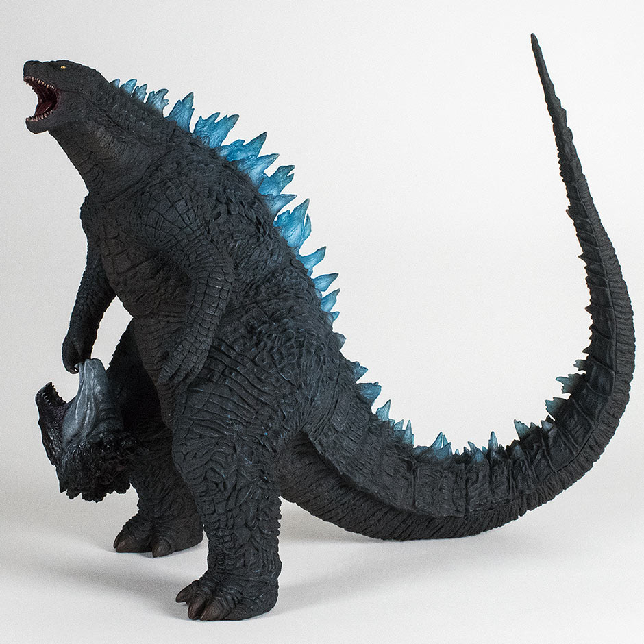
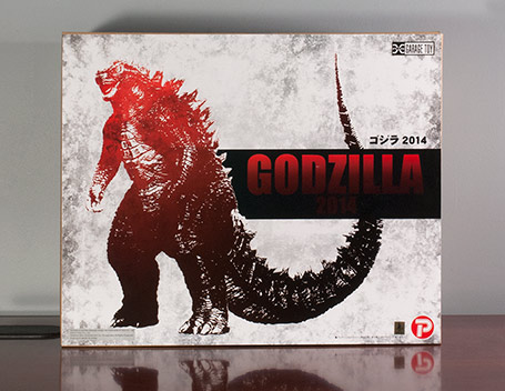
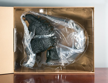
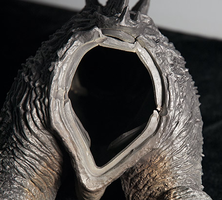
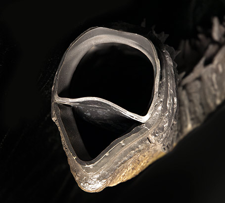
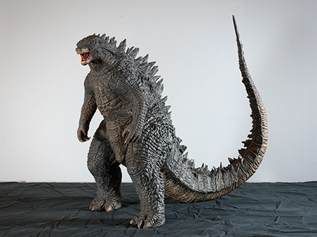
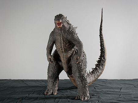
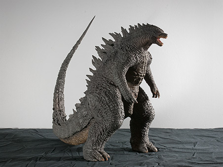
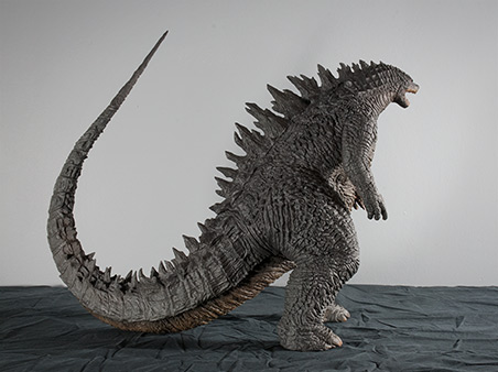
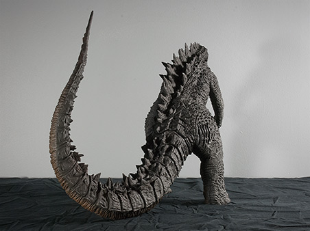
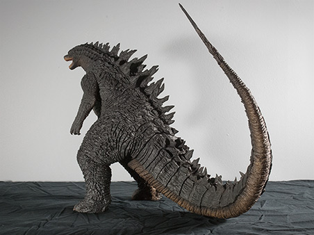
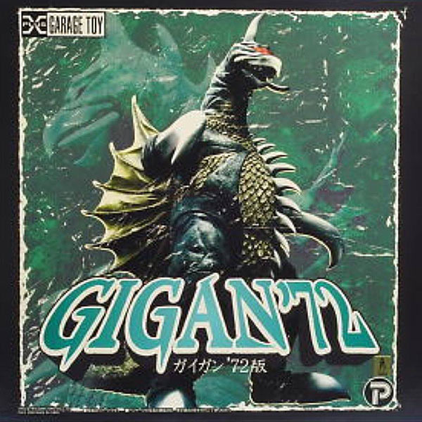
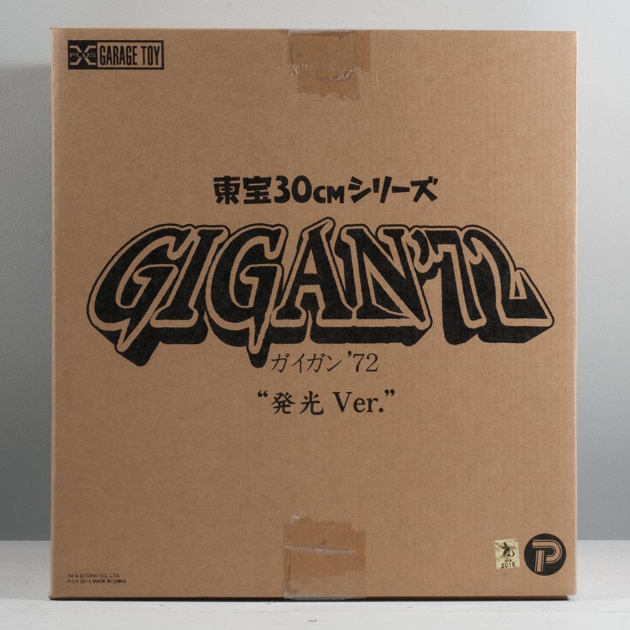
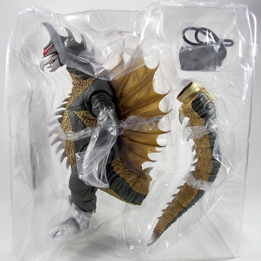
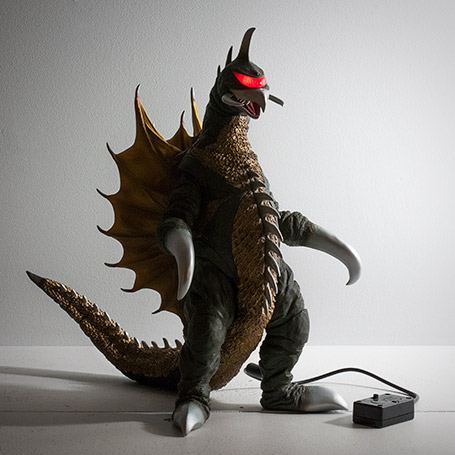
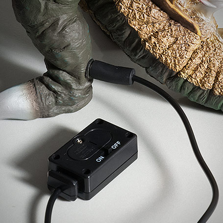
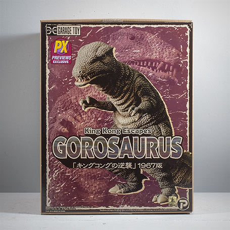
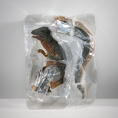
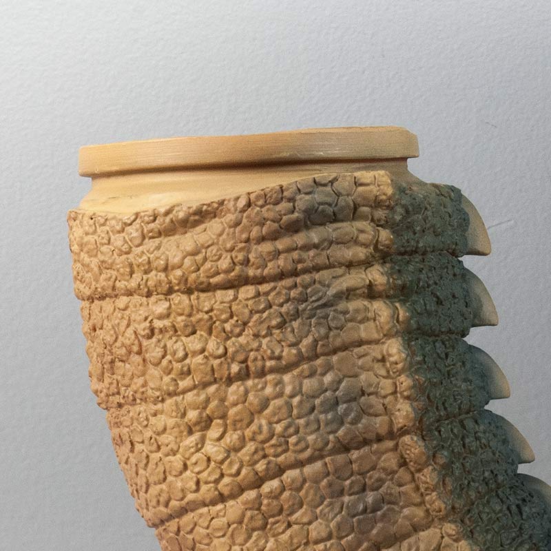
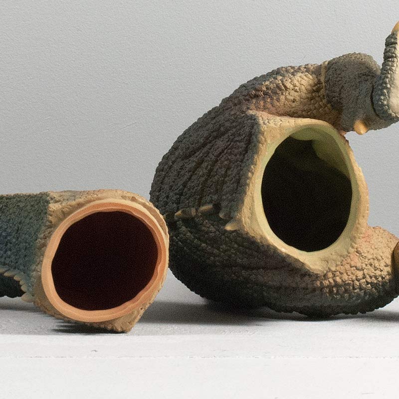
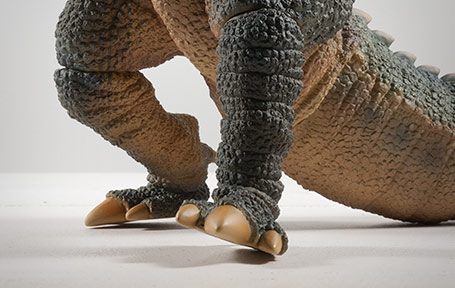
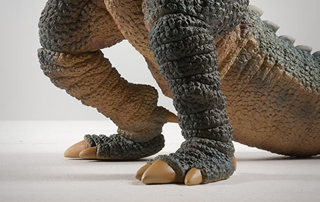
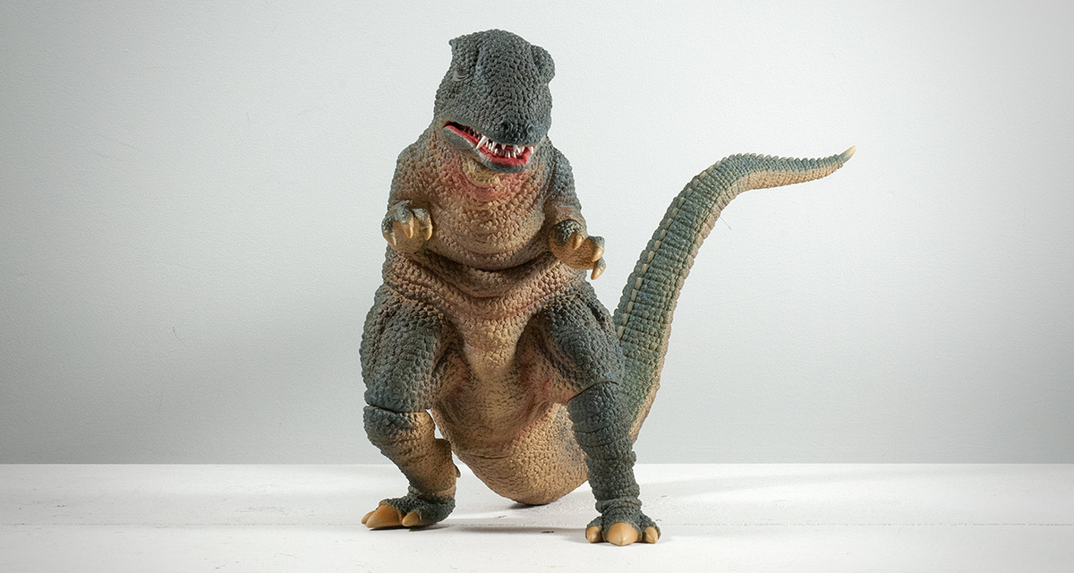
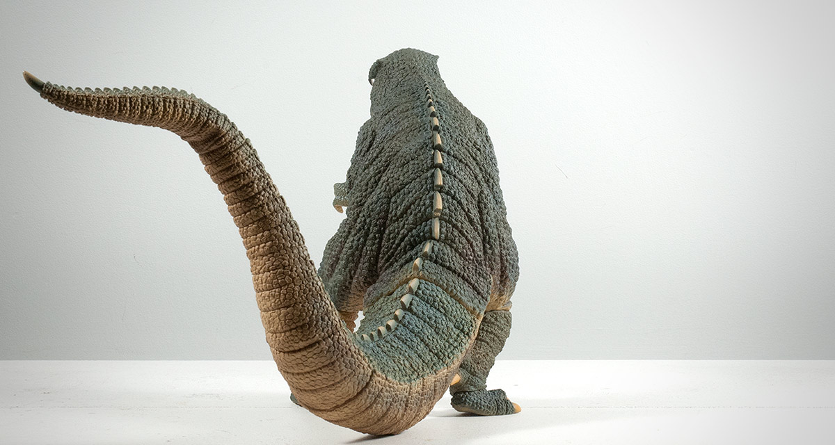
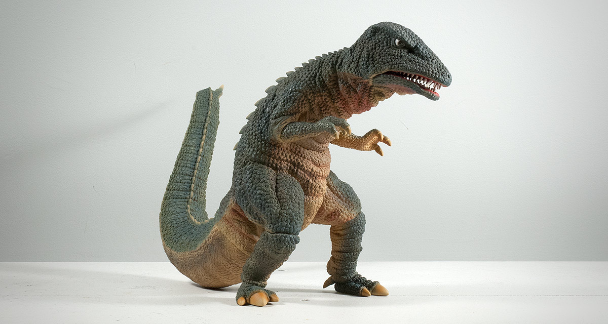
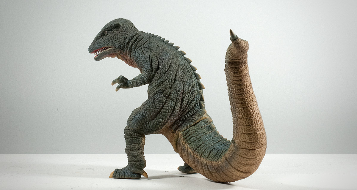
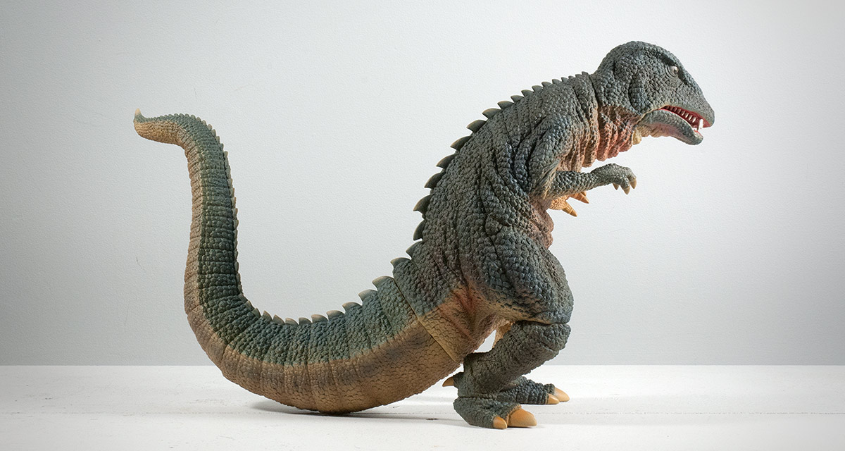
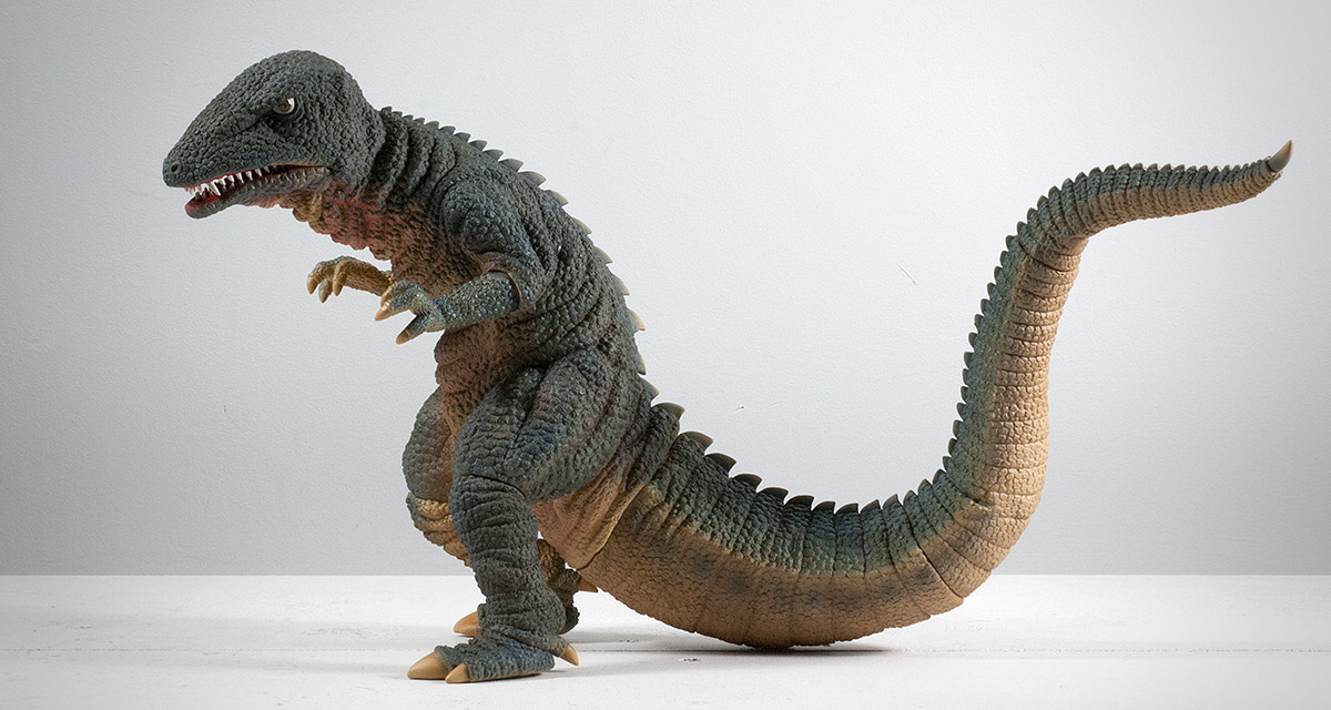
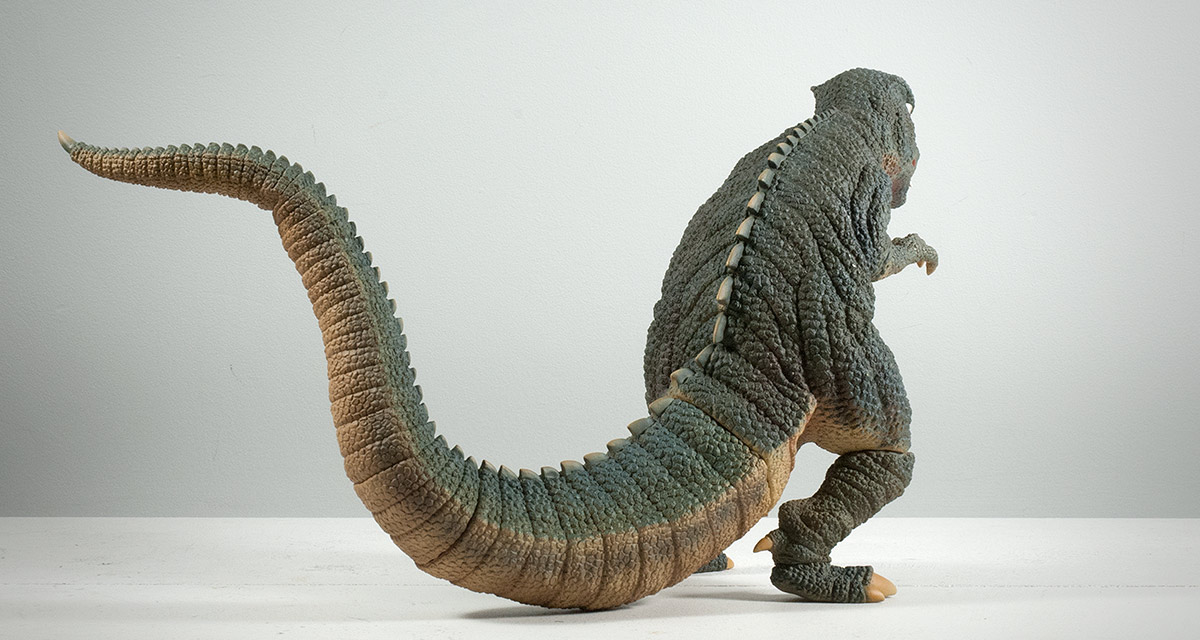
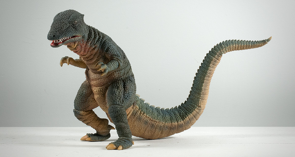
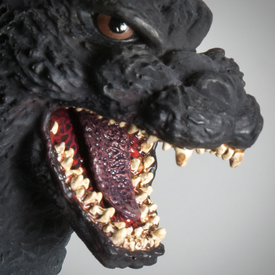
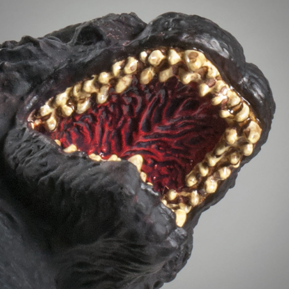
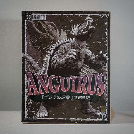
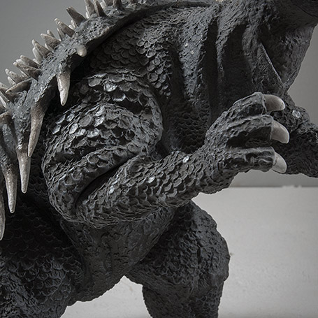
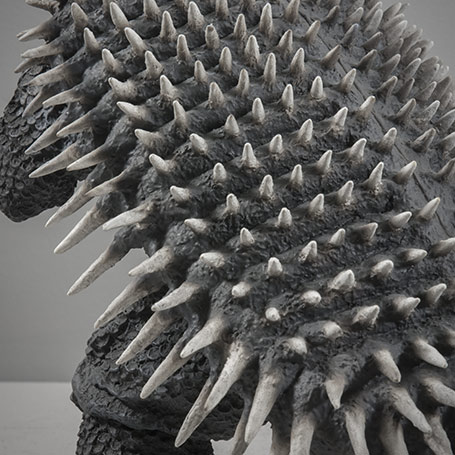
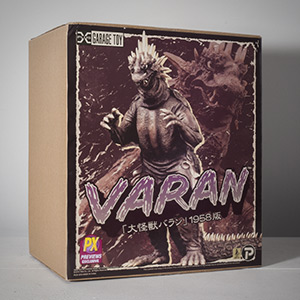
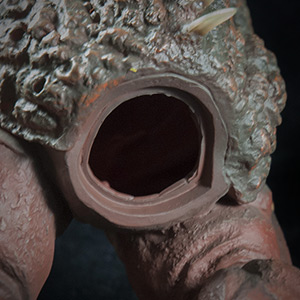
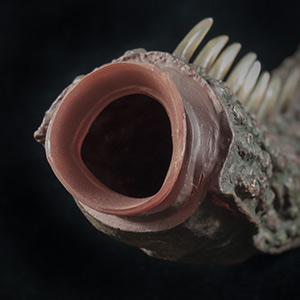
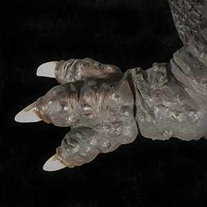
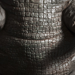

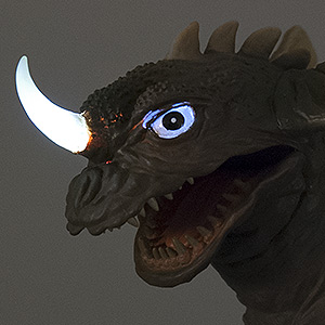
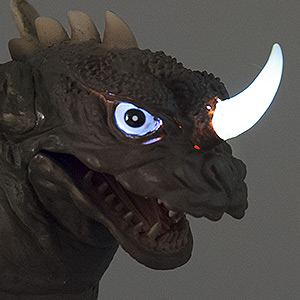
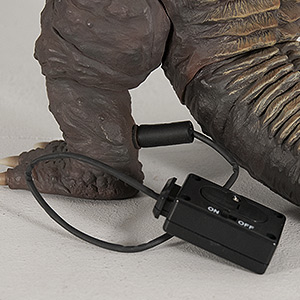
 RSS Feed